Beautiful and Innovative: In Praise of Artistic Experimentation in Literature
Sam Mills Makes the Case For Marrying the Literary and the Visual in Fiction and Nonfiction
I first read Laurence Sterne’s The Life and Opinions of Tristram Shandy as a teenager. I was hungry to assert maturity through my reading habits, to bypass YA fiction in favor of books for adults, and so initially its playful visuals made me frown; I associated illustrations with children’s books. Soon, however, I realized how sophisticated and delightful they were.
The squiggle representing the emphatic twirling of Corporal Trim’s cane. A blank page where the reader is invited to imagine how Widow Wadman might look—”paint her to your own mind.” A marbled block which the reader can gaze into and contemplate the mysteries of life. And—my favorite—the iconic black page that represents the death of Parson Yorick.
Whilst Sterne was certainly an innovative writer ahead of his time, it is worth noting that this was not anarchic at the time of publication; other texts published in his era, such as funeral publications, also included black pages as a symbol of death. However, the image was unusual for a novel, and is a perfect visual representation of grief, inviting multiple interpretations—a dark tombstone, funeral attire, a bleak starless night, a black hole of grief.
These books felt idiosyncratic, shaped by authorial intent, as if harking back to those medieval manuscripts where monks wrote in calligraphy and included beautiful pictures in colors bright as stained glass.
Sterne was on my mind when I was first published by Faber & Faber in 2006. He’d inspired me to consider how experimenting with visuals could bring a new dimension to my storytelling, might enchant or surprise the reader. In my debut novel, A Nicer Way to Die, two boys are the sole survivors of a coach crash and escape to a deserted mansion, where their enmity intensifies as night falls. I represented a sequence of tense dialogue by flipping to black pages and white lettering. My later novel, The Quiddity of Will Self—which aims to be the literary equivalent of Being John Malkovich—includes a section where a character called Richard sits writing in a towerblock, a literary public exhibit. Gradually he realizes that this is a delusion and he is the victim of a bizarre psychiatric experiment. Enigmatic playing cards pop up on the page, depicting Will Self’s craggy face, implying that Richard is being brainwashed; I wanted to tease the reader and suggest hints of A Clockwork Orange-style experiment.
In my most recent novel, The Watermark, two lovers booksurf across narratives through time and space. In the middle story, set in a fictional Russian state in the 1920s, they align their consciousness with birds, specifically Russian waxwings. I wanted them to leave language behind, to represent their more primitive, simple state of being and after much experimentation, I eventually opted for a graphic novel section, collaborating with the artist Christiana Spens.
Some of my favorite contemporary novels also follow in Sterne’s footsteps. The Raw Shark Texts by Steven Hall is a metafictional novel I’ve long admired for its marriage of prose and pictures. Hall worked as an artist before he crafted his debut, stating that “I think the text imagery predates my writing fiction. I was interested in that first.” The narrator, Eric Sanderson is suffering memory loss and a dissociative fugue state, for he has suffered the attacks of a Ludovician, a predatory shark which swims in “the streams of human history, human culture and human thought” and feeds on “human memories and the intrinsic sense of self.” The images in the book include conceptual fish constructed from words and symbols. Towards the end, there is a flip book whereby the shark gradually comes closer and closer, a childlike device rendered sinister and chilling.
Hall has expressed frustration with criticisms of typographical play in books: “I hate the idea that everything beyond straight, left to right text is somehow a gimmick,” pointing out that the concept he’s exploring, that of language and ideas forming a watery medium where predators might lurk means that “it’s the text itself that’s dangerous and unreliable and risky.” The visuals in Raw Shark do not simply compliment the text; they are part of the story. The result is that novel feels like a living, breathing ecosystem, where words can gather in currents which might morph into malevolent form.
Mark Z. Danielewski’s House of Leaves, published in 2000, became an instant cult classic. It’s a labyrinthine tome about a house that grows larger into the inside which is part mystery, part horror novel, part academic satire, told through a collage of memoir, text, footnotes, and photographs. The narrative is one of competing perspectives and stories, which the reader must assemble their own truth from: Johnny Truant, Zampanò, and the Editors are each defined by a different font (Courier, Times, and Bookman).
At certain points, the POV jumps from one character to another via a footnote: the literary equivalent of a jump-cut in a film. Danielewski has explained that, before he wrote the book, he penned “a series of essays for myself on how cinematic grammar could be applied to text;” inspired by his father, a film-maker, he considered that: “Before an action sequence, a director tends to present the audience with long shots and static views so the eye is fixed on a certain focal point on the screen and doesn’t move. When the action sequence actually comes in, a lot of short cuts are used and it intensifies the viewers’ experience by shifting the focal point all over the screen. The eye is moving all around and there’s an actual visceral response to that.”
Danielewski was interested in exploring the textual equivalent. The book’s experimental typography impacts the speed with which we read. Some pages, with just a few lines of text, can be sped through; others, such as the Labyrinth Chapter, force us to slow down and rotate the text to read, our attention scattered by footnotes and text in boxes.
When I first picked up The Raw Shark Texts and House of Leaves, flicking through their pages, glimpsing text shaped as sharks and labyrinths, I felt as though I was holding something special. Authors usually play a minor role in picking the covers that publishers put on their books; the typography chosen represents the publisher’s imprint, their brand.
In an age where mass market paperbacks can be picked up in airports, in supermarkets, and easily discarded once read—left on a plane, a train—by contrast, these books felt idiosyncratic, shaped by authorial intent, as if harking back to those medieval manuscripts where monks wrote in calligraphy and included beautiful pictures in colors bright as stained glass. When Laurence Sterne penned letters to publishers with precise instructions about the print type, lay out and paper quality for Tristram Shandy; in early editions of the book, the marbled page was initially made by hand, then stuck in, which meant that each reader had their own unique design.
None of these books read well on the Kindle. They demand to be savored in classic, physical form; they are books you want to handle with TLC.
Non-fiction books that marry prose and art are often those which avoid easy categorization. The faded, melancholy photographs that feature in W.G Sebald’s books serve to reinforce their ambiguity as haunting hybrids of travelogue, fiction and memoir. Sebald saw them acting as “barriers or weirs” which “hold up the flow of discourse;” in one instance, the photo he includes is not of the landscape being described in the text, creating a jarring dissonance.
Leanne Shapton’s Swimming Studies is one of my favorite memoirs, a gorgeous interplay of writing and artwork. For Shapton, an artist, it was her first prose-heavy book, exploring her former career as a professional swimmer. Stark prose sits in dialogue with photos of old swimsuits and paintings of watery abstracts. Shapton describes how swimming allows her to understand pictorial space—”I don’t understand how to really draw until a teacher says ‘Imagine you are running your hand over the surface of what you’re drawing.'” On one page, blots of watercolor each signal a different scent associated with swimming: ‘Clarkson High School parking-lot,’ ‘your team-mate’s hair’ or ‘your mother’s breath.’
In Claudia Rankine’s Citizen: An American Lyric, a hybrid of essay, poem and visual art, her use of art and typography is part of her exploration of Black experience in America today. Her writing captures the microaggressions suffered in daily life—the neighbor who mistakenly calls the police on your Black friend, a friend who accidentally calls you by the name of her Black housekeeper. These fragments are juxtaposed with art, photographs, stills from videos, which are included without captions and sometimes without context.
It is for the reader to form a dialogue between prose and picture, to consider on the inclusion and placement of J.M.W. Turner’s The Slave Ship, or Kate Clark’s Little Girl, a sculpture where a woman’s face is superimposed on a deer. Rankine explained her creative process: “I love engaging other senses while you’re reading so that you’re brought into the text full-body. I love the freedom that is created when the text and the image are in juxtaposition—that it creates a kind of associative field that I can’t control.” Rankine considers that this allows for a multiplicity of responses—”so there is not even the pretense that we can close this down and lock in meaning in any classic way.” Critic Catherine Zuromski observes that this undercuts a tendency in the art world to “reduce artwork by contemporary African-American artists to what is perceived to be a coherent and singular black experience.”
Halfway through Citizen, there is an etching by Glenn Ligon, an overlayered print which repeats over and over Zora Neale Hurston’s quote that “I feel most coloured when I am thrown against a stark white background.” It also works as a commentary on the book itself, for the white/negative space in Citizen is part of its political argument: small blocks of black text against stark white paper, illustrating a Black experience in an environment dominated by whiteness.
None of these books read well on the Kindle. They demand to be savored in classic, physical form; they are books you want to handle with TLC, keep in pristine and safe on a bookshelf. They are books that invite the reader to collaborate, or tease the reader and play games, perhaps best encapsulated in W.G. Sebald’s assertion that his use of photographs is a “game of hide-and-seek” with his readers.
__________________________________
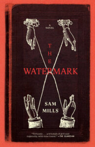
The Watermark by Sam Mills is available from Melville House.
Sam Mills
Sam Mills is the author of The Quiddity of Will Self, along with three young adult novels, including the award-winning Blackout. Her memoir about being a carer, The Fragments of My Father, was published in 2020. Mills has written for a number of publications, including the Guardian, Independent, 3 AM and London Magazine. She is the co-founder of the independent press Dodo Ink and lives in London looking after her father and cat.