An Unofficial Ranking of Publishing Colophons
Dylan Brown on the Fishes, Kangaroos, and Borzois
That Adorn Our Books
Colophons started out as short statements providing a book’s publication info—details like where and who and when. Those statements often included little emblems, logos, which are now also referred to as colophons (from the Greek kolophōn, meaning “summit, final touch”), and they slowly made their way to the spines of books. Like tattoos or mascots, many of these logos depict animals, often fish (or dolphins): FSG, Anchor Doubleday, Aldine Press, and Houghton Mifflin Harcourt. Birds are another well-represented category: Penguin, Bantam, Norton, and Europa Editions, to name a few. So if you’re going to be judging a book by its cover (you’re probably kidding yourself if you think you don’t) then you better start factoring in the colophon as well.
These symbols are often taken for granted because most readers are, understandably, less familiar with publishers than writers or booksellers are, but they have a totemic quality to them that’s worthy of consideration, functioning not just as trademarks but as little windows into the personalities of the publishing houses and the people who run them. The following list is a very unofficial ranking of some of the more interesting colophons, the ones that take risks or have more of an emphasis on design, something unique about them, that offer subtle clues as to what awaits us inside.
*
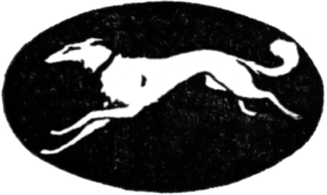 8. Knopf
Kudos for being one of the only well-known publishers to feature a dog instead of a bird or fish. The dog featured is a borzoi, a Russian wolfhound, which, ironically, Knopf co-founder Blanche Knopf thought of as being “cowardly, stupid, disloyal, and full of self-pity.” You wouldn’t know it from just looking at the spine though: the dog’s lithe silhouette cuts a graceful figure mid-leap from one side to the other, as if it were urging the reader on to crack open the book and start turning those pages already.
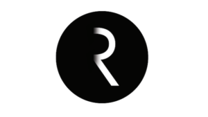 7. Riverhead
Probably the sleekest of the bunch here, the half-‘R’ in the Riverhead colophon emerges from its penumbral background like something cosmic shifting into the sunlight. Where is the other half of that ‘R’? Shrouded in mystery, that quintessential story engine. Riverhead art director Helen Yentus is quoted as saying she hopes the colophon captures a sense of the contemporary and varied voices the imprint publishes.
 6. Farrar, Straus, Giroux + Fischer Verlag
The history of FSG’s colophon is informed by the apocryphal saying “good artists copy, great artists steal.” When FSG acquired Noonday Press they took on the three fish that appeared on the cover of their journal, set above text that read, “stories, articles, poetry.” But Noonday Press had likely “borrowed” the logo from the German publisher, Fischer Verlag, whose own three fish-ed emblem was itself likely “borrowed” from Medieval European heraldry, but facing in opposite directions. It was designed by Wolf Zimmerman, and dates back to the early 1950s, when post-war Germany was hungry for literature after years of isolation.

5. New Directions
Like many New Directions books, its colophon is enigmatic, rebellious, and probably more concerned with being interesting than with being a commercial success, which makes sense considering publisher Barbara Epler once said she wouldn’t know a bestseller if it bit her in the butt. Based on a sculpture by Heinz Henghes, a friend of Ezra Pound’s, this sketch of a horse and a man, a centaur perhaps, still has that sculptural feel to it: the design is loose, almost abstract, but with enough substance to hold it all together.

4. City Lights
Another one of the more cryptic emblems associated with a publisher, this one comes from where else but another book. Lawrence Ferlinghetti lifted this medieval trademark from Rudolf Koch’s strange little volume titled The Book of Signs. The trademark is actually a combination of two symbols: the circle is a countermark and the Y-shaped symbol, is the fork aka the thief’s cross and was beloved by German mystics in the 13th and 14th century. In addition to symbolizing the trinity, it represented the “expectant soul, man gazing aloft with outstretched arms.”
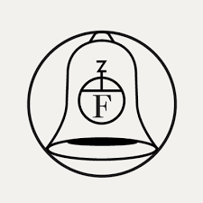
3. Fitzcarraldo Editions
Knowledge of Werner Herzog’s harebrained masterpiece, Fitzcarraldo, isn’t a requirement to appreciate this elegant colophon, but it does help. For the uninitiated: it’s the story of a man who attempts to move a three-story steamboat across a hillside in the Amazon in order to transport rubber. At one point in the movie, Fitzcarraldo (Klaus Kinski) stands atop a bell tower and demands to the people below that an opera house be built. The logo, designed by Ray O’Meara in conjunction with the type, title page, cover, and layout, is a nod to the challenges and commitment necessary to run a successful independent press. If you look closely at the logo’s encircled bell, you’ll see it features a play on early printers marks, with the initials F and Z, recalling the symbols of the earliest printed books while still keeping things fresh and contemporary

2. Black Cat
With its colophon designed by Roy Kuhlman, Black Cat is a paperback imprint founded in the 1960s by Grove publisher Barney Rosset in order to make older Grove Press titles more affordable and more widely available, emphasizing the avant garde books in their catalog. Kuhlman also designed many jacket covers for Grove, including books by Samuel Beckett, Frantz Fanon, and Simone de Beauvoir. The imprint was shuttered from 1984 until 2004 when it was brought back to life for a wider audience. It’s simple but evocative, pleasing to the eye while still conveying a sense of danger, something perhaps even a little illicit about it—what better way to sell a book?
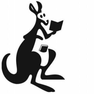
1. Pocket Books
It’s pretty much impossible to beat a colophon featuring a kangaroo named “Gertrude” who keeps books in her pouch. The cherry on top though is that the artist, Frank Lieberman, named the literate kangaroo after his mother-in-law. The good son-in-law was, unfortunately, paid just $25 for his design in 1939, about $470 in today’s money. In 1986, The Washington Post ran an article about Gertrude, who got a redesign from Disney in the 40s. At one point in the article the author describes Gertrude as “probably one of the best-known logos in the United States”—as much as I wish this were still true, I suspect we’ve fallen a long way from any publisher, besides maybe Penguin, having that level of recognizability.
Colophons are reminders that books, unlike the stories and information they hold, are physical objects with origins independent of the author who wrote them. The most iconic ones are in conversation with the books they adorn, they’re shaped by them and in turn will shape and, be shaped by, the books that are yet to be published.
If you take a look at your bookshelves you might find that they’re dominated by just a few publishers, many of which are imprints of the big five four. While it’s absolutely important to read writers from a variety of backgrounds, it’s also important to make sure you’re not getting all of your books from just a few publishers, which might translate to a relatively homogenous list determined by a select few. The next time you’re at the library or bookstore, take a few seconds to find the colophon on the spine or the title page—you might be surprised at what’s hiding there, in plain sight.
Dylan Brown
Dylan Brown's short stories and non-fiction have appeared in places like Gulf Coast, Hobart, Tin House, FSG Work in Progress, and LA Review of Books. He was born in Düsseldorf, Germany and lives in Los Angeles.
