Alan Lee on Illustrating J.R.R. Tolkien’s The Lord of the Rings
On Creating the Feeling of a Gateway into Another World
I first read The Lord of the Rings in 1964, when I was seventeen and working in a cemetery during a hiatus in my art school education. For a few months the Hillingdon suburbs were transformed into the marshes, fells and woodlands of Middle-earth and my friendships were upgraded into fellowships.
Seven years after their first publication, the books were becoming a cultural phenomenon; the combination of playfulness, poetry and romance and an existential struggle to save the world seemed to align with the spirit of the times, while the characters—now recruited into the counter-culture—lived far beyond the confines of the text. For me though, it was the landscapes of Middle-earth that most captured my interest and lingered long after the quest was fulfilled and the epic concluded.
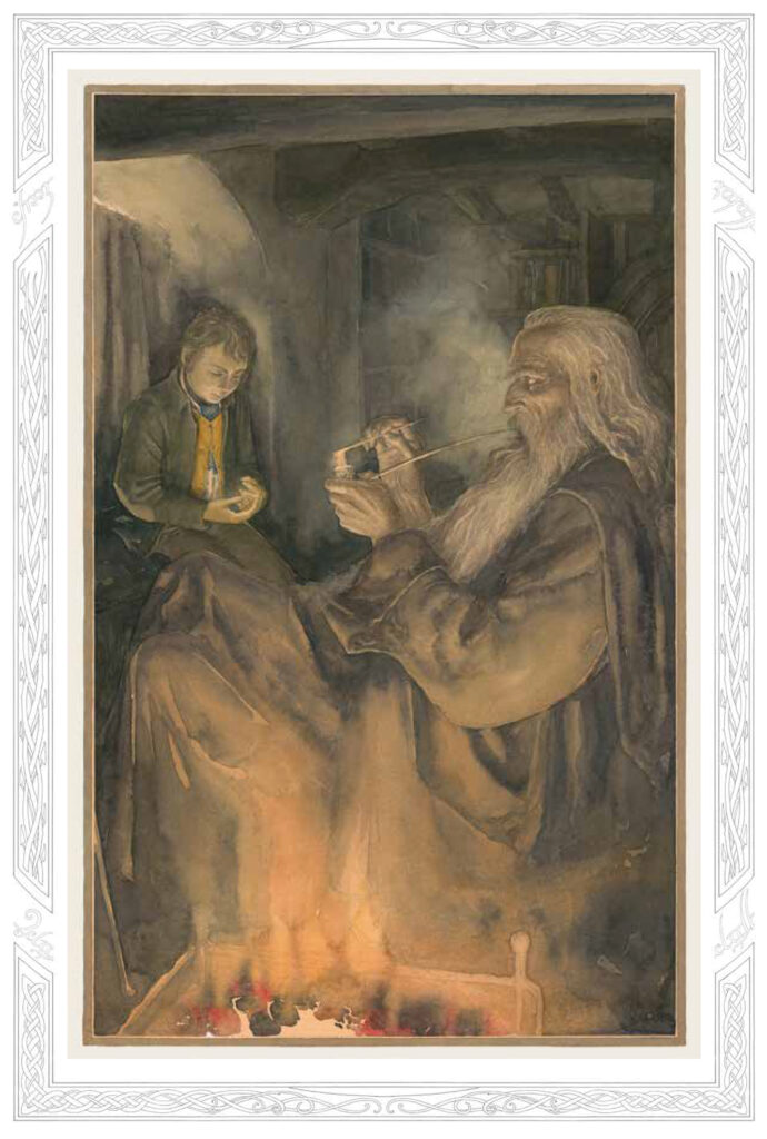 Illustration © Alan Lee for The Folio Society’s edition of J.R.R. Tolkien’s The Lord of the Rings.
The author’s descriptions of these landscapes are comprehensive and consistent, though unlabored—once conjured, the mountains are kept aloft by the lightest of touches—and some places are so beautifully evoked that they may stay with you for a lifetime. This believable and immersive quality is amplified by the way the names, languages and histories of cultures and characters are deftly threaded into the work, and by the way the themes echo half-remembered stories from our own world.
I had grown up with a great love of legends and fairy tales—the Celtic and Norse myths having had a particularly strong influence—so my love of Tolkien was almost pre-ordained. I didn’t immediately conceive a desire to illustrate the books, though they had a huge influence on the type of drawings I did as a student of illustration and graphic design. The first opportunity to dip into Tolkien’s work professionally came with Castles, in 1984, which was a heavily illustrated account of the role played by these impressive and often magical structures in myth, romance and literature. I included drawings of Cirith Ungol, Barad-dûr and Minas Tirith.
The UK publisher of this book, Unwin Hyman, also happened to be Tolkien’s publisher, and it was their Tolkien editor, Jane Johnson, who began to look for an opportunity to commission an illustrated edition of The Lord of the Rings. This came with the approaching centenary of the author’s birth. The Estate slowly came around to the idea; the only request from Christopher Tolkien was that I should concentrate more on the landscapes than the characters, which suited my own preferences.
 Illustration © Alan Lee for The Folio Society’s edition of J.R.R. Tolkien’s The Lord of the Rings.
I was asked to produce fifty watercolors for the single-volume edition. The question of which episodes I should choose as subjects, which could have occupied me for a good part of the allotted time, was more easily settled; the color plates were to be printed on separate sheets and bound around alternating signatures of text pages, which meant that the illustrations would fall between every thirty-two pages of text.
This limitation turned out to be a blessing; it was important for me that every illustration should relate immediately to the text on the opposite page to create a harmony between story and image, and it also relieved me of the obligation to represent all the dramatic high points of the tale. This meant that I could concentrate more on scene setting and atmosphere building, and creating some quieter moments.
My feeling was that it would be better to add detail and color to those parts which the author had not described in great depth than to try to echo his powerful storytelling. That said, there are very few pages in The Lord of the Rings where nothing remarkable is happening! There are moments that are so gripping that it’s impossible to resist getting close to the characters, such as Frodo and Sam’s first terrifying encounter with Gollum, but more often I’m shadowing the heroes at a distance and getting distracted by the scenery.
My main concern is to try to avoid providing an interpretation of the story which interferes with the pictures that the author is creating; with such rich material there is a temptation to overelaborate and over-design, so it is important to continually check the text—and those vital maps. I find that watercolor is an ally in my slightly reticent approach to illustration. There is a shifting, unsettled and pro-visional quality in this transparent medium—closer to drawing than painting—which allows the viewer more room to complete the images in their own mind.
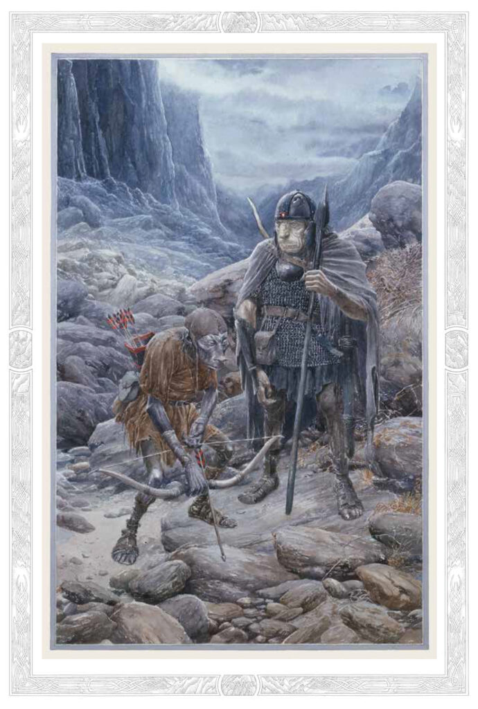 Illustration © Alan Lee for The Folio Society’s edition of J.R.R. Tolkien’s The Lord of the Rings.
In the new edition of The Lord of the Rings published by The Folio Society, I’ve been able to provide extra borders for the plates, creating more of the framing that J. R. R. Tolkien felt was essential to good book illustration; in his “On Fairy-stories” he lamented the abandonment of margins and elaborate borders for illustrations, describing this trend as “a folly and an abuse.” I wouldn’t go that far, but I do enjoy the opportunity to add in decorative elements that reflect different aspects of the narrative, and to create the feeling of a gateway into another world. I have also taken advantage of the opportunity to replace and finesse some of the illustrations that I had completed in too much of a rush as the centenary deadline approached, as well as add some new ones.
It has been an immense privilege to have been allowed to illustrate so many of Tolkien’s stories, though I see this as just one very pleasurable aspect of a lifetime’s relationship with this extraordinary author and the worlds that he has created.
____________________________________
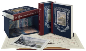
Excerpted from the preface to The Folio Society’s edition of J.R.R. Tolkien’s The Lord of the Rings. Used with permission of the publisher. Copyright © 2022 by Alan Lee.
Alan Lee
Alan Lee was born in London, England, in 1947. He attended the Ealing School of Art to study graphic design, concentrating on the depiction of Celtic and Norse myths. Lee is one of the most celebrated living illustrators of myth and fantasy: a recipient of the Kate Greenaway Medal and an Academy Award for Art Direction for Peter Jackson’s films of The Lord of the Rings.


