20 Iconic New Yorker Covers
From the Last 93 Years
The cultural capital of the New Yorker cover has waxed and waned over the years, but there’s no denying that many iconic images of New York (and for New Yorkers) have originated there—as well as quite a bit of beauty, as well as some ugliness. Predictably, some of the most iconic New Yorker covers are the ones that address tragedy, or illustrated some kind of upheaval—political, environmental, social—that affected New Yorkers and other Earthlings on a large scale. Others are simply unforgettable as images. Here are 20 of the most memorable. (NB: I’m consciously not including any Trump covers. It’s too soon—and we see his face enough on the internet.)
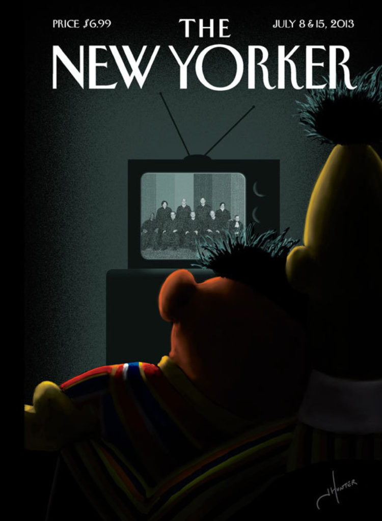 “Moment of Joy,” by Jack Hunter, July 8 & 15, 2013
Artist Jack Hunter originally submitted this design for Françoise Mouly and Nadja Spiegelman’s Blown Covers project. “The theme this week was “The Gays”, reflecting Obama’s recent statements about his evolving views regarding Gay Marriage,” Hunter wrote after being selected as the weekly winner. “While I’m certainly not the first person to speculate about Bert & Ernie’s more personal and private relationship, I thought they were well suited to represent how a lot of gay couples must have felt hearing Obama’s comments . . . after all, they’ve been together for almost 50 years . . . as “just friends” or otherwise.”
 “View of the World from 9th Avenue,” by Saul Steinberg, March 29, 1976
In a review of a recent exhibition of Steinberg’s work at the Art Institute of Chicago, Chris Ware wrote:
Historically speaking, “View of the World from 9th Avenue” was a cartoon nuclear reaction, smashing together what New York thought of itself with what the world thought of New York, all on the cover of The New Yorker itself. It spawned countless city-centered rip-offs that spiraled their particle trails through 1970s dens across the nation, including mine. To this day it remains the magazine’s most famous cover not featuring its unofficial mascot, Eustace Tilley. Yet the thieving of Steinberg’s easily thieved premise rankled him for the rest of his life, the most visible sign of his success legitimizing yet also blurring the importance of his contributions to cartooning, to say nothing of twentieth-century art.
This cover has been parodied countless times—Steinberg famously said that he “could have retired on this painting”-had he gotten royalties.
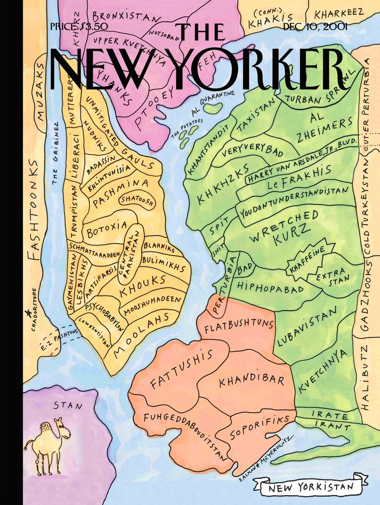 “New Yorkistan,” by Maira Kalman and Rick Meyerowitz, December 10, 2001
Speaking of iconic maps of New York City on New Yorker covers—who could forget New Yorkistan? Here’s the story of the cover’s creation, as Rick Meyerowitz tells it:
By early November 2001 the people of New York had settled into a deep funk, and the war against the Taliban had begun in Afghanistan. While they were being bombed by us, we were, in turn, bombarded in the news with strange names: Pukhtuns and Pashtuns; Tajiks and Turkomen; Uzbeks and Baluchis; Khandihar: Khunduz; Jalalabad; Veryverybad…
Maira Kalman and I were driving through the Bronx on our way upstate. I was complaining about the tribalization of the Democratic Party which was split into warring ethnic factions and careening toward a mayoral election it was sure to lose.
“Damn Democrats!” I sputtered. “And those Afghanis think they’re tribal? Since when did New Yorkers take a back seat to anyone? We’re the most tribal group on earth! They may have Pashtuns, but we have Sharptuns, Poptuhns and Fraidykhatz!”
“So are you saying we’re in Bronxistan?” Maira asked.
“Yes, but a small section of Bronxistan called Ferreristan.” (At the time, Freddy Ferrer was warring with Mark Green, the Democrat’s candidate.)
By the time we reached our destination, we had written down 40 names. By the next day we had close to 100. By Monday afternoon our sketch of New York City renamed New Yorkistan, was on its way up to the New Yorker.
The editors loved it and commissioned it for the back page. The reception to our finished art (you can see the original art here) was so enthusiastic they made it the cover of the December 10, 2001 issue.
The response to New Yorkistan was overwhelming. The magazine disappeared from newsstands in two days, becoming the best selling issue of the New Yorker in history.
You can also see some early sketches of the cover here.
 “9/11/2001,” by Art Spiegelman and Françoise Mouly, September 24, 2001
Françoise Mouly reflected on this image in 2011: “Ten years ago, my husband, the cartoonist Art Spiegelman, our daughter, and I stood four blocks away from the second tower as we watched it collapse in excruciatingly slow motion. Later, back in my office, I felt that images were suddenly powerless to help us understand what had happened. The only appropriate solution seemed to be to publish no cover image at all-an all-black cover. Then Art suggested adding the outlines of the two towers, black on black. So from no cover came a perfect image, which conveyed something about the unbearable loss of life, the sudden absence in our skyline, the abrupt tear in the fabric of reality.”
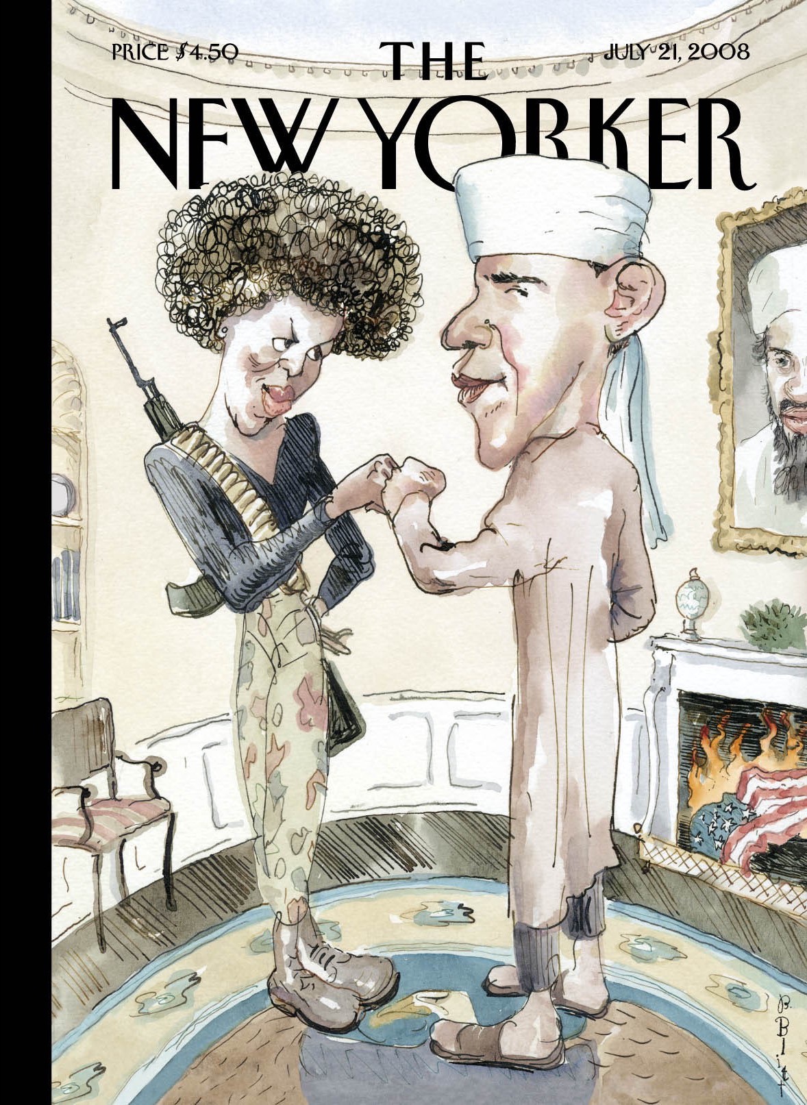 “The Politics of Fear,” by Barry Blitt, July 21, 2008
“We all remember the campaign of 2008,” Blitt told NPR last fall.
When Obama was running for president, there was a lot of stuff being said about him and Michelle. It was whispered and insinuated … that he was a terrorist, that Michelle was some kind of Black Panther or something. There [were] rumors of a video of her saying, “Kill whitey.”
I mean, I just scribbled in a sketchbook all of it in one picture, and I threw in a burning American flag and a portrait of Osama bin Laden on the wall of the Oval Office. … I had Michelle dressed as, you know, she had a gun on her back and she was sort of like a, I don’t know, a fictional Black Panther. It was a ridiculous picture and I hoped it would be seen as such. I thought it was obviously satire, but not everyone felt that way. I mean, the picture still makes me laugh. I don’t regret it.
Not everyone felt that way—indeed, this cover faced a lot of pushback, and both the Obama and McCain campaigns called it “tasteless and offensive.” Of the controversy, Blitt said:
One of the main criticisms of it was that people would say, “Oh, I get it, but what are those other people going to think?” which, you know, seems kind of condescending to me. Barack Obama was interviewed about it and was disgusted, and so was John McCain. You know, Rush Limbaugh.
Couple of days in, Jon Stewart on The Daily Show talked about it, about how ridiculous the reaction was. And it seemed to turn to love after that. I think people took a breath and realized this wasn’t going to cost anybody the election and it was just a cartoon.
 “Broken Arch,” by Bob Staake, December 8, 2014
“I wanted to comment on the tragic rift that we’re witnessing,” Staake told the New Yorker about his Ferguson cover. “I lived in St. Louis for seventeen years before moving to Massachusetts, so watching the news right now breaks my heart. At first glance, one might see a representation of the Gateway Arch as split and divided, but my hope is that the events in Ferguson will provide a bridge and an opportunity for the city, and also for the country, to learn and come together.”
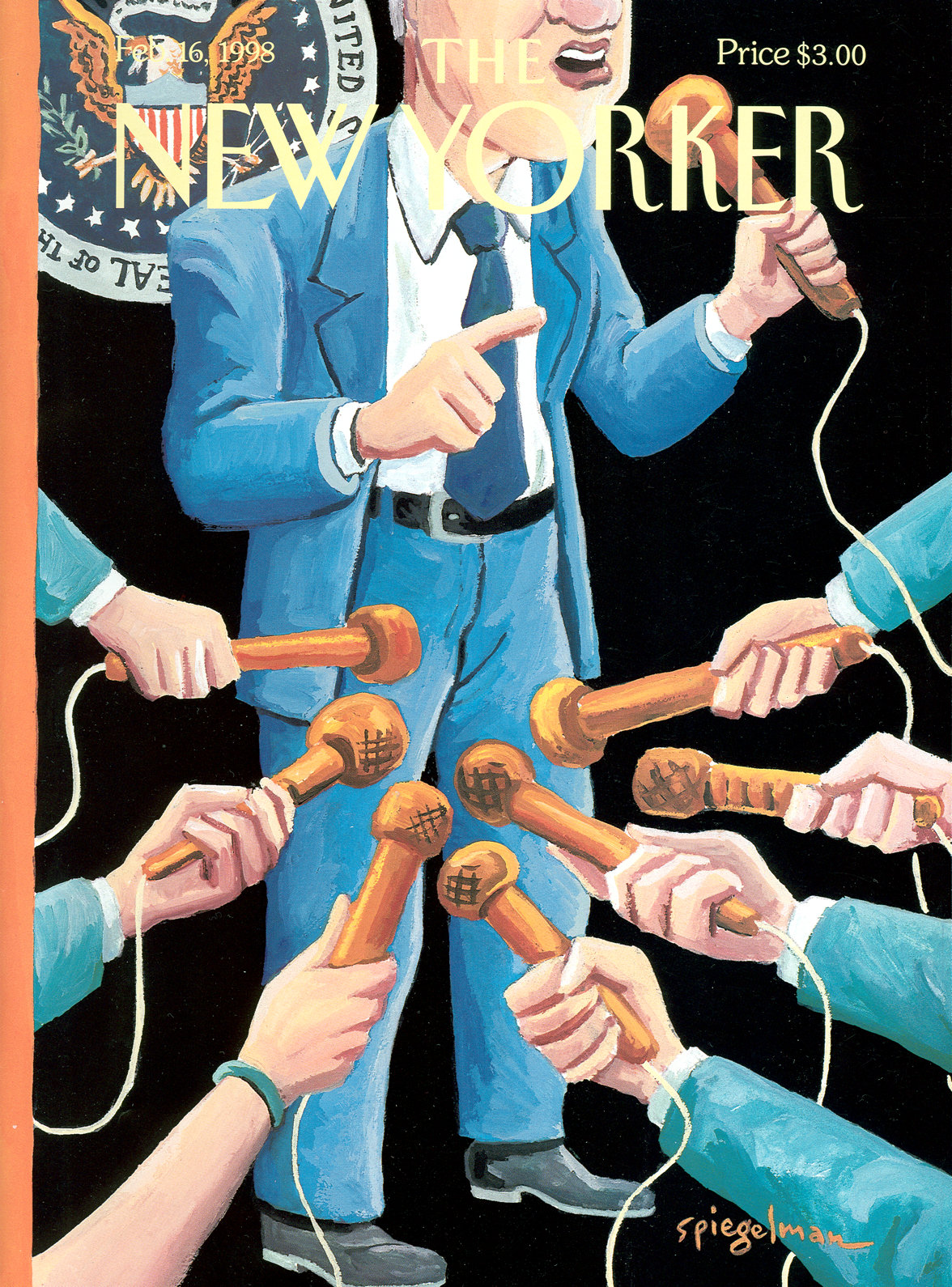 “The Low Road,” Art Spiegelman, February 16, 1998
The low road indeed—but I find this artwork interesting to contemplate in 2018, with the current president. No one cares about his sexual exploits at all. They’re too busy being shocked by what he says.
 “Reflection,” by Bob Staake, November 17th, 2008
According to Staake, this cover came together in record time:
Françoise [Mouly] called me up saying, “Do you have any ideas for Obama’s victory?” I hadn’t even bothered thinking about it because I thought they would have had something in the can for a while. I said, “Let me think about it.” So in an hour I went ahead and probably came up with about 10, 12 different ideas, all sketches, all different. One of the advantages I have is I can come at an issue from 12 different directions. That’s part of the process for me to flesh out what’s going to work and what isn’t. I kept submitting these. And I was getting closer and closer. Then I started thinking about iconography and that’s when I thought that there’s no other piece of architecture in Washington that’s more representative of black struggle than the Lincoln Memorial. So by having that ubiquitous O in the New Yorker‘s logo as the moon-that was at a time when we had a full moon every single night. There was just this incredible moon. I’d come out of my studio and look at it every night. So the moon above, the Lincoln Memorial representing the Emancipation Proclamation, and then the reflection of the columns on the water representing the bars of slavery. So it just all came full circle. When I came up with the sketch, she called me back five minutes later and said, “OK, that’s the cover. You’ve got to 9 in the morning to get it to us.”
It’s a beauty.
 “High Fashion,” by Danuta Dabrowska-Siemaszkiewicz, November 8, 1999
Very Beaux-Arts.
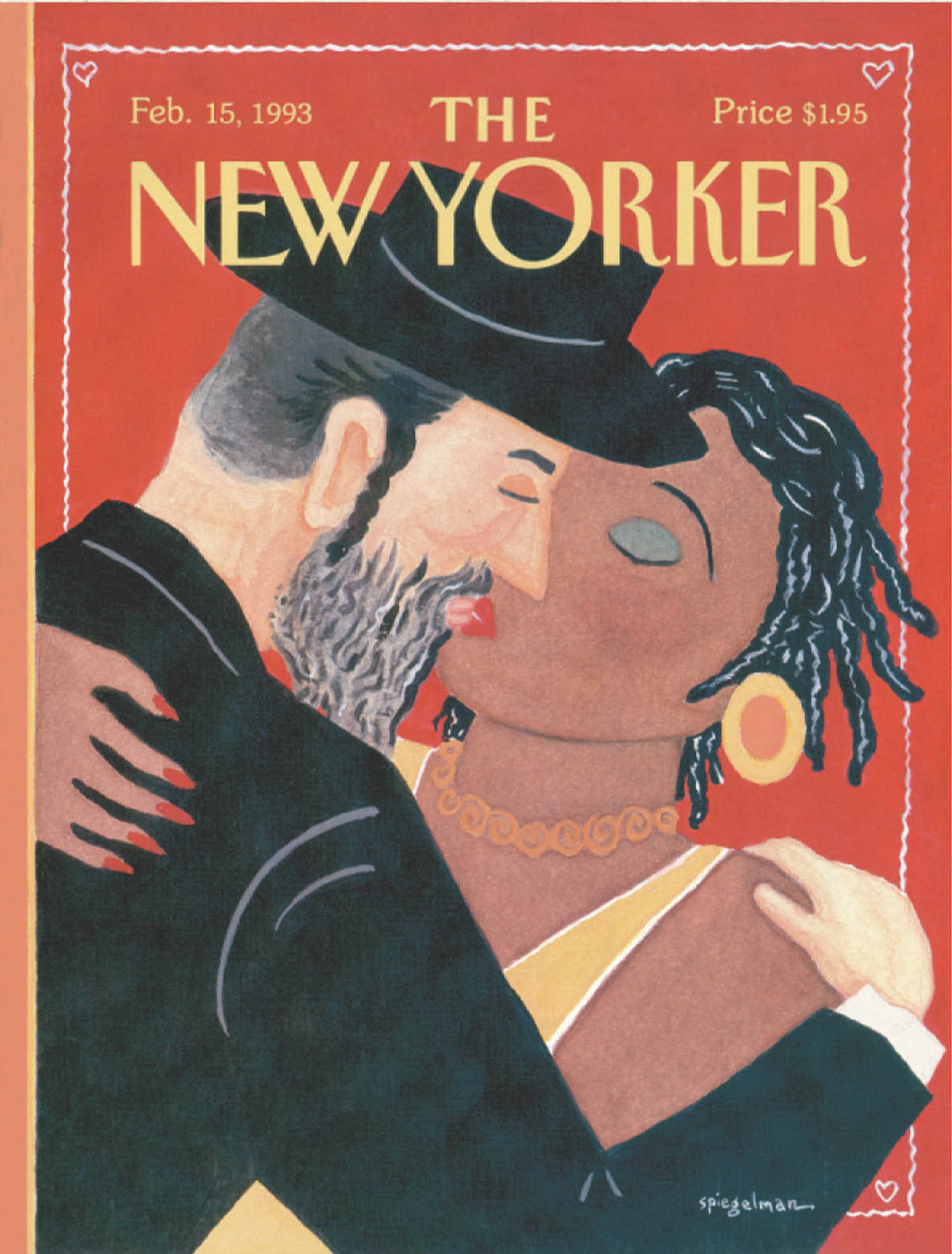 “The Kiss,” by Art Spiegelman, February 15, 1993
Art Spiegelman has created many of the New Yorker‘s covers over the years-and many of its best ones, as well. This highly controversial piece showed a Hasidic man and a black woman kissing as a commentary on ongoing tensions between the two groups in Crown Heights. About the cover, Spiegelman said:
It didn’t come as a shock to me that this got people to sit up and take notice. I’m interested in visual signs; and that’s certainly an aspect of the New Yorker cover . . . The signs are highly recognizable. The sign for Hasid is clear and unavoidable, without the usual anti-Semitic physiognomy that goes with it. The sign for African-American woman is equally unavoidable, without entering into Aunt Jemima stereotypes or anything of the kind. Then there’s this other sign that has to do with the Valentine’s Card-the kiss, the field of red with the lacy decoration around it, all of it weaving together separate meanings. The irony is you have these two groups that are at each other’s throats at each other’s lips instead. That’s supposed to conjure up carnality and yet Valentines Day, the image of Valentines Day, isn’t about carnality but a kind of benign romantic love. All those things course through this image and the impossibility of it is what’s so entertaining for me.
What got people most upset that week was not other magazines with the usual S/M imagery-chains and whips, leather and hurt-but something quite benign on the surface, playing with signs. Reverend Dougherty, a representative of the black community in Crown Heights, was very upset I used a black woman: one more time, he said, a white man was oppressing a black woman. Why didn’t I have a black man and a Hasidic woman, he asked on the radio. Maybe he’s a good reverend, I don’t know, but he’s a rotten art director. A Hasidic man is a lot easier to recognize than a woman with a handkerchief on her head. In terms of visual signs you’ve got one thing that works and one thing that doesn’t. Even more important, I answered him, if I had used a black man and Hasidic woman, you’d be complaining I was once again showing the black man as a rapist and defiler of white woman. This shows me the problem has nothing to do with the signs being shown but the reverberation of those signs in people’s heads.
The same thing happened in op-ed articles. There was an op-ed in The New York Times in which a woman who was very upset about the New Yorker cover writes about the Jew’s lascivious lips. Another person, equally upset in the Washington Post, described the Jew’s prim lips. Now you know I can’t draw lips that are simultaneously lascivious and prim, I’m limited. . . I just drew lips.
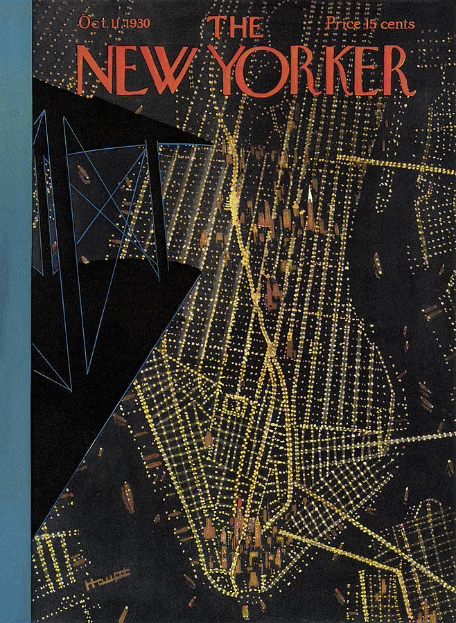 Theodore G. Haupt, October 11th, 1930
This cover was published smack in the middle of the construction of the Empire State Building—which was at the time of its completion the tallest building in the world, and the first to boast over 100 floors. It remained the tallest until the World Trade Center was built in 1972, but has at the time of this writing dropped to 39th.
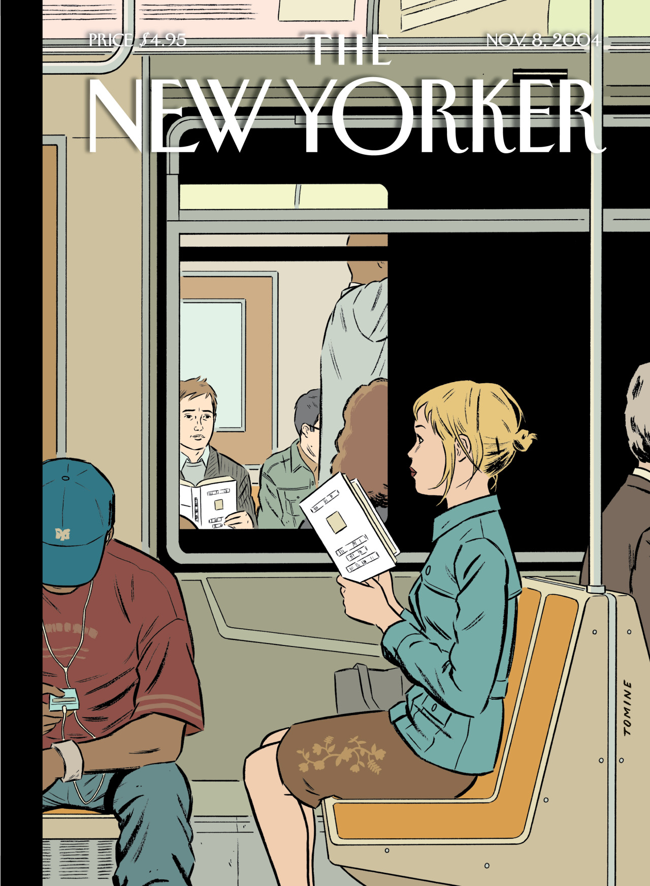 “Missed Connection,” by Adrian Tomine, November 8, 2004
Adrian Tomine has, like most of the other artists on this list, created many wonderful covers for the New Yorker, but these are two of the most iconic. The detail of the matching books, Tomine said, “was a last-minute addition that came about from conversations with Françoise. I had that basic image but the books were blank, and she had the idea of making it so that they’re reading the same book.”
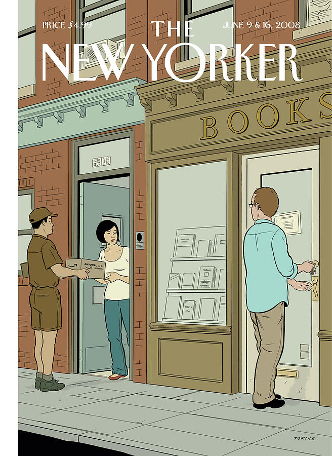 “Book Lovers,” by Adrian Tomine, June 9, 2008
This is another of Tomine’s bookish New Yorker covers that made the rounds. As Françoise Mouly has pointed out, his works “often hinge on the electricity generated by people looking at each other.”
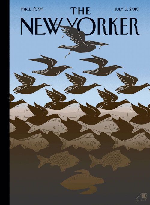 “After Escher: Gulf Sky and Water,” by Bob Staake, July 5, 2010
Bob Staake’s M.C. Escher-inspired New Yorker cover wasn’t their only one to represent the Deepwater Horizon disaster—but it was the most talked about. According to Samantha Henig at the magazine:
Staake modified the original Escher to include wildlife typical of the Gulf: a turtle at the bottom and a pelican at the top. To simulate a woodcut, he cut the animals out of white paper, laid them on a black background, scanned them, inverted the silhouette, then used Photoshop to draw light lines on top—a process that he says helped him get inside Escher’s head.
The biggest challenge was perfecting the colors of the polluted water and soiled creatures. “Color usually means joy,” Mouly says. “But here we didn’t want the image to be joyful.” She and Staake took about seven or eight drafts to perfect the gradation from the nearly-black bird in a blue sky to the murky waters below.
“It’s really the ugliest color scheme you could ever imagine,” Staake says. “As an artist, it’s completely the opposite of what I’d want to do, but you have to remain faithful to your concept and your idea.”
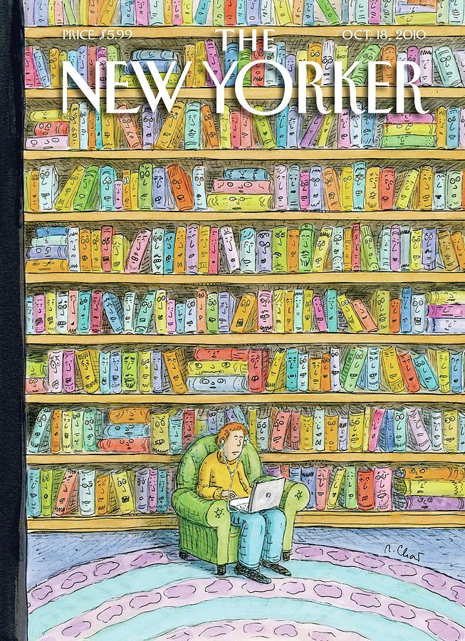 “Shelved,” by Roz Chast, October 18, 2010
Roz Chast is a wonder. You can now buy this cover in puzzle form.
 “Dark Spring,” Christoph Niemann, March 28, 2011
“It’s very tricky to do any drawing of a tragedy,” Niemann told the New Yorker. “A drawing often comes across as lighthearted, and there’s obviously nothing lighthearted about this thing.” So he hesitated before taking on this assignment: making a cover in the wake of the Fukushima Daiichi nuclear disaster. The original cover had a white background, but Françoise Mouly had a “reservation about how beautiful it was”—so it was transformed from “Spring Doom” to “Dark Spring.”
 “Life at the Top,” by Eric Drooker, September 12, 1994
“The city is so massive,” Drooker said in one interview, “that I always approach it in relation the human figure. To convey the city’s monumental scale, it’s best to contrast it with small, flesh-and-blood characters. I employ this device often in my cover paintings for the New Yorker magazine.”
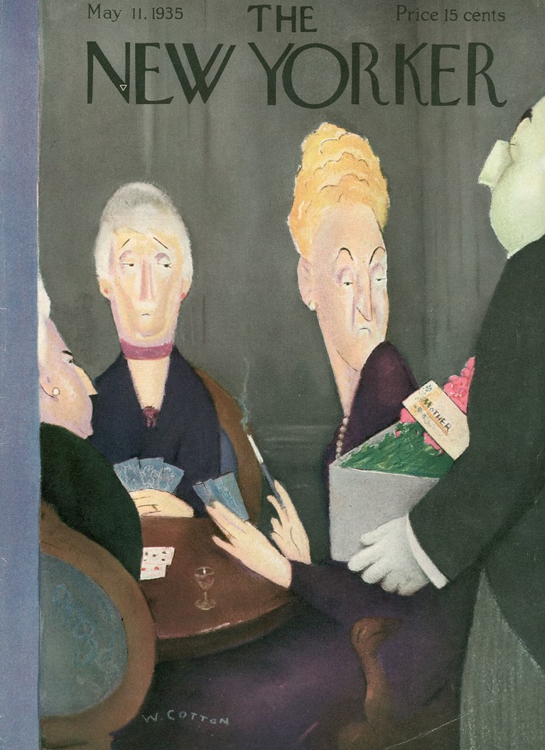 Will Cotton, May 11, 1935
“In the history of New Yorker covers,” Liesl Schillinger wrote, “there is perhaps no cartoon as coolly unsentimental as the Mother’s Day cover Will Cotton drew for the May 11, 1935, issue.”
In the illustration, a plucked-and-dyed society matron turns reluctantly from her cocktail, cigarette, and card game to cast a withering glance on a lavish bouquet of flowers, which a butler holds out for her inspection. The card attached to the flowers reads “Mother.” She looks as though she’d prefer an ace of diamonds.
In those days, New Yorker artists preferred to devote May covers to traditional rites of spring—maypoles, ladies trying on hats, men refurbishing their yachts, and swells waving from cruise ships. After the Cotton cover, Mother’s Day all but disappeared as an explicit holiday theme until 1990.
I’ve always loved this one.
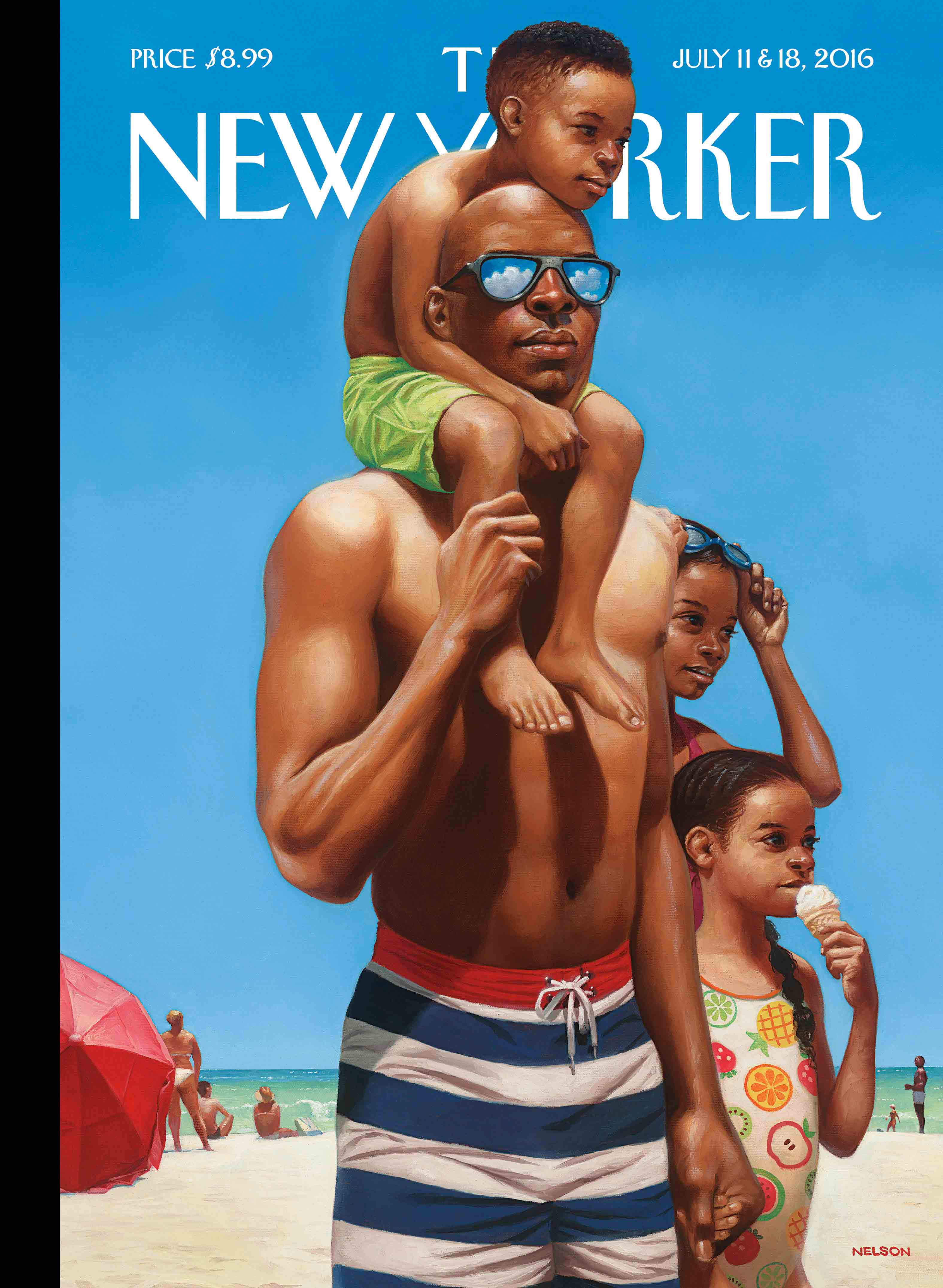 “A Day at the Beach,” by Kadir Nelson, July 11 & 18, 2016
To be fair, this one is a little to recent to be truly iconic, but it’s one of the few contemporary covers that has stuck in my head since I first saw it—it’s gorgeous, for one thing, but it’s the eyes that do it. “I grew up close to the shore, and I have always loved spending time at the beach,” Kadir Nelson said of the cover. “When I was young it meant time with my dad, and now that I’m a father myself I relish the long summer days spent with my own children.”
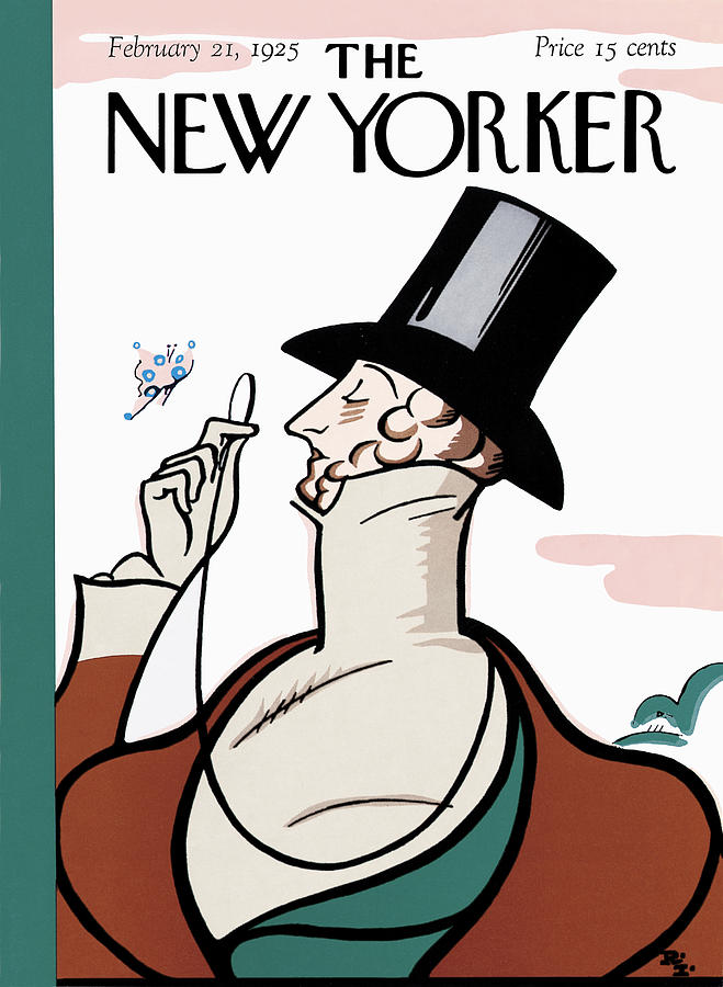 The New Yorker‘s first-ever cover art, by Rea Irvin, February 21st, 1925
Of course, the most iconic New Yorker cover may be the very first one-not least because the magazine does a tribute to it almost every year-created by the magazine’s first art editor, Rea Irvin, who also designed the now-classic headline font. As Louis Menard mused:
The picture is a joke, of course: which is more ephemeral, the dandy or the butterfly? But the picture also seems to be saying something about the magazine itself, and the question is: What? Is the man with the monocle being offered as an image of the New Yorker reader, a cultivated observer of life’s small beauties, or is he being ridiculed as a foppish anachronism? Is it a picture of bemused sophistication or of starchy superciliousness? Did readers identify with the cover, or did they laugh at it?
The character was named Eustace Tilley and originally appeared “in a series of humor pieces, by Corey Ford, that ran in the magazine during its first year, and that pretended to provide an inside look at the making of The New Yorker in a style that spoofed corporate promotional writing. Ford’s stories were accompanied by illustrations in which Eustace Tilley turns up, like Waldo, in various scenes-for instance, supervising the felling of “specially grown trees to make paper for The New Yorker.””
Since then, Tilley has worn quite a number of hats and faces-typically representative in some way of “the times”-and this year, for the first time, he has been reincarnated as a black woman. “I wanted to capture the poise and the pose of the original Eustace Tilley dandy, but do it as something extremely simple and modern,” said artist Malika Favre. “Like the original Tilley, I had her look slightly up, which shows her curiosity-and of course it was delightful to have the flight of fancy, the poetic touch, of the butterfly.”
Emily Temple
Emily Temple is the managing editor at Lit Hub. Her first novel, The Lightness, was published by William Morrow/HarperCollins in June 2020. You can buy it here.
