15 Covers for The Bell Jar, Ranked from Most to Least Sexist
Plus a Bunch of Crazy International Covers, Just For Fun
This Sunday is the 55th anniversary of the publication of Sylvia Plath’s first and only novel, The Bell Jar, which seems as good an excuse as any to revisit it. Or at least the front of it, anyway. Hey, I know you’re busy. Most of us read this blistering semi-autobiographical novel—originally published under the pseudonym “Victoria Lucas,” so that, according to one close friend, Plath’s mother would not know she had written it—in high school, whether in class, or after a heart-to-heart with the local feminist librarian, or you know, after seeing Kat Stratford read it in 10 Things I Hate About You.
Perhaps because of its perennial popularity with high school students, and high school girls in particular, The Bell Jar has sometimes been given a “girly” cover treatment—notably for its 50th anniversary five years ago (see below). But this always feels kind of strange because of course, though it concerns a “college girl,” The Bell Jar is not particularly girly. In fact, it is very dark. It is, after all, about madness—not to mention electric shock therapy, and suicide, and ambition, and how anyone can manage to survive in the world with all its contradictory restrictions and expectations.
There is probably no writer over whose image (and the treatment thereof) we obsess more than Plath’s—see the forever-controversy about which photographs of her are worth putting on posthumous publications—and this is in part because she is considered beautiful, and in part because she is considered tragic, and in part because our culture considers these two qualities to be related. But at the risk of adding to the obsession, and since a book’s cover was not something I did much interrogation of back in high school, I thought I would take the opportunity to look back at some of the best and worst cover treatments The Bell Jar has seen since its first publication (thanks to Goodreads and A celebration, this is for their indispensable data in this regard). For me, early versions seem to fare better than later ones, which may be a function of book publicity becoming increasingly cynical, or something else entirely. But don’t take it from me:
 Faber (UK) 50th Anniversary edition, 2013
This 50th anniversary cover treatment—and that stock image of a vaguely vintage-looking woman putting on makeup—drew considerable ire (and some defenders) and inspired quite a few parody covers. As Fatema Ahmed put it in the London Review of Books: “It should be possible to see The Bell Jar as a deadpan younger cousin of Walker Percy’s The Moviegoer, or even William Burroughs’s Naked Lunch. But that’s not the way Faber are marketing it. The anniversary edition fits into the depressing trend for treating fiction by women as a genre, which no man could be expected to read and which women will only know is meant for them if they can see a woman on the cover.”
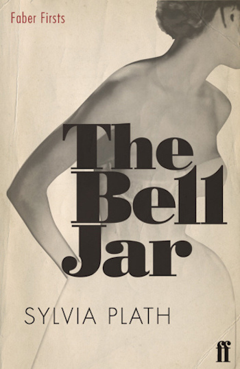 Faber Firsts (UK) 2009 edition
Less offensive, perhaps, but more boilerplate 50s imagery that also subscribes to the perennial, embarrassing and pandering trend of “sexy headless women” on book covers. (I also think it’s alarming the way that right breast has been blurred, but I suppose that’s neither here nor there…)
 Harper Perennial 2006 edition
Ah, headless again, I see. At least she isn’t sexy, hidden under all that waterproof material—but then again, with the colors at play here, her sexiness seems to have been exchanged for a kind of childishness. This is a novel about a young woman dressed up in the trappings of YA—something no one would think to do for a novel about a young man. (I have further comments about the general sense this cover gives of a young woman gazing longingly across the city at a phallic symbol, but I will (mostly) keep them to myself.)
 Harper Perennial 2005 edition
This one is fine, I guess, though it too subscribes to the trend of disconnected female body parts on book covers. At least it has a moodiness that makes it seem a little more appropriate for the book at hand.
 Faber and Faber (UK) 2001 edition
Points to this one for the author’s name being larger than the title. I also like the weirdness of the pink bubble, which threatens to burst under that steady gaze. I’m less sold on the badly photoshopped hands (particularly the one on the left, which is honestly barely a hand anymore) and the overall little-girl iconography. Again, she’s a woman. (Take it from my colleagues in the Lit Hub office: “It looks like she’s doing whip-its.” So there you have it.)
 Faber and Faber (UK) 1982 edition. Cover art by Donna Muir.
I’m a little on the fence about this one. I definitely hate the 80s lipstick effect given to the author’s name, especially as paired with the 5th-grader-with-a-crayon style of the title. I do like the illustration, which is much more interesting than a simple photograph would have been, but again, I wonder if a male writer would have been given the same treatment.
 Faber (UK) 1999 edition
To be fair, this is a relatively neutral one—not particularly sexist, despite showing an image of a girl who looks much too young to be the protagonist of this novel. But it is particularly ugly, and also reminds me of a 90s album cover that I can’t put my finger on. Bonus points if you can identify.
 Harper Perennial Classics 1999 edition
To me, this is the best of the Harper paperback editions—the blurred figure, almost a ghost girl, is evocative of Esther’s mental state, and though it still suffers a bit from “girl in a dress” syndrome, which plagues many books by and about women these days, at least you can see her whole (and non-sexualized) body.
 Harper Perennial 50th anniversary edition, 2013
Not bad, but at this point, that black and hot pink combo is such obvious shorthand for “this is a feminist book” that even though this was published five years ago, it just feels lazy.
 First Edition, Heinemann, 1963
Despite the girly font treatment for the author’s name, I have a soft spot for the first edition, which is tonally appropriate for the novel, and as a plus, looks like it could be a poster for a Hitchcock film.
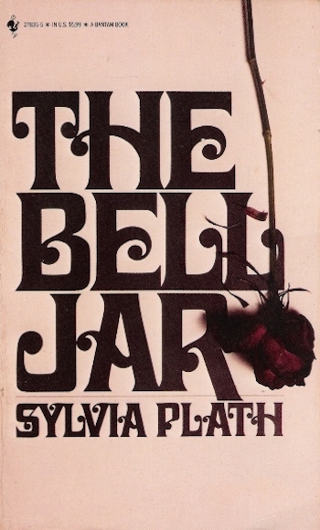 Bantam Books (UK) 1981 edition
I do love this one. It uses iconography traditionally coded “female”—the rose, the Gothic curlicues—while also conveying a darkness that befits the tone of the book. Proof (as if we needed any) that something can be overtly feminine and still feminist.
 First US Edition, Harper & Row, 1971
I love this spooky edition, which bears a number of the elements that would be reproduced again and again in slightly different forms on American covers in the years to come (the font, the rose, the hand). But even though this first US edition is a little dated-looking (and even though, yes, it is a disembodied arm), it’s wonderful in its strangeness, and for me strongly evokes Meshes of the Afternoon—that doll’s arm, that white flower!—which is certainly tonally appropriate if perhaps somewhat obscure.
 Quality paperback club edition, 1993
Totally not sexist, and also totally not appealing!
 Knopf Everyman Library edition, 1998
I’ve always loved the Everyman books, and happy to see Plath get the full treatment here.
 First Faber (UK) edition, 1966
The first cover to bear Plath’s name did it right: this looks exactly like the existential masterpiece of madness that it is.
Bonus: A collection of notable international covers, unranked and presented without comment (except, look at the Greek one!).
 Mondadori (Italian) edition, 2000
 كلمة (Arabic) edition, 2011
 Albert Bonniers Förlag (Swedish) edition, 2013
 Амфора (Russian) edition, 2000
 Polirom (Romanian) edition, 2003
 Editora Record (Portuguese) edition, 1999
 Denoël (French) edition, 2014
 麥田出版社 (Chinese) edition, 2013
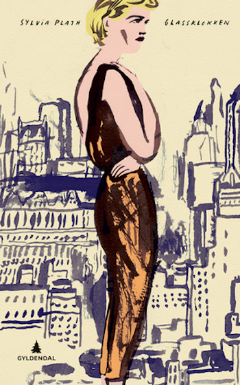 Gyldendal Norsk Forlag AS (Norwegian) edition, 2014
 Αίολος (Greek) edition, 1984
 Den norske Bokklubben (Norwegian) edition, 1986
 Európa (Hungarian) edition, 1987
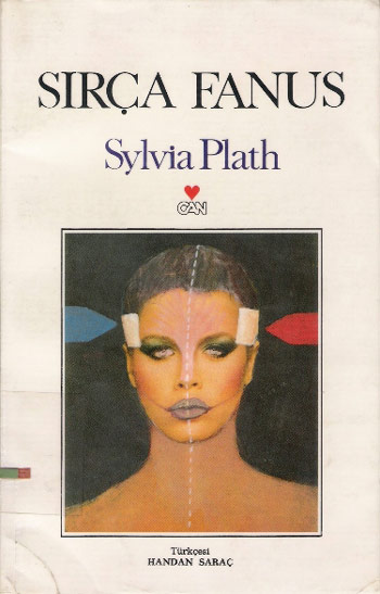 Can Yayınları (Turkish) edition, 1987
 Denoël (French) edition, 1977
 Image (Thai) edition
 Dutch edition
Emily Temple
Emily Temple is the managing editor at Lit Hub. Her first novel, The Lightness, was published by William Morrow/HarperCollins in June 2020. You can buy it here.