The 64 Best Book Covers of 2017
According to the Experts: Book Designers!
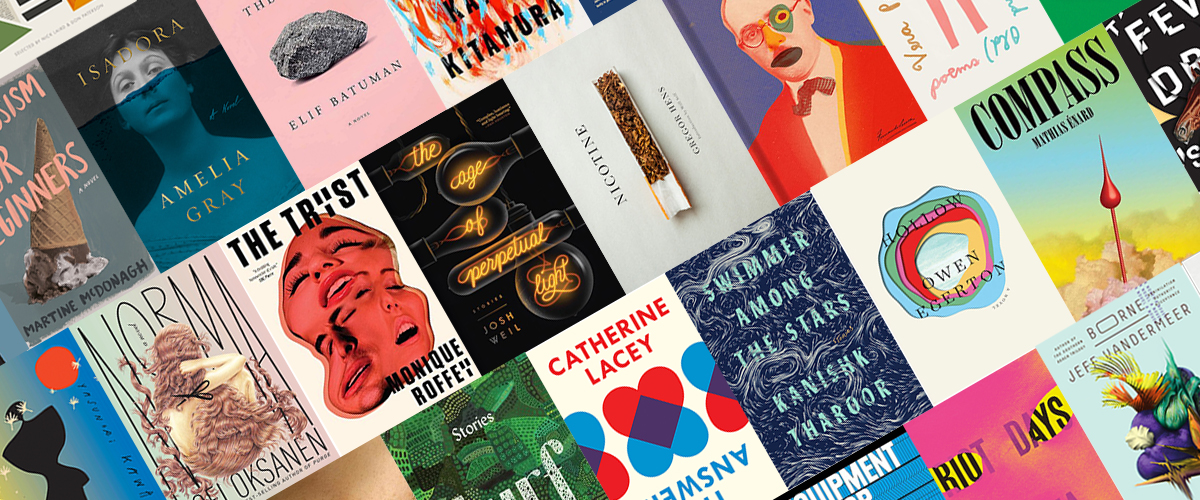
This year may have been terrible in many ways, but as always, there were at least a few bright spots. Many of these spots were books. Many of these books had fantastic covers. (Some of the covers had spots.) But of course, this being the back half of December, we are all contractually obligated to ask ourselves: which ones were the best? Like last year, I decided to turn to the experts on the subject: book designers themselves. I asked 20 of my favorite designers to share their picks for the best book covers of the year. After tallying the results, I can report that the most beloved cover was Owen Egerton’s Hollow, designed by Matt Dorfman, which five designers counted among the best. The other top picks were:
Heating & Cooling: 52 Micro-Memoirs, Beth Ann Fennelly; design by Alex Merto
(4 favorites)
*
The Age of Perpetual Light, Josh Weil; design by Nick Misani
(4 favorites)
*
The Book of Disquiet: The Complete Edition, Fernando Pessoa; design by Peter Mendelsund
(4 favorites)
*
The World Goes On, László Krasnzahorkai, design by Paul Sahre
(4 favorites)
*
Nicotine, Gregor Hens, trans. Jen Calleja; design by John Gall
(3 favorites)
*
Priestdaddy, Patricia Lockwood; design by Rachel Willey
(3 favorites)
I also want to note that book designers, as a group, have a clear favorite designer, and his name is Oliver Munday. He has seven different covers on the overall list. Rodrigo Corral, Rachel Willey, and Janet Hansen are also very popular, with four covers each.
Okay, data time is over. Now simply sit back, take a scroll, and bask in the best book covers of the year:
 The World Goes On, László Krasnzahorkai, design by Paul Sahre
The simple trick in the type combined with the metallic rainbow gradient (& lack of book jacket!) turn this book into a magical object that I needed to own and hold in my hands immediately. This cover also creates a moment that you have to experience in person, which I really appreciate in a world dominated by book cover thumbnails.
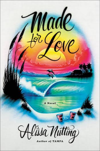 Made for Love, Alissa Nutting; design by Sara Wood
This cover, to me, is ultimate book design success. I love when designers find new ways to apply an already existing art form to their covers—and I think for this book the content and execution were a perfect match. Looking at it and imagining it being made fill me with joy. It’s been a rough year, we DESERVE more airbrush art.
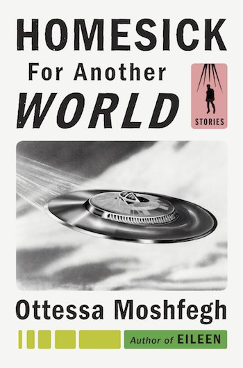 Homesick for Another World, Ottessa Moshfegh; design by Darren Haggar
I love everything about this cover. It feels whole and perfect to me, but it’s hard to explain it further than that. The composition, the colors, the imagery—they all feel considered, yet the design looks effortless.
Sometimes people design things that are so good that I can’t articulate at all what’s good about them, but when I look at them they’re activating some sort of pleasure center in my brain. Usually it’s solutions where I can’t immediately see the direct line from point A (title? Plot?) to point B (final cover), but I’m happy that they arrived at them. I think these are a few of them (that were more difficult for me to articulate further):
 The Idiot, Elif Batuman; design by Oliver Munday
Simple, restrained, and pleasing to the eye. Also it’s a funny yet unexpected image for the title.
 How to Behave in a Crowd, Camille Bordas; design by Christopher Brand
Clever solution for a title that is type, imagery and emotion all at the same time.
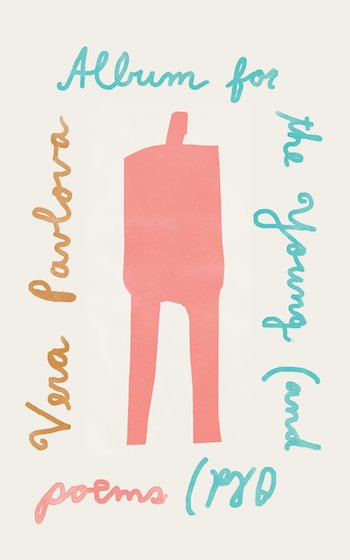 Album for the Young (and Old), Vera Pavlova, design by Janet Hansen
I want to hang it on my wall.
When I look at the book covers I was most drawn to this year, one quality that comes to mind is the Chinese concept da fang (大方), which literally translates to “big square.” Something that is da fang is generous and open-handed, or in good taste. All of these covers capture this feeling in both definitions of the term, delivering their message effortlessly, stylishly, and, it goes without saying, confidently. So confidently, in fact, that two of them don’t even have the title or author on the cover.
 Exit West, Mohsin Hamid, design by Rachel Willey
It dazzles without being heavily labored over. I love the bold, painterly hand lettering—especially the playfulness of the “W” and “M”—and how it sits on two different planes. The world that Rachel has created is expansive and magical, a nod to the magical realism in the book.
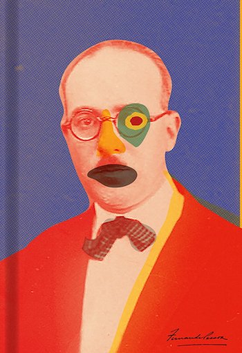 The Book of Disquiet: The Complete Edition, Fernando Pessoa; design by Peter Mendelsund
Miniscule author name! No title! The success of this cover lies, in part, in New Directions’s recognition of the allure of a single image. Whether or not Peter had to do any convincing, the publisher needs to be lauded for their consistent boldness. As for the design itself—the playful, strange shapes are a lovely contrast to the graininess of the monochromatic photograph. The modernist sensibility reminds me of a Hans Hofmann painting.
 Lenin: The Man, the Dictator, the Master of Terror, Victor Sebestyen, design by Oliver Munday
This cover is arresting along similar lines—it only features the title on the cover (nice job, Pantheon). Because we all know what Lenin looks like, I love how Oliver used an illustration reminiscent of a propaganda poster instead of a conventional close-up photograph of Lenin’s face. The Pantone colors, which are far richer in real life, create an unusual palette. A classy cover for a terrifying tyrant!
 Album for the Young (and Old), Vera Pavlova, design by Janet Hansen
I love this cover for so many reasons: 1. The delightful hand lettering that forms a perimeter around the figure; 2. The sideways and upside-down orientation of this lettering that does not entirely cater to readability; 3. The fact that Janet was given the art—made by the author’s young daughter—to work with, and how she tastefully combines type and art as if they were made by the same hand.
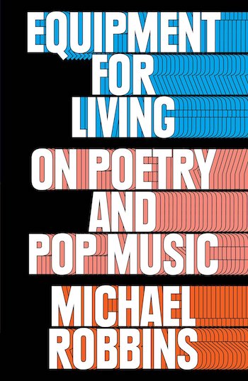 Equipment for Living: On Poetry and Pop Music, Michael Robbins, design by Thomas Colligan
This is such an appealing piece of graphic design that uses repetition in a smart way. I am a sucker for typographic covers that rock a single visual move. Also, great negative space.
 Homesick for Another World, Ottessa Moshfegh; design by Darren Haggar
No designer can create a cover that feels familiar in an ephemeral sort of way without giving into to a sense of simulation or simple re-contextualization like Darren Haggar. His cover for Moshfegh’s stories is the right kind of weird with a tight composition and beautiful colors that shape the typographic wrongness and UFO imagery into something sophisticated.
 Mental, Jaime Lowe; design by Ben Denzer
Denzer’s optically stunning cover for this memoir about severe bipolar disorder and lithium is impossible to escape. It is gorgeous and strange. Its two levels of visual interaction hold together and conflict in a way that unites the formal and conceptual solution without being overtly editorial.
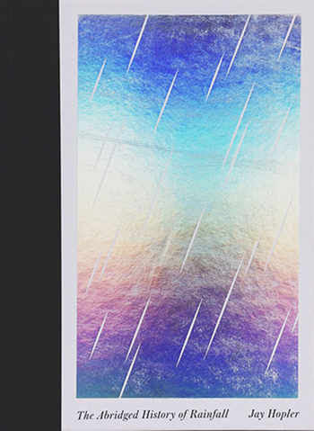 The Abridged History of Rainfall, Jay Hopler; design by Sunra Thompson
This beauty came out in late 2016, but I didn’t see it until 2017. Holographic foil is often a commercial splashy signal, but works here as pure color/light/love with the abstract simplicity of the full rectangle, diagonal lines, the small type aligned at the bottom corners. A fresh and amazing package for Hopler’s poetry.
 Nicotine, Gregor Hens, trans. Jen Calleja; design by John Gall
A gorgeous, smart cover with that perfect kind of modern design solution that seems impossibly exactly what it should have been all along. The conceptual turn of the open cigarette and formal twist of the type running up wouldn’t get lost on a shelf and feels contemporary in any decade.
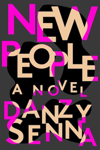 New People, Danzy Senna; design by Rachel Willey
This is the kind of good cover that first makes you feel like something is very wrong. The arresting visual energy of the moving, oddly spaced type could possibly fall apart. But Willey holds our eye with the shifts from the pink into the beige on shapes of black in a way that suggests space with the deeper black—a visual suggestion that is undermined by the flatness of it all. It’s that special visual formal magic of tension one can create in 2 dimensional design. And it signals big fiction while leaving room for that abstraction to be filled in by the racial issues in the book.
 My Cat Yugoslavia, Pajtim Statovci; design by Oliver Munday
My favorite of Munday’s covers from this year. Yes, a great deal of the charm lies in the character of the illustration, but what a great illustration. And then the seemingly off-hand visual collusion of the lettering with the illustration in that here and there overlap and the misbehaving color splotches for the shirt and shoes. The coloring trick gives that line art some spatial weight and with the overlap/underlap tension (the Y, u, m, and S relate to the blue line just so) from the lettering brings a dynamic visual tension to what could very easily be a flat composition. Lovely.
 The World Goes On, László Krasnzahorkai, design by Paul Sahre
Clean, simple, and beautifully executed. I’m looking forward to reading Paul’s new book Two-Dimensional Man over the holidays too, so I can steal all of his ideas.
 The Tryst, Monique Roffey; design by June Park and Rodrigo Corral
I could have chosen five Rodrigo covers this year, as pretty much every year. He makes consistently great work that I’m always envious of. This is just great. A brilliant use of photography and love that ‘Y’.
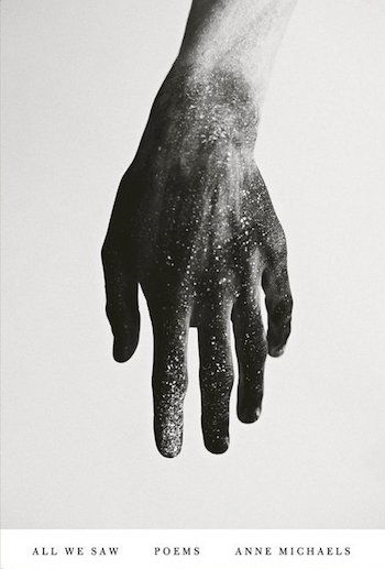 All We Saw, Anne Michaels; design by Janet Hansen
Just a beautiful image and used in such an elegant way. Makes me want to own this book. For the second year in a row I say “grrrr… damn you Janet Hansen!”
 Riot Days, Maria Alyokhina; design by Tom Etherington
I loved this iconic and impactful cover. It leapt off the shelf for me this year. The clever use of simple colour and space.
 Nicotine, Gregor Hens, trans. Jen Calleja; design by John Gall
John’s work is the benchmark for all of us working in cover design. Always inventive and smart. This is just so beautifully executed.
 The Book of Disquiet: The Complete Edition, Fernando Pessoa; design by Peter Mendelsund
New Directions is an incredible publisher because they believe in taking chances with experimental covers. Published elsewhere this beautiful cover may not have been title-free.
 Heating & Cooling: 52 Micro-Memoirs, Beth Ann Fennelly; design by Alex Merto
I like any cover that connects you to an experience, to something you have felt and can feel again. The melting pop, sticky on the wood, makes me remember the taste. And the need to bite the stick when it’s done.
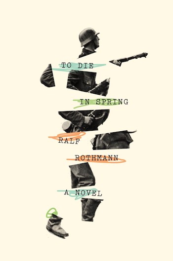 To Die in Spring, Ralf Rothman; design by Oliver Munday
It’s hard to make violence pretty, but the delicate alternating between the broken armed soldier and gentle pastel colors make a beautiful cover. The clash between violence on screen and lullaby-like music in the 1973 movie Badlands, though unrelated in subject, both work in a similar way—they bring an innocence to where it shouldn’t be.
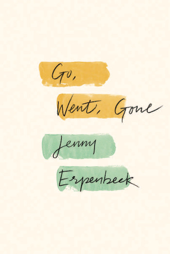 Go, Went, Gone, Jenny Erpenbeck; design by Rodrigo Corral
You look at that word falling off that swath of color, regardless of the reason, and continue to stare.
 Arbitrary Stupid Goal, Tamara Shopsin; illustrated & designed by Tamara Shopsin
In these dark times, the levity and wit of this design for Tamara Shopsin’s memoir—illustrated by Tamara Shopsin—really filled a void. Shopsin’s naive hand-lettering and self-portrait-as-clumsy-football-player are pitch-perfect for her title, but NPR’s Heller McAlpin assures us that Arbitrary Stupid Goal, an elegy to Greenwich Village in the 1970s and ’80s, “is actually neither arbitrary nor stupid.” We love the unexpected package she’s wrapped it up in.
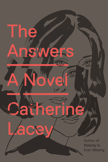 The Answers, Catherine Lacey; illustration by Patrick Leger, design by Rodrigo Corral
This was the first cover to turn my head this year. Catherine Lacey writes with great sensitivity about fractured psyches, and Claire and I love how Corral integrated electric, unfeminine type that slices at the rough charcoal portrait of a woman coming apart—or maybe coming back together? Either way, the balance of type to image seems just right.
 The Idiot, Elif Batuman; design by Oliver Munday
Blockhead, numbskull, ignoramus, nitwit, clod . . . The lone, nondescript rock illustrates all of these, and Munday paired his against a demure pastel pink. We here at the studio really appreciated this juxtaposition of grace and good taste with the inelegance of the humble (idiotic!) rock. It wedged itself nicely into our list of favorites.
 The Blot, Jonathan Lethem; design by Gray318
There is nothing more satisfying than beautiful type. The warm, hand-drawn typography in this design is obscured, and yet it is perfectly readable. The layer that reads “The Blot” might be sitting above or below the layer that reads “Jonathan Lethem,” creating a sense of play with space and dimensions that only makes this cover more interesting to look at. The textured background implies layers of paint on a wall, giving us the sense that the “Blot” was either covered up or revealed, but either way there is clearly a story here to unravel.
 All We Saw, Anne Michaels; design by Janet Hansen
Designers are always looking for ways to provide a fresh take on what it means to be human. In All We Saw, day-to-day, tangible life is captured through an intimate photograph of a hand. The universe and all its inherent unknowns are suggested through a photograph of a starry sky, juxtaposed on top of the hand. Restrained typography supports this powerful pairing of images, and as a result we understand that this book of poems will tell the story of a universal human experience.
 Exit West, Mohsin Hamid, design by Rachel Willey
I cannot imagine a more perfect cover for this book. It draws you in without giving too much away. Then, once you’ve read the novel, the visual that was once simply abstract and graphic becomes perfectly clear in your mind’s eye. It makes perfect sense. On top of that, much like Rachel’s amazing cover for The Mothers last year, this jacket is even better in person. The colors pop beautifully, the gradient has just the right subtlety, the finish is soft touch, which makes the gradient feel even more dreamy, and the “stars” are even little flecks of silver foil. Not only do you want to read this book, you want it on your shelf at home, the exact job of a spot-on book cover.
 Ghachar Ghochar, Vivek Shanbhag; design by Luke Bird
This cover is so confident in its simplicity, I can’t help but stare. Every element is perfectly in place, the proportions of the typography guide your eye easily through the composition, and the slight angles give it just the right jaunty playfulness. It looks absolutely effortless (even though I’m sure for Luke it took a lot of patience). This is also the perfect example of a trend I’ve noticed this year of pink and orange, for example: The Rules Do Not Apply and Stay with Me.
 Shark Drunk, Morten Strøksnes; design by Oliver Munday
Being a book cover designer means that often times your favorite covers are the ones that make you think, “Why didn’t I think of that?!” and Oliver’s covers never fail to have that effect on me. The cleverness of the idea in Shark Drunk makes me endlessly smile, the fact that he noticed that aspect of the ascenders on ‘h’ and ‘k’, just fantastic! Then to top it all off, it is executed flawlessly.
 Draw Your Weapons, Sarah Sentilles; design by Oliver Munday
I really only wanted to mention one Oliver Munday cover, but his jacket for Draw Your Weapons was another of his signature, clever visual puns this year.
 The Book of Disquiet: The Complete Edition, Fernando Pessoa; design by Peter Mendelsund
Another thing that can happen to me while browsing book covers that I love is the ugly thought of jealousy. New Directions gives designers an amazing amount of artistic freedom and it always pays off for them. No question. This cover is fantastic and beyond enticing. I mean you have to pick it up to know what it is! If I showed this cover to my editors they would say, “Where’s the title?” and “I can’t read his name.” But Peter got away with it and the result is something all publishers should take note of.
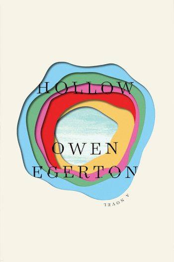 Hollow, Owen Egerton; design by Matt Dorfman
This cover gives me hope that there will always be new ideas to try. I love everything from the quirky placement of “A Novel,” to Matt’s color choices, his restraint with white space, and the detail of the type on each level. Lovely execution and lovely little pop of texture on the last layer.
 Heating & Cooling: 52 Micro-Memoirs, Beth Ann Fennelly; design by Alex Merto
This cover is fun and fearless! I would have never been brave enough to even try green and purple together, but thank goodness Alex did!
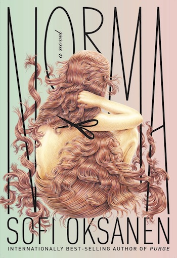 Norma, Sofi Oksanen; design by Kelly Blair, art by Winnie Truong
It would be tempting to keep the type on the simpler side so as not to detract from the truly stunning artwork, but the type here is really visually interesting in and of itself. And it’s just so masterfully integrated with the art so as to enhance it rather than take away.
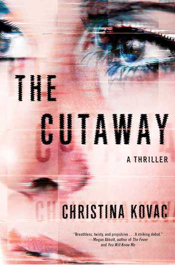 The Cutaway, Christina Kovac; design by Laywan Kwan
It’s not often you see really up-close images of people on covers in an interesting way — I love this one because the textures make the face here really compelling and tell so much more about the story, and the type works really well with it in a way that’s not overdone.
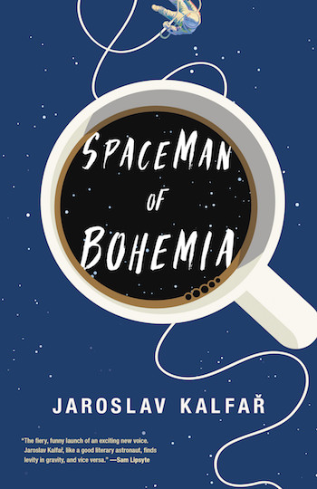 Spaceman of Bohemia, Jaroslav Kalfař; design by Allison Warner
I love how surreal the image is and the way the title type plays with that. The combination of intriguing elements make me want to know more about this story, which is really the mark of a successful cover.
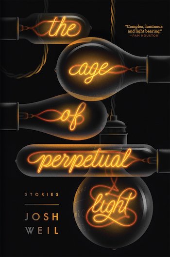 The Age of Perpetual Light, Josh Weil; design by Nick Misani
Just really gorgeous type and illustration, perfectly executed. I especially love the details—the reflections, the distortions, a true visual study of the nature of light.
 Fever Dream, Samanta Schweblin, trans. Megan McDowell; design by Rachel Willey
This is a cover I saw early on in the year and I found it so haunting—I really love the way the type has been broken up and composed on this to evoke a feeling of madness.
 Dandelions, Yasunari Kawabata; design by Peter Mendelsund
Such an intriguing, odd, beautiful piece of art. I love how I can’t tell what year it was made, how nothing is perfect or aligned and the colors are a bit strange. . . pure charm and character.
 Isadora, Amelia Gray; design by Na Kim
Historical fiction could tend to feel like a conformist party, but this is so fresh! The execution of the gold foil type, the alluring black and white portrait, the angle of her face working perfectly with the idea that she is underwater—I even love the contrast of the contemporary ‘A Novel’. So beautiful and striking.
 The Idiot, Elif Batuman; design by Oliver Munday
 My Cat Yugoslavia, Pajtim Statovci; design by Oliver Munday
Always clever. Always playful. Always sophisticated. Damn you, Ollie! I treasure both of these designs. Neither of them shout and yet they both stop me in my tracks.
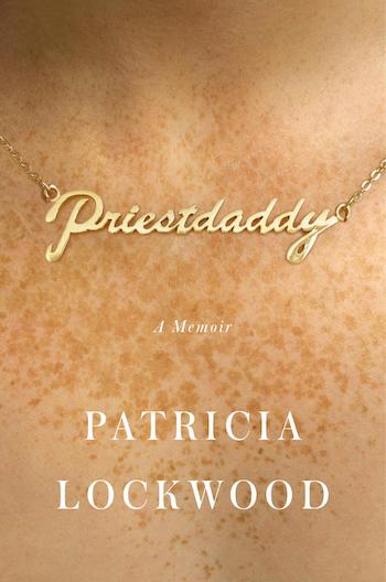 Priestdaddy, Patricia Lockwood; design by Rachel Willey
Name necklaces, gah! Such a throw back to the ’90s and so kitschy, in the best kind of way. In juxtaposition with the title it feels both dirty and innocent—hilarious!
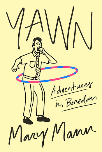 Yawn, Mary Mann; design by Tyler Comrie
I LOLed when I saw this. A lot of designers think it is redundant to depict a title, but this cover works so well because it does just that. Very clever for this subject matter. And I love how young and effortless it feels!
It’s hard to pick my five favorite book jackets of 2017 because I didn’t like the majority of the covers on the books I read. The jackets that I did like were primarily on books I haven’t yet read and came from two independent publishers: New Directions and Verso Books. The covers these presses published feel less burdened with marketing and industry constraints and their talented art directors Erik Rieselbach and Andy Pressman (respectively) took great care in respecting the aesthetics of the books. Mainstream publishers should take note.
 Greece and the Re-Invention of Politics, Alain Badiou, design by Wei Huang & Julia Novitch
I’m a sucker for bold typography in black and white.
 The World Goes On, László Krasnzahorkai, design by Paul Sahre
The last thing that comes to mind when I think about the writing of László Krasnzahorkai is “rainbow foil gradient”—but it doesn’t matter! This is a masterful cover from Paul Sahre.
 Arbitrary Stupid Goal, Tamara Shopsin, design by Tamara Shopsin
I loved reading this book so much, and the cover (designed by the author) has a clever reveal when you remove the jacket.
 Futurability, Franco ‘Bifo’ Berardi, design by Raf Rennie
If I know anything about Raf Rennie, it’s that he is obsessed with Franco ‘Bifo’ Berardi. The designer’s love of the author really comes through on this jacket; there is a beautiful use of die cuts and texture.
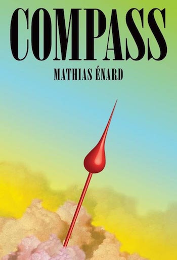 Compass, Mathias Énard, design by Peter Mendelsund
I’m not really sure what’s going on here. Is that the tip of a compass? Why is the sky so colorful? Is that the Nirvana font? Whatever it is, it’s beautiful.
I seem to have a thing for hand-drawn type, but then again there’s a lot of it out there again this year. Combine this with pattern or texture and a bit of vibrant colour and I am well and truly sucked in.
 Turf, Elizabeth Crane; design by Kelly Winton
This appeals to my fondness for hand-drawn type and non-repetitive pattern and has a great sense of freedom. A quirkily charming piece of graphic design.
 The Age of Perpetual Light, Josh Weil; design by Nick Misani
A beautifully balanced and finely crafted cover from a Louise Fili graduate. Incredible attention to detail in the illustration, from the warmth of the filaments to the title reflected in the glass.
 Riot Days, Maria Alyokhina; design by Tom Etherington
If I had worked on this cover the temptation to use hand-drawn lettering would have been strong, yet the juxtaposition of confident typeface and ripped fabric is perfectly balanced and totally appropriate.
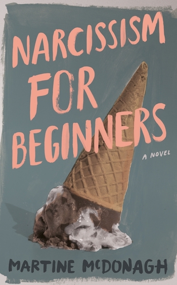 Narcissism for Beginners, Martine McDonagh; design by Tree Abraham
A confident design with a great sense of humour, this cover exudes personality, you just want to pick it up and read.
 Entangled series, Cat Clarke; design by Sinem Erkas
A playful composition of materials and bold use of colour make these covers sing. Sinem Erkas has an eye for unique and striking design.
 Borne, Jeff VanderMeer, design by Rodrigo Corral and Tyler Comrie
This gorgeous, exotic, post-apocalyptic bird of paradise paired with an exquisitely odd type treatment makes this the most stare-worthy jacket of the year. It makes me want to look at it forever, get lost in the “O” of “Borne,” and inhabit the world this alien plant sprouted from!
 A Separation, Katie Kitamura, design by Jaya Miceli
This one took my breath away when I first saw it. It manages to convey beauty, violence, heat, and noise all within the confines of a one-dimensional space. I can hear it, feel it, even smell it—the image paired with the title gives you the overwhelming sense that this is not a clean, amicable “separation.” It’s abstraction put to the best use possible.
 Priestdaddy, Patricia Lockwood; design by Rachel Willey
This title is a designer’s dream. . . until you actually sit down to work on it and realize yes, it’s amazing, but impossible to live up to visually! This design makes it look easy—it manages to take a brilliant title and enhance/compliment it in ways that are incredibly smart. There’s something so intimate and subversive about setting the word “Priestdaddy” in a gold nameplate against an endless backdrop of freckled skin. There’s warmth here—a kind of goofy love—that’s subtly irreverent.
 War Against War, Michael Kazin; design by Thomas Colligan
War books tend to follow a familiar genre look—a photo from the time period paired with a serious type treatment. When Thomas started working on this for me, I asked him to approach it from a different angle—to use WWI protest posters as an inspiration. This was one of the first designs he showed me and it blew me away. It manages to be both strong and serious, but not academic or unapproachable. It does what all great jackets do: respects the subject matter while also demanding your attention.
 Hollow, Owen Egerton; design by Matt Dorfman
This design feels like the visual equivalent of a short poem—so much intensity packed into such a small space. You sense there’s a many-layered journey here, but one that ultimately yields hope and calm despite the haunting title.
When I was a kid and didn’t know what I wanted to be when I grew up, I loved it when I came across a book with a cover that stirred my curiosity enough that I would stare at it for long periods of time. There were so many beautiful cover designs this year that did that for me, but I managed to narrow it down to 5. These covers, for all different reasons, sparked that same nostalgic response in me: I want to stare at them forever.
 The Age of Perpetual Light, Josh Weil; design by Nick Misani
The elegant lettering and the emanating subtleties of luminosity.
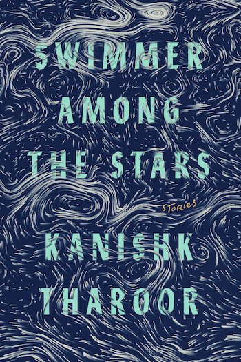 Swimmer Among the Stars, Kanishk Tharoor; design by Tyler Comrie
A modern inspired Van Gogh.
 Hollow, Owen Egerton; design by Matt Dorfman
Love the combination of overall simplicity and contained complexity.
 Heating & Cooling: 52 Micro-Memoirs, Beth Ann Fennelly; design by Alex Merto
The title, the colors, and the multiple visual meanings.
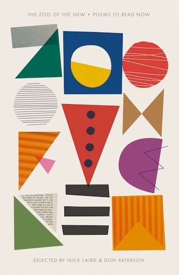 The Zoo of the New, ed. Don Paterson & Nick Laird; design by Richard Green
Letters made of shapes. Need I say more?
 Dandelions, Yasunari Kawabata; design by Peter Mendelsund
Peter does a really great job of bridging the gap between design and art. This design can serve as a cover for the Kawabata book but it would also not look out of place on the wall of a gallery.
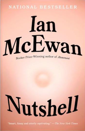 Nutshell, Ian McEwan; design by Linda Huang
This is a book about a witty fetus and his perspective on what’s going on outside the womb. This image of a belly button is so clever and immediately makes you chuckle to yourself. It’s too bad this cover didn’t make it to print but I think it still deserves recognition.
 The Tryst, Monique Roffey; design by June Park and Rodrigo Corral
This book is described as multi-sensory, arousing, and fantastical. This collage of three orgasmic people embodies all those words in a single eye-catching, original visual.
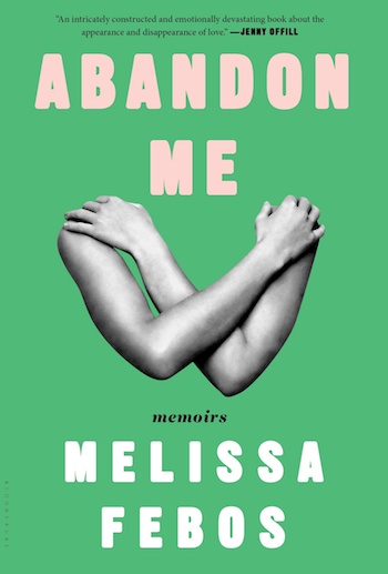 Abandon Me, Melissa Febos; design by Patti Ratchford
Very few covers elicit an emotional response in me, but this one does. There’s a vulnerability to the juxtaposition of the way the arms are covering a body we don’t see and the title, Abandon Me.
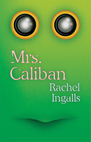 Mrs. Caliban, Rachel Ingalls; design by Erik Carter
It’s just so charming and weird and fresh—like most designs coming out of New Directions.
 Norma, Sofi Oksanen; design by Kelly Blair, art by Winnie Truong
I was immediately drawn to this cover, which skillfully weaves type and image in a seamlessly balanced and expressive design.
 Hollow, Owen Egerton; design by Matt Dorfman
A bright spot in the field of covers this year. . . the cut paper layers are an effective device to draw in the viewer. Sharp and engaging.
 The Age of Perpetual Light, Josh Weil; design by Nick Misani
Absolutely brilliant merging of type and image, perfectly evocative of the subject matter.
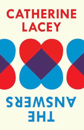 The Answers, Catherine Lacey (UK edition); design by Gray318
I appreciate the simplicity of the graphic forms here and the unexpected type positioning. Makes a bold and elegant statement.
 Isadora, Amelia Gray; design by Na Kim
In an age of illustrative book covers, this striking photo-driven design is executed beautifully.
 How to Behave in a Crowd, Camille Bordas; design by Christopher Brand
A cover that perfectly personifies the title of a book.
 Made for Love, Alissa Nutting; design by Sara Wood
If we’re judging by how frequently I think about a book cover, I’d say this is my favorite cover of the year. Seeing it always makes me feel jealous that it’s someone else’s idea. Love, love, love, love, love it.
 Priestdaddy, Patricia Lockwood; design by Rachel Willey
A cover that’s subtly packed with feeling and intrigue.
 Nicotine, Gregor Hens, trans. Jen Calleja; design by John Gall
The ability to take a common well known object and present it in a new way is awe-inspiring.
 Heating & Cooling: 52 Micro-Memoirs, Beth Ann Fennelly; design by Alex Merto
I think it’s really cool how this image captures the future, past, and present, all at once.
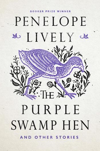 The Purple Swamp Hen, Penelope Lively; design by Nick Misani, art direction by Paul Buckley
An update of the original design, I really enjoy the way the type, color, and illustration masterfully work together.
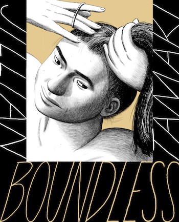 Boundless, Jillian Tamaki; design by Jillian Tamaki
Jillian Tamaki is a masterful draftswoman. Any book with her beautiful art will always be one of my favorites. Check out her Instagram for some wonderful drawings.

 You & a Bike & a Road, Eleanor Davis; illustration and design by Eleanor Davis
Eleanor Davis’s beautiful artwork reveals itself as it wraps around her latest publication. It’s an absolute pleasure to slowly discover every colorful detail.
 We Are Okay, Nina LaCour; illustration by Adam Carvalho, design by Samira Iravani
This slightly off-register iconic design blends hand-drawn typography, Illustration, and set typography into one beautifully composed graphic design. Book cover yin-yang is in full effect.
 I Am Not Your Perfect Mexican Daughter, Erika L. Sánchez; design and illustration by Connie Gabbert
I love the iconic nature of type and Illustration working together. I love the blend of simplicity and detail.
I am so exhausted by this year’s political shit-show that I have nothing deep and eloquent to say on the state of cover design. These five covers are just so great looking that they make me smile, and they also tell you a lot about what kind of read lies within. That’s all I require.
 Chemistry, Weike Wang; design by Janet Hansen
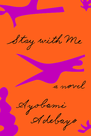 Stay With Me, Ayobami Adebayo; design by Janet Hansen
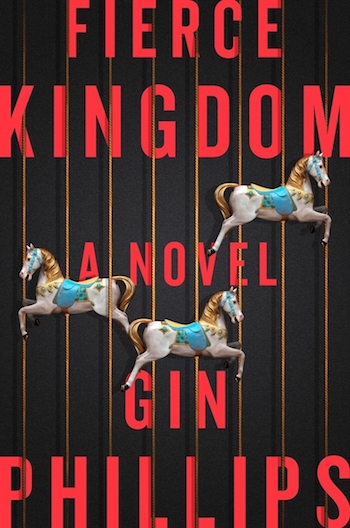 Fierce Kingdom, Gin Phillips; design by Jason Ramirez
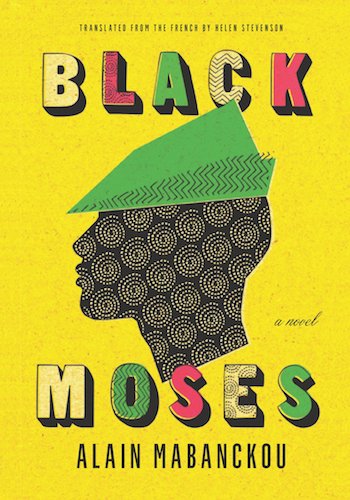 Black Moses, Alain Mabanckou; design by Gray318
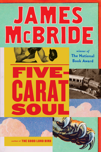 Five-Carat Soul, James McBride; design by Ben Denzer
The theme here is, unless already obvious, simplicity!
 Arbitrary Stupid Goal, Tamara Shopsin; illustrated & designed by Tamara Shopsin
 The Book of Disquiet: The Complete Edition, Fernando Pessoa; design by Peter Mendelsund
 Hollow, Owen Egerton; design by Matt Dorfman
 I Am the Brother of XX, Fleur Jaeggy; design by Oliver Munday
 The World Goes On, László Krasnzahorkai, design by Paul Sahre
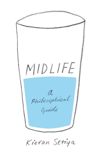 Midlife, Kieran Setiya; design by Amanda Weiss
Emily Temple
Emily Temple is the managing editor at Lit Hub. Her first novel, The Lightness, was published by William Morrow/HarperCollins in June 2020. You can buy it here.
