The 60 Best Book Covers of 2016, As Chosen By Designers
As chosen by the best book cover designers in the business
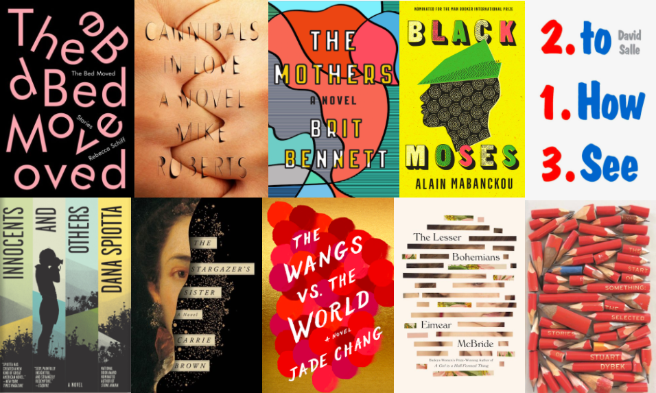
Today in “2016 was garbage but at least we had good ____,” we bring you: book covers. Because it’s true: this year, we had a healthy quantity of beautiful, inventive, arresting, unforgettable book cover designs, many of which deserve recognition. Now, of course, since it’s the end of the year, we are socially obligated to ask, but which were the very best? So I wondered: which were the very best? I know what looks good to my laywoman’s eye, but which were really marvelous and which simply pretty? To make sense of it all, I asked seventeen designers whose own work I have deeply admired to talk about their personal favorite book covers of 2016.
As might be expected, some of the artists I asked championed a few of the same book designs, so I feel comfortable saying that the very top three best book covers of the year are the following:
Cannibals in Love, designed by Na Kim (7 nods)
The Bed Moved, designed by Janet Hansen (5 nods)
The Mothers, designed by Rachel Willey (5 nods)
Other books listed multiple times were My Father the Pornographer, designed by Jamie Keenan, Peter Mendlesund’s W.B. Sebald backlist redesigns, as well as his cover for How to See, Was She Pretty, both written and designed by Leanne Shapton, But What If We’re Wrong?, designed by Paul Sahre, Knockout, designed by Matt Dorfman, The Start of Something, with design by Suzanne Dean and art by Marion de Man, The Wangs vs. the World, designed by Kimberly Glyder, the complete Tale of Shikanoko, designed by Alex Merto and Yuko Shimizu, and The Stargazer’s Sister, designed by Oliver Munday.
But every book on this list is spectacular in one way or another—and industry expert approved. So without further ado, feast your eyes on the 60 best book covers of the year—and I’d suggest checking out more of the recommenders’ work while you’re at it, too.

Mike Roberts, Cannibals in Love, design by Na Kim
This jacket is one of the most perfect integrations of title and image I’ve ever seen. Every moment makes sense both intellectually and visually. It manages to be abstract and representational at the same time. But the main thing is I can’t stop staring at it, so not only is it a beautiful work of art, but it’s doing its job as a book cover. Genius!
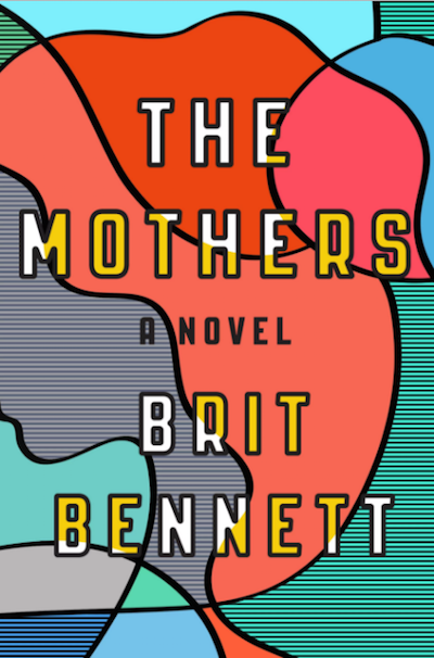
Brit Bennett, The Mothers, design by Rachel Willey
I’m not even sure what this visual is—a modern interpretation of a stained glass window madonna? With references to African textiles? Maybe? All I know is that I’ve never seen anything like it before. I love how it subtly solves the age-old “put a woman on it” dilemma without compromising good design.

Robert Moor, On Trails, design by Jim Tierney
When I contacted Jim Tierney to work on this title, I knew he could give me what I was looking for—a beautiful object that made sense for the genre, but also moved beyond it. What he designed looks like a modern classic. I’d like to think if Thoreau was publishing in 2016, this is how his work would be presented.

Matthew Desmond, Evicted, design by Jake Nicolella
I love how this design manages to say so much with such a simple image. By showing what remains after a person is forced to leave their home—what’s left behind after their possessions have been removed—you’re seeing family, the passage of time, and loss, all at once. Seeing the image and the title together makes your heart sink.
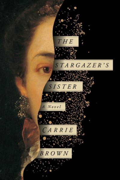
Carrie Brown, The Stargazer’s Sister, design by Oliver Munday
This is one of those “why didn’t I think of that” covers. In my freelance life I’m often hired to work on period novels that feature strong female protagonists. It’s difficult to think of new and exciting ways to design these jackets, and this one succeeds at pushing the genre into new territory. It manages to capture the time period without feeling tired and musty. I love how it appeals to a contemporary audience without abandoning the spirit of the novel.
Strick&Williams (Charlotte Strick and Claire Williams Martinez)

Ben Fama, Fantasy, design by John Lisle
I discovered this slim volume of poetry glittering like a piece of forgotten candy tucked among the piles on a desk at The Paris Review office, and I couldn’t wait to show it to Claire. This truly weird and wonderful psychedelic illustration is made especially winning thanks to the specked foil stamping—creating a shimmering effect against the warmth of the uncoated stock. Bravo to designer John Lisle and Ugly Duckling Presse.

Rebecca Schiff, The Bed Moved, design by Janet Hansen
Simplicity in design can be a real battle, but designer Janet Hansen makes it look elementary with her design for The Bed Moved. Hansen manages to balance chaos and composition in such a way that the eye doesn’t at first detect the repeated letters. It’s a design triumph!
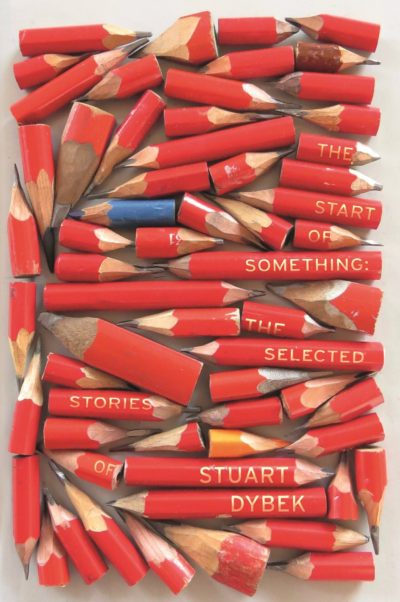
Stuart Dybek, The Start of Something, design by Suzanne Dean, art by Marion de Man
We still value a good ole pencil here at the studio, and we like to imagine the designer, Susanne Dean, working through the night to chisel each of these artfully, jagged points to create this cover! We applaud how well the title and image work together.
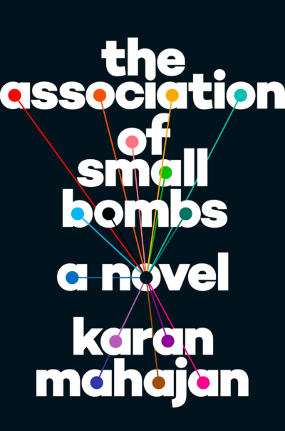
Karan Mahajan, The Association of Small Bombs, design by Matt Vee
Many people have awarded this cover a gold star in 2016, and we’d like to add another. While we expect explosions to create chaos, the impact of the bomb in this composition is very organized and evocative of networks; it is a timely interpretation of violence.

James Gleick, Time Travel, design by Peter Mendelsund
The design for Time Travel doesn’t need to rely on additional images to make its point. Mendelsund’s typographic design looks effortless, but the thinking behind it is demanding.
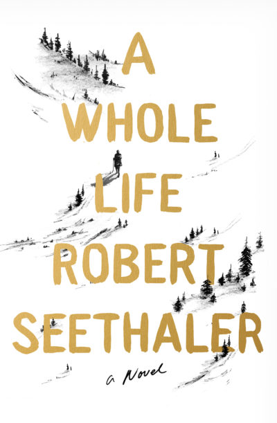
Robert Seethaler, A Whole Life, design/illustration by June Park
We both love the delicacy of June Park’s illustrated cover for A Whole Life. The small, single figure—so close in form to the surrounding pine trees—advances up the incline of this book jacket and the still landscape seems to speak volumes about the beauty of the words we hope to discover inside.

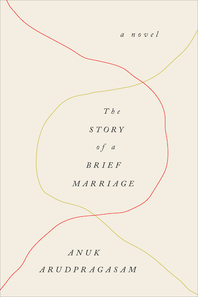
Rebecca Schiff, The Bed Moved and Anuk Arudpragasam, The Story of a Brief Marriage, both designed by Janet Hansen
One of the many things I like about Janet’s work is how she manages to convey so much of a book’s content and tone with the barest of moves. These two covers are graphic design at its purest—form-making using only line and typography.
The Bed Moved exudes a carefree joy reminiscent of an exercise usually only enjoyed in Typography 101. I mean, the two type styles are barely legible from a market standpoint: the large title letters are off-kilter, extraneous letters abound; the smaller type that gives information about the full title and author is buried at 17 pts! How very bold (of the publisher, too). Janet has captured the wit and irreverence of the author’s stories, so it’s no surprise that this is such a pleaser.
So little design, so much pathos. I doubt I’ll ever come across a pair of lines on a cover that will stir in me as much as the paths do on The Story of a Brief Marriage. The way they gently waver, intersect, and encapsulate pockets of space for the delicate type is beautifully restrained. It’s also a very clever metaphor for a brief marriage without showing any of its messiness.

Mike Roberts, Cannibals in Love, design by Na Kim
When I first saw this cover I quietly gasped. Its ingenuity lies in its ability to be both carnal and conceptual. Na takes what is familiar and abstracts it, then finds the perfect tool to execute her idea. The roughness of the hands and the slivers of shadow from the cut-out type are intimate and chilling. Without knowing much about the book, I feel like I totally get it and it gets me: love cuts pretty deeply, and this cover pierces.

W.G. Sebald, The Emigrants, design by Peter Mendelsund, part of a Sebald series
Ugh. I admire everything Peter does, particularly when it comes to his work for classic authors. His love for Sebald is evident in the way these were conceived and designed as collages. Each of them, especially The Emigrants, is thoughtful, poetic, and a nod to Sebald’s writing—fragmentary and nostalgic—without being overtly melancholic (we don’t want to sell sad covers). They’re so gorgeous I want to buy them all only to rip off the covers and frame them.
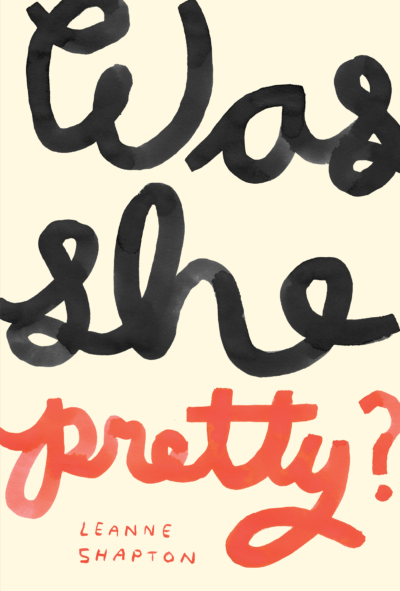
Leanne Shapton, Was She Pretty, design by Leanne Shapton
When you think of typography or hand lettering as personification, then I want to be best friends with the title lettering on Leanne’s paperback cover. She’s bold and sassy. She’s generous. She’s even slightly subversive. Although I like the original hardcover—a piece of art in its own right—I love this edition even more. Leanne takes three short words and fills up the entire tableau, and in doing so, inverts their conventional importance (when have you ever seen “Was” and “She” this emphasized before on a cover?). The sense of scale is gleefully satisfying. If you can’t already tell, I’m envious of her work.
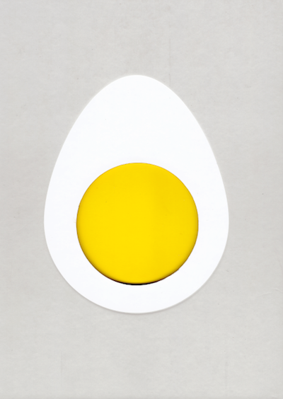
Blanche Vaughan, Egg: The Very Best Recipes Inspired by the Simple Egg, design by Clare Skeats
Design as fine art. In the world of cookbooks, there seems to be an excess of covers with large type and food photography. But this pure and minimalistic cover does the exact opposite and the result is incredibly striking—with a die cut case and egg colored gilded edged paper, it is a timeless and indispensable object.

Mikhail Bulgakov, The Master and Margarita, design by Krystyna Skalski, art by Robert Goldstrom
I might be cheating with this one. It’s a 2016 reissue of a 1991 design. But I do love that they chose to keep it—I hope you agree that its excellence speaks for itself…

Leanne Shapton, Was She Pretty, design by Leanne Shapton
Leanne Shapton’s lettering perfectly juggles an effortless, highbrow, and playful execution. I love the confident rawness of this cover.
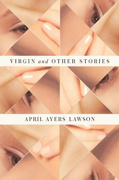
April Ayers Lawson,Virgin and Other Stories, design by Rodrigo Corral
I was wandering around a bookstore one day when I just gravitated towards this one. It speaks to both the reader and designer in me. Without giving anything away, it evokes a great human purity and emotion—and on top of it all it is perfectly executed.
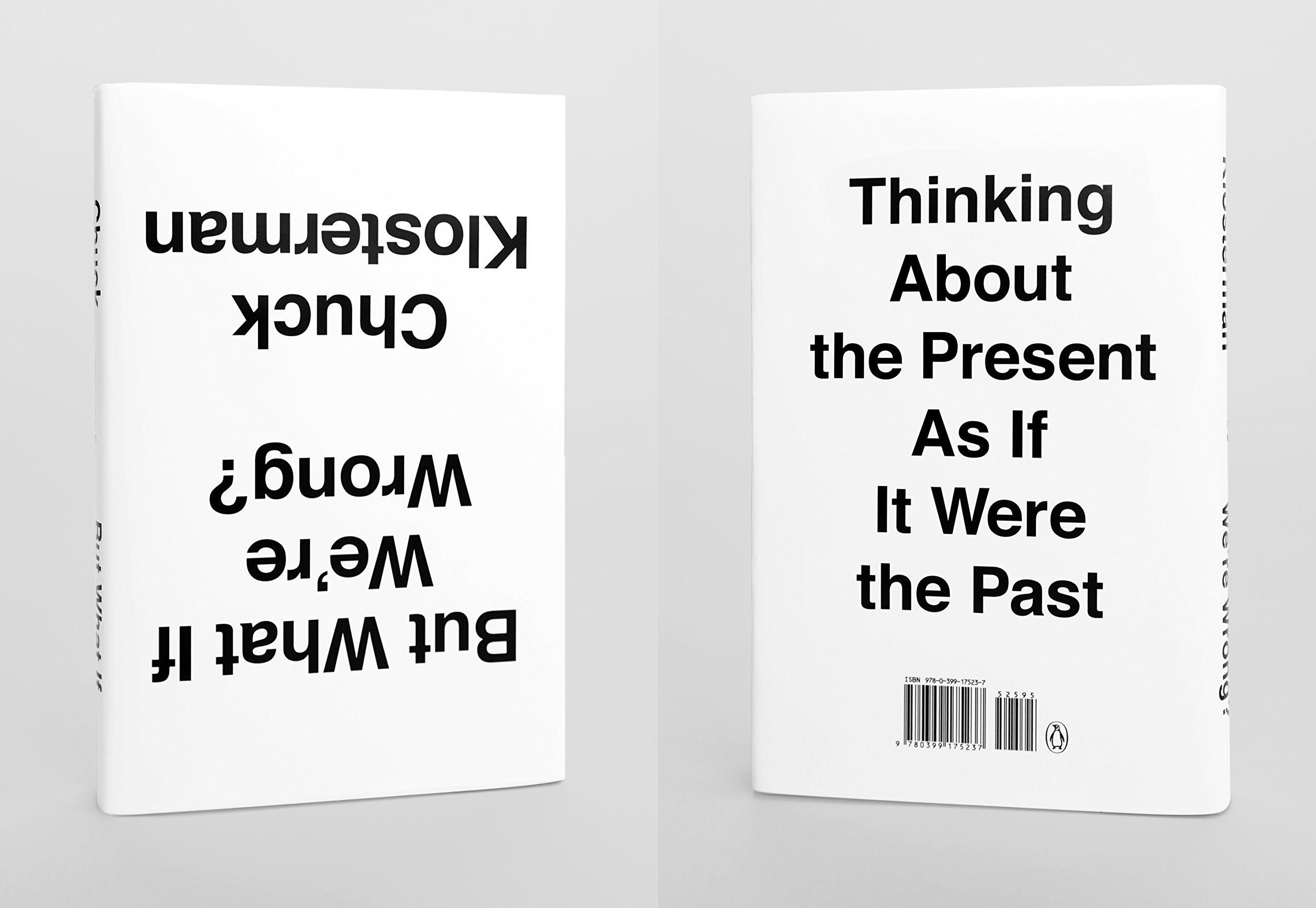
Chuck Klosterman, But What If We’re Wrong?, design by Paul Sahre
It can get monotonous seeing covers that follow all the rules. This one is a great success simply by breaking them.

Brit Bennett, The Mothers, design by Rachel Willey
With a title like this, the jacket could have gone in so many—perhaps predictable—directions, but this design is completely unexpected and the colors (all spot colors) are fantastic. My favorite part is that the woman’s face is not on the jacket, but it surprises you on the spine.
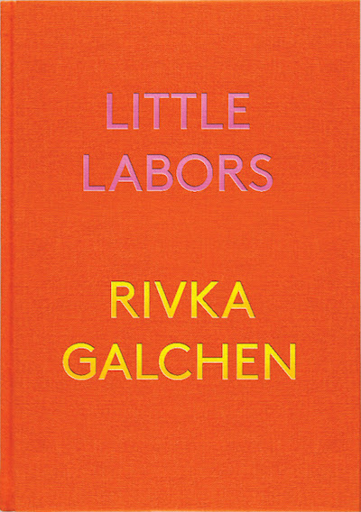
Rivka Galchen, Little Labors, design by Paul Sahre
This book lets the colors and production do all the talking. The beautiful and perfectly balanced type on this book allows its unique and satisfying color combination and cloth bound case to shine.
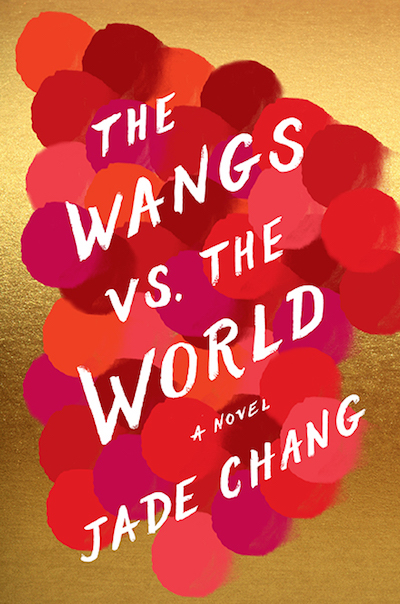
Jade Chang, The Wangs vs. The World, design by Kimberly Glyder
This cover makes my heart sing with its combination of color, type and materials. The hand-written text adds a sense of excitement that I hope I will find within the pages of the book. I like to compare how books are marketed differently in different countries and this US version just does it for me. It feels liberated from appealing to a particular genre.
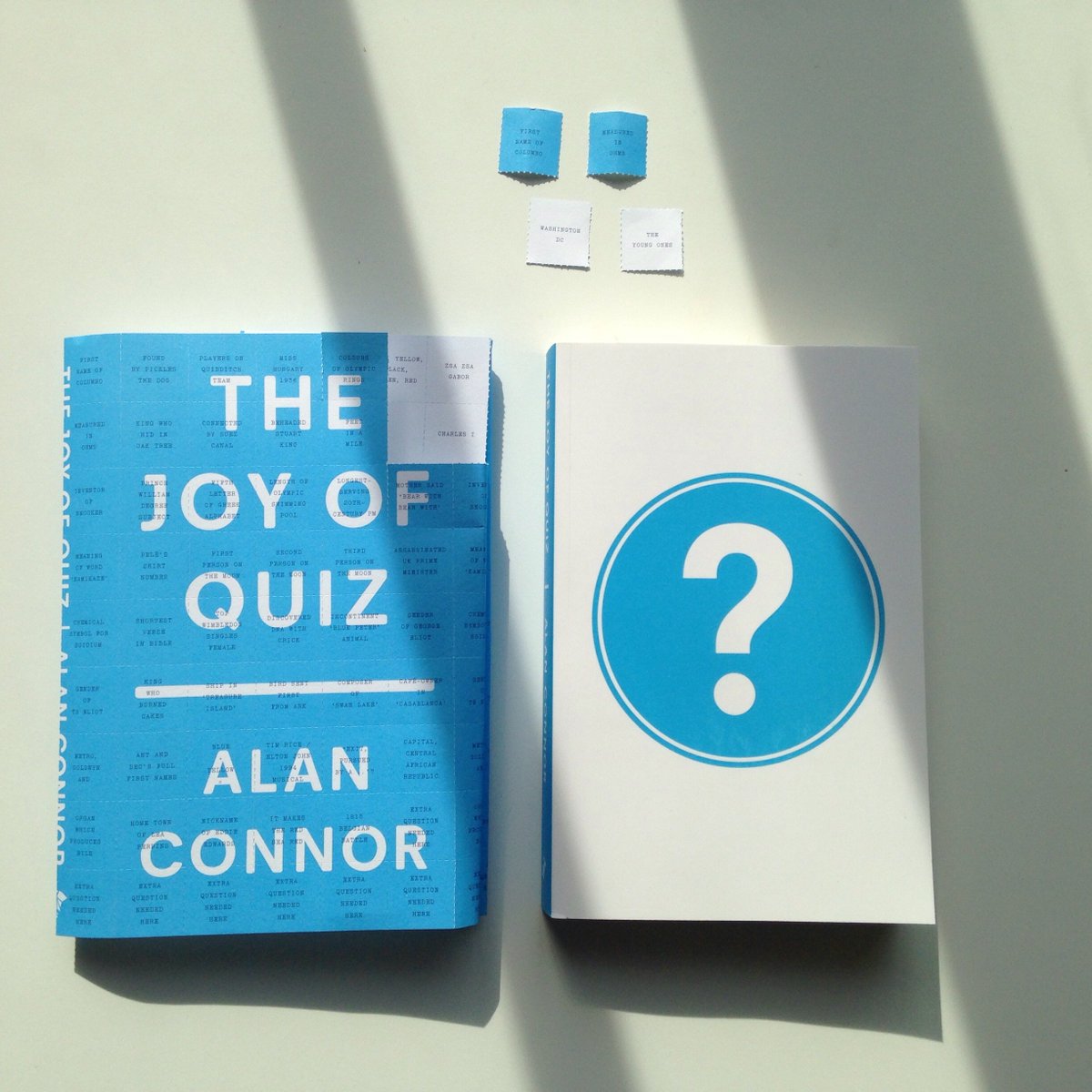
Alan Connor, The Joy of Quiz, design by Tom Etherington
This design is very clever. The entire cover is perforated into squares and on the front of each square is a question, while the answer is printed on the reverse, allowing you to tear up the cover to make a quiz. Even the price, design credit and ISBN have been turned into quiz questions! It is a simple, witty, design solution—I wish I’d come up with it.
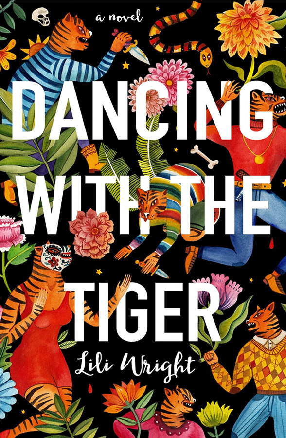
Lili Wright, Dancing with the Tiger, design by Aitch
This cover defies the visual expectations for a literary thriller and I love that it all the more for it. It has beautiful illustrations that exude color and energy but do not detract from the text on the cover. A really great balance. The artist manages to maintain legibility within an abundance of energy.
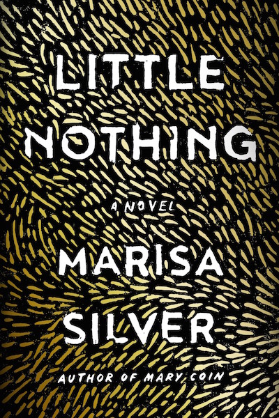
Marisa Silver, Little Nothing, design by Rachel Wiley
This cover has been catching my eye a lot. I love the simplicity and feeling of rhythm that comes from the mark-making. For me the way the marks play around the text is subtle, balanced perfection. I am looking at this purely from my own design perspective as I have not read this book, but I love it!
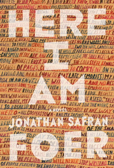
Jonathan Safran Foer, Here I Am, design by Jon Gray
Apparently this cover took over 80 visuals to get right yet Jon Gray’s work always looks so effortless. It seems that the bigger the author the harder it is to pitch the cover just right. I remember having a similar experience with a Naomi Klein cover at the start of my career and I think I produced about 50 visuals. Not the most fun I had designing a cover! Trying to maintain enthusiasm is difficult so I admire that Jon Gray kept going. He hit the jackpot with this one.

Mike Roberts, Cannibals in Love, design by Na Kim
For its surprising and jarring relationship between soft and sharp. It looks like nothing else on the shelf and is one in the eye for those who prioritize legibility above all else.
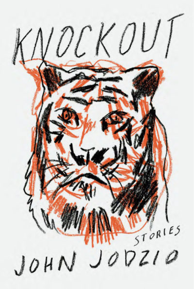
Jon Jodzio, Knockout, Design by Matt Dorfman
Type and image—rendered by the same hand—working in complete harmony. Bristling with energy and full of possibilities.
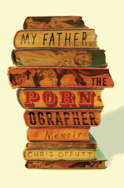
Chris Offutt, My Father the Pornographer, design by Jamie Keenan
Jamie’s smile-in-the-mind cover really makes me smile in my mind.


W.G. Sebald series, design by Peter Mendelsund
Such elegance in economy. These impressionistic compositions feel like the perfect reflection of Sebald’s spectral writing style.

Carmen Boullosa, Before, design by Anna Zylicz
The utter joy of the spirited and unrefined mark. A rare thing indeed in our age of endless finessing.
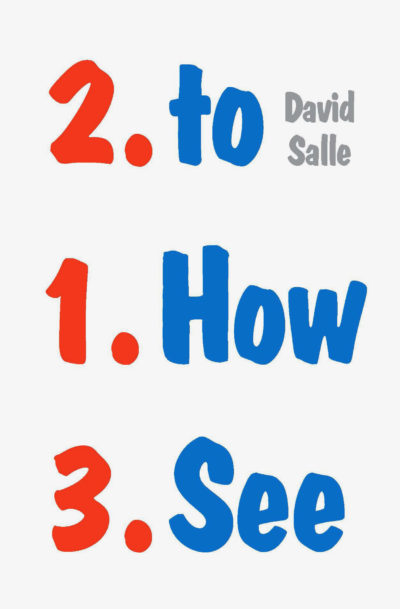
David Salle, How to See, design by Peter Mendelsund
M. O. Gee.
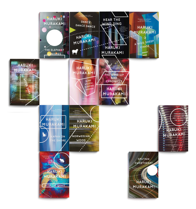
Haruki Murakami backlist (Vintage Books), design by John Gall
I’ve had the pleasure of handling the files for John Gall’s new designs for Haruki Murakami’s backlist titles here at the Vintage Books office. Every time I see another design come in, I get excited. I love the vivid colors. I love that each design features the work of a different artist and yet, they complement each other so well. I love that they all come together to form one big piece. They look eye-catching, they look weird and they look fresh.

Leanne Shapton, Was She Pretty, design by Leanne Shapton
I have been a fan of Leanne Shapton’s work for a long time. There is something so compelling about the line quality of her illustrations and the simplicity of the compositions. The cover for Was She Pretty is no different.
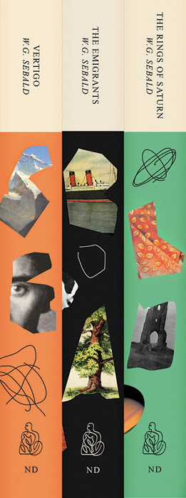
W.G. Sebald series, design by Peter Mendelsund
All three designs are beautiful to look at but my favorite part are the thin squiggly lines on the spines and the way they complement the New Directions logo.
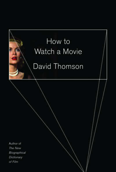
David Thomson, How to Watch a Movie, design by Oliver Munday
I love how the concept behind this design is very literal but the execution is very abstract. You clearly see a movie screen but it had been simplified to a wide white box. The combination of the dotted lines with the black and the movie-grab of Grace Kelly makes for a very interesting composition.

Kazuhiro Kiuchi, Shield of Straw, design by Janet Hansen
My favorite thing about this cover is that it is so unique for the thriller genre. If you walk into that section of a book store, you’re bombarded with lots of black and dark imagery. This cover manages to embody the action of a crime novel with the bare minimum of a bright color, a funky typeface and a few white lines.
I love book cover designs that are unexpected, unusual and plays off the title in some kind interesting interactive way and not just a predictable literal interpretation of the book.

Brit Bennett, The Mothers, design by Rachel Willey
Chock full of energy and color.

Mike Roberts, Cannibals in Love, design by Na Kim
The interlocked hands and the cut out type work wonderfully together.

Álvaro Enrigue, Sudden Death, design by Rachel Willey
The delicate feather over the striking bold type treatment is elegant and fierce.

Rebecca Schiff, The Bed Moved, design by Janet Hansen
Love the playfulness of the letters. Also, pink and black!
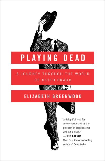
Elizabeth Greenwood, Playing Dead, design by Alison Forner
The illustration is oddly friendly and inviting for such a strange subject matter. Works brilliantly with the title.
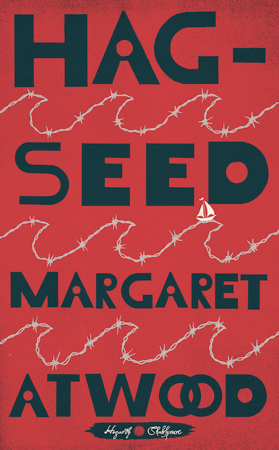
Margaret Atwood, Hag-Seed, design by Christopher Brand, illustration by Christopher Silas Neal
I’m drawn to the bold, unusual typography. The type is purposefully interwoven with the barbed wire and the small inset boat to help move your eye through the text.
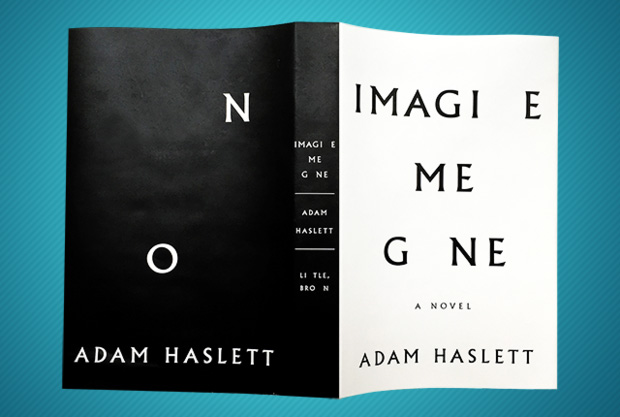
Adam Haslett, Imagine Me Gone, design by Keith Hayes
The cover works on its own, but seeing the full jacket makes this one even stronger. I haven’t read the book, but I do know the novel deals with loss and mental illness. Simply taking away letters in the title to reinforce the themes of the book is a smart, elegant solution.
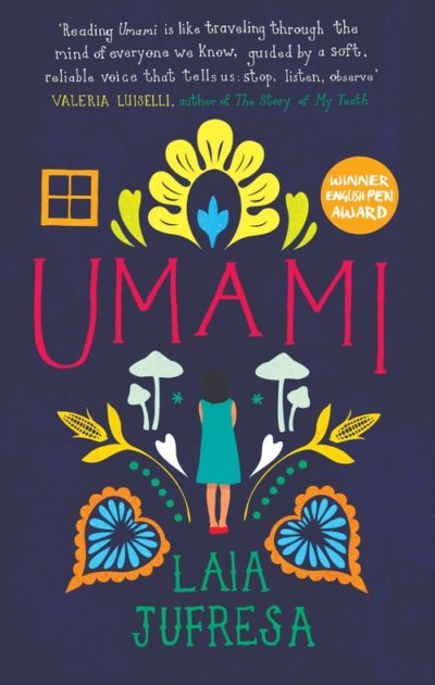
Laia Jufresia, Umami, design by Anna Morrison
We’re in an age of illustrative covers, but this colorful design stood out to me with its symmetrical beauty. From the central figure sprouts various florals and ornamentation. The hand-drawn type seems to grow naturally out of the figure as well, creating a balanced display of elements.
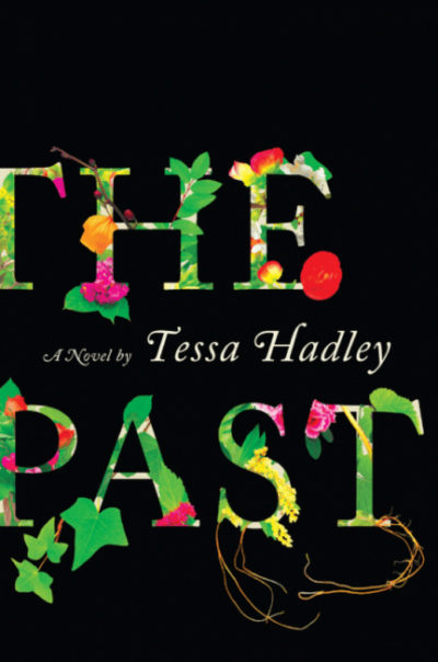
Tessa Hadley, The Past, design by Robin Bilardello
To appreciate this one fully, I think it’s best to see it in person with its graphic spine. I love when type becomes the image on a cover. Here, the flowers grow out of the type, reacting off one another and placed in stark contrast to the black background.

Stuart Dybek, The Start of Something, design by Suzanne Dean, art by Marion de Man
A well-conceived design. The type on each pencil is thoughtfully placed so that you travel through the cover. Brilliant!
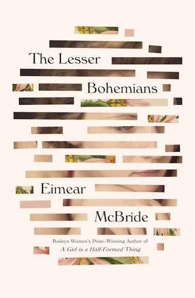
Eimear McBride, The Lesser Bohemians, design by Oliver Munday
This cover may be one of my favorites of all time. I shouldn’t include Oliver Munday in my list because of my personal connection to him, however he is in my opinion the most talented designer in the world. I am in constant awe of the jackets he designs and The Lesser Bohemians is one of the most lovely and elegant treatments a book could have.
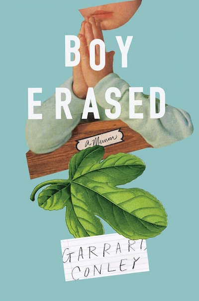
Garrard Conley, Boy Erased, design by Rachel Willey
Beautiful collage and palette.
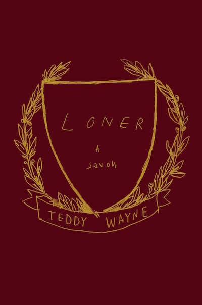
Teddy Wayne, Loner, design by Na Kim
Such a simple, yet inventive jacket. It says everything it needs to very quickly.

Alexander Pushkin, trans. Richard Pevear and Larissa Volokhonsky, Novels, Tales, Journeys, design by Oliver Munday
Again, Oliver Munday, sorry. This is just masterful composition and killer typography.

Javier Marías, Thus Bad Begins, design by Peter Mendelsund
I like this cover for a few reasons. Obviously, the simplicity, but the cover appears as if we are looking through a frame at a giant shadow, then only seeing half a person. Maybe a signal we will be revealed only half the story? Because this is a novel, the black, white, and gray intrigue me. Why is this cover almost fully consumed by black? The type is almost a quiet warning. It’s making me ask questions, and isn’t that was a good book cover is supposed to do?
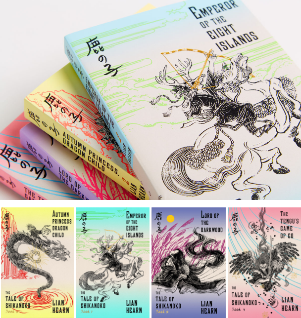
Lian Hearn, the complete Tale of Shikanoko, design by Alex Merto and Yuko Shimizu
The complete Tale of Shikanoko is probably my favorite of the year. A great collaboration between cover designer (and Associate Art Director of FSG Books) Alex Merto and the artist Yuko Shimizu, who created the custom illustrations for the series. I find it to be the perfect balance between two worlds and a modern take on the classic oriental art.

Brit Bennett, The Mothers, design by Rachel Willey
Reminiscent of classic 1960s and 70s American graphic design (think of Milton Glaser, Push Pin Magazine, etc), this cover manages to grab your attention and lure you into the book, while also feeling modern and timeless.

Carrie Brown, The Stargazer’s Sister, design by Oliver Munday
Both well-balanced and alluring this book cover feels like the perfect image/illustration combo and fits tremendously well with the book without giving too much.
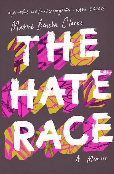
Maxine Benea Clarke, The Hate Race, design by Allison Colpoys
Even with a limited color palette, this one probably pops-out from the shelves. I love how in-your-face this cover gets, speaks loudly to any reader.

Dexter Palmer, Version Control, design by Janet Hansen, art by David Szauder
I really love how this cover approached the sci-fi genre with the subtle pixel art by David Szauder, while also managing to evoke a more “highbrow-ish” tone through the subtle marriage of image and typography.

Jade Chang, The Wangs vs. The World, design by Kimberly Glyder
The art here is relatively uncomplicated but it looks rich and lush thanks to the use of the gold foil and the multitude of red shades. And even though these are the archetypal ‘Chinese/Asian’ colors, the way they’re used here feels completely fresh.
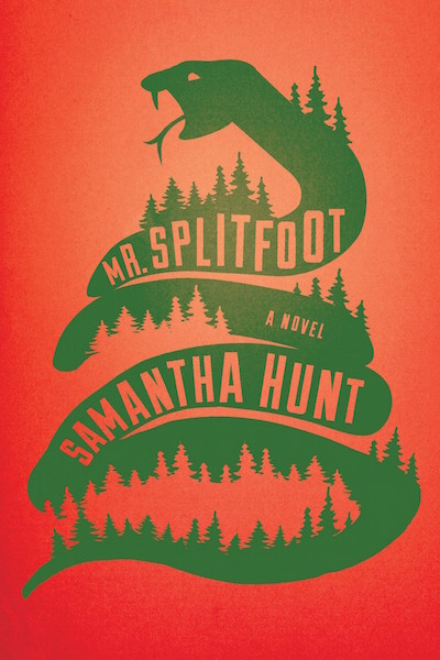
Samantha Hunt, Mr. Splitfoot, design by Strick&Williams
I just love how the shape of the snake lends itself to the shape of the mountain which then allows for all the undulating positive and negative spaces. And that color combo can be so tricky but they totally pulled it off here!

Carrie Brown, The Stargazer’s Sister, design by Oliver Munday
I saw this cover in the beginning of the year and it stayed in my mind all year long—it’s beautiful and mysterious, it has all the elements you’ve seen before but assembled in an unexpected and surprising way.

Mike Roberts, Cannibals in Love, design by Na Kim
I love the way the type was done on this, that in and of itself is gorgeous enough—and then that image of the hands pairs so well with it. Full cover flesh images can look really creepy but this has a nice warmth to it.

Rebecca Schiff, The Bed Moved, design by Janet Hansen
My absolute favorite cover this year, it’s a really beautiful example of typographic play and creating an entire mood out of something as deceptively simple as a font choice. And it’s so wonderful how much obvious trust there was from everyone involved in allowing this design to happen—that they didn’t remove the extra letters!!!

Lian Hearn, the complete Tale of Shikanoko, design by Alex Merto and Yuko Shimizu
I love the use of fluorescent colors and gold foil stamping. To me, the covers are a perfect harmony of traditional clashing with contemporary ideas and imagery. I’m always happy to see Shimizu’s art on anything!
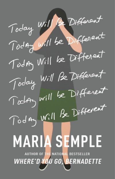
Maria Semple, Today Will Be Different, design by Kelly Blair, illustration by Geoff Mcfetridge
I love the hand-drawn title and Mcfetridge’s quiet yet complex artwork.
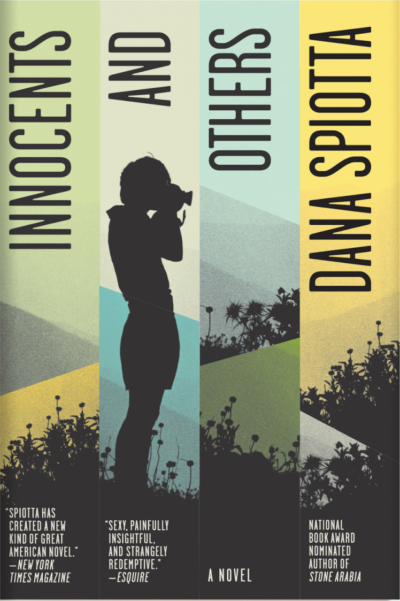
Dana Spiotta, Innocents and Others, design by Strick&Williams
I worked with Charlotte Strick (one half of Strick&Williams) on Jeff Vandermeer’s Southern Reach Trilogy. I love everything about this book cover. The colors, the type, silhouettes—it’s book-cover poetry. There is a great article on The Spine where Charlotte and Claire discuss the ideas for their design.
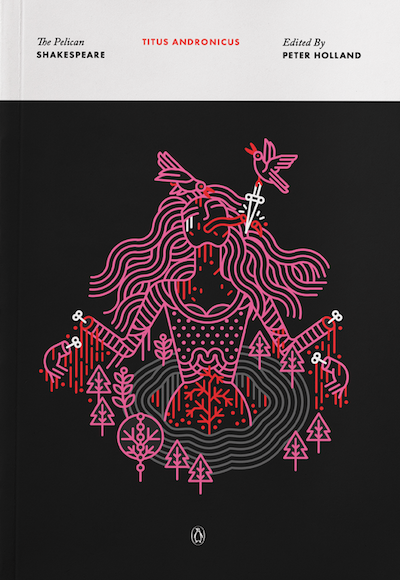
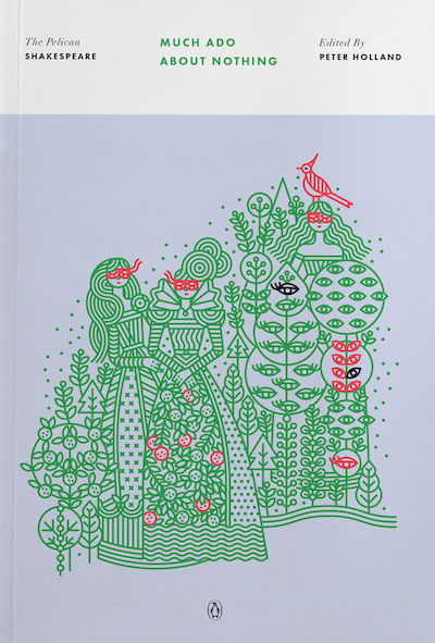
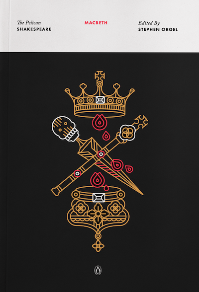
The Pelican Shakespeare Series, design by Paul Buckley, illustration by Manuja Waldia
I think there are about 18 of these beautiful Shakespeare titles designed by Penguin Creative Director Paul Buckley and illustrated by Manuja Waldia. Even before I actually started working with Paul on my own series (The Penguin Orange Collection), I was obsessed with these beautiful covers.
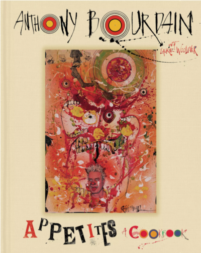
Anthony Bourdain, Appetites, design by Ralph Steadman
Ralph Steadman sets a rebellious gonzo inspired tone with expressive type, and a masterful portrait for Bourdain’s delightful collection of at-home recipes. I recently got to see a retrospective of Steadman’s work at the American Museum of Illustration, it was wonderful! It makes me happy that this book is out in the universe.

Chuck Klosterman, But What if We’re Wrong, design by Paul Sahre
One of those solutions that you experience and immediately feel yes, wow, of course. It’s so powerful because it’s so simple—everything is reduced to the one big move that no one has ever really done on a trade book cover. So strange, but clear and immediate and smart, but also a little understated. So Chuck Klosterman. So Paul Sahre.

David Salle, How to See, design by Peter Mendelsund
With its pop-art friendliness, the bold-colored type calls out to you and then screws your brain up for a few seconds. Again the simpleness allows for the one big disruption of expectations to be so powerful and jarring. Just like the Klosterman, the decision to not put the subtitle on the front cover allowed for the title and visual/formal concept to exist un-muddled.
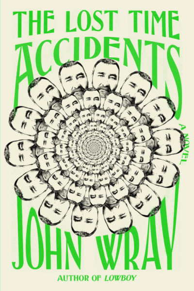
John Wray, The Lost Time Accidents, design by Janet Hansen
I remember smiling the first time I picked it up and really wanting to read it. Everything about it is perfect. The surreal absurdity of the very well crafted heads-vortex (the chin tucking between the heads!) plays so well off the expression of the face, promising something weird and wonderful. The bend of the type embraces the circular vortex of heads and creates a unified composition with such a lovely neon green/beige relationship. The touch of tension from the stretch of the type also bridges into the inward depth of the smaller heads.

Mark Greif, Against Everything, design by Kelly Blair
Another that grabbed me in the bookstore. The pressure of the type hitting the edges mixed with the dimensional flip flop tension of the construction, along with the beauty of the colors makes this Kelly Blair design a delight. Inside that tension and beauty the visual conundrum suggests something intellectually challenging but alive and good.

Andrew Matheson, Sick on You, design by Ben Denzer
This has that freshness of not feeling like another book cover. It’s bizarre and visually alive with idiosyncrasies in the lettering, but completely resolved as a formal composition. The turned photo and awkward naive lettering bring an over the top honesty to the glampunk outfits of the band, embracing the subject but hitting that tone of self-deprecating humor.

Rebecca Schiff, The Bed Moved, design by Janet Hansen
This deceptively simple cover stood out by a mile for me this year. So clean and clever. It’s one of those covers that you see and your stomach drops because you realize you’ve done nothing that even comes close! Grrr Janet Hansen!

Mike Roberts, Cannibals in Love, design by Na Kim
I love the way the type is handled on this cover. The photograph itself is a lovely concept and then the way the type is handled just lifts it to another level.

Jon Jodzio, Knockout, design by Matt Dorfman
This is just fun. There are now SOOO many hand-drawn covers with pencil drawings and drawn type, that it’s really hard to make anything new or interesting that way, but Matt has achieved that. It has a lot of energy and made me want to buy it.

Stuart Dybek, The Start of Something, design by Suzanne Dean, art by Marion de Man
For me this has parallels with The Bed Moved cover. It’s all about control of space and the way you read it. It’s a beautifully tactile cover too. Again, one I wish I’d done.

Brit Bennett, The Mothers, design by Rachel Willey
This cover won’t leave me alone. It came into my head the minute I was asked to write this list. I don’t quite know what it is I love about it but I do. The coloring? The overlay in the type? It’s attention grabbing and again, a little bit tactile and soft around the edges.

Mike Roberts, Cannibals in Love, design by Na Kim
This cover is like the crux of design genius. So simple and perfect, turning the type into an effect of the photo. It’s basically what I try to do when I sit down to design a cover, but usually fail at.

Janna Levin, Black Hole Blues, design by Janet Hansen
Beautiful and restrained. The design doesn’t require any tricks and there’s nothing fussy to it. It’s just a great idea that’s wonderfully executed.
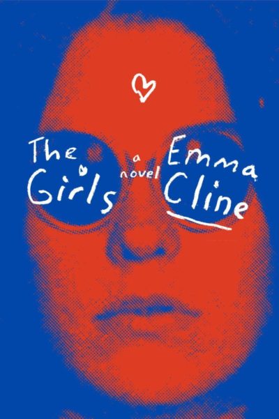
Emma Cline, The Girls, design by Peter Mendelsund
It’s edgy, striking, it doesn’t look like a “typical” book cover in its composition or execution. It’s a both a bit of a throwback and totally fresh at the same time. And the colors are buzzing in the BEST way.

Lara Vapnyar, Still Here, design by Michael Morris
I think what draws me most to this cover is that instead of it being bright/bold/graphic or all the other things that I typically rely on to make a striking cover, this design has such a strong sense of mood and place. Everything is giving off this ethereal, soft glow. It also all feels very purposeful and thoughtful, even the inclusion of “a novel” into the design.

Chuck Klosterman, But What if We’re Wrong, design by Paul Sahre
So smart! I was in the office when this cover was sent in and when it was first presented it was so clearly THE solution that it was hard to imagine the book with anything else.
I’ve chosen these five covers solely for their aesthetic appeal—I make no claims that they also capture the essence of the stories within. I just love looking at them, and they make me want to read the books themselves, which I think is the truest test of what makes a great cover.
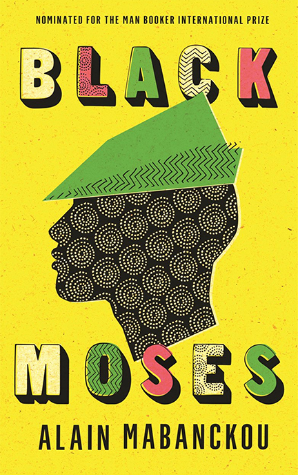
Alain Mabanckou, Black Moses, design by Gray318
I find this cover irresistible. It’s exuberant but also dignified, it’s retro but also fresh, and its cultural references are spot-on.
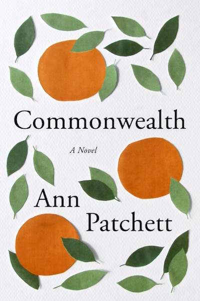
Ann Patchett, Commonwealth, design by Robin Bilardello
This cover shows how powerful and successful simplicity can be. It’s a breath of fresh air, and totally charming.
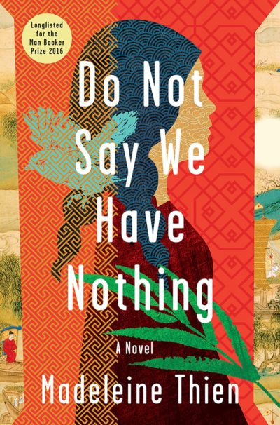
Madeleine Thien, Do Not Say We Have Nothing, design by Jaya Miceli
I love how intricately layered this cover is, each piece of art so different and beautiful on its own, each working with all the others to create a rich and gorgeous composition.

Chris Offutt, My Father, the Pornographer, design by Jamie Keenan
This cover is incredibly clever, and also great fun. I’ve admired it all year but I hadn’t noticed until selecting it for this post that the stack of books creates the profile of a man’s head.
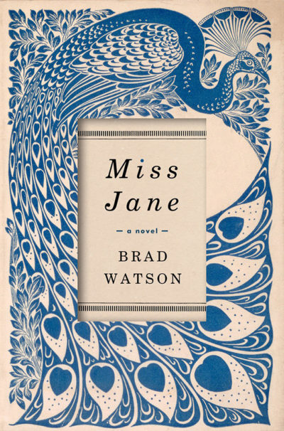
Brad Watson, Miss Jane, design by David High
I find this cover’s combination of flamboyance and propriety visually pleasing and intellectually intriguing.
Emily Temple
Emily Temple is the managing editor at Lit Hub. Her first novel, The Lightness, was published by William Morrow/HarperCollins in June 2020. You can buy it here.


