When You Have to Kill the Perfect Book Cover
Sara Wood on Designing Joseph Cassara's The House of Impossible Beauties
The projects that come across my desk as a cover designer at Ecco are diverse and always deeply engaging; they offer me countless opportunities to push myself not only as a designer, but also as a reader. I’m fully aware of how lucky I am in that regard—being in the book cover design business at all is such a privilege. I see my job as akin to being a sort of visual tour guide, leading a potential reader into the world that the author has created. What a lush, sparkling world I found in The House of Impossible Beauties by Joseph Cassara.
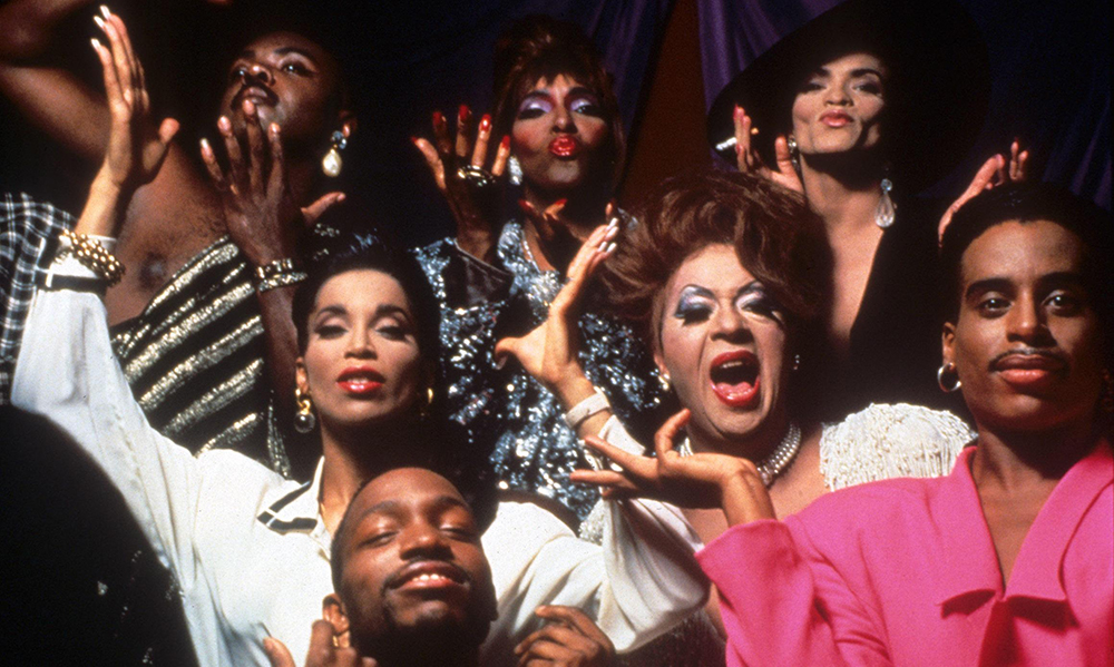
This debut novel is set in New York City’s underground ballroom scene of the 1980s, where LGBTQ youth would gather to flaunt their fiercest drag looks, shock each other with increasingly daring vogue styles, and experience a sense of community and inclusion that was often denied them in everyday life. The notorious real-life House of Xtravaganza—known for being the first all-Latinx house to enter the scene, in 1982—features most heavily in this story; you might recognize the name from the 1990 documentary Paris is Burning. Cassara took great inspiration from the key members of Xtravaganza, most of whom appear in Paris is Burning, and it’s clear that he also did an enormous amount of his own research into how those balls must have looked, sounded, and felt to a young, aspiring queen. Every page sizzles with the heat of those stage lights, and you come to fall head-over-heels in love with these characters—Venus, Angel, Juanito, and Daniel. You want to party with them, laugh with them, and protect them. Life for these young people comes with so many dangers, between the AIDS epidemic and the constant adversities of racism, homophobia, transphobia, and poverty, but these characters find joy and laughter in everything. This is a heartbreaking but hopeful story about unapologetic living, the power of chosen family, and always striving to pair grit with glitter.
My first approach to a cover always begins in my sketchbook. After reading the manuscript and taking brief notes, I begin drawing small thumbnail versions of loose cover ideas to work out composition and placement. This helps me to avoid getting mired in unnecessary details too early in the process. There is so much that I wanted to capture on this jacket, this was definitely an instance where I had to break it down to one overarching mood: I chose fa-bu-lo-si-ty.

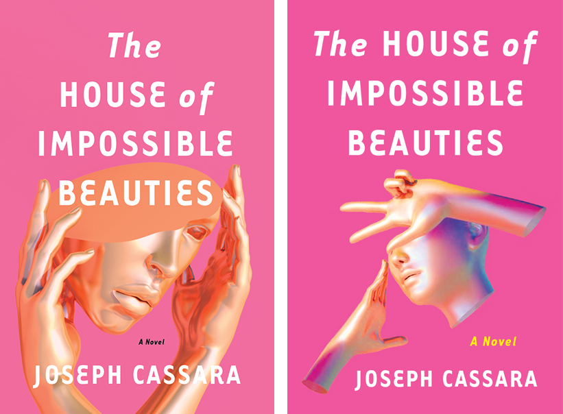
Voguing obviously came to mind—could I represent the graphic hand movements cleanly? Would it be readable and tell the reader exactly what he or she needed to know right away? I found the work of an illustrator named Blake Kathryn who creates these dreamlike 3D illustrations, and while I loved that these figures appeared to be voguing, something about the digital rendering looked a bit too sci-fi.
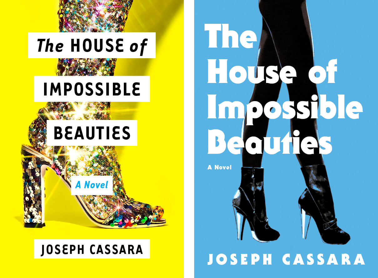
What about walking in the ball? Stomping down the catwalk in heels that could kill? Would that transport the reader? I found a great photo by one of my favorite photographers, Bobby Doherty, and also experimented with the work of fashion illustrator Francois Berthoud, and while they definitely captured fabulosity, I wasn’t getting enough of the magical feeling that a designer gets when they know that they’re on the right track. It’s nearly impossible to describe adequately, but perhaps it’s the moment when you know that you have something that will spark the perfect amount of curiosity in a potential reader. A good cover makes a viewer say, “Yes, nice! I see what you’ve done, very clever.” A great cover will make a viewer say, “OK, this is stunning. I MUST know why someone has put this on a book cover. Who/what/where/when/how?” I wasn’t there yet, and I knew it.
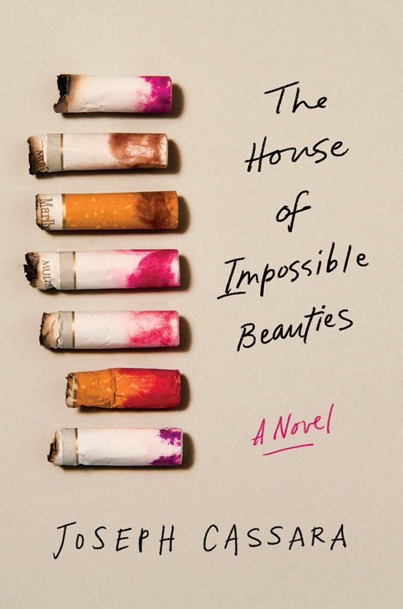
I wanted to try one more symbolic image, especially since a particular visual had been stuck in my head since I first read the manuscript: lipstick on a cigarette. It combined sexiness and grit in a way that I thought could look intimate and familiar. This photograph by Alessio Paniccia perfectly captured the fact that this story was about multiple characters having a shared experience. Unfortunately there just wasn’t enough brightness or power in the overall design. I needed to turn it up several notches.
The thought of using photographs of people was always going to be tricky—they couldn’t be too much of any particular thing, or it would be distracting. There had to be some ambiguity as to which character within the story the photo would actually represent, and universality is difficult to find. I knew that the lighting had to be spot-on, and thankfully I discovered the work of Aaron Feaver, who had an amazing series of high-glam, 80s-inflected club-like portraits from which I could choose.
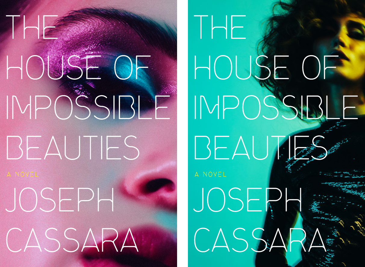
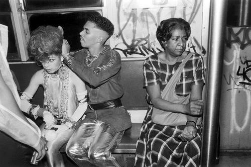
I still love these when I look at them now, but they’re too fashion-centric. Fab-u-lo-si-ty was there in spades, but I realized that what I really needed was more humanity. I had the great luck of stumbling across the photography of Florence & Nicolas on a blog somewhere (designers are like magpies—we’re constantly trawling art blogs and Tumblr pages, hoping to collect bits and bobs for future use), and saw one of the most affecting portraits that I’ve ever seen. It was so unimaginably perfect. There was androgyny, vulnerability, retro glamor, and a dynamic point of view. In this I saw Venus waiting in the wings, preparing to walk in a ball for the first time, with apprehension and adrenaline coursing through her veins. I wanted to reader to go where this photo was taking me.
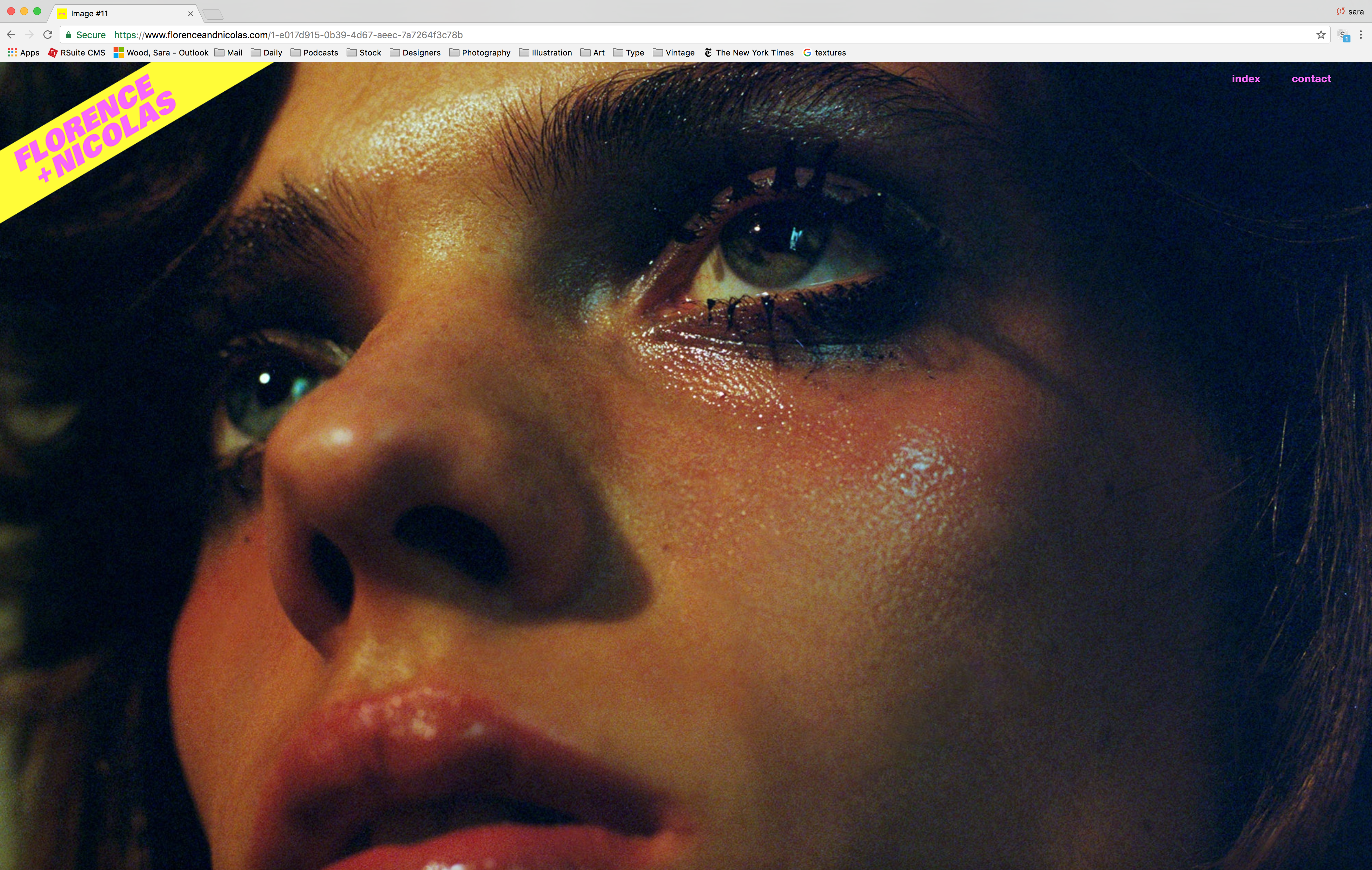
With the photographer’s permission, I put together a design using that image.
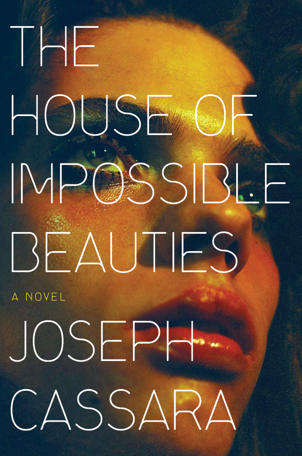
The editor loved it! The author loved it! I loved it! Success, on all fronts. When it came time to officially license the image, the photographer noted that he did not have a signed model release, which presented a legal obstacle to our use of the photo. No matter, I thought, I’ll just contact the model’s agency and seek a signed release. I was sure that it wouldn’t be a big deal.


It took the modeling agency 19 whole minutes to formulate that response. If you are thinking that I ever received further explanation, you are mistaken. “Info” was never heard from again—with or without punctuation.
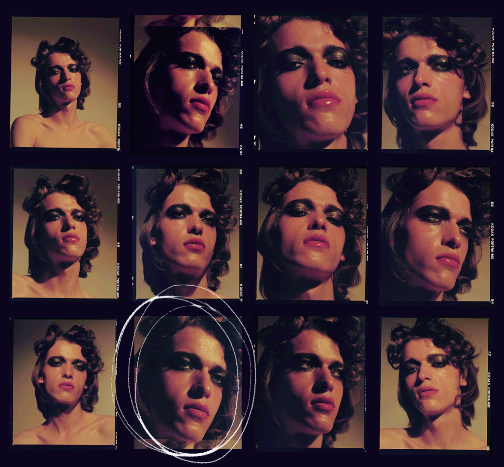
With the wind taken right out of our cover sails, it was clear that we had only one option: to re-shoot the image. Nicolas Coulomb of Florence & Nicolas was so incredibly patient and obliging with me throughout the process of filing paperwork, sending me models to choose from, and planning out the rush schedule for the new photoshoot in Paris, which I would kind-of-sort-of art direct from NYC. It took weeks and weeks of planning on what was already a pressed timeline, but Florence & Nicolas made magic happen. I was sent the following contact sheet, and I immediately knew that we had struck gold.
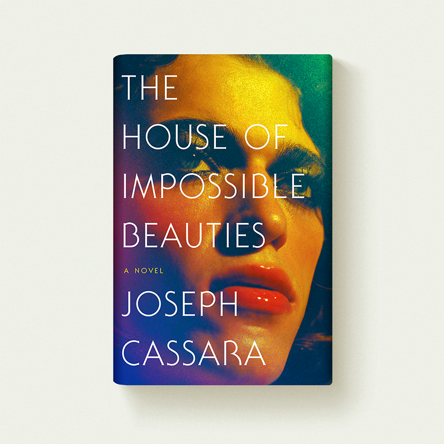
With some final color manipulations, we had our cover. It was a longer journey than I had expected, but I’m so happy with this jacket. We’ve printed it on pearlescent stock, which enhances the natural glow of the image. My work is done on this one, so I can only hope that the jacket draws readers into the world of Xtravaganza—it’s such an intoxicating place to be.
Sara Wood
Sara Wood is an associate art director at Ecco, an imprint of HarperCollins. She holds a BFA in Illustration from The University of the Arts and lives in Brooklyn.


