Secrets of the Book Designer: Creating Something From Nothing
Ben Denzer on Making His Way Out of the Blank Page
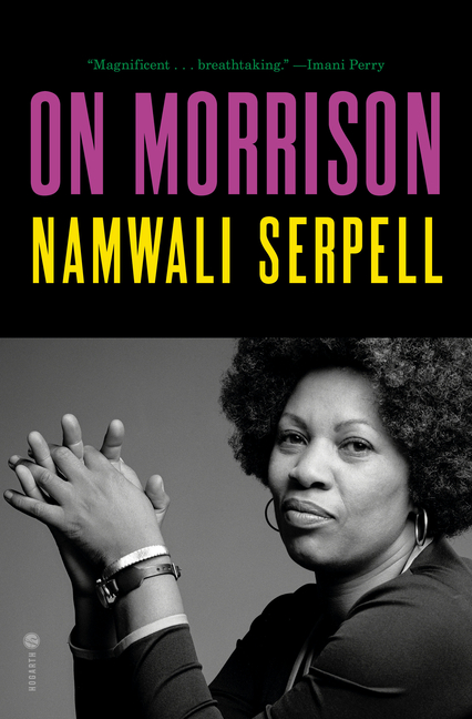
In designing a book cover, the how is more important than the what. The way something is visually rendered—in the form of typography, image, shape, pattern, color, etc.— is more important than what it symbolically represents. While content and meaning are obviously valuable, they come second to emotion and execution. First, the book has to be picked up. If the design does not get you there, the fact that the cover may perfectly encapsulate the text is irrelevant. It’s what the cover feels like that matters.
This is especially true for contemporary fiction, where more often than not a jacket simply needs to look big, important, and “warm”—this last term being a catch-all for “approachable,” “human,” and “covetable.” Something that is “warm” feels good and real. Conceptually straightforward, this can be tricky to achieve.
Designing on a computer is wonderful, but digital specificities make it easy to fall into unconsidered defaults (regular alignments, crisp edges, automatically spaced type, flatness, etc). While warmth can be created through the sheer force of good design—a harmonious relationship between the visual elements, an interesting composition, a beautiful typeface expertly employed, a cohesive color palate, etc— there are also helpful tricks. To infuse a feeling of humanity, Designers often work between the physical and the digital: composing on the computer, then bringing the design into the real world to be softened. While such softening effects can be created digitally, the easiest way to make something feel “real” is to actually do something real to it. A physical process adds the needed uncertainty to create reality. Tracing the type with a brush, cutting out and pasting elements, manually setting the type, using imperfect transferring techniques to add grit; each of these processes can add warmth.[1]
 Where the Water Goes, before and after cutting out the background shapes, layering them on multiple levels of Plexiglas over a light table, and photographing the result.
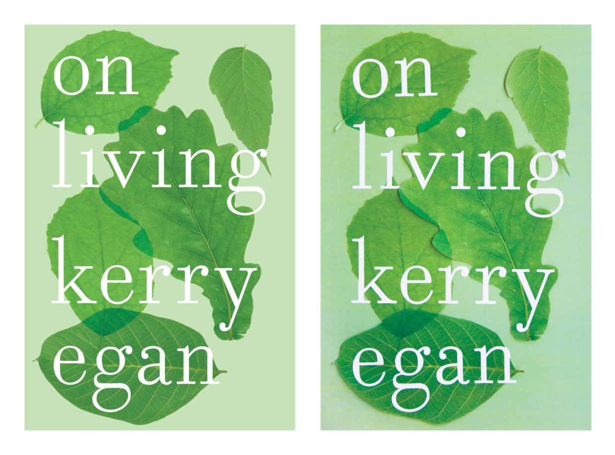 On Living, before and after cutting out each of the elements (type included) and photographing in natural light.
However, I often get stuck far before getting to this point. The problem is always how to start.
So instead of waiting until the end of a design process I can’t begin to add this feeling of reality, I use a physical process to initiate and influence my design. Rather than seek out a library of visual references to copy and modify (endlessly and helplessly scrolling through Pinterest), I look through the manuscript to find material and procedural references. On the most basic level, this means if the book is about water, I play with water.
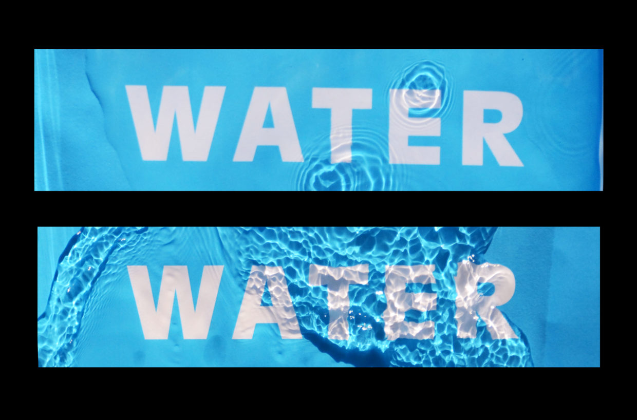
Things are usually not this direct. Often it’s a matter of finding a way to express an abstract theme or an emotional environment through a material.
These loose textual references are simply points of departure. A way to get something from nothing.
Physically experimenting makes me feel productive, even if nothing immediately comes of it. I can either stare anxiously at a blank computer screen, or I can assign myself a task. Given the choice, I’d rather spend a day carving type out of a block of foam, ripping up paper, or playing with layers of transparency on a light box.
Sometimes the process is successful. Sometimes it’s not. But if I physically make something, I can look at it from different angles, pinch it, twist it, crumple it up. Occasionally this will produce unexpected and exciting results. I’ll end up with a design I did not plan for.
By allowing myself to get lost in a physical process, I find decision-making comes more naturally. Rather than working linearly from concept to sketch to rough to final, I’m able to make design decisions on the fly, to iterate naturally and quickly as I discover new things.
Above all, it’s about trying to get somewhere different. Finding a way to accept the fact that I have no idea what I’m doing and using that to move forward and make something new.
[1] As a side note, this is one of the reasons pre-digital book covers often feel so great. When you had to set the type by hand you were forced to think about each letter consciously. Nothing is perfect (corners are a little rounded, the grit of a process is often just visible), but these slight imperfections add up to something that feels real and true. For great examples of this, visit the exhibition of George Salter’s (1897-1967) cover design work currently on display at the New York Center for Jewish History. Above all else, Salter’s covers are very “warm.”
Ben Denzer
Ben Denzer is a graphic designer at Penguin Press and a Scholar for the Advanced Studies in Book Arts at the Center for Book Arts. He also photographs ice cream on top of books.


