Secrets of the Book Designer: Collaboration is Key
Joanne O'Neill on Designing the Cover for Sunshine State
As a book cover designer, I create visual representations of other people’s words for a living. Like all artistic translations, this can be an elusive pursuit—but it’s almost always a rewarding one. My goal is always to make something beautiful and eye-catching, but also to capture the specific editorial vision for each cover. It is immensely gratifying when those two elements can fit hand in hand.
Last year, I was tasked with designing the cover for Sunshine State. A compelling mix of memoir and journalism, Sunshine State is a candid, soulful, and oftentimes dark collection of essays in which author Sarah Gerard reflects upon her adolescence in her home state of Florida.
Usually, when approaching a cover, I try to provide a variety of options to give the editor something to react against. There is always a favorite that I hope will be chosen, but I never really know which way things will go. I can be convinced that I have nailed a cover only to have it not be given so much as a glance next to others. When this happens, it is a sobering reminder that my favorite design is not necessarily what best represents the book. Selfishly, my favorite is often the one that I feel best represents my own taste and abilities as a designer.
But in the case of Sunshine State, the editor, Erin Wicks, already had a good idea in terms of where she wanted to go with the design. She asked me to explore just two specific directions.
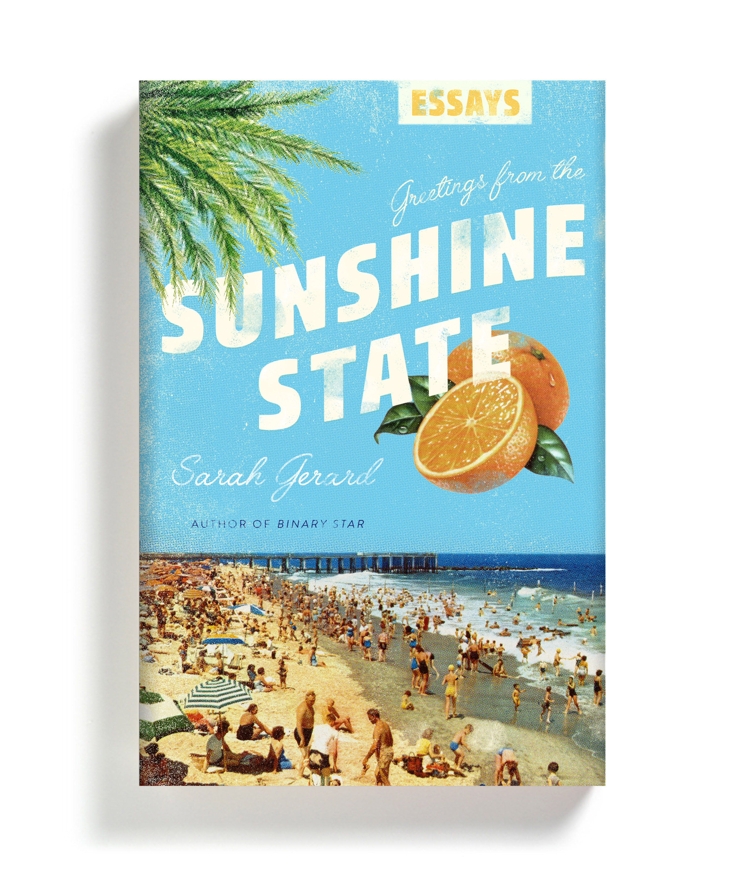
First, we tried a design akin to the classic souvenir large-letter postcards that popped up in the 1930s—a saturated landscape with some Floridian identifiers: the ocean, palm trees, citrus. The sunny beach juxtaposed with the not-always-so-sunny interior of the book is gently sarcastic, and is in keeping with the sense of nostalgia generated by the author in the essays. We wanted to take the overly optimistic title of the book and push it even further to contrast with the text, but the visual itself wound up feeling a bit expected. I tried an alternate version to counteract the sense of cliché, using a photo of a sunset with the silhouette of an oil rig in the foreground, but it still wasn’t quite right.

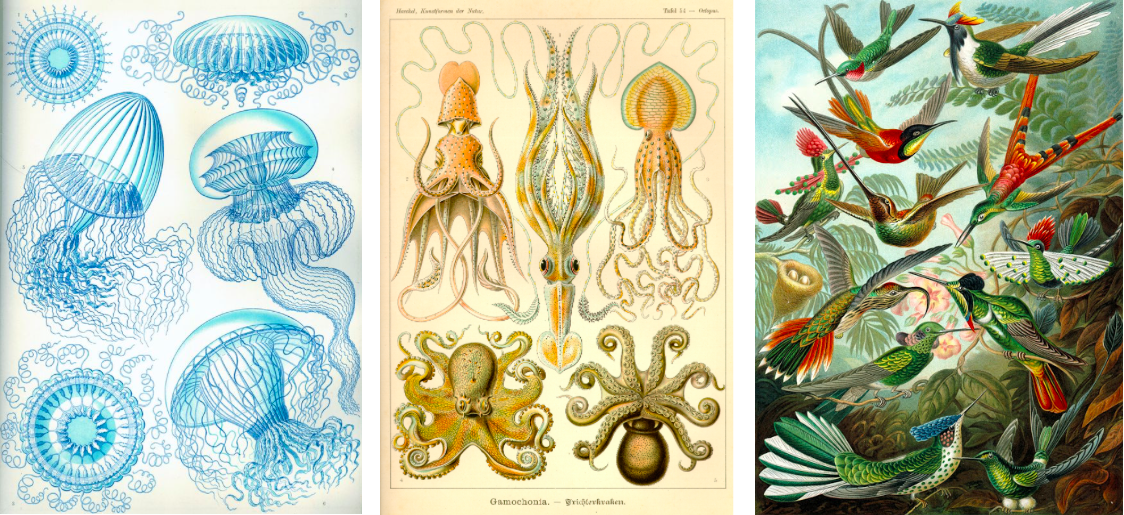
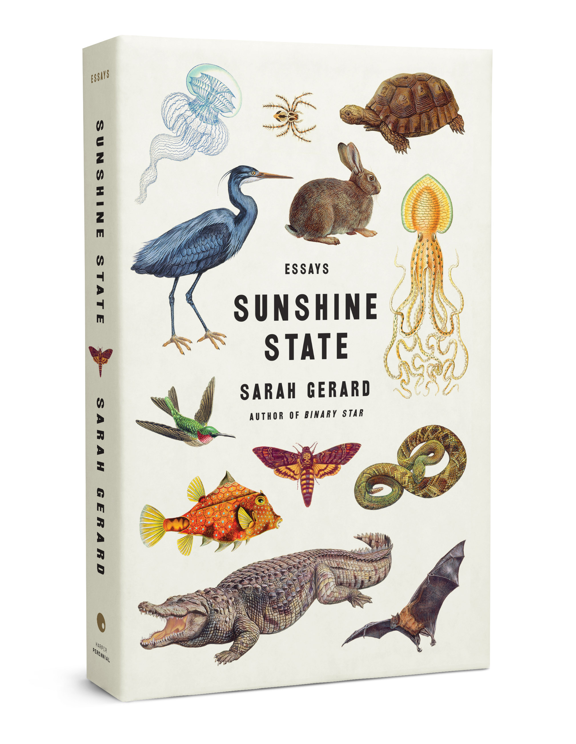
Erin’s second idea was to use the art of Ernst Haeckel. Haeckel was a 19th-century German biologist, philosopher, and artist, whose work was greatly admired by Charles Darwin, and who actually discovered many of the creatures he depicted in his beautiful illustrations. Animals feature heavily in Sunshine State, and I jumped at the chance to use Haeckel’s drawings; they have so much personality. Erin and Sarah gave me a list of animals that they felt related most to the book, and I hunted through Haeckel’s oeuvre to find the best examples of each. In the end, I opted to silhouette a number of different animals from a range of illustrations, dropping them on a white background. Though Haeckel’s originals are stunning, I thought this would help remove them from their original academic context. And while not all of the illustrations on the final cover are illustrated by Haeckel, I managed to locate other images of Floridian animals that matched his work stylistically. So often as designers, we represent the work of one artist by repurposing and re-contextualizing the work of another, and these artists—like Haeckel—are the unsung heroes of our work.
The cover for Sunshine State was approved very quickly, and I attribute that to editor and author input ahead of the design process. While I wouldn’t want to approach every cover this way (it is also enjoyable to start from scratch and come up with your own concepts), there is much to be said for trust and collaboration between editorial and design. It is clear that close collaboration can produce wonderful results.
Joanne O'Neill
Joanne O'Neill is a senior designer at HarperCollins.


