There’s so much in the title. Longing and irony; tension and sensuality. With the two D’s, one can just about hear a ruler slapping flesh. As with the rest of Fleur Jaeggy’s prose, the phrase is sharp enough to wound, but not without revealing some inner musculature.
I design book covers by trade, and titles are important. They’re often the first clue to the text. It’s astonishing how quickly imagery suggests itself. A designer’s mind has the ability to construct entire visual narratives from just a few words.
Not long ago, an art director at New Directions asked me to design a new cover for Fleur Jaeggy’s 1989 novel Sweet Days of Discipline. New Directions is a wonderful publisher to work with, one which tends to publish the kind of writer’s writer’s writers whose books benefit from unusual covers. In short, they allow us designers to feel like artists sometimes.
Jaeggy is one such writer, and before reading a word of this book I found its title beguiling. I should admit I was poised to love the novel; I’d designed and enjoyed several of Jaeggy’s other works; she was a chic, Swiss recluse who wrote in Italian; and perhaps most significant, her books bear a singular literary imprimatur: a Sontag blurb.
To make the process more enticing, I was given no hard deadline for my initial presentation of ideas. New Directions was updating the cover after several decades, which meant little pressure and ample time—an unusual freedom for a designer. It allowed me to do something extraordinary: read the novel and savor it.
So then why, once sitting down at my computer, did I find myself staring at an empty rectangle begging to be filled with ideas? How was it that this wonderful project became the most demanding in recent memory?
*
The novel is set in the 1950s, at a boarding school for girls in the mountains of Appenzell, Switzerland. It’s an institution populated with privileged children whose parents can’t be bothered. There’s an austere German frau. The narrator, whose point of telling is uncomfortably situated in the future, goes by Miss X. She’s named only halfway through the book, as a sort of formality, but as Jaeggy assures us in the chapter’s final sentence: Omission is not deceit.
Miss X has been a boarder at various schools since the age of eight. She’s determined to postpone true adventure until being in the world, as she imagines her grown-up existence. But adulthood and the world which furnishes its accommodations can’t possibly deliver on the dreams of youth. The narration aches with this fact, occasionally slipping tenses, as if the older X desires to more fully inhabit the past she’s describing.
X’s family is somewhere in Brazil; they send infrequent dispatches to see how she’s keeping up. I was studying French, German, and general culture. I wasn’t studying at all, she confesses to us. X is alone with her judgment, suffering the indignities of a simple German roommate. She’s an adolescent. But when an inscrutable new student named Frédérique arrives, the narrator becomes obsessed with her. X’s sights are trained on this elegant creature; it’s not enough to simply befriend Frédérique, she must conquer her. Conquering becomes a refrain.
*
I received no additional directives with the old copy of the book that the art director sent over. I could take months and months if I wanted. The lone imperative was my own: the novel was a masterpiece, and had to be represented as such.
As I read, I dog-eared pages with unusual frequency. At certain moments, I actually forgot that I had a job to do. The novel is short, just about a hundred pages, and in a subsequent reading I marked up the margins more thoroughly (In contrast, I often can’t bring myself to read even thirty pages of a novel I’m designing, much less annotate it). From the start, Jaeggy’s sentences were evocative, containing troves of imagery and symbols to be wielded. An early description of Frédérique resonated with visual potential; it involved her orderliness, from cupboards to handwriting, and the narrator, in a temporal leap, admits:
“And I still write like Frédérique today, and people tell me I have beautiful, interesting handwriting. They don’t know how hard I worked at it.”
Pages later, X describes brushing her hair before the mirror: a hundred brush strokes. This description was conversant with the idea of writing, how it pursued an ideal. Penmanship is style after all, and traces of our inner lives can escape in ink.
The idea of rote repetition in service of emulation was a compelling one. It hinted at further metaphorical possibilities. Signatures abound in Jaeggy’s work, in things as much as people, and this led me towards a kind of composite image. I drew a thinly outlined face, Frédérique’s perhaps (but just as easily X’s), thinking about the ways in which children are taught cursive. I’ve always loved the diagrammatic vernacular of cursive charts. I wondered what a figure would look like rendered using those wonderful loops:
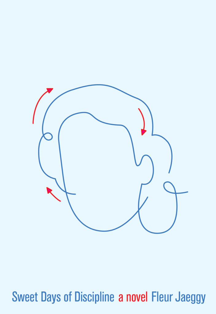
There was something unsettling about the featureless face; it was eerie in a way that felt accurate. It’s not clear what one hopes to gain by copying another’s writing, but I suppose the gain is in the act, the rhythm of impressions. What’s more was the added element of memory in the anonymous face. It called the stability of mental pictures into question. This felt an important aspect to convey: How faithfully can we call to mind the people closest to us?
It seemed fitting, also, to try writing out the title by hand. At the very least as an alternate option. I soon realized that the cover, in showing the act of writing itself, was capturing action in a distinct way. The paper I was filling might appear an artifact from the text, rather than an idea construing it. It signaled practice as much as punishment. I exhausted many sheets of loose leaf, thinking about how the cursive described the contours of an obsession:
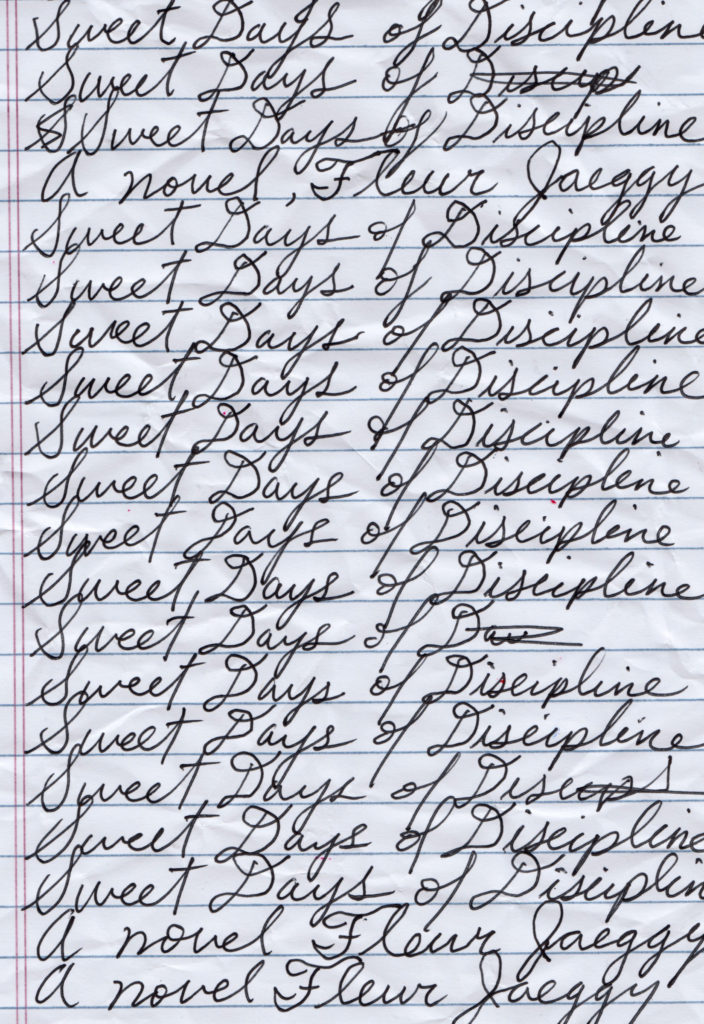
One problem was that this visual territory was well-trodden. Being derivative is an occupational hazard, but my idea felt authentic enough to the book to continue exploring. I realized another issue shortly thereafter, which was that my handwriting wasn’t even close to worthy of a precocious European child. Another potential pitfall: the paper used in post-war Switzerland was probably of a different sort than was readily available at Duane Reade. Historical continuity be damned! I had more than one idea.
*
Jaeggy’s prose can be dark. Beautifully dark. The novel is a crypt-like chamber of echoes, and death is never further than a few sentences away. This imbues the mostly adolescent story with a grim, comic hue. A locker is described as a dear little mortuary of our thoughts; a girl has votive hands; minds are a series of graves in a wall. There’s a moment where black cars are shuttling students away at the end of term in a sinister procession. Between these sentences are succinct vigils for the moments lost to time.
Memories are almost ghosts. It wasn’t long before I began contemplating my own, and again, the notion of a face came to me. A ghostly face, an old friend whom I hadn’t seen in decades, and I imagined it had suffered wear with each conjuring. There’s an agony to it. Next, I thought about X and Frédérique trapped by the walls of a classroom. Finally, the scene of Frédérique’s departure from school:
“Farewells have distant ancestors and the hills and fields cover them with chaff and dust.”
Dust. Dust is diffuse. Dusty is how one might describe an old chalkboard—the palimpsest it becomes after years of erasure. From there, the work was painstaking, but rewarding:
The rendering was spooky, and it seemed to resolve various elements of the novel in an interesting way. As before, it didn’t matter whose image I was representing because the space for interpretation was vital. And besides, the boundaries between our idea of ourselves and others is often porous:
“. . . I’ll let myself imagine that it’s her dictating this story, or writing it, laughing in her caustic way. I also have an inexplicable premonition that the story has already been written. Is finished. Like our lives.”
*
I left the designs to themselves for a day or so, let the dust settle. The following morning, I emailed the initial drafts off to the art director. I waited. Waiting is excruciating work.
For the sake of brevity and some preservation of dignity, I’ll paraphrase: the covers weren’t quite right.
This is not unusual. I’m long inured to rejection; I traffic in it. But this time the failure was more significant. It stung. I suspect this had to do with the fact that deep down I knew the feedback to be true, but also the feeling that I’d failed the novel somehow.
So I returned to the drawing board—just no chalk this time.
*
I’d put a star beside a sentence I thought to be a perfect distillation of the book: Idyll and death in a graceful whirling. I was happy to be reminded of this duality, that the novel isn’t strictly morbid. Jaeggy’s sentences are elegiac, but also capable of breathtaking turns toward wonder:
“Outside, if the moon and stars were up, lay a visionary desert.”
Beauty is beheld, and of course it is, because what else would be left to mourn?
Often, snow falls on the Appenzell. It caps the mountains and blankets the hillside in white. A veil. Miss X goes on morning walks, an important ritual during which she flirts with the world beyond without having to be in it. The pastoral scene surrounding the school is like an ethereal buffer from the effects of totalitarianism and World War II, but also from growing old. Nature isolates X’s experience, protects it from the brutality of time.
Fleur means flower in French, and flowers are a recurring motif in the text. They sprout from the soil of the void. There’s an obvious risk in exploring the imagery: I didn’t want to seem cheeky with regard to the author’s name. While remaining wary, I was convinced in my ability to honor the poetry of the prose without committing a nominal offense.
I could see X picking a flower on a springtime walk. Perhaps she’d pull it apart or stow it away as an ironic keepsake. Before long, I was dissembling the flower in my head, reminded of yet another potent metaphor from late in the novel:
“All those girls we knew have infiltrated our minds, became a tribe; and they come back to us in a sort of posthumous flowering.”
It’s a scene in which X is looking at an anonymous photograph of a girl. In the moment, she is whisked to a time when she was eight and just beginning her life as a boarder. The memory is remote and formative; it’s the scene from which the novel’s title derives. We find our sisters in their faces, she writes. It was seamless how the petals gave way to eyelids:

This version contained a missing aspect of prior attempts. Though strange and anthropomorphic, the image uses explicitly human elements. There’s tactility to the collage, and the handwriting was free from the rigor of baselines, and wilder for it. It evoked the spirit beneath the surface, I thought, the inner life that Frédérique and X masked beneath their orderliness. Despair and latent desire. But the image was ironic, too, a little oblique maybe, capturing bits of the mischief which peeks its nose onto the pages of the novel. I hoped this cover conveyed something of the secret language that develops at boarding school, the lingua franca indecipherable to parents, instructors, and even the reader.
I’ll admit that this cover makes use of material that threatened me in the book. I couldn’t help but return to the worst of my adolescent torments: unrequited crushes, infatuations and all that was said behind my back. I mean, even my adult self was intimidated by these tweens who knew their Baudelaire. But this is also something I relish about Jaeggy; how the men in her novel—beyond those of the canon—are described with a ruthless, double-charged wit, issuing from both ends of time. They’re withered, weak, and cripples. One such lad tries to land a kiss with a clumsy proffering of the lips. These feckless dudes hover at the novel’s periphery, insignificant to the cool eyes of the girls.
And soon I realized that I was among the men, my own hapless tribe. I’d been unable, again, to adequately portray the book. Very smartly, the editor thought it ill-advised to bring Fleur and flower in such close contact. The design wasn’t worth the risk.
*
I thought back to an instinct I’d had when initially tossing the title around: a strictly typographic design, reminiscent of a 1970’s Roth or Morrison jacket, emboldened by how unadorned it was. But even with so many false starts, I couldn’t abide simply setting the title in an elegant typeface. It felt like a cop-out.
Or perhaps the project was better off with another designer—a new pair of eyes who wouldn’t put pupil-petals on a cover.
Selfishly, I refused to give up. I was incapable of bearing someone else’s interpretation of this book I loved. I forged ahead, and as if to further taunt me, a sentence poked me in the eye:
“Order was like ideas, something you possessed, something that possessed you.”
Again, I returned to the title, repeating it over and over as I awaited possession. My next thought was to seek aid in the form of a different book altogether, a book whose title shares a word: Foucault’s Discipline and Punish. I skimmed the famous opening where the regicide is drawn and quartered in spectacular fashion. Fleur can be savage, describing her characters with glints of violence, but nothing so gruesome. But in going back to Foucault, I remembered what was more striking than the brutally described scene. The first words of the paragraph directly following it mention a time-table. Time is drawn and quartered. Charts, grids, schedules, all of the schematics through which we process our lives. It’s impossible to separate the idea of a Wednesday from its middling position in the calendar. In fact, the little rectangle, if flipped, resembled the small, white canvas glowing on my computer screen.
I began by making a mock schedule: a grid of fine, institutional-grade lines. I wanted it to feel constraining, orderly, a bit oppressive. I also needed another element with which it could interact. A figure being imposed upon? X perhaps? Whomever it was, the goal was to articulate the current of repressed emotion beyond the grid.
I searched for mid-century school portraits and found a version that felt suitable enough. In Photoshop, I applied a blurring effect that caused the image to recede, diminish:
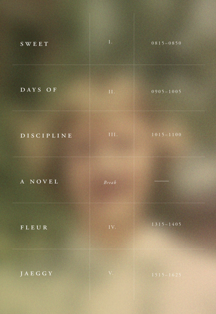
There was much that I noticed in this cover: a face through a fence, a cell, or simply someone faceted by a schedule. Whatever the case, the warmth of this diffuse human form was beyond containment, determined to evade a schedule’s subtle tyranny. There was also the way the typography fit seamlessly into the rows. I imagined Frédérique and X in class—all that was left unsaid between them.
I’d have to give Foucault a co-credit on the back cover, I thought, but I sent it off to the art director with confidence. Some time later, I read a few lines of the response. My concept was appreciated—the design in itself was great—but the figure was too vague, and not elegant enough. The girl represented should be more clearly chic. Desirable.
*
It’s impossible to say everything on a cover. Fiction is complex, and especially when a book resonates, it becomes difficult to decide which parts of the narrative to broadcast. This is precisely why a cover can never be right; there are only degrees of error. I’m not just saying this to couch my ineptitude—I really believe it.
I used to work in the art department of a major publishing house, where designing covers under conditions demanded by the market could be brutal. As designers, we’re commercial artists, sure, but it’s nevertheless chastening to be reminded.
Being afforded the freedom to create was a rare privilege. I imagine someone in a marketing department somewhere scoffing at the suggestion. In hindsight, as I faced an interminable project of my own failures before me, I felt desperate. Like Miss X, I needed to conquer it. I wanted direction, or limitations, or at the very least, someone to prune my delusions.
I began to think about the past, the ways in which I might start designing an anticipated literary debut, say, or some thriller with an eye cast on the best-seller list. I could nearly hear the request whispered over my shoulder: We want that Big Book look. At least with that kind of request, I knew certain things were out of bounds. No small type, nothing alienating or overly complicated. I wanted to feel the gust of relief that follows a fall of submission. I was longing for my own sweet days.
*
I surveyed the state of affairs, deciding to accept my wayward attempts as boundary markers. I had, at the very least, some guidelines. I would heed the last bit of criticism and focus on character. I had to put on Frédérique the cover, the object of obsession herself, and it felt necessary to position the reader in X’s vantage of pursuit. The difference this time was that I’d be direct in doing so. There was no more time for obfuscation.
I thought about the beautiful, tortured young aesthete just beyond X’s grasp. Frédérique’s appeal was how her unknowability made her dangerous, yes, but a part of that was her effortless style. Her cool indifference. This brought me back to still more instances of Jaeggy’s incision—the mordant humor with which she cuts the sorrow:
“We, perhaps, were still innocent. And perhaps innocence has something crude, pedantic, and affected about it, as if we were all dressed in plus fours and long socks.”
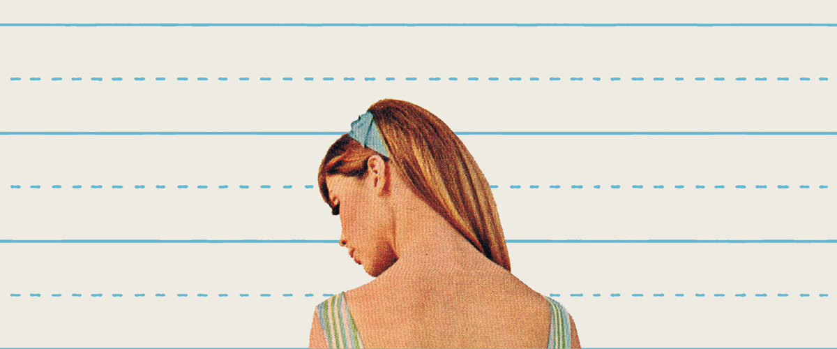
Swoon. I remembered the way she reserved precision for fashion, dressing her characters up and down. This led me to search the internet for clothing catalogues and fashion magazines from the period. I found a few pages with promise, and began to pull and isolate figures, setting them in a new context. I intended to keep some of the stricture, the discipline, and decided on the generic line-pattern of notebook paper as a worthy design element. It succeeded in preserving some tension. I placed my Frédérique analogue in the center of the cover, and felt a jolt:
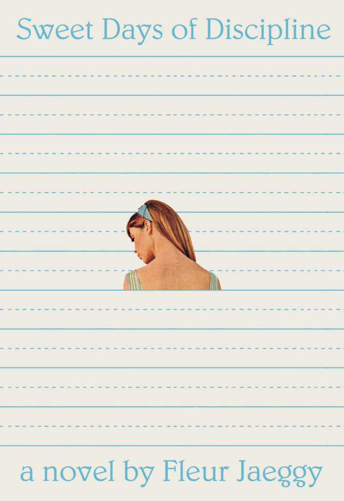
The disclosure of skin was the missing sensual charge. She looked vulnerable, a posture often reserved for unsuspecting moments. The framing of X’s obsession was always one of conquering, and as such, the figure was prey. There was Frédérique, set amid the sea of straight lines, clearer to us than she’d ever again be to X.
*
I sent an email with this new option attached. A sentence-long preamble described my idea. If all goes well, I thought, the description wouldn’t matter. Conversely, it might help tip the scales if the design was met with ambivalence.
The response was quick: everyone at New Directions loved it. I was relieved and maybe thrilled. The cover felt like a successful summary of this gorgeous, complicated little book. It was my summary.
I thought then, of perhaps my favorite admission from the novel: Cheerfulness is difficult to handle. I couldn’t help myself.