For what is now the seventh time in a row, I am pleased to present the best book covers of the year—as chosen by some of the industry’s best book cover designers.
This year, I asked 31 designers to share their favorite covers of the year, and they came back with a grand total of 103 covers, representing work by 62 different designers for 54 different imprints. Their choices, and their comments, are below.
But first . . . the stats.
The stats:
The best of the best book covers:
First place (tie, six mentions each):
Elias Canetti, I Want to Keep Smashing Myself Until I Am Whole
design by Alex Merto, illustration by Ian Woods (Picador, September 27)
Tess Gunty, The Rabbit Hutch
design by Linda Huang (Knopf, August 2)
*
Second place (three-way tie, five mentions each):
Fernando A. Flores, Valleyesque
design and illustration by Na Kim (MCD x FSG Originals, May 3)
Charles Simic, No Land in Sight
design by John Gall (Knopf, August 9)
Lidia Yuknavitch, Thrust
design by Lauren Peters-Collaer (Riverhead, June 28)
*
Third place (nine-way tie (!), four mentions each):
Michael Cunningham/Virginia Woolf, The Hours/Mrs. Dalloway
design by Pablo Delcan (Picador, May 3)
Katherine J. Chen, Joan
design by Holly Ovenden (Hodder & Stoughton, July 5)
Missouri Williams, The Doloriad
design by Luke Bird (Dead Ink, March 3)
Jem Calder, Reward System
design by Alex Merto (FSG, July 19)
Yiyun Li, The Book of Goose
design by Na Kim (FSG, September 20)
Maayan Eitan, Love
design by Stephanie Ross (Penguin Press, March 8)
Gwen E. Kirby, Shit Cassandra Saw
design and illustration by Lydia Ortiz (Penguin Books, January 11)
Sheila Heti, Pure Colour
design by Na Kim (FSG, February 13)
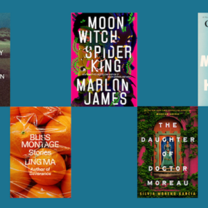
Ling Ma, Bliss Montage
design by Rodrigo Corral (FSG, September 13)
The presses with the most covers on the list:
First Place (13 mentions): FSG
Second Place (11 mentions): Knopf
Third Place (8 mentions): New Directions
The designers with the most different covers on the list:
First Place (7 covers): Janet Hansen
Second Place (6 covers): Na Kim
Third Place (5 covers): Alex Merto
The best month for book covers:
First Place (tie, 12 covers each): May, September
Second Place (11 covers): June
Third Place (10 covers): April
The full list:
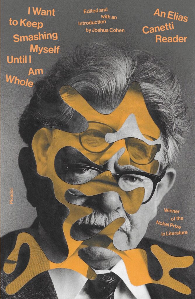 Elias Canetti, I Want to Keep Smashing Myself Until I Am Whole, design by Alex Merto, illustration by Ian Woods (Picador, September 27)
I can’t stop looking at this eye-bending collage. Love how the hectic, unsettled type complements the art, channels the title really well, and manages to get quite a lot of copy onto the cover. Neon orange is a great touch.
This is such a fun cover. I love the brain-like cutout and the playful, head-smashing type treatment.
This cover looks like its title; smashed yet whole.
How? What? It’s insane. I love it.
Alex has somehow woven together two images with a shape that isn’t exactly conventional and set the type playfully without making the whole thing look like a messy plate of spaghetti. He is in complete control of his craft.
Alex! I want to keep staring at your collage to see how you did this.
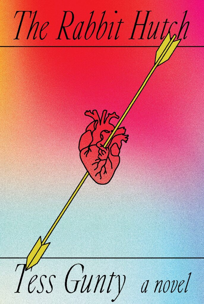 Tess Gunty, The Rabbit Hutch, design by Linda Huang (Knopf, August 2)
When I first saw this I was blown away by Linda’s use of color, texture, negative space, and the delicately balanced typography and illustration. The jacket is printed on a lithofoil stock that gives it that extra special sheen. Not only did the author win the NBA for fiction, but she was also given one of the most beautiful covers of the year.
These bright colors suck me in when viewed in RGB, and the design gets “even better” when experienced IRL, printed on that lovely metallic paper.
I am instantly pulled in by the bright colors and symbolic design. I want this as an art print on my wall.
It’s always nice to see special effects being used thoughtfully. That gradient plus shimmer is beautiful.
“Shot through the heart and you’re to blame” taken literally.
This cover just stands out so much online and on the shelf. The bold composition + foil + soft touch, it’s a stunner.
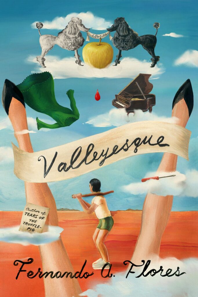 Fernando A. Flores, Valleyesque, design and illustration by Na Kim (MCD x FSG Originals, May 3)
Na is such a talent in both design and illustration. This cover really shows how skilled she is in both worlds.
Valleyesque received a well deserved gasp from me. With a palette and style that connects you to some of the paintings of Hieronymus Bosch and in a similar fashion, begs you to look closer at the tiny details and intrigues you to want to learn more.
If I could dictate the visual language of my dreams, this is what I would choose every single time (complete with banner-wielding poodles).
I truly cannot get over this surreal, incredible art.
Every element in this dreamlike painting is treated with such balance and thought, creating deep intrigue.
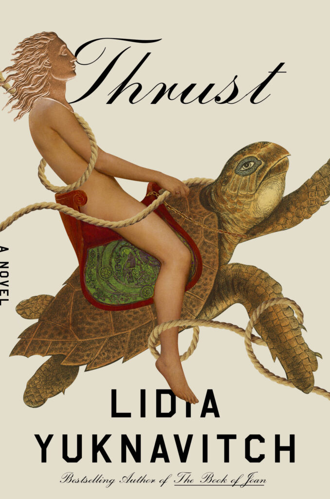 Lidia Yuknavitch, Thrust, design by Lauren Peters-Collaer (Riverhead, June 28)
Thrust is perfection. Each collaged detail feels like it belongs exactly where it is. The combination of textures, styles, the two contrasting typefaces sent me marching to the store.
This design is bonkers in the best way possible. Every moment here, from the image to the typography, is fresh and unexpected.
I have no idea what is happening and I love it.
Such a fun and intriguing collage with a ton of upward momentum. Somehow the clashing typography adds to that sense of kinetic energy too.
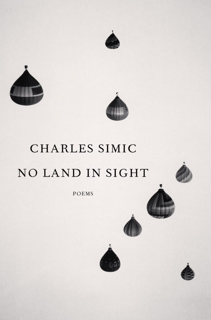 Charles Simic, No Land in Sight, design by John Gall (Knopf, August 9)
I love how the upside down balloons look like raindrops or tears. Really fantastic cover design made to look really easy.
Such wonderful simplicity. Each time I look at it I can sense my brain processing it all—everything clicking into place with delight. As an aside, I highly recommend everyone watch a hot air balloon inflate at least once in their life. They are like dinosaurs roaming the sky.
Effortlessly beautiful and dreamlike.
The simple move of turning an image upside down is so powerful here, especially paired with the title.
Great design, though I spotted a printer error; the photo is upside down. Awkward.
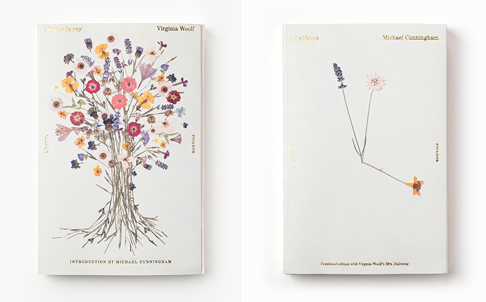 Michael Cunningham/Virginia Woolf, The Hours/Mrs. Dalloway, repackage design by Pablo Delcan (Picador, May 3)
Such a beauty! The pressed flowers with the gold foil type is so sweet and lovely. A true object to treasure.
Simply beautiful.
These made me shriek. Exquisitely executed, ethereal, and clever, they exist in the realm of fine art. Pablo makes everyone jealous.
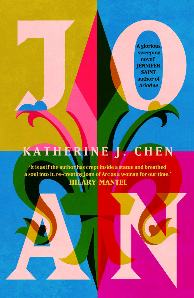 Katherine J. Chen, Joan, design by Holly Ovenden (Hodder & Stoughton, July 5)
Printed on uncoated stock with deboss on the type, I want this book just for the beautiful jacket. Holly is an amazing designer and illustrator, and this is my favorite cover of the year from the UK.
This stunning cover reimagines the subject of Joan of Arc in such a powerful way. The type and colors are so unexpected and pack such a bold punch.
Ah the colours…they are glorious. It’s very satisfying when type works as an image within a cover; it’s such a pleasing composition, a real beauty, as are all of Holly’s designs.
The colors are stunning—feels energizing to just look at! It captures the spirit of Joan of Arc in such a fresh and dynamic way.
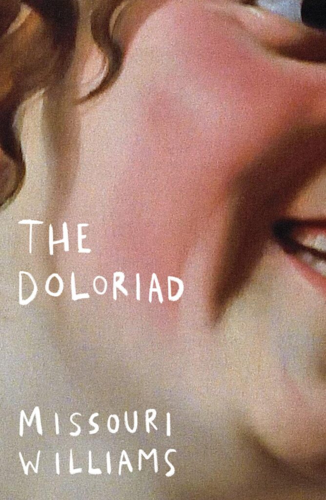 Missouri Williams, The Doloriad, design by Luke Bird (Dead Ink, March 3)
I couldn’t work out if it was a contemporary artwork or an old painting, whether the person is unhinged or if it is just the crop playing tricks on me. It’s so engrossing, and sets the tone for what sounds like a mad book without giving anything away.
The reviews of this book all use words like “bizarre”, “unsettling”, “disturbing” or “challenging”—they could be reviewing the cover too. “Brilliant.”
The power of a great crop! It’s so effectively unsettling and compelling.
The cropping and lettering is perfection.
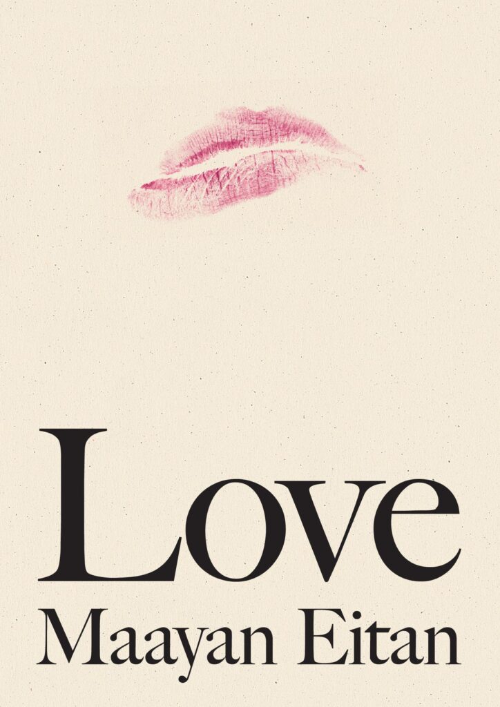 Maayan Eitan, Love, design by Stephanie Ross (Penguin Press, March 8)
The simplicity in this is striking. Perfect example of less is more.
So simple, elegant, and perfect.
Stephanie takes what would otherwise be a clichéd icon and subverts it with that slight grimace. The placement in the mass of negative space and the choice of a rough-hewn serif elicit in me a feeling of mono no aware, something design rarely does.
Looking easy is very hard.
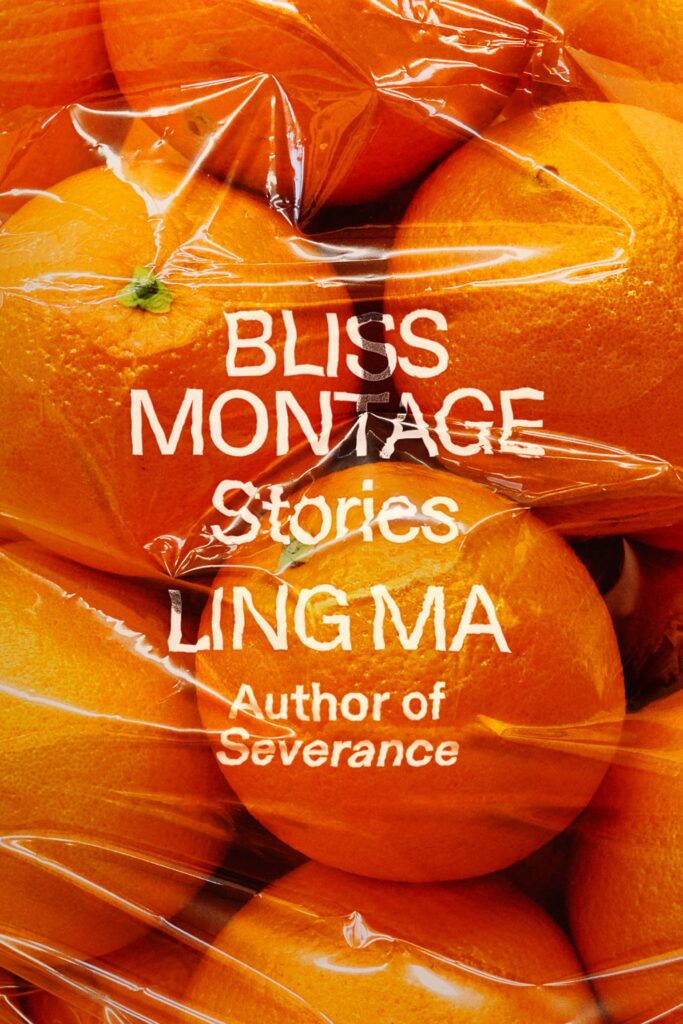 Ling Ma, Bliss Montage, design by Rodrigo Corral (FSG, September 13)
You can almost smell this cover. Amazing.
So vibrant! This cover hits all the senses! (Get your hands on a copy for the glowing color, glossy finish, and raised type!)
Just so brilliantly executed.
The distorted type is perfect. It feels like you’re suffocating in a bag of oranges and need to get out.
 Jem Calder, Reward System, design by Alex Merto (FSG, July 19)
Simple. Clever. Ominous.
Just the sight of that spinning wheel makes me feel slightly anxious (it seems to move now and again, too). This is such a simple cover, but with such a lot going on.
So clever!
I just stare at it waiting for the cover to load… Well played…
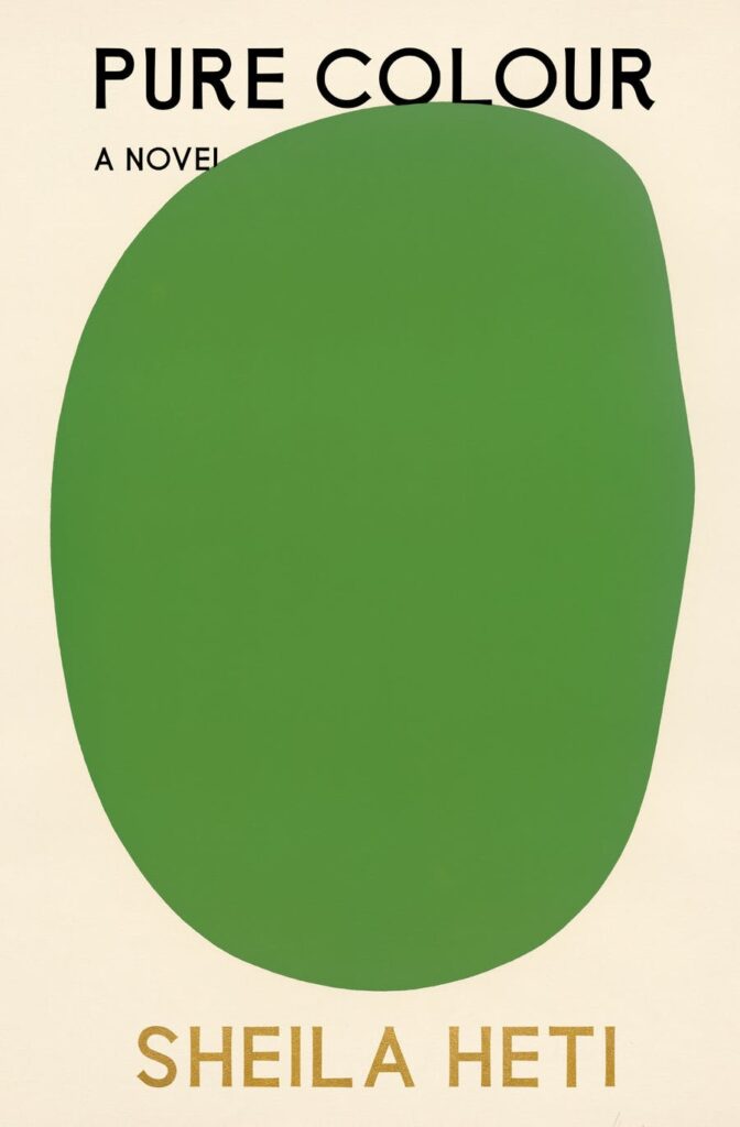 Sheila Heti, Pure Colour, design by Na Kim (FSG, February 13)
There is always a tension you have to interrogate as to how you want to communicate the title of a book. What Na Kim did with this cover was take one of the most direct routes possible while still leaving room for ambiguity with the shape and placement of Ellsworth Kelly’s art. No small feat for a title this simple.
The simplicity and minimalism of this design is so satisfying.
I love the way the green blob almost seems like a monster overtaking the title, and the way it just barely overlaps with the “L” in “NOVEL” is perfection.
It’s so elegantly done. Ellsworth Kelly’s Green crowding out the text on the cover somehow feels exactly like the book does; a crowded petri dish of emotions.
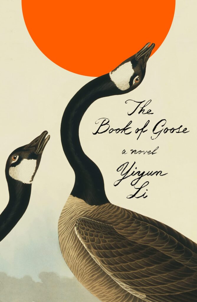 Yiyun Li, The Book of Goose, design by Na Kim (FSG, September 20)
Euurgh its just SO beautiful. Perfection. But what else would you expect from Na Kim? I don’t just want to read it… I want it on my wall too.
Love how all the elements interact with each other.
Na is great at creating simple yet emotive covers. The mix of the Audubon-esque art and the graphic sun gives this cover a nice contemporary yet elegant look.
Gorgeous. There’s something about a goose neck.
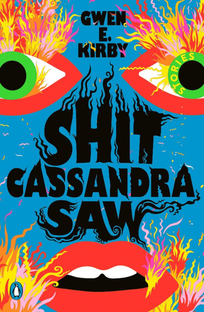 Gwen E. Kirby, Shit Cassandra Saw; design and illustration by Lydia Ortiz (Penguin Books, January 11)
I can’t imagine what those burning eyes saw. The type on fire and mouth slightly open seals the deal for this one.
Hell yes.
Crazy! Love it.
Frantic to the max and I just love looking at this. Its also worth nothing that getting this to print so vibrantly was no small challenge.
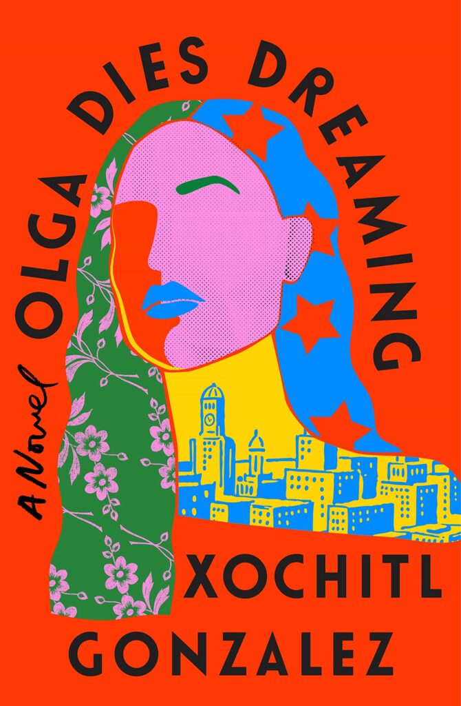 Xochitl Gonzalez, Olga Dies Dreaming, design by Lauren Peters-Collaer (Flatiron, January 4)
I was so relieved to realize this beautiful book was published in early January, and that I could include it on this list! It was an instant favorite of mine—the balance of pattern, color, and texture is just perfect. The elements work well on their own and come together in a wonderful whole.
LPC does it again! Everything about this cover is incredible: the colors, the collage of imagery, the typography! It’s nuanced and packs a punch at the same time.
I think this one took everyone’s breath away when it came out—the colors, the type, it all works beautifully together.
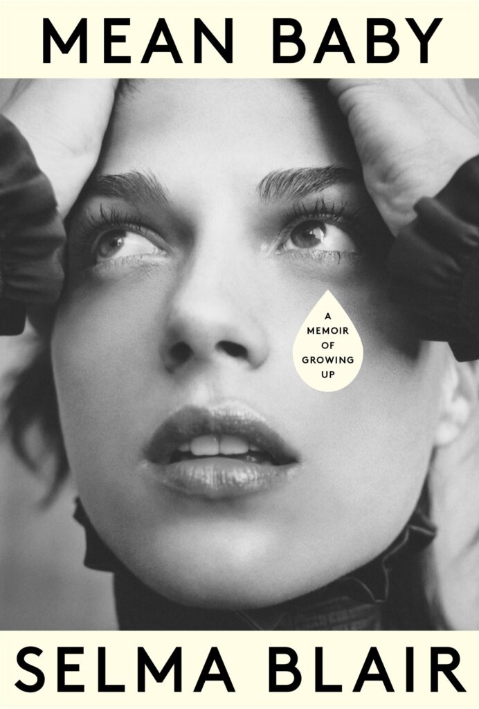 Selma Blair, Mean Baby, design by Janet Hansen (Knopf, May 17)
The solo tear drop is a perfect device to hold the requisite “memoir” type, elevating this simple biography cover to something double-take worthy.
Mean Baby just keeps creeping into my mind. A fantastic crop of the image and combination of photo, title and that subtitle placement! Simple, eye catching and jumped off screens and shelves and is memorable.
Designing celebrity books can be hard, and making something that stands out is even harder. There are so many parts that are involved and getting to a place that is so elegant and interesting is a feat.
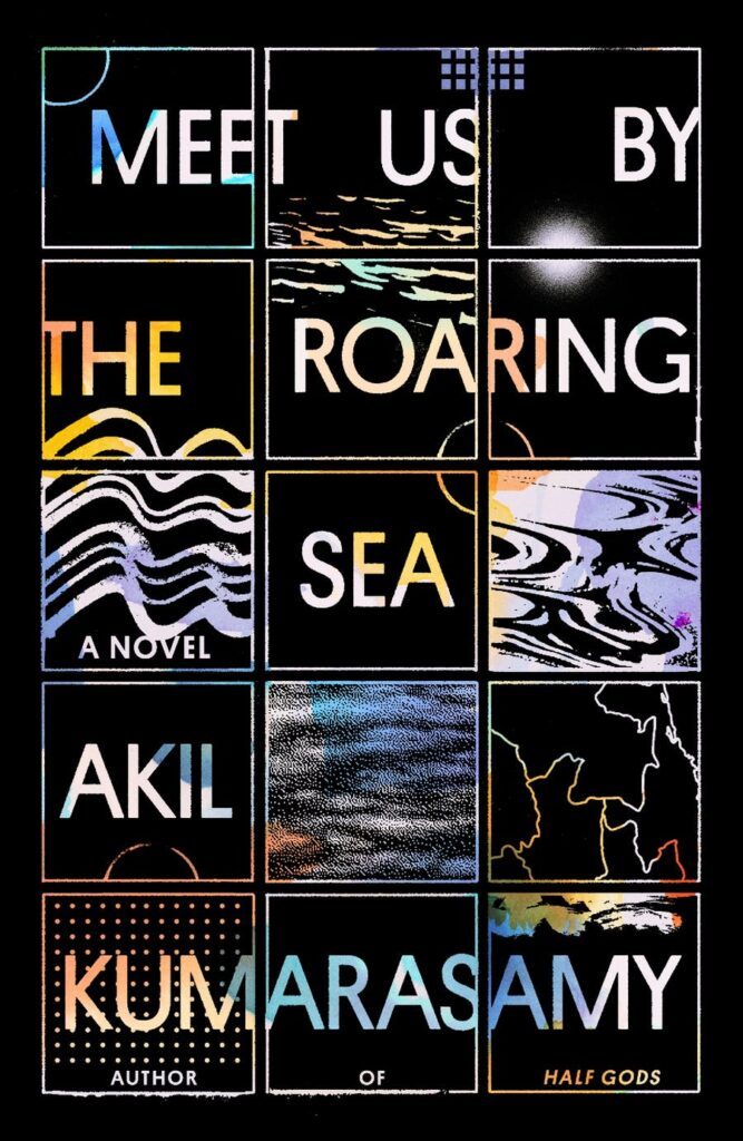 Akil Kumarasamy, Meet Us by the Roaring Sea, design by Thomas Colligan (FSG, August 23)
Beautiful arrangement of type and imagery. The design has an ethereal quality and love how the structured grid interacts with the gradient watercolors.
Immediately draws you in! I love everything about this, the way the type seemingly moves through the squares, the holographic quality, the various water textures.
So much energy and movement captured within a grid—I could puzzle over these tiles for hours.
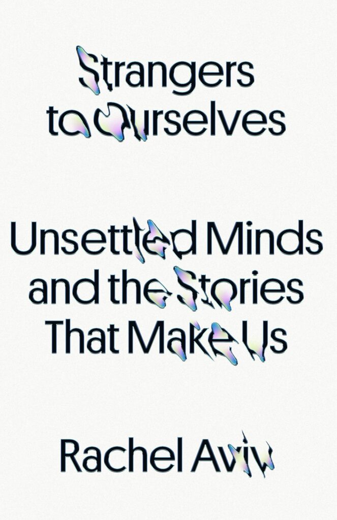 Rachel Aviv, Strangers to Ourselves: Unsettled Minds and the Stories that Make Us, design by Rodrigo Corral and kate.jjj (Kate Jensen) (FSG, September 13)
Such a simple design, yet so incredibly unnerving—it’s a design you can almost hear. Perfectly captures a break with reality.
So elegantly illustrates a book about those who occupy the “psychic hinterlands, the outer edges of human experience, where language tends to fail.”
Deceptively simple, really effective.
 Peter C. Baker, Planes, design by Linda Huang (Knopf, May 31)
Love how Linda utilizes the type here, the way the bold flat title sits against the textural photographic background. I find myself wanting to “look around” to see what’s hiding behind it. The bits of aliasing on the title is a lovely cherry on the top touch.
The title stretched into the black shapes is brilliant.
I’m a sucker for letters as shapes and in this case it really works with the title.
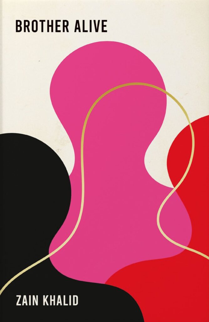 Zain Khalid, Brother Alive, design by Jo Walker (Grove Press UK, August 18)
UK publishers seem to have had a crisis of confidence recently, a lot of books seem to have three endorsements on the front cover now and all type at 72pts. Sometimes it feels like on this side of the Atlantic we have forgotten that books are physical objects that people covet, rather than a jpeg that needs to shout louder than everything else around it. When I first saw Brother Alive in a bookshop it stood out against the other books because of its bold, understated cover design.
So bloody simple and ambiguous—I have no idea what it is about, but that cover is just drawing me in. I love how Jo has pulled everything back to an abstract image, and the type is perfectly balanced. Jo is one of my favourite cover designers, she just nails it every time.
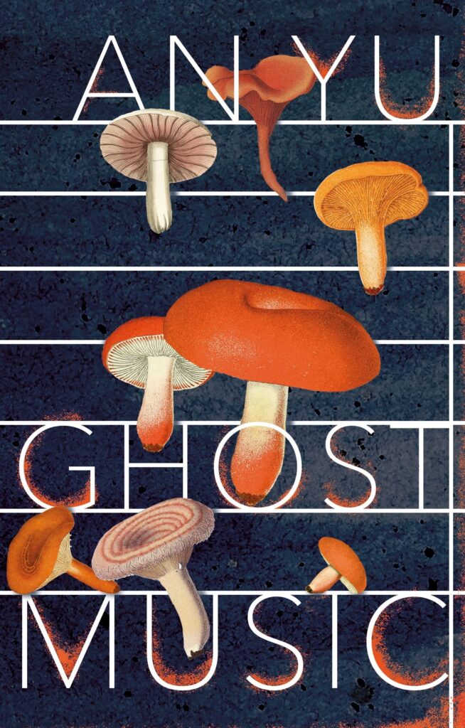 An Yu, Ghost Music, design by Suzanne Dean (Harvill Secker, November 3)
Love the allusion to sheet music and the consistency of the line weight throughout. The art really works here; haunting and unexpected.
Ethereal mushrooms floating through the air against a scale that seamlessly integrate with the type: 😘
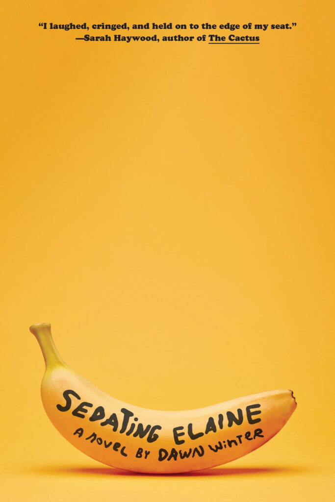 Dawn Winter, Sedating Elaine, design by Janet Hansen (Knopf, April 12)
Another Janet cover, Sedating Elaine must be mentioned. You can tell the inside will be darkly comedic and a wild ride and I even love the combination of the quote typeface combined with the roughly hand-lettering across the banana.
Every year, Janet’s work stands out for its beautiful simplicity. She takes something familiar, like lettering on a piece of fruit, and somehow makes it look better than ever.
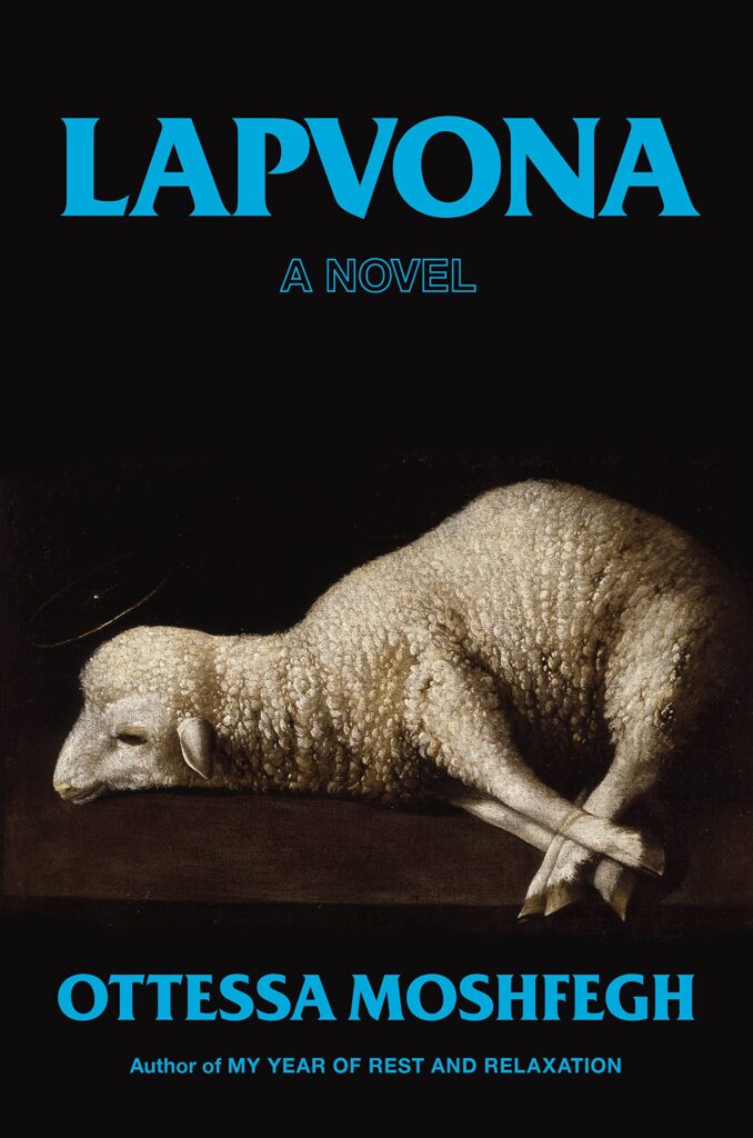 Ottessa Moshfegh, Lapvona, design by Stephanie Ross (Penguin Press, June 21)
This ominous and frankly sad painting paired with the electric blue text feels both classic and edgy.
Unsettling and striking image with brilliant type.
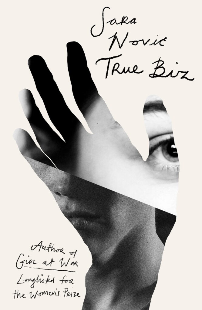 Sara Nović, True Biz, design by Jack Smyth (Little, Brown UK, April 21)
A gorgeous and thoughtful design. The collage so elegantly captures the power of language and communication.
There’s a satisfying simplicity to this cover; all the elements are arranged so elegantly.
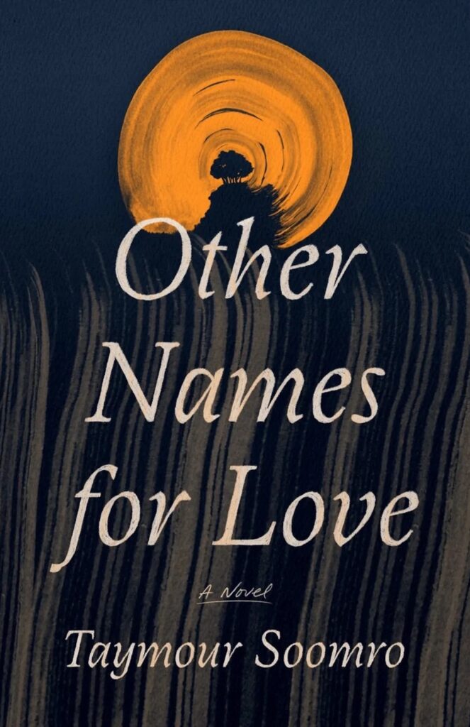 Taymour Soomro, Other Names for Love, design by June Park (FSG, July 12)
The illustration with this title packs so much emotion.
I love the gestural quality and simplicity of the illustration. The thin, italicized type is such an excellent choice in mimicking the slender, linear feel of the art.
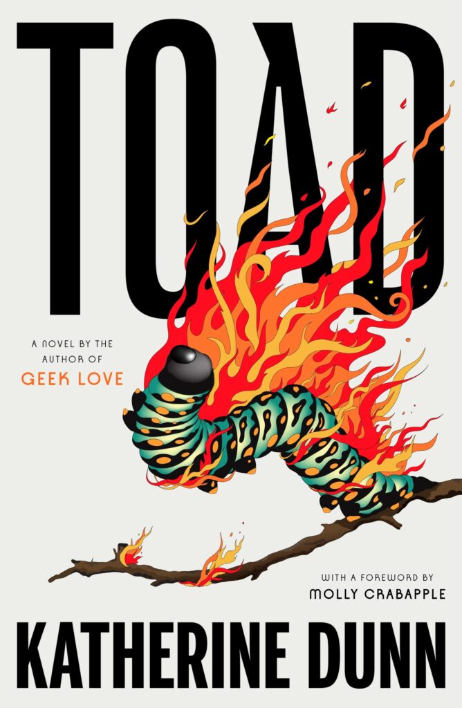 Katherine Dunn, Toad, design by June Park, illustration by Lydia Ortiz (MCD, November 1)
Love the drama happening here. Beautiful type and illustration. As off-beat as the classic Geek Love jacket while doing its own thing entirely.
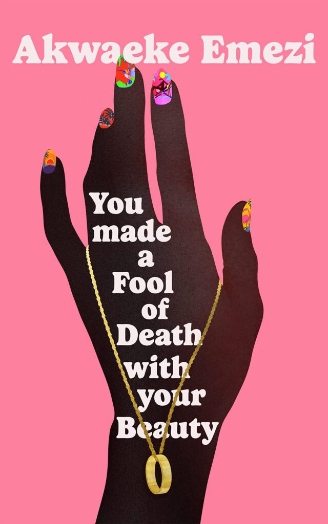 Awkaeke Emezi, You Made a Fool of Death with Your Beauty, design by Anna Morrison (Faber Books, May 26)
It’s no easy feat to make a long title like this work so elegantly, but this cover pulls it off. The silhouetted hand is simple at first glance, but the nail illustrations and hand position (hitting the author’s name ever so slightly), bring a beautiful complexity.
A hand cover, but a fantastic hand cover. Adore the little scenes painted on fingernails.
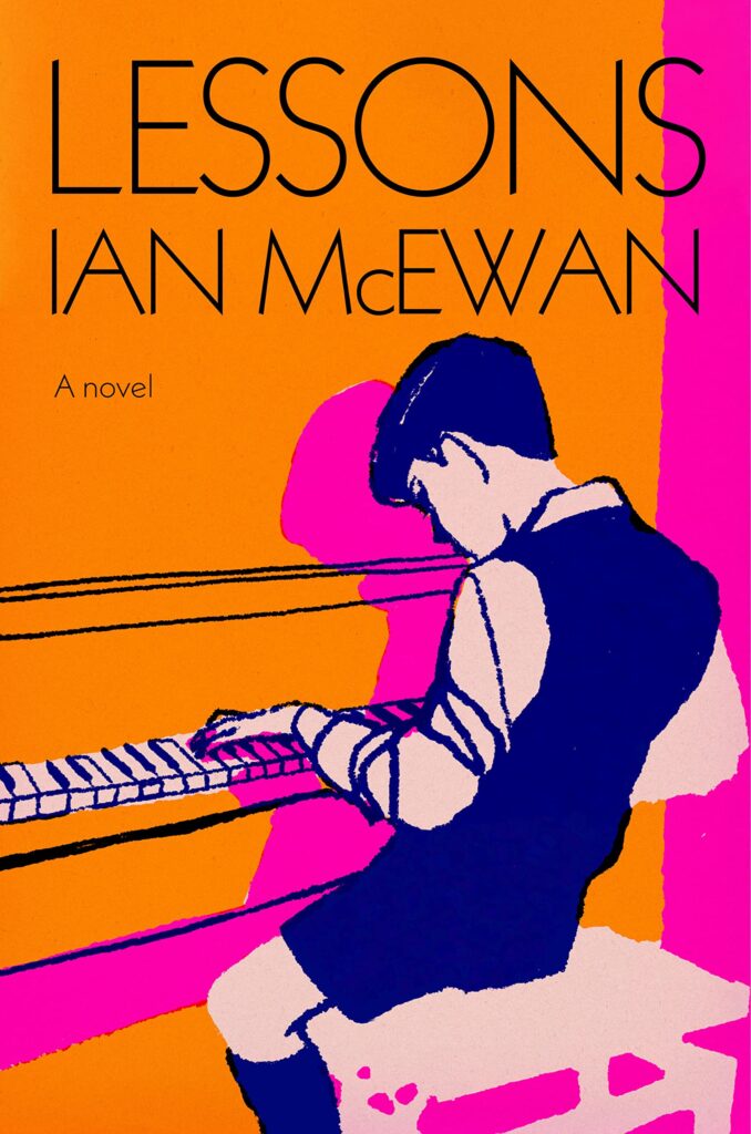 Ian McEwan, Lessons, illustration by Tina Berning/Synergy, design by John Gall based on a design © Suzanne Dean (Knopf, September 13)
Such a bright and fresh look! The colors are stunning—super saturated and bold, both on screen and in print. And the line quality of the illustration has a beautiful personality. I especially love the bits of color bleed and overprinting.
Nostalgic but with a really modern, vibrant palette. Balanced beautifully. Looks even better in the flesh that it does on screen.
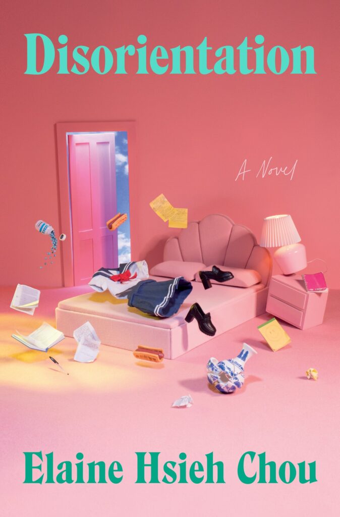 Elaine Hsieh Chou, Disorientation, design by Aleia Murawski and Sam Copeland (Penguin Press, March 22)
This cover doesn’t even need the title to convey disorientation. The waffle-wrapped-hot dog is such a weird and especially disorienting touch.
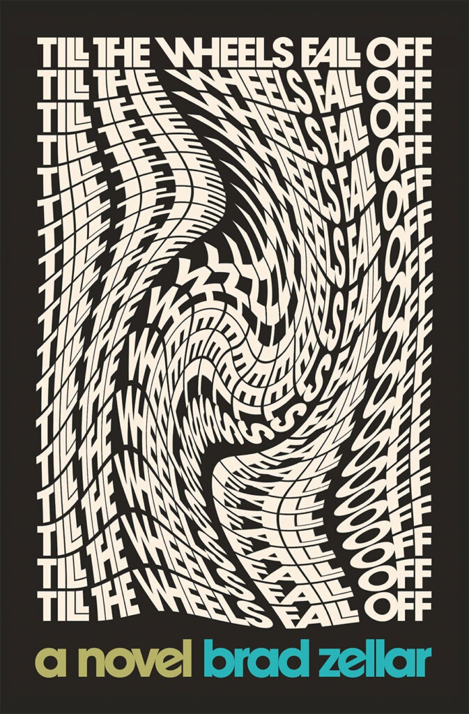 Brad Zellar, Till the Wheels Fall Off, design by Alban Fischer (Coffee House Press, July 12)
Brilliant design—so much movement and energy that come across using just type as image.
Mind-bending in the best possible way.
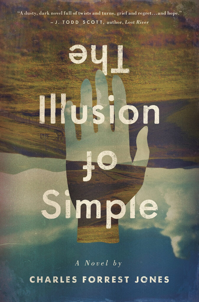 Charles Forrest Jones, The Illusion of Simple, design by Derek Thornton (University of Iowa Press, May 18)
Beautiful and rich, and very clever in its layers of illusion.
Beautiful execution of this concept. And upside down type! and it works! Give Derek a big hand (sorry).
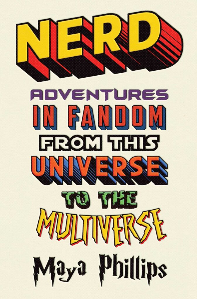 Maya Phillips, Nerd, design by James Iacobelli (Atria, October 11)
I love the creative usage of all the different fonts on this cover. It really taps into my inner child of the ’80s!
So playful and well done.
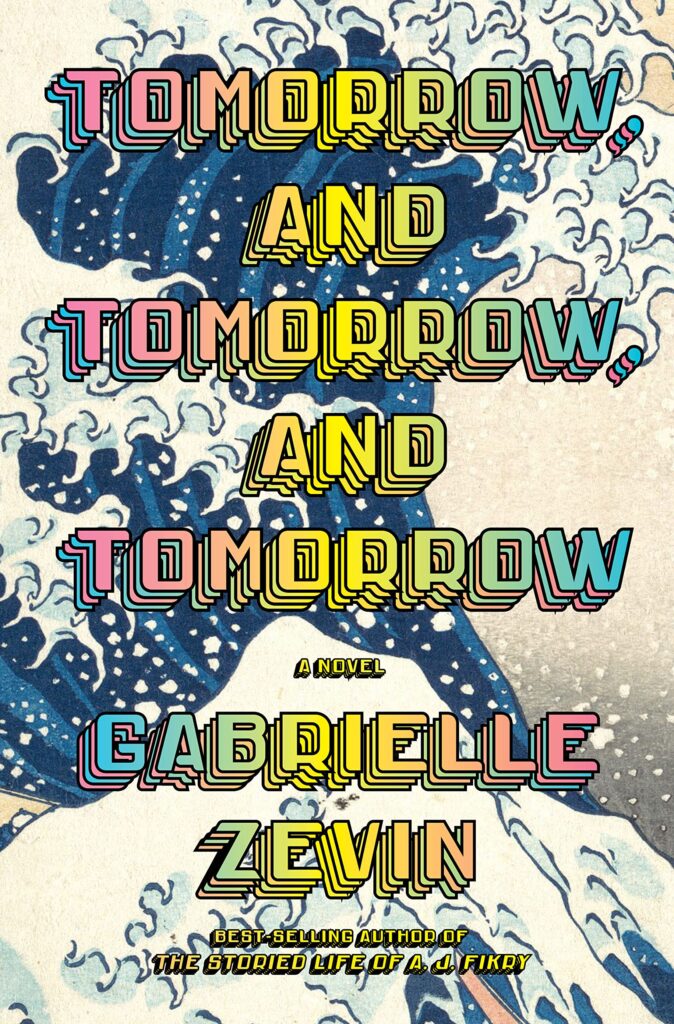 Gabrielle Zevin, Tomorrow, Tomorrow, and Tomorrow, design by John Gall (Knopf, July 5)
The type on this is mesmerizing. The stacked, repeating type with the rainbow gradient fits perfectly with the title.
I wasn’t quite sure what to think when I saw this for the first time, but it stayed with me. Now that I caught up with it, I love it!
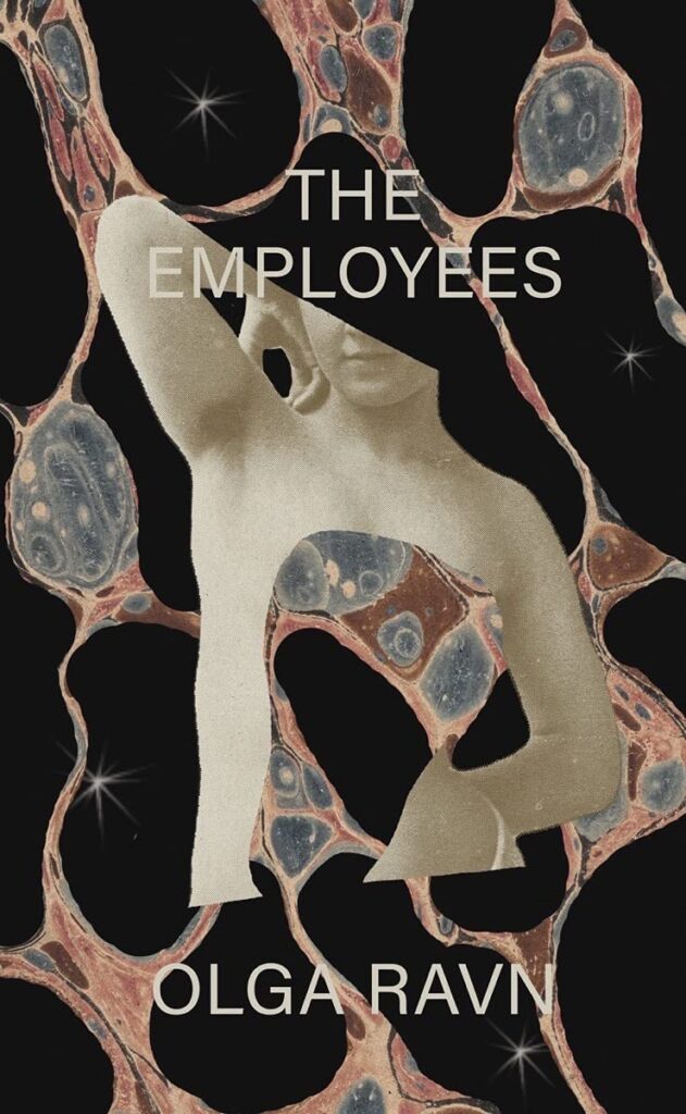 Olga Ravn, tr. Martin Aitken, The Employees, design by Joan Wong (New Directions, February 1)
Outer space salami statue.
JUST GOOD.
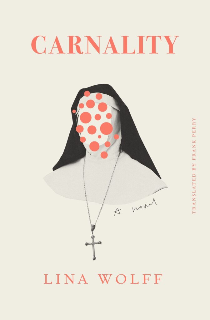 Lina Wolff, tr. Frank Perry, Carnality, design by Tyler Comrie (Other Press, July 12)
I don’t know what this book is about, other than being darkly comic and featuring a diabolical nun, but the cover makes me want to read it.
There’s something so unsettling about the reduced palette and diseased looking dots combined with the loaded religious imagery. It really pulls you in, without resorting to anything heavy-handed or “easy.”
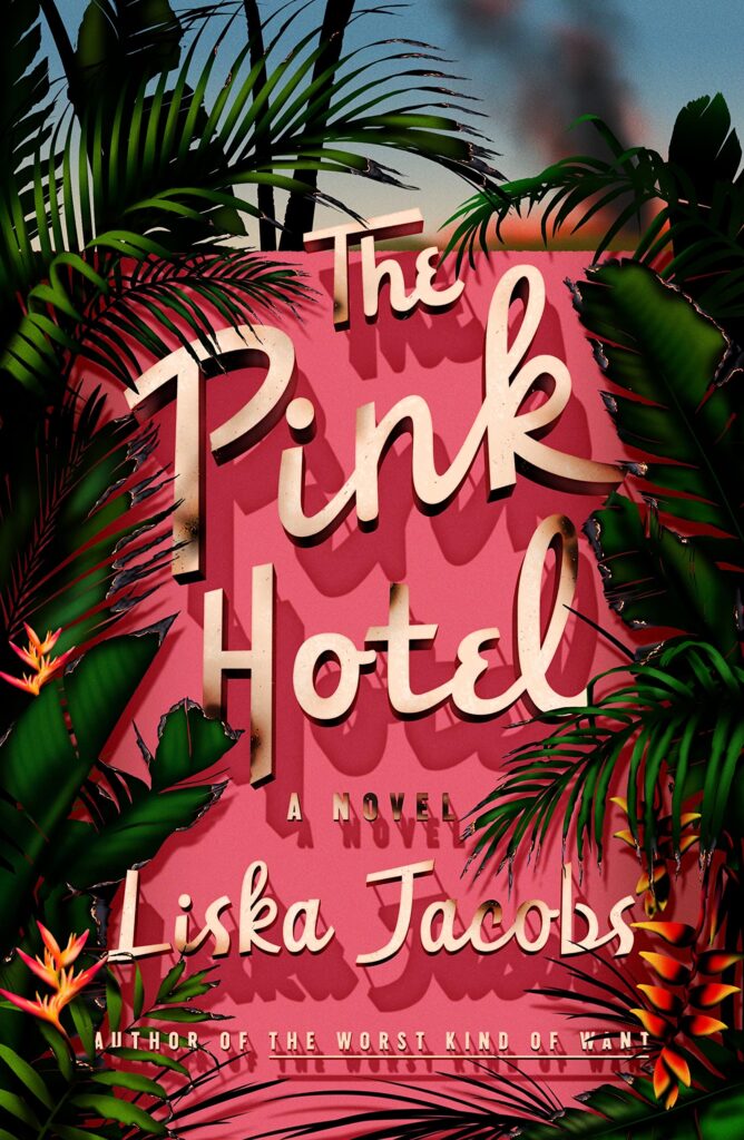 Liska Jacobs, The Pink Hotel, design by June Park (MCD, July 19)
I love the saturated color palette and the dimensionality of the type. This design gives such a sense of place. And the title font choice is amazing!
I honestly can not stop looking at this because every element works so perfectly together to create such a specific atmosphere and setting, it’s a really well-crafted cover!
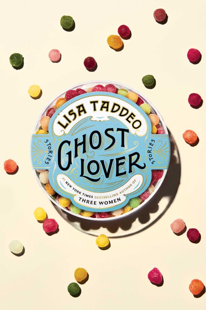 Lisa Taddeo, Ghost Lover, design and art direction by Alison Forner, lettering by Nicholas Misani, photograph by Chelsie Craig (Avid Reader Press, June 14)
Exquisite typography and execution. Having the candy beautifully photographed really takes this to the next level.
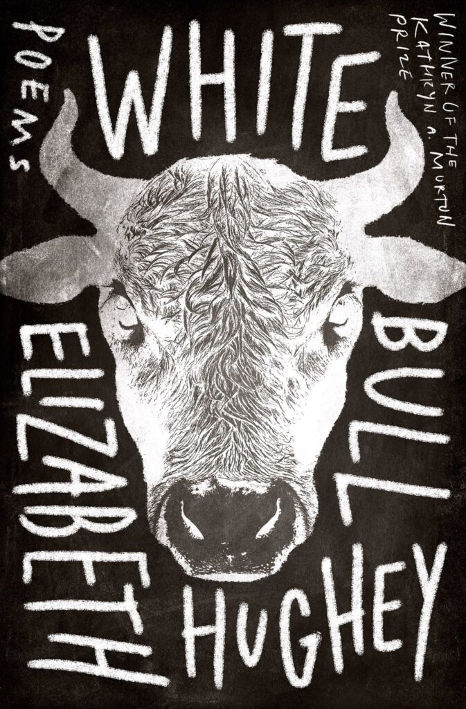 Elizabeth Hughey, White Bull, design by Alban Fischer (Sarabande, January 4)
While the image does clearly depict the title (which could work against a designer), the inverted photo and silhouetted head, the limited palette, and the gorgeous hand lettering make this cover so appealing.
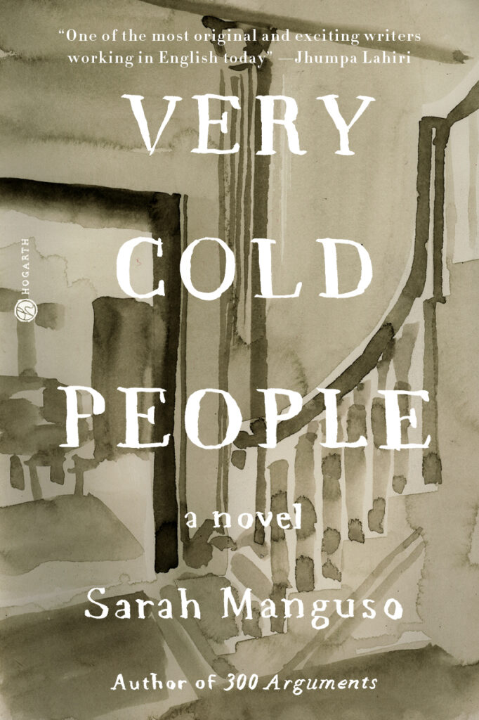 Sarah Manguso, Very Cold People, design by Leanne Shapton (Hogarth Press, February 8)
The tactile, handmade quality of the cover and the domestic scene contrasts beautifully with the “cold people” evoked in the title.
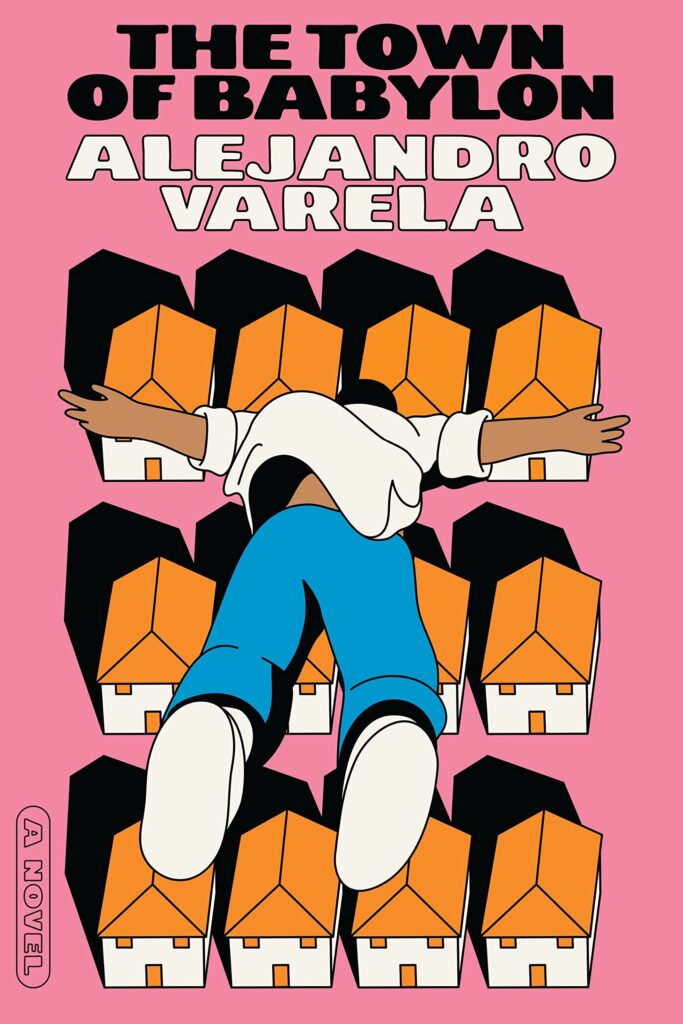 Alejandro Varela, The Town of Babylon, design by Rodrigo Corral (Astra House, March 22)
I love the unique perspective here—it feels as if you’re flying with the figure, diving head-first into that neighborhood. I had an almost visceral response to this illustration; I felt connected to the character without even opening the book.
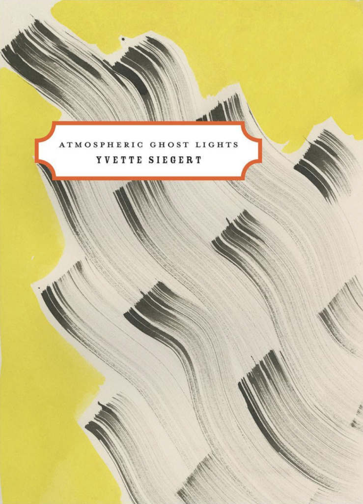 Yvette Siegert, Atmospheric Ghost Lights, design by Gabriele Wilson, illustration by Cecilia Carlstedt (Poetry Society of America)
I’ve long admired the work of both Gabriele and Cecilia so to see a collaboration on the always thoughtfully designed poetry society chapbooks was a treat. This one is my favorite.
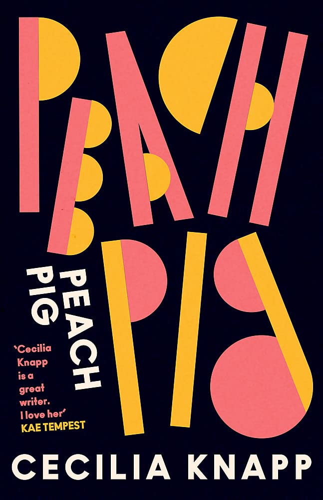 Cecilia Knapp, Peach Pig, design by Jack Smyth (Corsair, October 6)
This type creates within me a sort of effervescent joy.
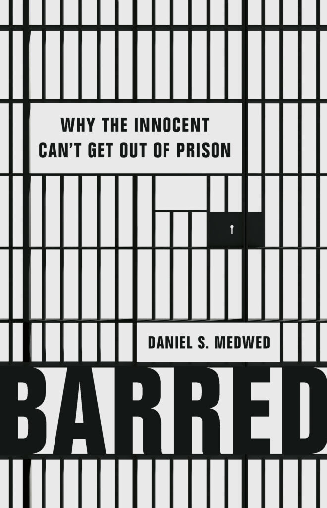 Daniel Medwed, Barred, design by Chin-Yee Lai (Basic Books, September 20)
Smart and succinct pairing of subject and graphics.
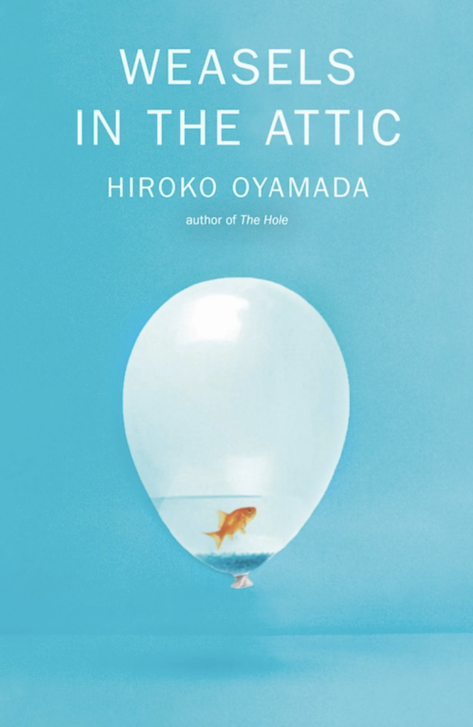 Hiroko Oyamada, Weasels in the Attic; cover design by Janet Hansen (New Directions, October 4)
Surreal, simple and smart, and the stones are the perfect subtle addition.
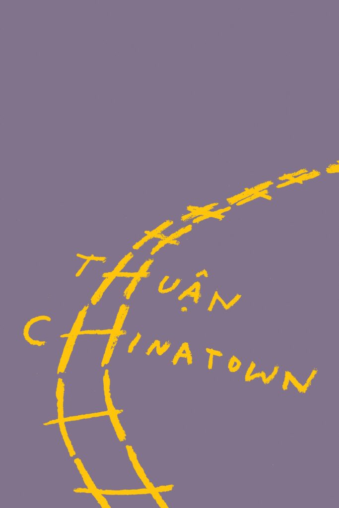 Thuân, tr. Nguyen An Lý, Chinatown, design by Oliver Munday (New Directions, June 21)
Very clever.
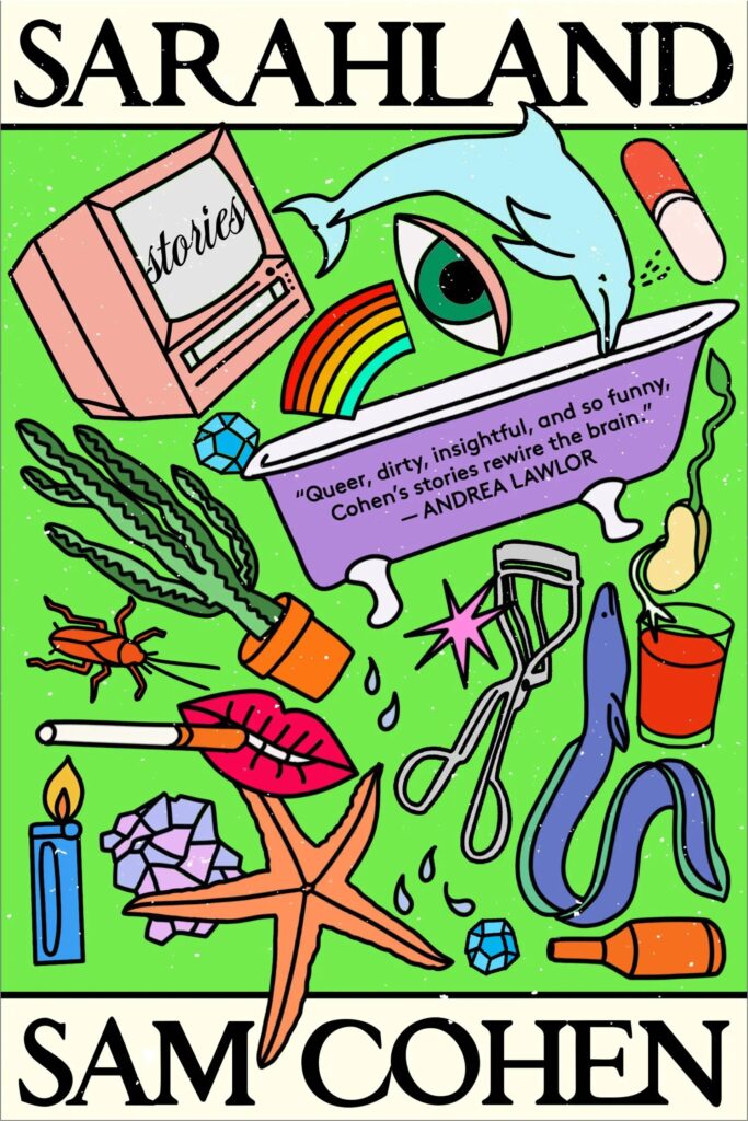 Sam Cohen, Sarahland (paperback edition), design by Holly Ovenden (Grand Central, March 8)
I’m getting nuanced, Lisa Frank vibes and that is high praise.
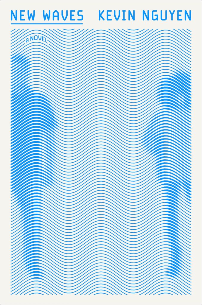 Kevin Nguyen, New Waves, paperback design by Zak Tebbal (One World, July 12)
Op-art! Very satisfying.
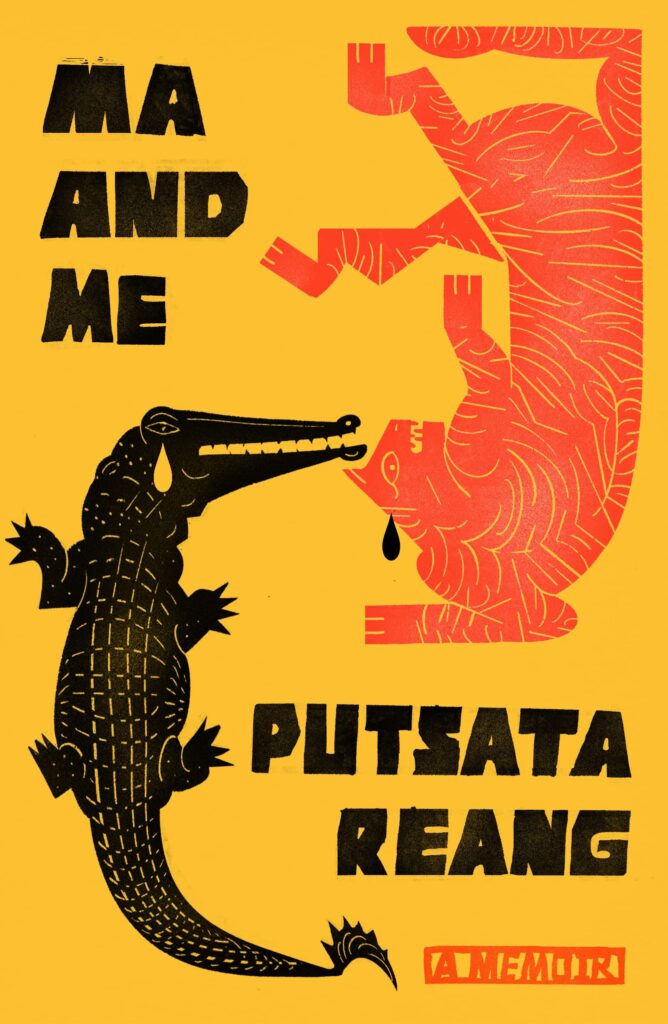 Putsata Reang, Ma and Me, design by Na Kim (MCD, May 17)
Perfect match of art and lettering, inventive layout, great use of color.
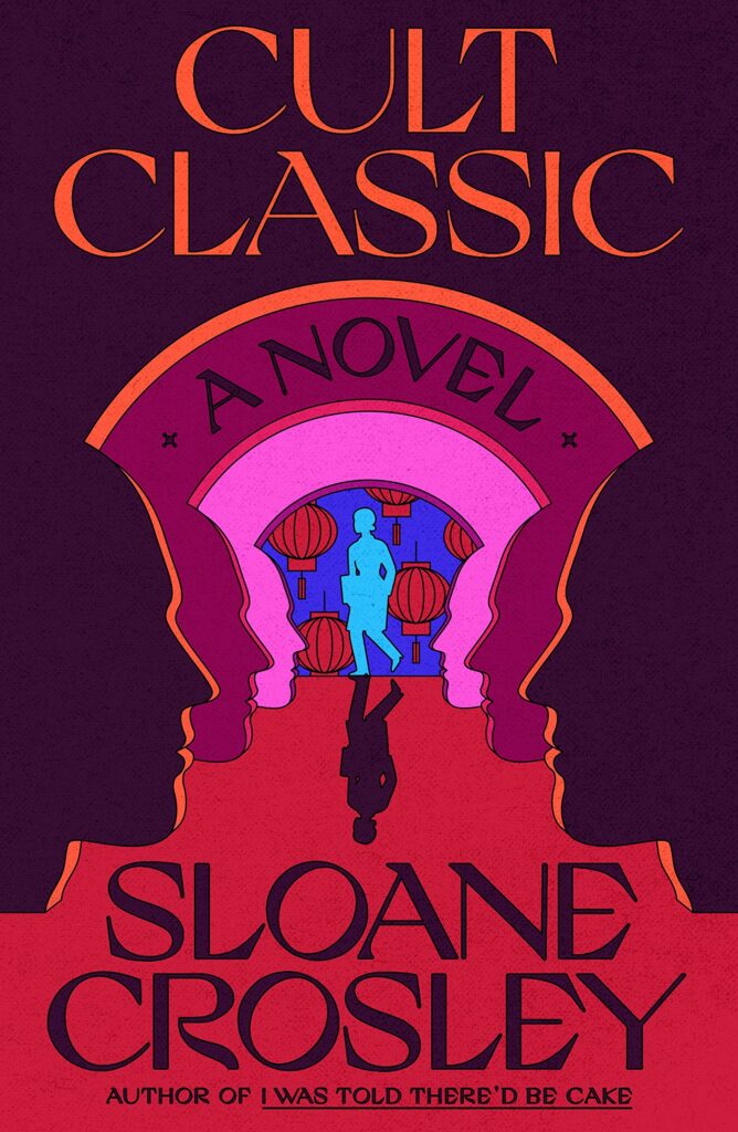 Sloane Crosley, Cult Classic, design by June Park (MCD, June 7)
There are a lot of things that I love about this cover, but I’ll just say this: We rarely see book covers that embrace the color purple and this one does it oh, so well!
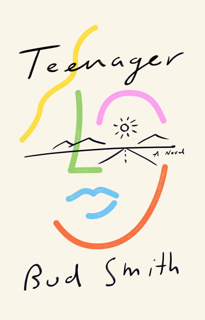 Bud Smith, Teenager, design by Tyler Comrie (Vintage, May 10)
Less is more with Teenager. My eye travels down the highway right to the sun, the perfectly placed eye of the teenage face.
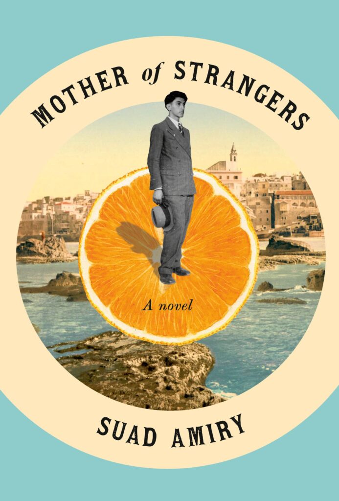 Suad Amiry, Mother of Strangers, design by Jenny Carrow (Pantheon, August 2)
A refreshingly light approach to historical fiction.
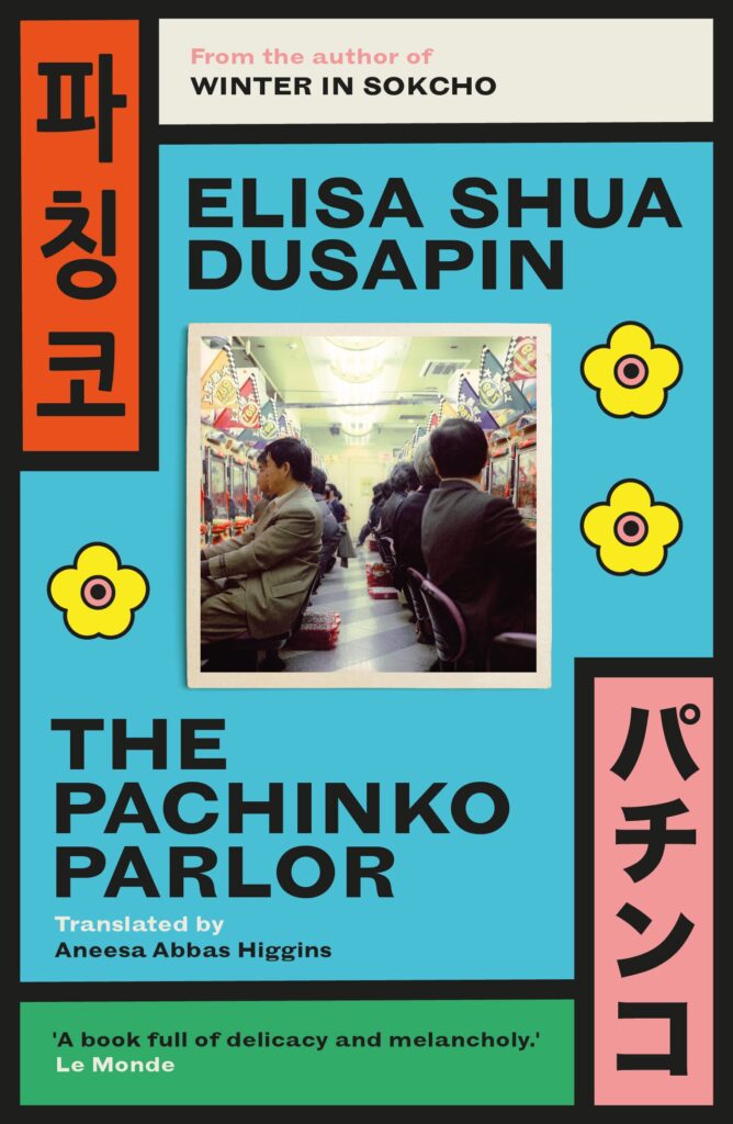 Elisa Shua Dusapin, tr. Aneesa Abbas Higgins, The Pachinko Parlor, design by Luke Bird (Open Letter, September 27)
This is a standout for me. I would notice it from across the room. A very original layout with a unique color palette, and those thick, black lines holding it all together.
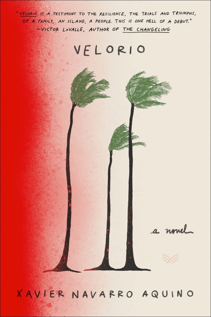 Xavier Navarro Aquino, Velorio, design by Claudia Rubín (HarperVia, January 4)
Powerful, elegant, and haunting.
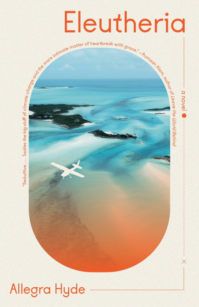 Allegra Hyde, Eleutheria, design by Maddie Partner (Vintage, March 8)
Am drawn immediately into this cover, an eerie porthole into fraying world.
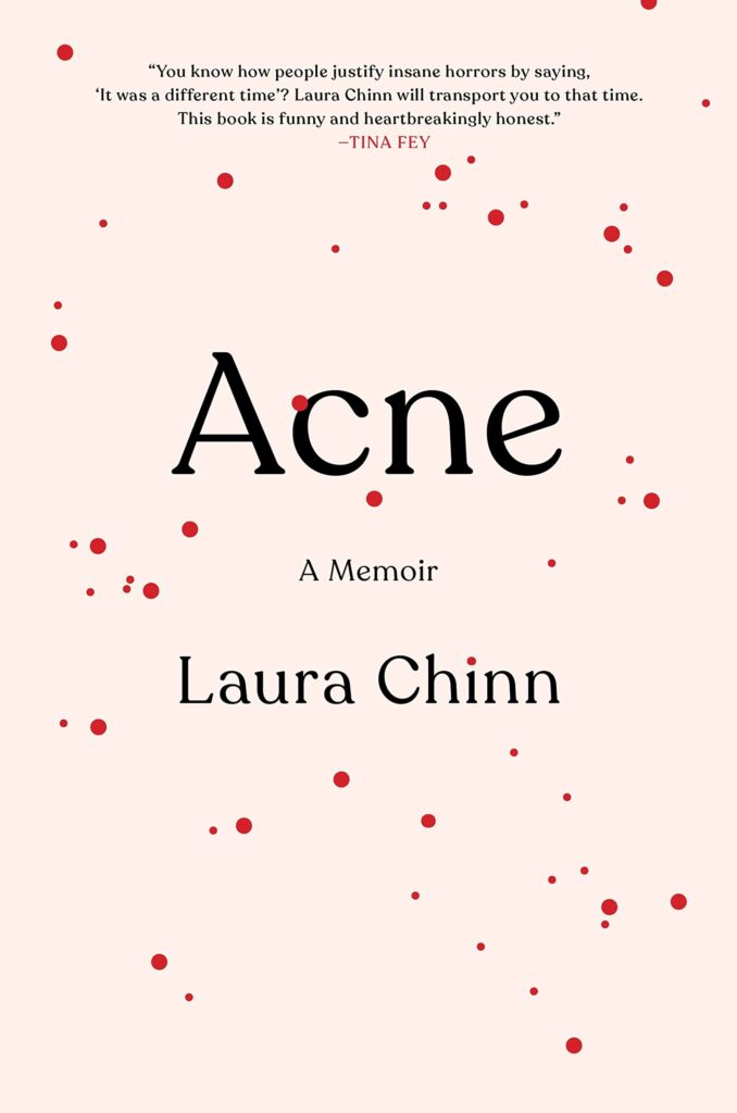 Laura Chinn, Acne, design by Amanda Kain (Hachette, July 19)
Kudos to Amanda for taking something that is so reviled (yuck, pimples!) and for displaying them in such a cute way. This design is so
inviting.
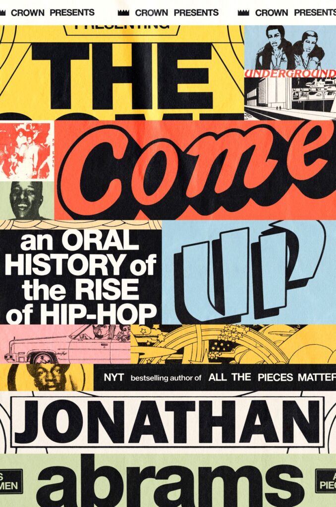 Jonathan Abrams, The Come Up, design by Chris Allen, Rodrigo Corral Studio (Crown, October 18)
Books about music have to look authentic and this does such a good job.
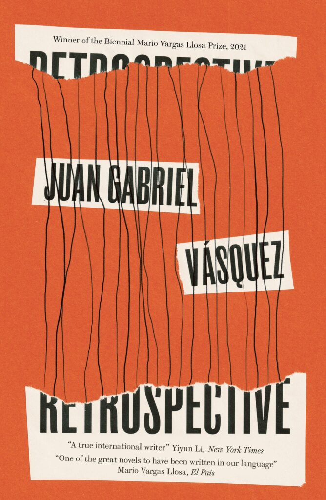 Juan Gabriel Vásquez, Retrospective, design by Jack Smyth (MacLehose Press, September 1)
The best “torn paper cover” ever. Clever concept. I know the designer worked with physical pieces of paper and scanned them in, and it really shows.
 Boris Groys, Philosophy of Care, design by Everything Studio (Verso, March 1)
A complicated and abstract subject—care—visualized in an equally abstract but simple form.
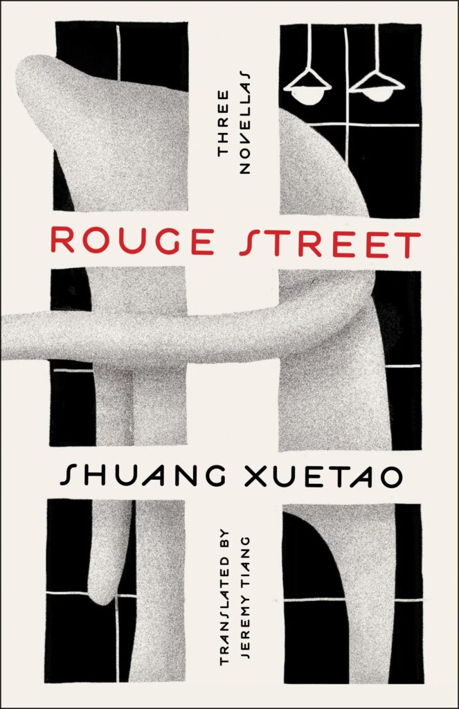 Shuang Xuetao, tr. Jeremy Tiang, Rouge Street, design by Christopher Sergio, illustration by Jocelyn Tsaih (Metropolitan Books, April 19)
Something about the strange, soft, almost tactile illustration draws and holds the eye. Just lovely to look at, perfectly balanced with interesting but understated type, and I love how the arm wraps around onto the spine.
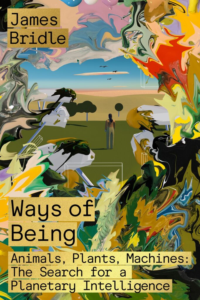 James Bridle, Ways of Being, design by Pablo Delcan, illustration by Jon Han (FSG, June 21)
It takes a mind like Pablo’s and an open-minded publisher/art director to marry Jon Han’s incredible style with a nonfiction book and it works so so well.
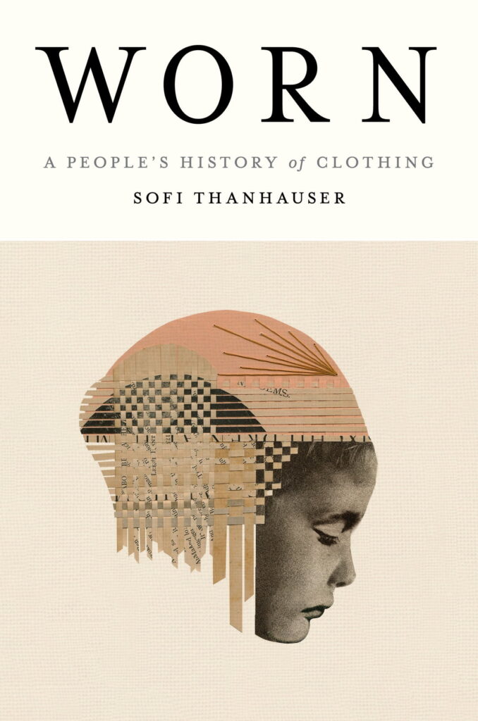 Sofi Thanhauser, Worn, design by Janet Hansen, art by Hollie Chastain (Pantheon, January 25)
The pairing of this typography with the artwork by Hollie Chastain is perfect and elegant.
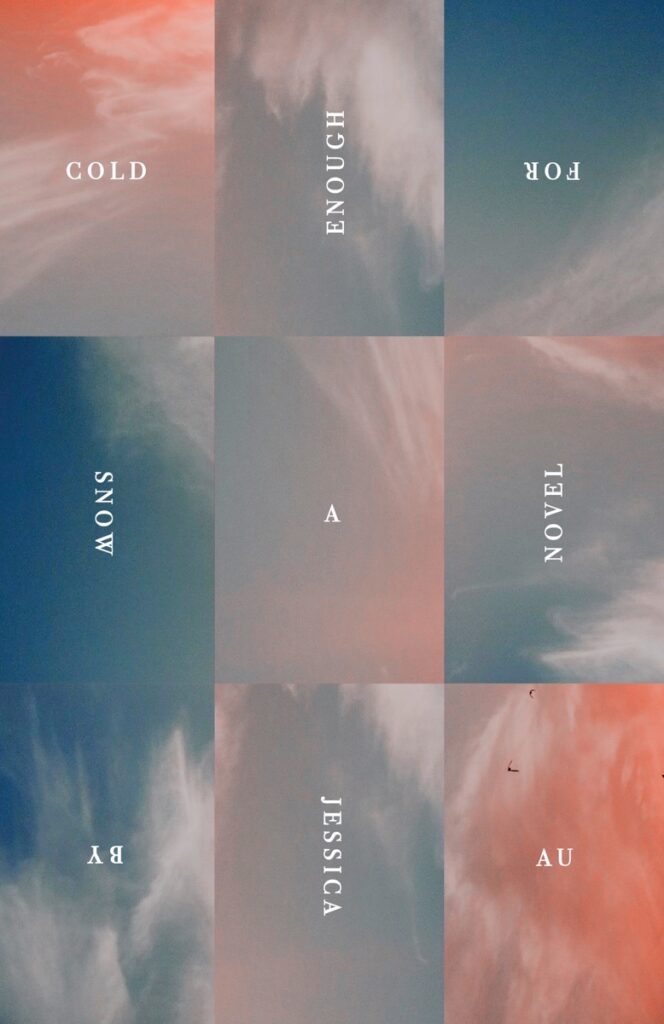 Jessica Au, Cold Enough for Snow, design by Janet Hansen (New Directions, February 8)
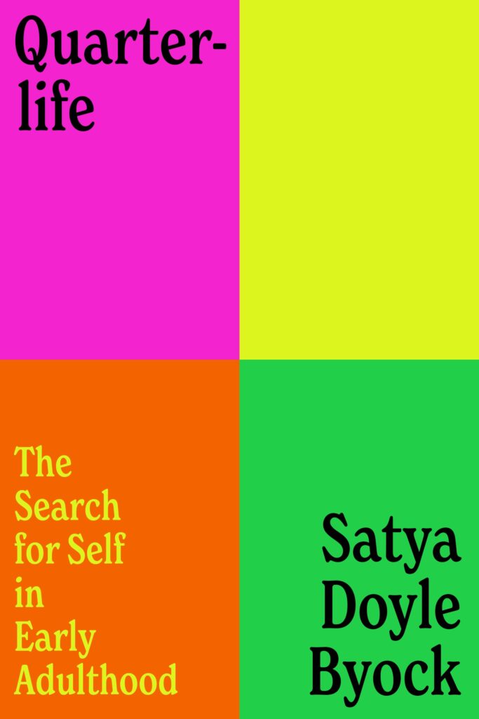 Satya Doyle Byock, Quarterlife, design by Alicia Tatone (Random House, July 26)
Succinct and clever, which is hard to do. I love the simplicity of the design and how it interacts perfectly with the title.
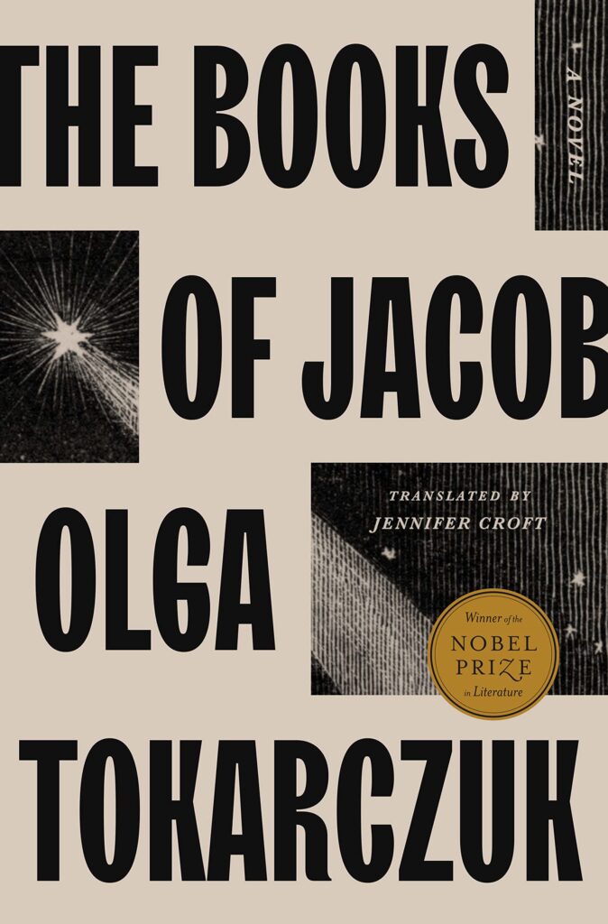 Olga Tokarczuk, tr. Jennifer Croft, The Books of Jacob, design by Grace Han (Riverhead, February 1)
This cover achieves a monumental, iconic feel with such economy—it’s magic.
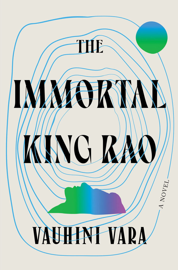 Vauhini Vara, The Immortal King Rao, design by Keith Hayes (W.W. Norton, May 3)
Love how all of the elements are tied together with the blue circles. It has a big book look, but is also very artistic and elegant.
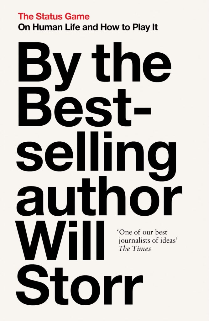 Will Storr, The Status Game: On Human Life and How To Play It, paperback design by Steve Leard (William Collins, September 13)
Maybe it’s the amount of time I’ve spent with the words “bestselling author” talking, but this is hilarious and inspired.
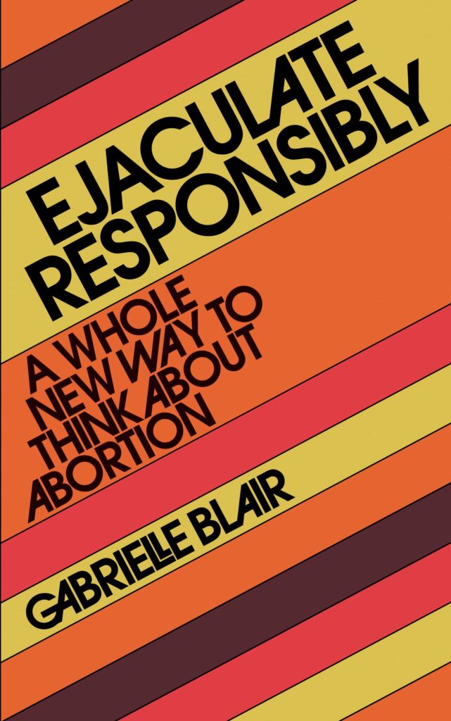 Gabrielle Blair, Ejaculate Responsibly, design by Studio Eight and a Half (Workman Publishing, October 18)
This retro cover is as eye-catching as the title, it will stand out on any bookshelf.
 Bette Howland, W-3 and Things to Come and Go, redesigns by Janet Hansen (Public Space Books, June 28)
Bold colours, small type, unusual composition and Vivian Maier photographs. What’s not to love about these covers?
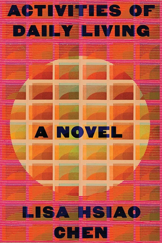 Lisa Hsiao Chen, Activities of Daily Living, design by Kelly Winton (W.W. Norton, April 12)
I love the color and the texture and that it sets a mood.
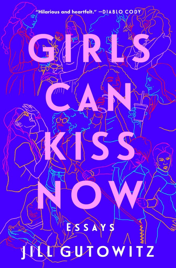 Jill Gutowitz, Girls Can Kiss Now, design by Kelli McAdams (Atria, March 8)
The illustration on this cover is so interesting. From a distance, it looks like an abstract cover of lines and color, but upon closer inspection you can see all the different scenes and couples!
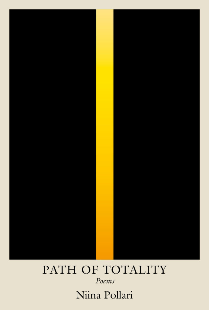 Niina Pollari, Path of Totality, design by Michael Salu (Soft Skull, February 8)
This cover contains so much elegance, power and dignity, for a subject matter that could be difficult to illustrate. Michael Salu has created such a moving cover with the simplest of designs.
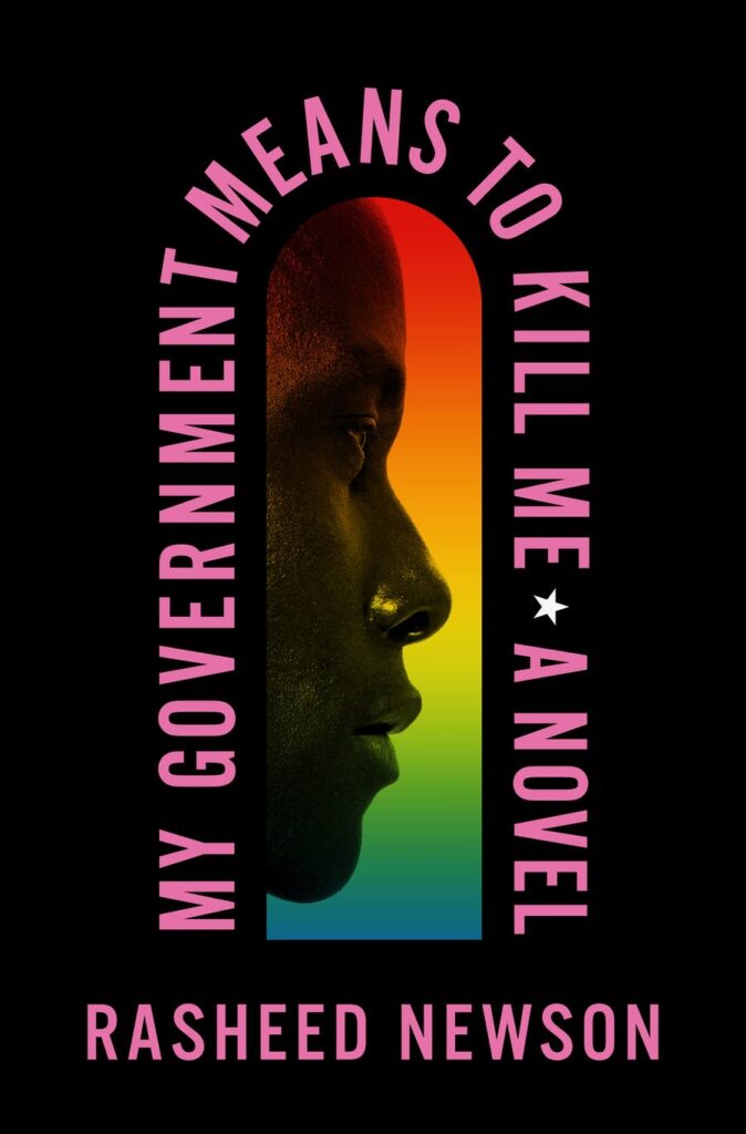 Rasheed Newson, My Government Means to Kill Me, design by Keith Hayes (Flatiron, August 23)
The type frame is so effective here. Everything just comes together perfectly.
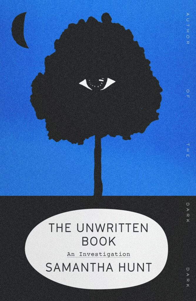 Samantha Hunt, The Unwritten Book, design by Alex Merto (FSG, April 5)
When I first saw this cover it stopped me in my tracks—so intriguing. I love the textures, composition, colours; the eye just draws you in. The author line going up the side is genius, so unexpected. To create such an atmosphere within such a small space is a real gift.
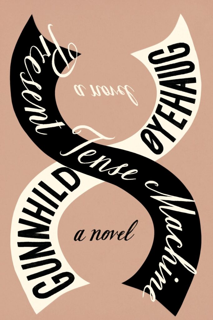 Gunnhild Øyehaug, tr. Kari Dickson, Present Tense Machine, design by Na Kim (FSG, January 11)
One of the blurbers calls this book “an ingenious pocket universe,” which could describe the cover itself: a small package that locks you in its orbit—you can’t help but trace that fascinating lettering round and round!
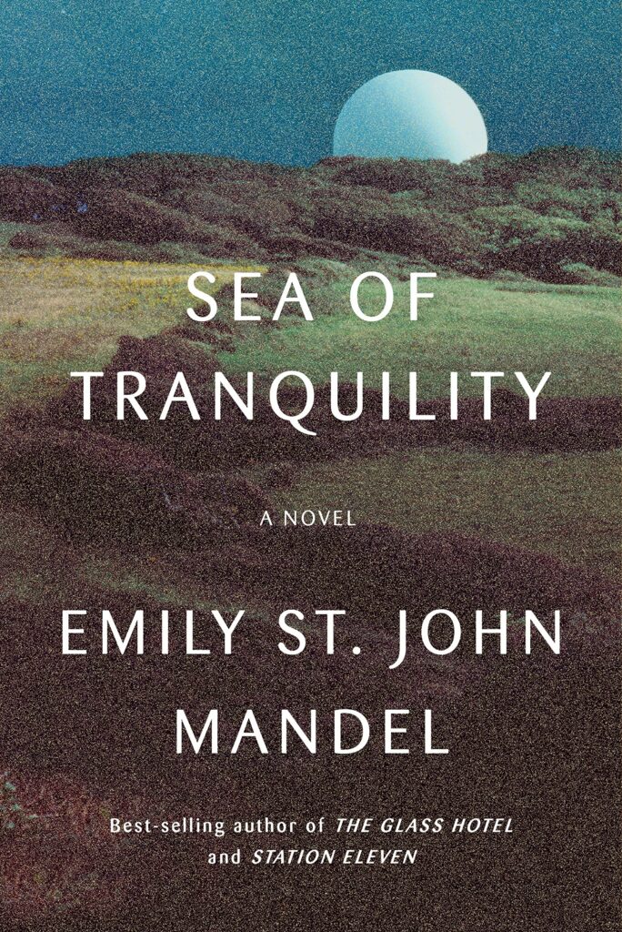 Emily St. John Mandel, Sea of Tranquility, design by Abby Weintraub (Knopf, April 5)
I love the noise and fuzziness of the image, especially on the print edition where it’s amplified by lithofoil. The texture gives a sense of static and uncertainty before you even begin to read. A beautiful example of a darker image, and smaller type, standing out on shelves.
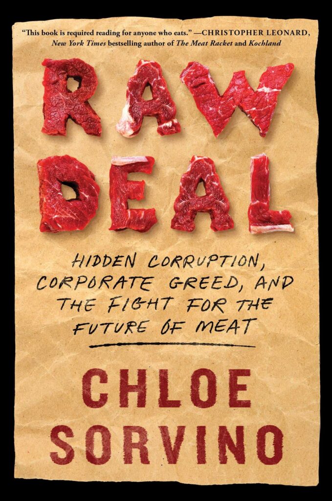 Chloe Sorvino, Raw Deal, design by Claire Sullivan (Atria, December 6)
You would think seeing raw meat on a book cover would be offputting… but it really works here: meat as type! I love it.
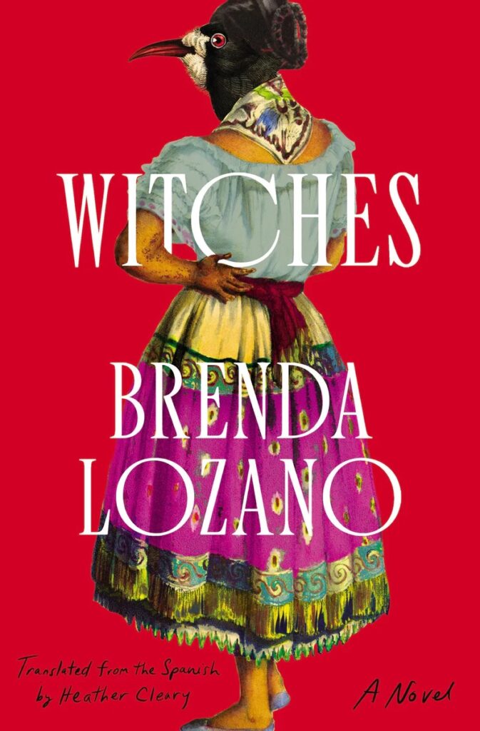 Brenda Lozano, tr. Heather Cleary, Witches, design by Jaya Miceli (Catapult, August 16)
Such a perfect—and totally intriguing—marriage of art, type, and title.
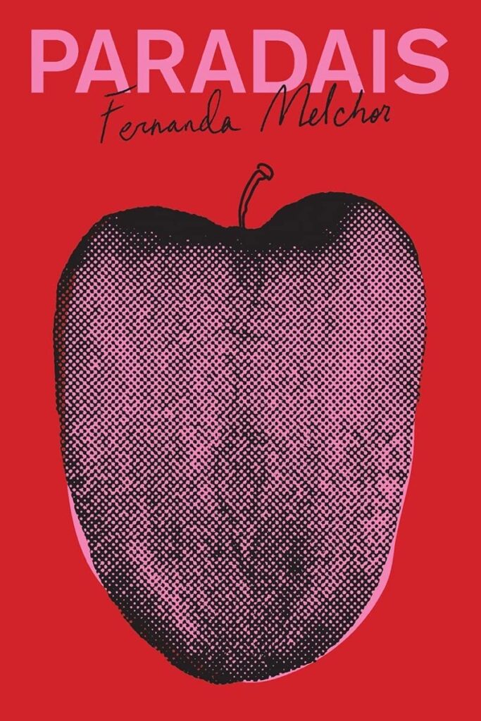 Fernanda Melchor, tr. Sophie Hughes, Paradais, design by Oliver Munday (New Directions, May 10)
Oliver Munday summons up the spirit of Henryk Tomaszewski in this cover. Love it.
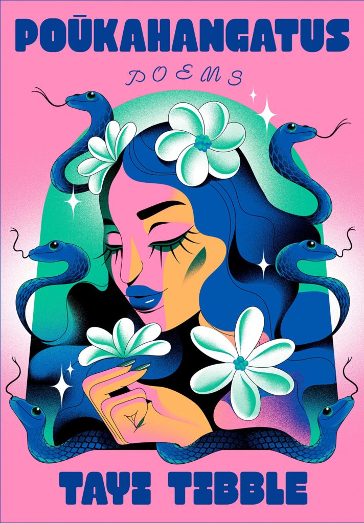 Tayi Tibble, Poukahangatus, design by Linda Huang, illustration by Simone Noronha (Knopf, July 26)
I adore Simone Noronha’s playful illustration and the way title treatment really lets the artwork shine.
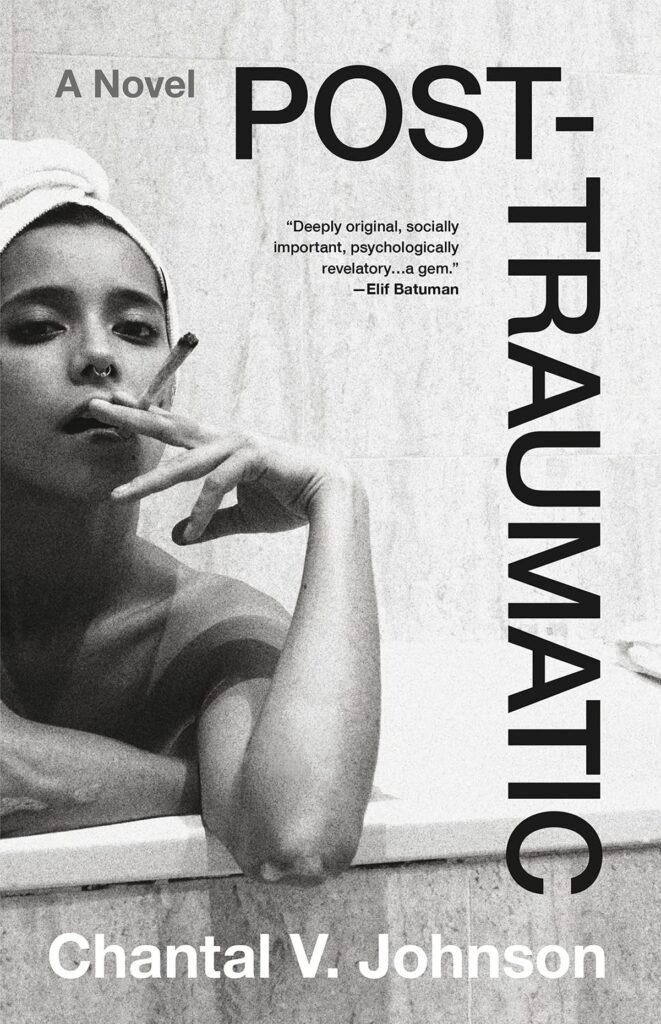 Chantal V. Johnson, Post-Traumatic, design by Lucy Kim (Little, Brown, April 5)
This is such a powerful and direct image. The modern type beautifully frames the scene but doesn’t distract. I love that it’s all in black and white—the starkness and her gaze say so much.
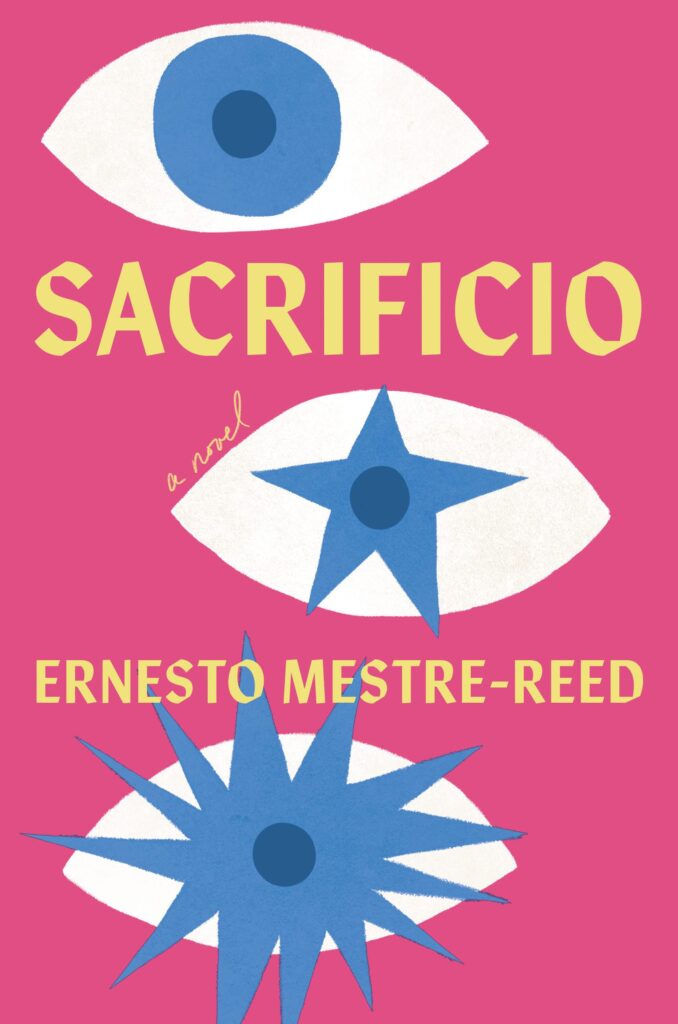 Ernesto Mestre-Reed, Sacrificio, design by Dana Li (Soho Press, September 6)
With its pitch-perfect palette and bold, confident shapes, this cover just about leapt from the display table!
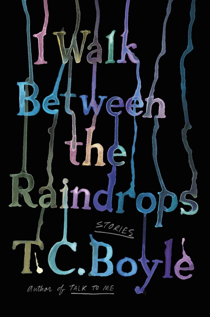 T.C. Boyle, I Walk Between the Raindrops, cover design and lettering by Jim Tierney (Ecco, September 13)
There’s just something magical about this beautiful blend of type, image, and idea.
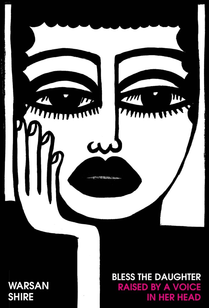 Warsan Shire, Blessed The Daughter Raised by a Voice in Her Head, design by Kishan Rajani, illustration by Natalie Osborne (Chatto & Windus, March 10)
This is my cover of the year—it literally sings in the bookshop, so striking! The illustration grabs your attention. The rest of the book is beautifully designed too, the end papers are gorgeous. I love it, just wonderful.
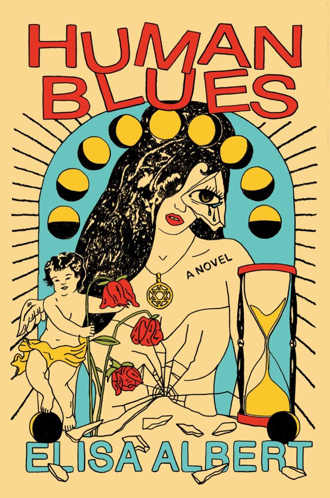 Elisa Albert, Human Blues; cover design and illustration by Lia Kantrowitz, art direction by Alison Forner (Avid Reader Press, July 5)
Love the simple line quality of this illustration and all its crooked crumbling pieces on the perfectly selected uncoated stock.
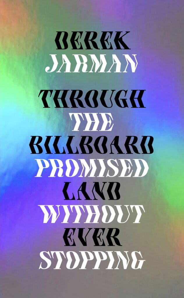 Derek Jarman, Through the Billboard Promised Land Without Ever Stopping, design by Theo Inglis (House Sparrow Press, November 3)
Amazing optical illusion created by beautifully set type, on rainbow holographic foil. Really nice.
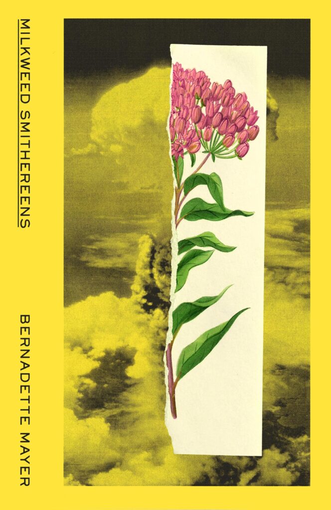 Bernadette Mayer, Milkweed Smithereens, design by Tyler Comrie (New Directions, November 1)
Beautiful and restrained use of collaging to deliver a power image.
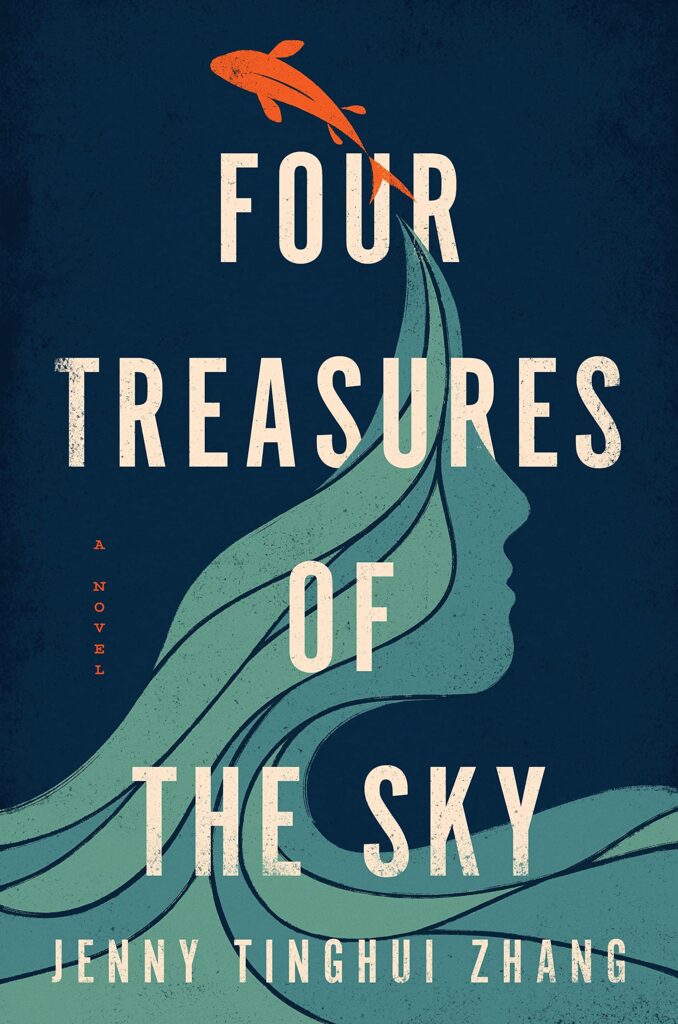 Jenny Tinghui Zhang, Four Treasures of the Sky, design by Vi-An Nguyen (Flatiron, April 5)
Such an ingenious way of integrating a woman’s profile into the scene.
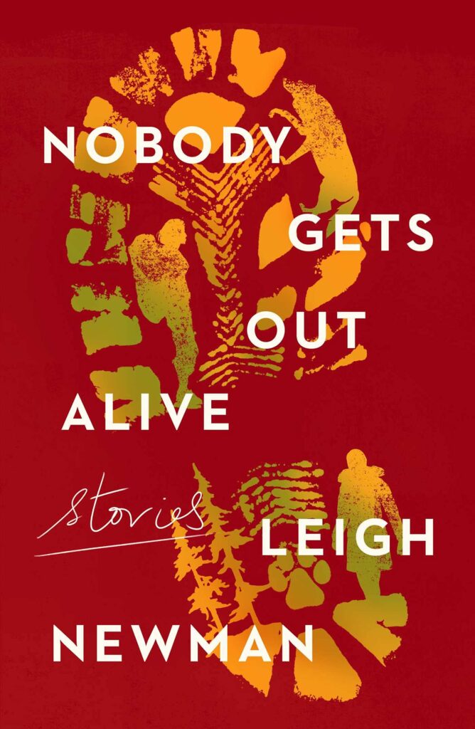 Leigh Newman, Nobody Gets Out Alive, design by Jaya Miceli (Scribner, April 12)
Nobody Gets Out Alive looks straightforward, but again the small thoughtful details within the illustration, that are hidden so well by the gradient, are a smart, provocative but subtle easter egg for the viewer.
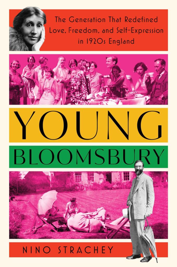 Nino Strachey, Young Bloomsbury, design by Emma vanDeun (Atria, December 6)
The usage of panels, color, and collage is so playful on this cover! Who knew you could make history look so fun and interesting?
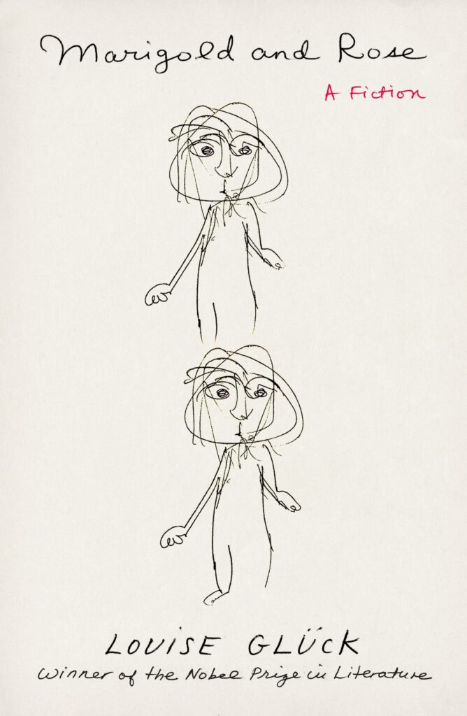 Louise Glück, Marigold and Rose, design by Na Kim (FSG, October 11)
Such a funny, crude doodle that looks like something Willem de Kooning would have sketched. I love that this illustration was printed on a commercial book cover.
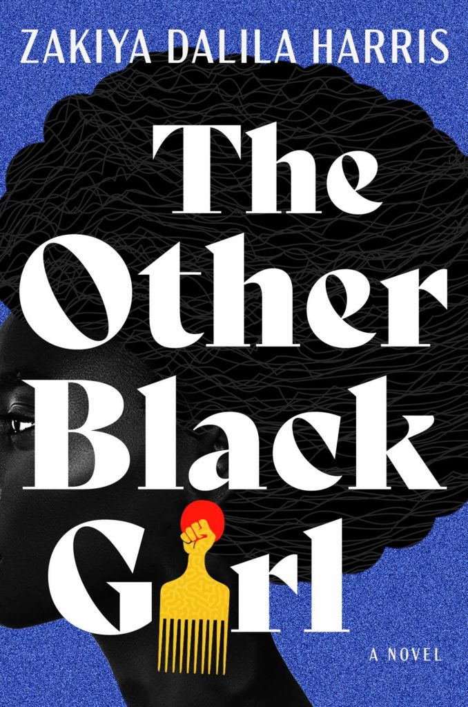 Zakiya Dalila Harris, The Other Black Girl, design by James Iacobelli, illustration by Temi Coker (Atria, June 7)
Somehow the title and illustration don’t feel like they are competing, instead they work together seamlessly in this instantly iconic package.
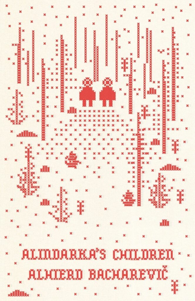 Alhierd Bacharevic, tr. Jim Dingley and Petra Reid, Alindarka’s Children: Things Will Be Bad, design by Delcan & Co. (New Directions, June 21)
A cross-stitch that’s unlike any other cross-stitch I’ve seen.
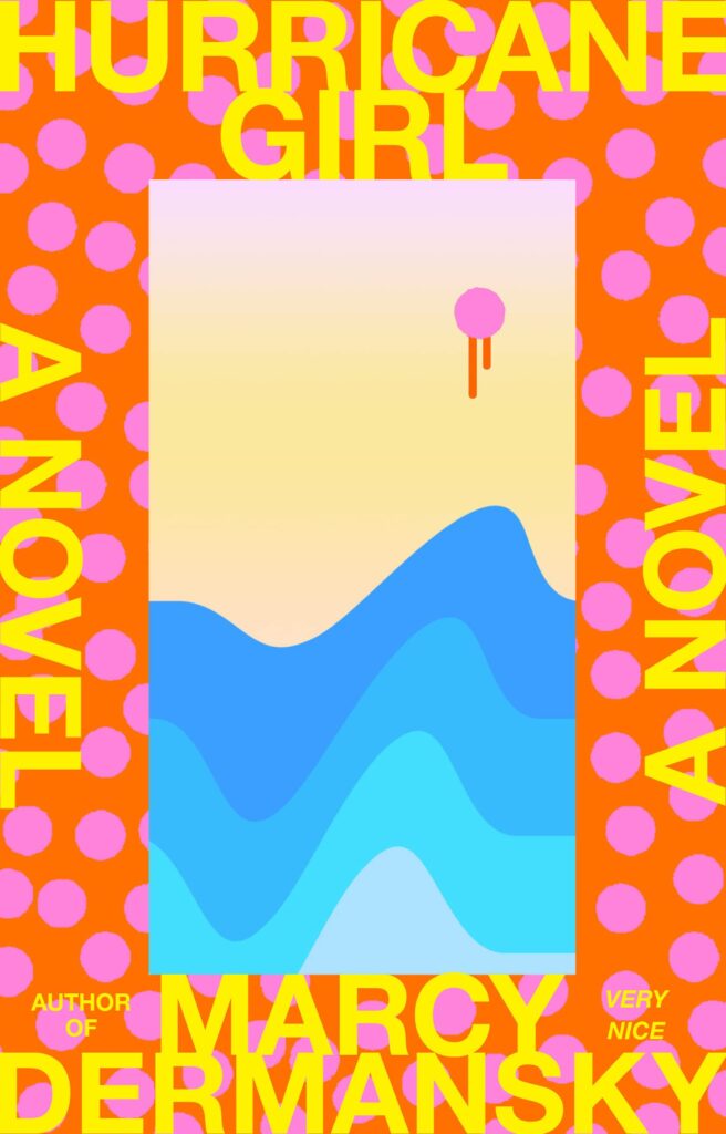 Marcy Dermansky, Hurricane Girl, design by Janet Hansen, illustration by Tyler Spangler (Knopf, June 14)
So punchy and eye-catching! The pink dripping dot gives the cover an intriguing sinister edge.
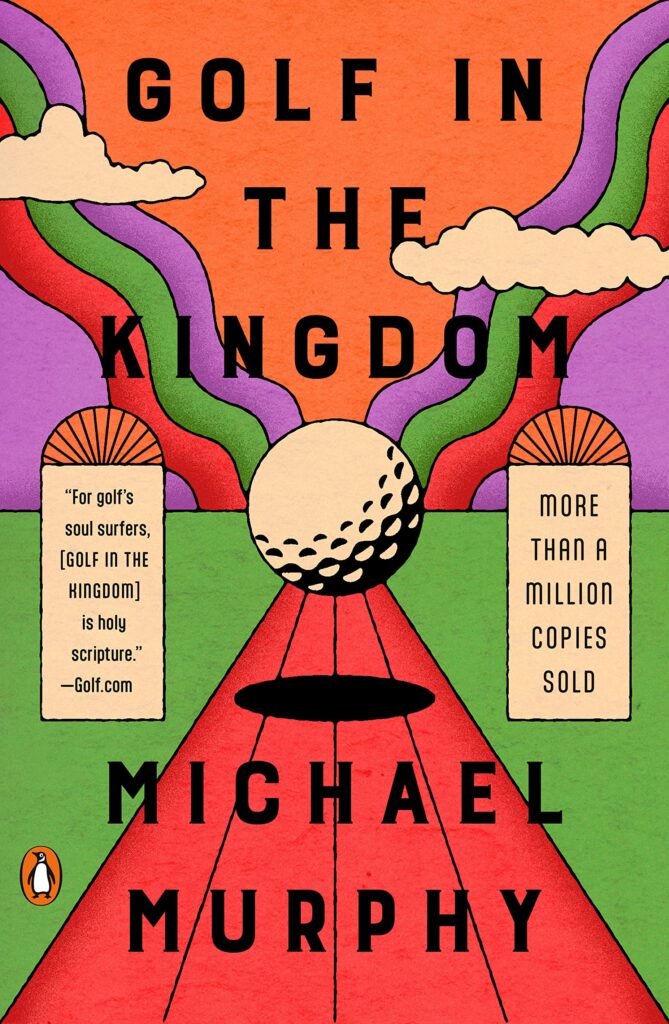 Michael Murphy, Golf in the Kingdom, reissue design by Lauren Peters-Collaer (Penguin Books, October 1)
This design and golf vibes!
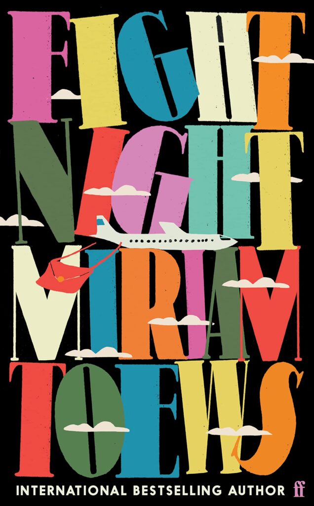 Miriam Toews, Fight Night, design by Anna Morrison (Faber & Faber, June 2)
The plane and clouds float effortlessly against a wall of type that’s barely standing. So much energy packed into a small space—it feels like it’s vibrating and barely contained.
 Alice Sedgwick Wohl, As it Turns Out, design by Alex Merto (FSG, August 16)
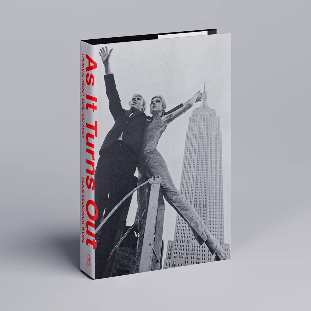
Huge credit for persuading the publisher to do away with the cover text altogether, but the way it just creeps on to the cover is really clever. Somehow always pleasing to see a cover distilled down to the absolute minimum of elements.
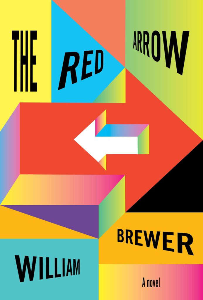 William Brewer, The Red Arrow, design by John Gall (Knopf, May 17)
I want to run around inside this cover—the movement and dynamism are masterful.
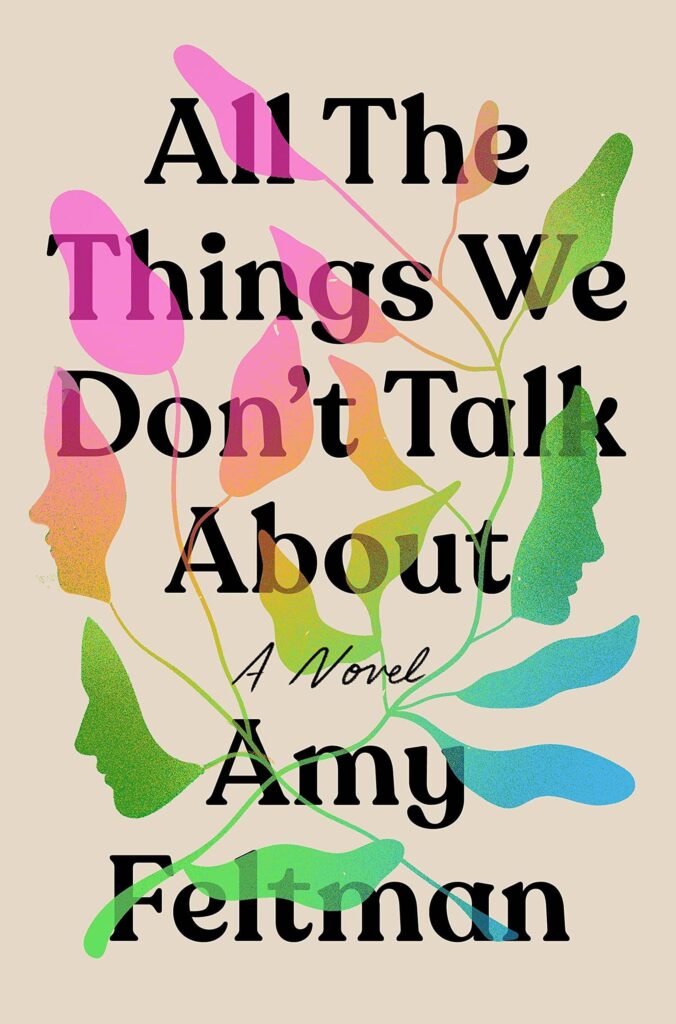 Amy Feltman, All the Things We Don’t Talk About, design by Grace Han (Grand Central, May 24)
I love the use of color, and yes! more cleverly incorporated profiles!
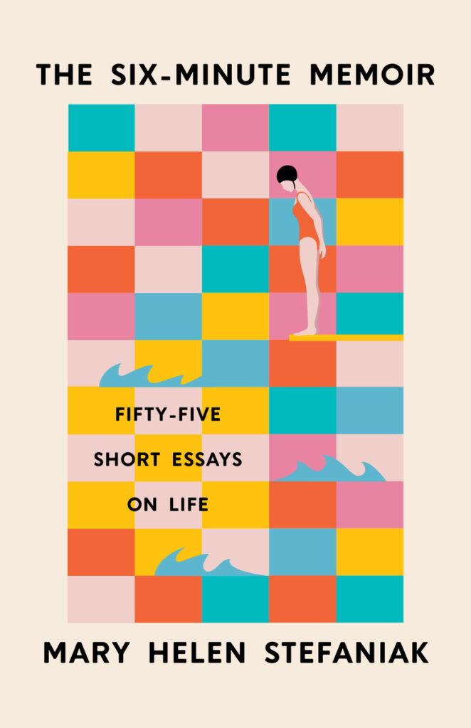 Mary Helen Stefaniak, The Six-Minute Memoir: Fifty-Five Short Essays on Life, design and illustration by Kimberly Glyder (University of Iowa Press, October 25)
What a lovely way to work in the fifty-five panels. The diver makes you feel like you could dip in and out of these stories at any time.
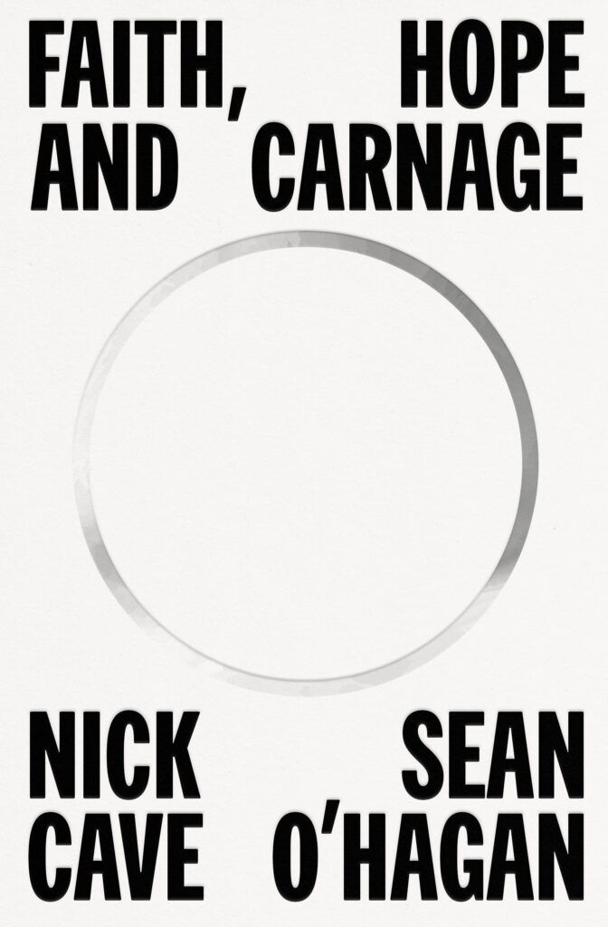 Nick Cave and Seán O’Hagan, Faith, Hope, and Carnage, design by Alex Merto (FSG, September 20)
Always envious when a designer can get away with so little, especially when the cover relies on so few bells and whistles: a strong yet refined typeface and unconventional spacing. This would be strong even without the empty circle. Pure graphic design.
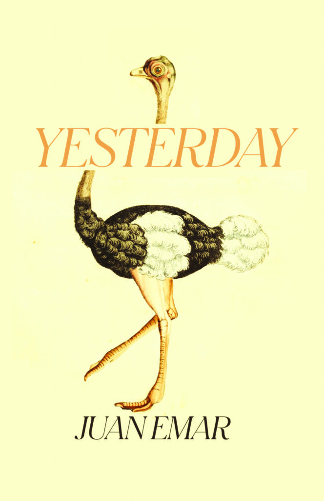 Juan Emar, Yesterday, design by Erik Carter (New Directions, April 5)
Would like to come up with something wise here but I fear it might in truth boil down to “lolz I like ostriches.” In any case, one of best ostrich covers I have ever seen.
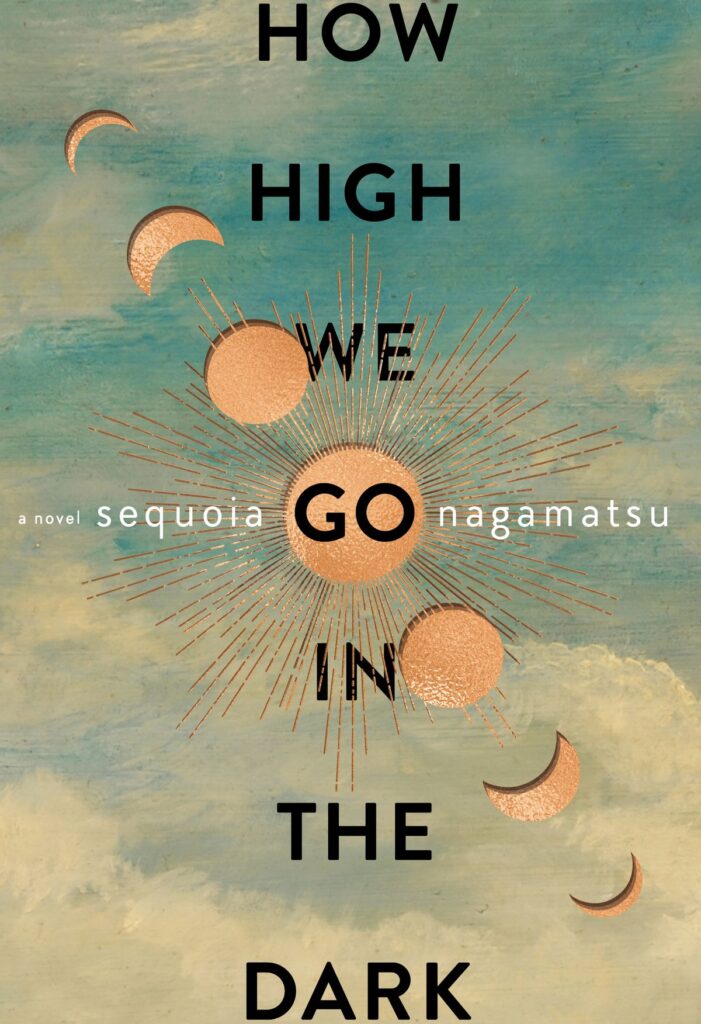 Sequoia Nagamatsu, How High We Go in the Dark, design by Will Staehle (William Morrow, January 18)
Love the balance and symmetry.
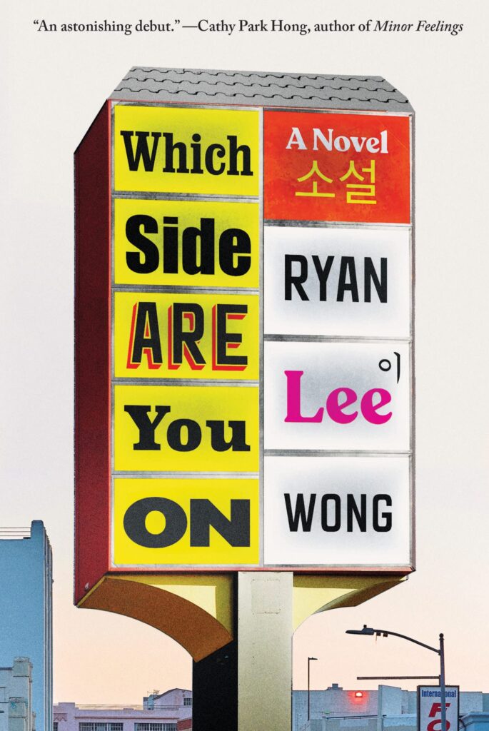 Ryan Lee Wong, Which Side Are You On. design by Gregg Kulick (Catapult, October 4)
This feels very LA. I love the clever mix of typography and how the clear division on the strip mall sign implies the themes of the book in a really graceful and attention grabbing way.
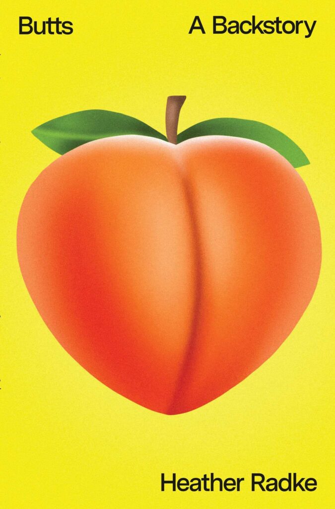 Heather Radke, Butts: A Backstory; cover design by Rodrigo Corral, art direction by Alison Forner (Avid Reader Press, November 29)
What’s not to love?!
BONUS:
 Chuck Tingle, Bisexually Stuffed by an Orgy of Sentient Thanksgiving Foods, design by Chuck Tingle himself (November 22)
This cover is perhaps not as sophisticated as some of its more highbrow colleagues from the world of letters, but it communicates its startling content with admirable zest.