Well, friends, it’s been another tough year. But as we wind down 2021, it is useful to remember the good parts, the pleasures small and large that got us through. And yes, a beautifully designed book can be one of those pleasures—especially when we’re still spending more time at home than perhaps we would like.
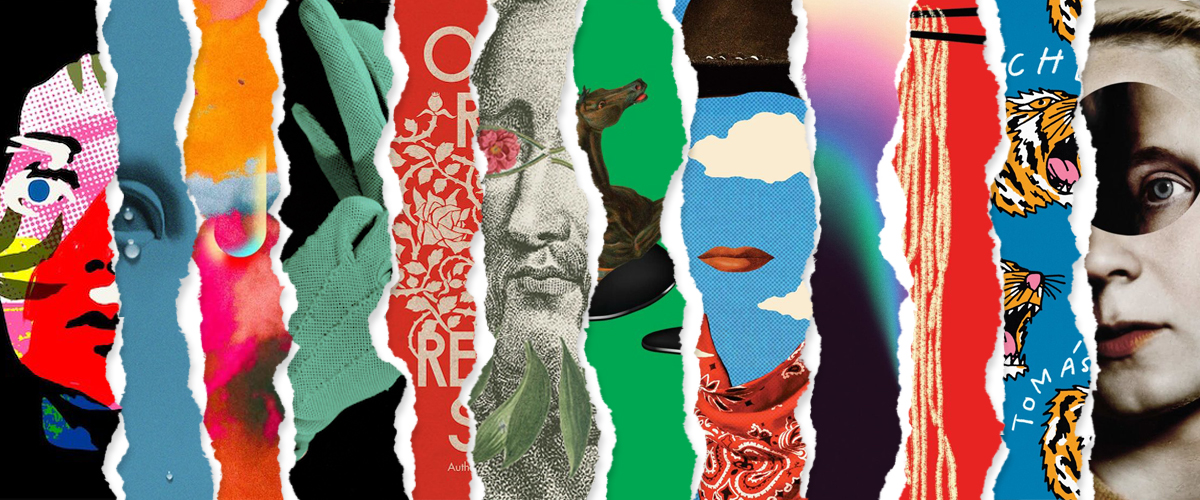
So you know the drill. For the sixth year in a row, I asked a few of my favorite professional book cover designers (34 of my favorites, in fact) to choose their favorite covers of the last twelve months. They came back with a grand total of 101 glorious covers, representing work by 67 different designers for 54 different imprints. All of their picks, along with what they had to say about them, are below.
But as you may know if you’re a frequent Literary Hub reader, I also like stats, and therefore I have tallied the best of the best for you here. Feel free to skip that part if you’d just like to look at some pretty book art. Either way, I think you’ll enjoy:
The stats:
The best of the best book covers:
First Place (tie, with 8 mentions each):
Anna North, Outlawed; cover design by Rachel Willey (Bloomsbury, January)
Pola Oloixarac, tr. Adam Morris, Mona; cover design by Thomas Colligan (FSG, March)
*
Second Place (6 mentions):
Kristen Arnett, With Teeth; cover design by Lauren Peters-Collaer (Riverhead, June)
*
Third Place (5-way tie, with 5 mentions each):
Jonas Eika, After the Sun; cover design by Lauren Peters-Collaer (Riverhead, August)
Chang-Rae Lee, My Year Abroad; cover design by Grace Han (Riverhead, February)
Wole Soyinka, Chronicles from the Land of the Happiest People on Earth; cover design by Linda Huang (Pantheon, September)
Joy Williams, Harrow; cover design by Kelly Blair (Knopf, September)
Richard Zenith, Pessoa: A Biography; cover design by Yang Kim (Liveright, July)
*
Honorable Mentions (3-way tie, with 4 mentions each):
Melissa Broder, Milk Fed; cover design by Jaya Miceli (Scribner, February)
Tamara Shopsin, LaserWriter II; cover design by Tamara Shopsin (MCD, October)
Rebecca Solnit, Orwell’s Roses; cover design by Gray318 (Viking, October)
The presses with the most covers on the list:
First Place (12 mentions): Knopf
Second Place (8 mentions): Riverhead
Third Place (6 mentions): FSG
The designers with the most different covers on the list:
First Place (6 covers): Janet Hansen
Second Place (tie; 5 covers each): Lauren Peters-Collaer, Na Kim
Third Place (4 covers): Tom Etherington
The best month for book covers:
First Place (13 covers): September
Second Place (four-way tie; 10 covers each): February, March, July, August
Third Place (tie; 9 covers each): June, October
The full list:
 Anna North, Outlawed; cover design by Rachel Willey (Bloomsbury, January)
This pop art collage style is definitely having a moment of popularity, and there’s no shortage of excellent designs to choose from. Rachel’s stands out to me because of the playfulness and surreal quality. The cover instantly drew me to this book and portrays the story perfectly.
Love the collagey mash of Western and Magritte. Everything about this cover is so fun.
This book stopped me in my tracks every time I passed it this year. The design is doing so much, so well, using surrealism, collage and color to deconstruct genre and gender archetypes.
The colors! The fonts! The texture! I am always drawn right to this cover whenever I see it in a bookstore. I want this as a poster. This says “Western” but also “not your grandpa’s Western.”
Such a fresh and stylish take on the traditional western genre. Love the color palette and the surreal, almost dream-like effect of the collage.
Do I ever get past one of these lists without including Rachel Willey? Impossible.
I love how this cover plays with Western tropes—a cowboy hat, handkerchief, and slab serif typography—but then subverts them with a healthy dash of campiness and fun that you rarely see in the genre.
I feel like R.O Kwon’s quote applies to the cover design as well. So cool how Rachel takes elements that are familiar to us and makes it feel fresh.
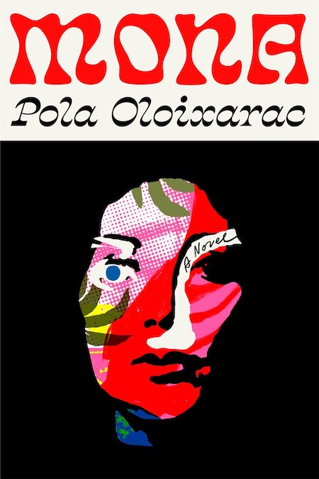 Pola Oloixarac, tr. Adam Morris, Mona; cover design by Thomas Colligan (FSG, March)
Mona is the best cover of the year. It is so iconic that they better hang this at the Hall of Fame.
There’s something so awesomely weird and psychedelic about this, it almost reminds me of a 70’s Polish movie poster. Beautiful, beautiful type and I love how the letter forms mirror the organic shapes of the illustration.
A colorful mess, I can’t stop staring.
Gorgeous! Fun! Fresh!
Immediately eye-catching! The illustration and type here is so fun and striking.
This cover is so stunning. Every time I look at the face, I find something new in the art. The collage and lettering are both so strong they could exist as separate entities.
Type and illustration working in perfect harmony.
Without question the best cover of the year.
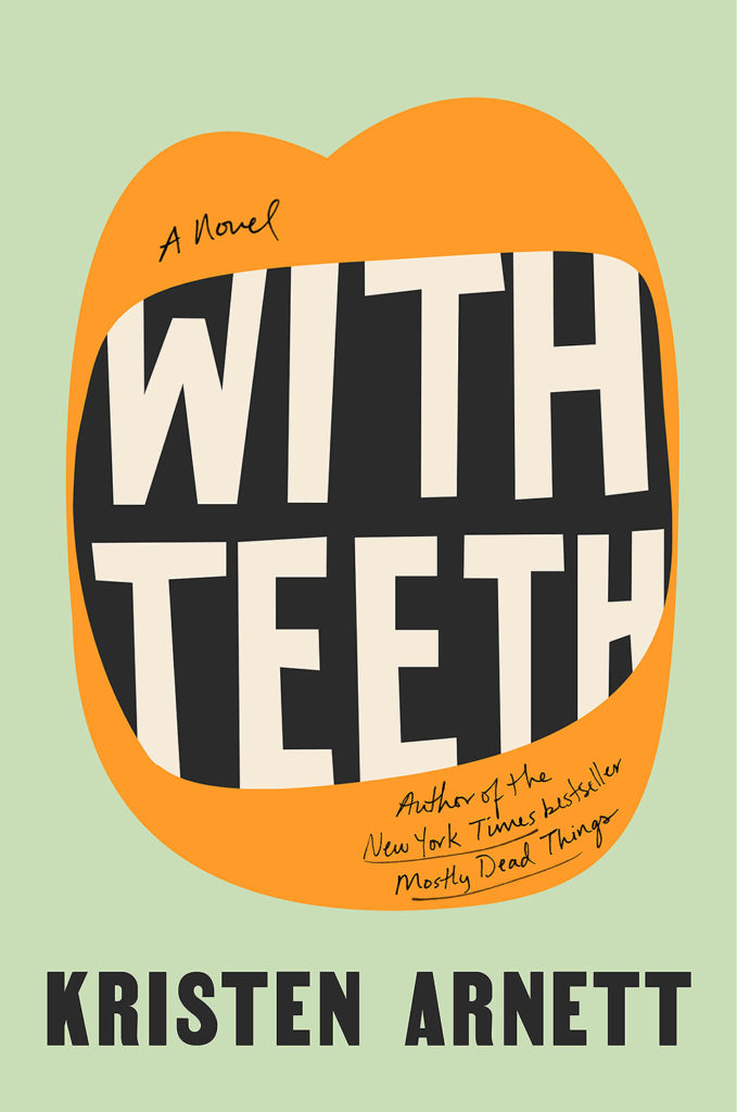 Kristen Arnett, With Teeth; cover design by Lauren Peters-Collaer (Riverhead, June)
This is so simple and clever! I love how the letters in the title make up the teeth!
Clever, oddball fun, with a biting edge (pun unavoidable).
Lauren did such a great job with this cover. The design is so whimsical and graphically eye-catching I can’t help but want to pick it up and give it a read.
Effortlessly fun and bold.
It’s wonderful when the art and title work together as perfectly as they do on this cover.
This jacket grabs my attention every time I see it. Such simplicity, and yet so much emotion in the shape of that mouth full of type.
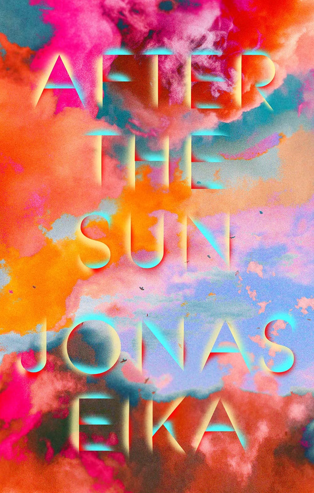 Jonas Eika, After the Sun; cover design by Lauren Peters-Collaer (Riverhead, August)
I’d rather not admit how many books I have purchased because of Lauren’s cover designs. Her work is always fresh and expertly crafted. I’m especially drawn to her use of color, and this title is no exception. It’s electric in person – a design that could easily turn muddy is crisp and legible. I want to know her pre-press secrets!
Vibrant colors and large type are every publishers’ favorite look but after a while it can be difficult to do it in a fresh and intriguing way—the beautiful rendering of the type on this cover combined with the intense contrasting colors makes this so effective.
Beautiful type, color palette, the whole package!
The colors remind be both of a psychedelic sunset and an oil-slick rainbow. The way the type seems to emerge and shine on its own immediately gives it dimension. I could spend forever looking at this cover.
I don’t know how Lauren came to be a designer, but she always seems to approach a book cover in a slightly unusual way—never reverting to a nice typeface on a nice picture. I love how this looks like 3D type poking through a sheet of tin foil that’s reflecting an amazing sunset.
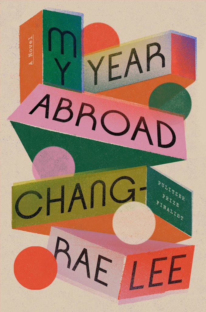 Chang-Rae Lee, My Year Abroad; cover design by Grace Han (Riverhead, February)
I’m a sucker for perspective type and dimensional design; this is probably my favorite. Love the shapes, the texture and the off-register colors. This feels big in such a fun, funky way.
A particularly pleasing composition of shapes, colors, texture, and typography.
So many layers to get lost in, but what stands out is Grace’s type choice: the round characters match the five circular shapes. My eyes jump around in the best way
This cover is so playful, evocative, and incredibly beautifully crafted. The ultimate eye candy!
I love the way this cover conveys a subtle narrative through its teetering forms and type moving in all directions.
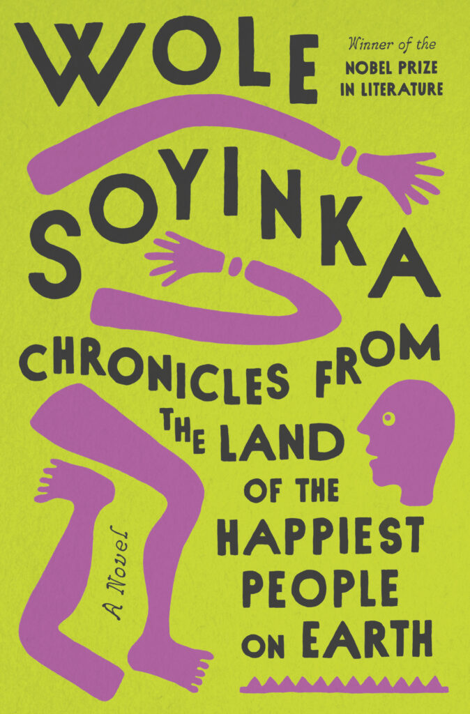 Wole Soyinka, Chronicles from the Land of the Happiest People on Earth; cover design by Linda Huang (Pantheon, September)
This is such a bright and dynamic design. Love the rich pink and chartreuse green, the zany arrangement of type and artwork, and the wonderful illustration. This title has a lot of text and Linda Huang did such a great job with it! Such a unique and sharp cover.
You have to see it in real life! The colors are so vibrant. The way the elements are arranged is fun and playful, yet everything is clear and readable.
A really appealing, memorable color palette, and the long title is handled so well within the space.
OMG this is the longest title ever and I’m so inspired by how the type is really playful yet clearly legible among the spots of artwork. The masterful layout and simple color palette combine to give this cover so much wonderful, crazy energy.
The deft touch in the dance between type and image on this jacket pulls you in and along for the ride. This is such an energetic and elegant solution for a jacket with a long title.
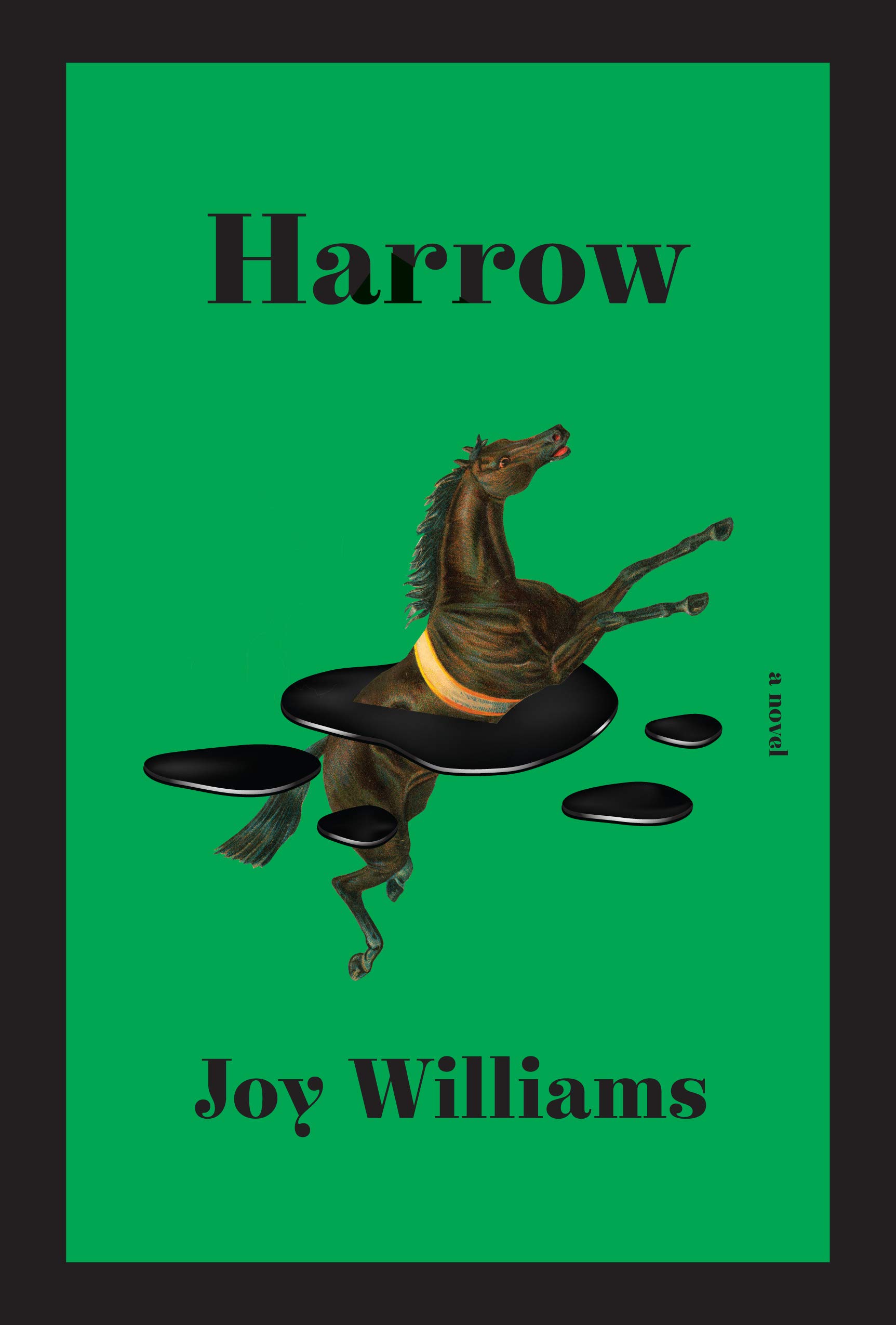 Joy Williams, Harrow; cover design by Kelly Blair (Knopf, September)
I am totally captivated by this bizarre and beautiful image. The horse, the droplets, the strange physics at work—what is happening?? I love it.
The horse trapped in that black pool is such a sublime and devastating image. I also love how the choice of serif, with its bulbous terminals, complements the shape of the black blobs.
The combination of the lush green background and the surreal floating horse is incredible.
A classical layout and type treatment juxtaposed with a surreal & haunting image…and that green! Totally captivating.
Simple, elegant, smart. I’m intrigued.
 Richard Zenith, Pessoa: A Biography; cover design by Yang Kim (Liveright, July)
A great modernist design and an original way to play with a portrait on a cover. Loved the title font treatment, the soft colors, and particularly enjoy how the subtitle looks like a stamp—such a perfect detail. Has a lovely depth and charm to it while also encompassing the subject’s enigmatic life.
Such a refreshing biography design.
The more you examine this cover, the more moments of intrigue draw you in. Yang really designed this ‘repeat pattern’ in a fun and fresh way with a truly vibrant color palette.
Love how the layers bring focus to Pessoa.
One of my favorite covers of the year. A gorgeous and super fresh take on a genre that we all know often leads to the overdone & everseen: “photo of a guy” + type. Each element is so carefully composed and clearly considered here—I can feel it! Yang Kim knocked this one out of the park.
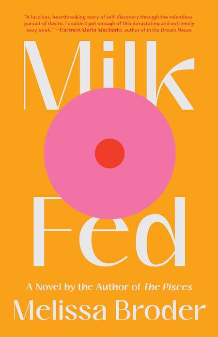 Melissa Broder, Milk Fed; cover design by Jaya Miceli (Scribner, February)
Let us not forget about this early in the year cover with a brilliant, minimal, eye catching illustration that not only makes you want to read the book but also inspired you to frame it and place it up on your wall. Beautiful palette, bold design, iconic image.
Smart, funny, subversive, eye-catching—this cover is such a fantastic distillation.
Another instantly iconic cover, The retro type and the cheeky illustration make this a conversation starter for sure.
SO GOOD. What a perfect combination of image and colors and font.
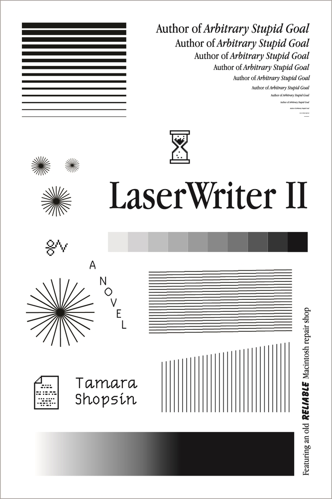 Tamara Shopsin, LaserWriter II; cover design by Tamara Shopsin (MCD, October)
I can’t stop looking at this. That horrible condensed Garamond, everything just a tiny bit lo-res and all the elements looking like they’re stuck on with no thought. I bet it took ages. It’s a brilliant cover.
So fun and approachable even with a limited palette.
Made me smile. Such a fresh take on a very specific visual language from the past.
Looks like someone had way too much fun here. Gotta love the commitment to form and technology.
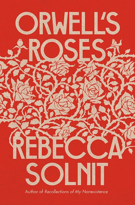 Rebecca Solnit, Orwell’s Roses; cover design by Gray318 (Viking, October)
Reminds me of an old box of chocolates, both simple & delicious. Gray318 never ceases to amaze and delight!
Incredibly beautiful marriage of typography and image. Simple but arresting.
Such a beauty! The woven flowers with the elegant san serif type is so pleasing to the eye. Love the rich but muted colors and the thorns on the stems. A timeless design.
A beautifully striking design that is almost just one color.
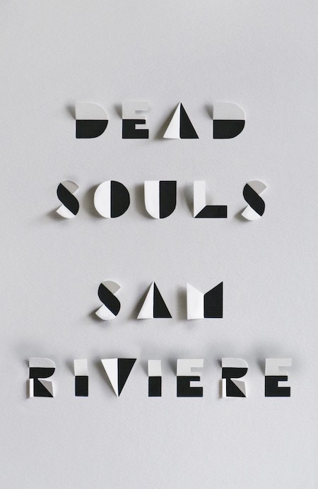 Sam Riviere, Dead Souls; cover design by Jamie Keenan, paper engineering and photography by Gina Rudd (Weidenfeld & Nicholson (UK), May)
So clean and smart, I want to hold this but I’m afraid I’d tear the perfect paper folds.
I am a sucker for all-type, cut paper, Jamie Keenan covers.
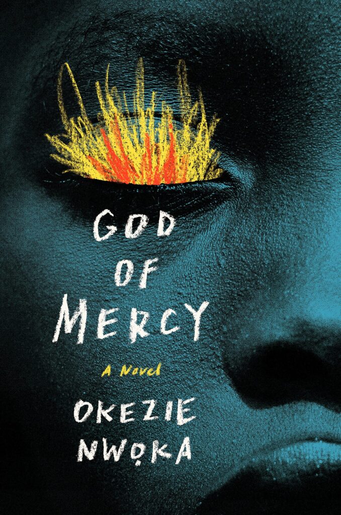 Okezie Nwoka, God of Mercy, cover design by Sara Wood (Astra House, November)
A haunting cover, at once elegant and disturbing. I think it has so much power because it’s so succinct in its depiction of violence and trauma.
Whoa…that contemplative face and the deep tones of the art are beautiful. The way Sara introduced the element of surprise with the textured type and illustration makes it feel so fresh.
Perfect layout/cropping, stunning use of photography, illustration, and handlettering. This one is a real gut punch. There’s a silent scream here you can’t turn away from. What has this child seen??
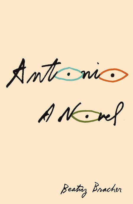 Beatriz Bracher, tr. Adam Morris, Antonio; cover design by Janet Hansen (New Directions, March)
The simplicity of this cover is deceiving—the scale and tension of the entirely hand-drawn elements create a beautifully compelling representation of its subject.
This achieves such a mood with such economy. The three Os used to convey the three different viewpoints is thrilling.
A minimalist master, Janet Hansen’s restraint knows no bounds!
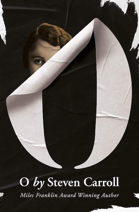 Steven Carroll, O; cover design by Gray318 (4th Estate (UK) February)
The curling of the O to reveal a colorful woman—such a simple and effective way of communicating that there’s a story behind the story.
This has everything I like to see on a book cover: a bit of trompe l’oeil, something annoying like the O not being stuck down perfectly, something hidden to add a bit of intrigue, some ripped paper to give a hint of danger and some really small type to make the big type seem even bigger (and vice versa)—BINGO!
 Laurent Binet, tr. Sam Taylor, Civilizations; cover design by Alex Merto (FSG, September)
This cover is so clever. I love the subtle type treatment and the simplicity of the artwork and how it plays with the title perfectly. The artwork looks like a ship or could also be rocks which is such a smart way to get one’s attention. A cover that requires a closer look always wins me over.
Nice textures in an unexpected layout.
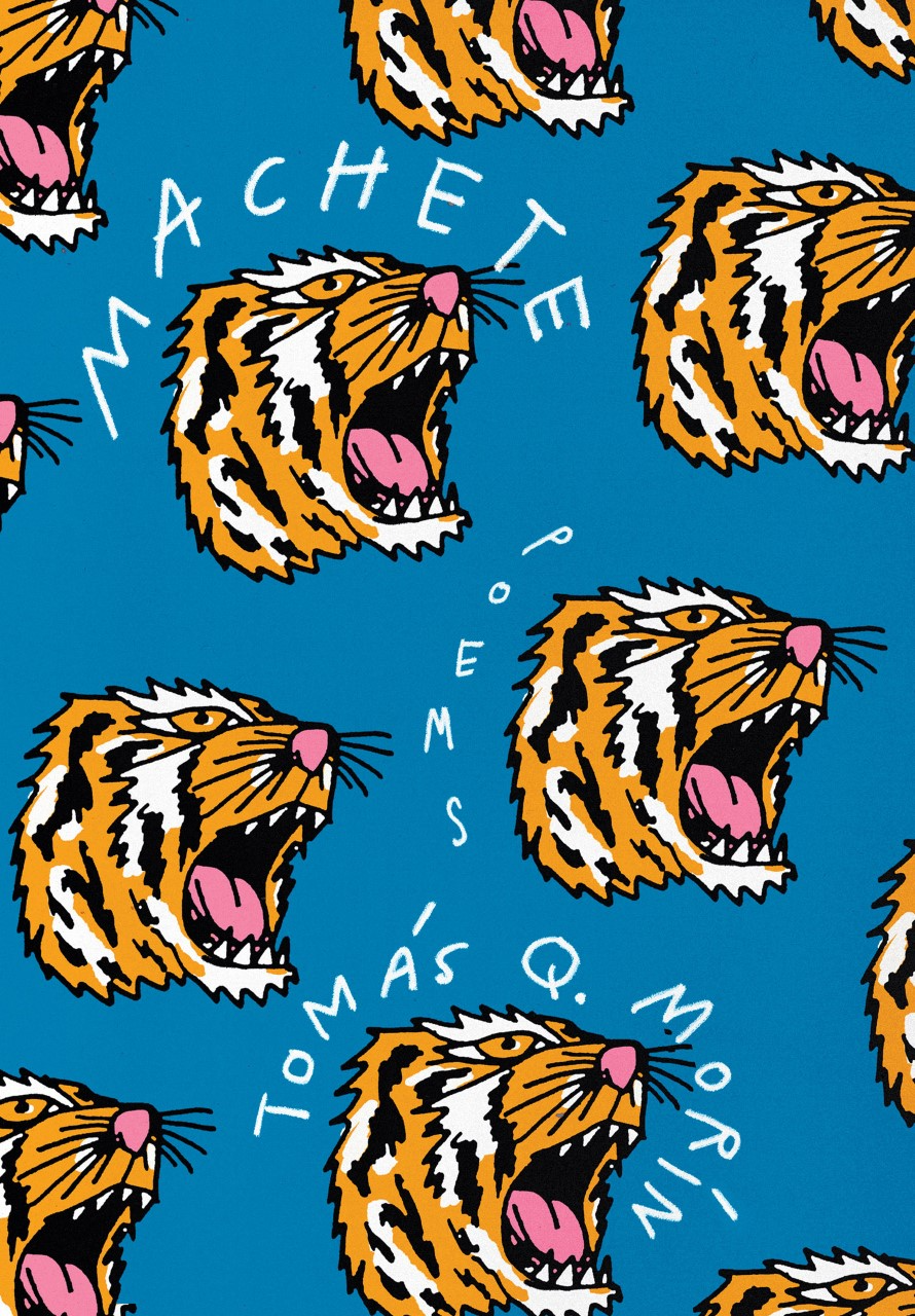 Tomás Q. Morín, Machete; cover design by Bráulio Amado (Knopf, October)
Always on board with a roaring tiger pattern.
What’s better than one tiger on a book cover? TWELVE TIGERS ON A BOOK COVER!
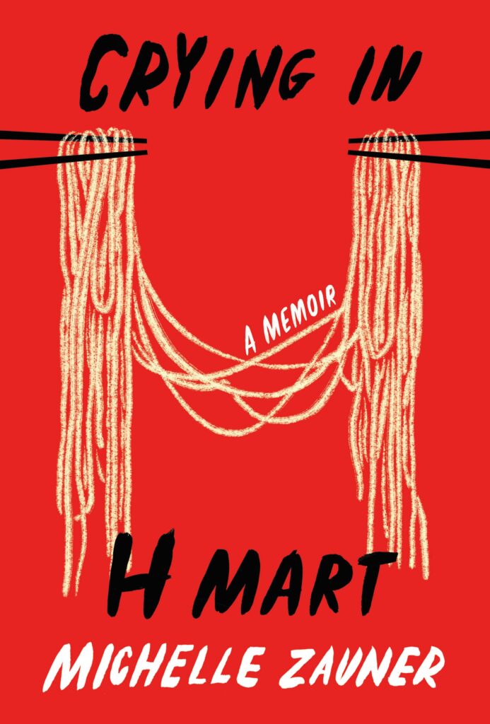 Michelle Zauner, Crying in H Mart; cover design by Na Kim (Knopf, April)
This cover is masterful in its avoidance of the obvious; It somehow evokes the experience of sharing food, crying, and graphic representation of the H Mart logo with barely any literal representation.
Na is so good at capturing the core of a text in the simplest yet most memorable way possible. Crying in H Mart is just another example of that and, I’m sure all my Asian fellows agree, deeply felt.
Such a brilliant composition and smart use of the image as part of the typography. Also comforting to see this particular image with the title.
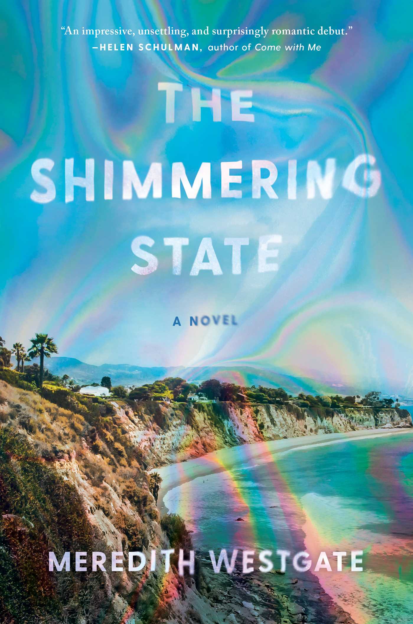 Meredith Westgate, The Shimmering State; cover design by Chelsea McGuckin (Atria, August)
A beautiful cover that lets us know that something is not quite right by how the image and the type seem to be flowing like an oil slick.
The way the oil slick (or soap bubble?) plays with the type makes this cover so intriguing and ominous while the bright colors invite the reader in and place is squarely in LA.
 Eley Williams, The Liar’s Dictionary, cover design by Emily Mahon (Doubleday, January)
Excellent use of a three-dimensional object within a design, graceful combination of illustration and photography, and spot-on funny: we all peacock with our words.
I love the contradictions of this cover art: smart, but goofy; serious, but humorous; academic, but…not. It prompted me to see what it was about. Mountweazels! Who knew!? The two-dimensional peacock strutting under the weight of the three-dimensional book…taking on a little too much weight. Defiantly taunting the reader to question the authenticity of its cargo! Brilliant.
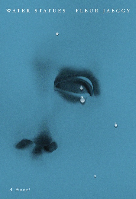 Fleur Jaeggy, tr. Gini Alhadeff, The Water Statues; cover design by Arsh Raziuddin & Oliver Munday (New Directions, September)
Only a few elements needed to elevate this. The empty space makes this design feel whole.
A beautiful 2021 update of Man Ray’s “Tears” photograph. Logically so wrong—tears are never this perfect—but aesthetically so right.
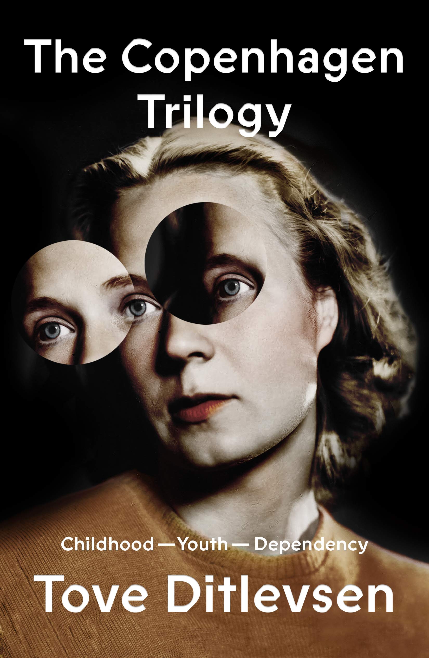 Tove Ditlevsen, tr. Tiina Nunnally and Michael Favala Goldman, The Copenhagen Trilogy; design by Na Kim (FSG, January)
I spent a while staring at this cover and being impressed about the three eyes lining up perfectly. I feel like this one is deceptively simple and the cut out section reveals an inner truth only found in the book itself. Na Kim’s separate covers for each part of the trilogy are also fascinating, with different iterations of the same image.
This is just so good. The clean white type somehow manages to be serious and quirky at the same time and pairs beautifully with the manipulated image. I love how simple yet superbly effective the displacement/swap/tiling of the eyes is.
 Nathaniel Mackey, Double Trio; cover design by Rodrigo Corral (New Directions, April)
Double Trio: Love a Baldessarian blob. Each cover in this series has wonderful art.
Bold, courageous, clever and very original.
 T.J. Newman, Falling; cover design by David Litman (Avid Reader Press, July)
A super commercial book cover, but that doesn’t stop it looking great. About as vertical as you can get and I love how the image sits somewhere between photographic and illustrative for that blockbuster movie poster feel.
Another beautiful color palette! I think it can be hard for commercial thrillers to look new and different, and still invoke the category. David’s design expertly bridges both. It’s fresh, but iconic with a classic feel. Full of suspense, but warm and eye-catching.
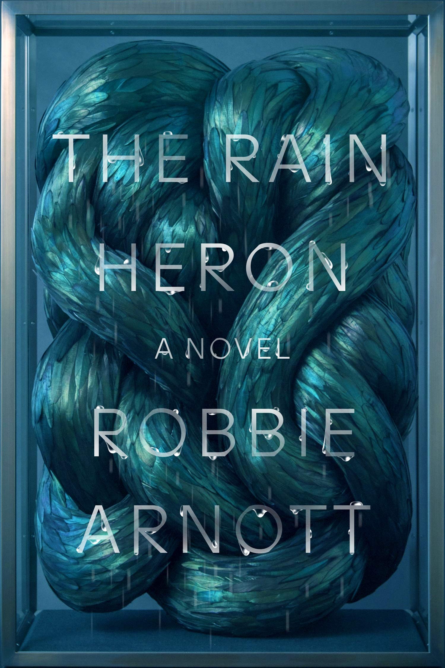 Robbie Arnott, The Rain Heron; cover design by Na Kim, art by Kate MccGwire (FSG Originals, February)
Just mystifying! Na has given us a perfect jewel box to puzzle over, made tactile with touches of spot gloss.
I just want to touch it.
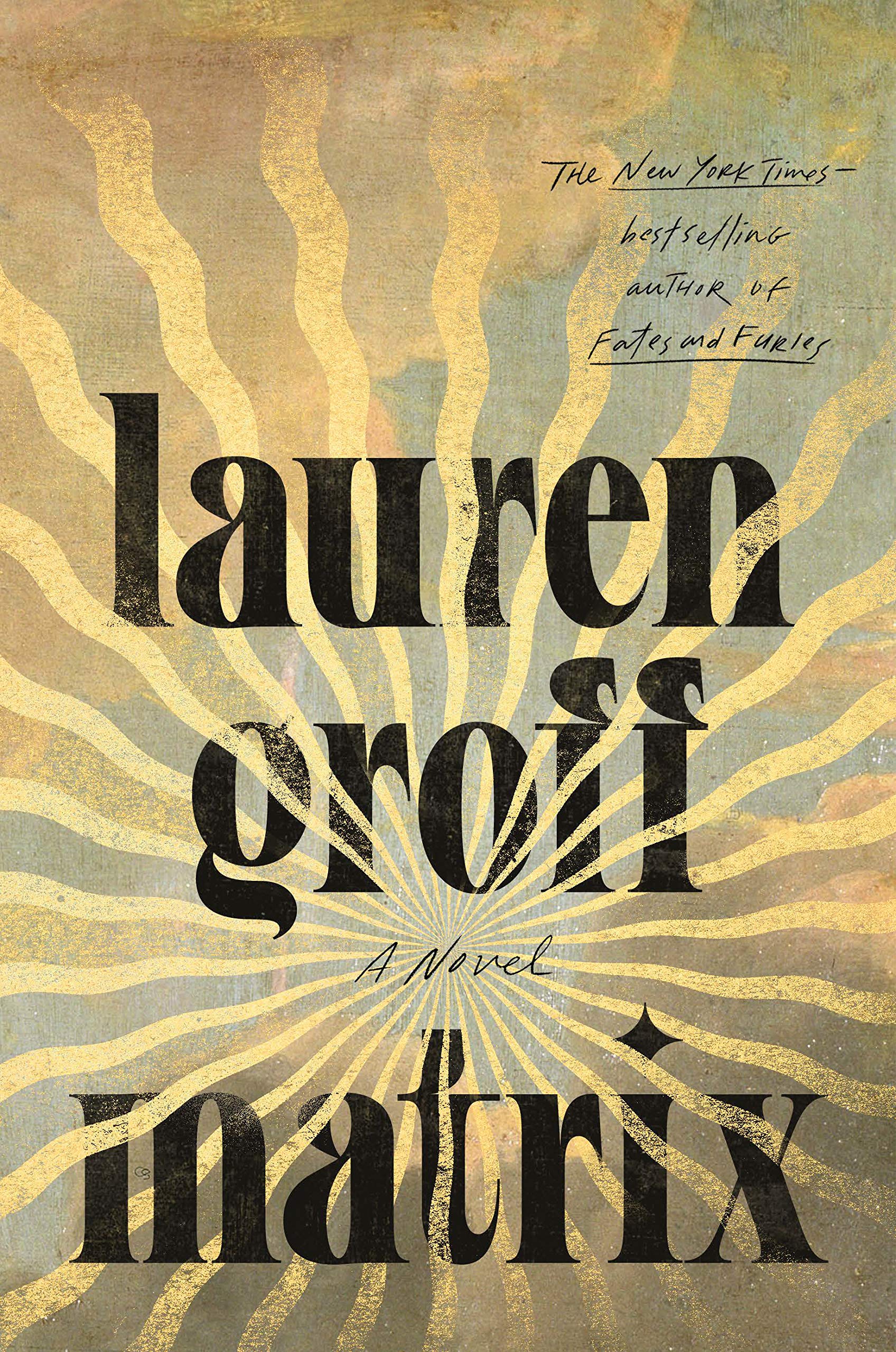 Lauren Groff, Matrix; cover design by Grace Han (Riverhead, September)
So beautiful. The weathered golden rays and textured painting with more modern type really hits that right balance of evoking a story from the past with a contemporary feel.
I’m obsessed with this typeface as well as the heavenly gold rays that make the cover seem to glow.
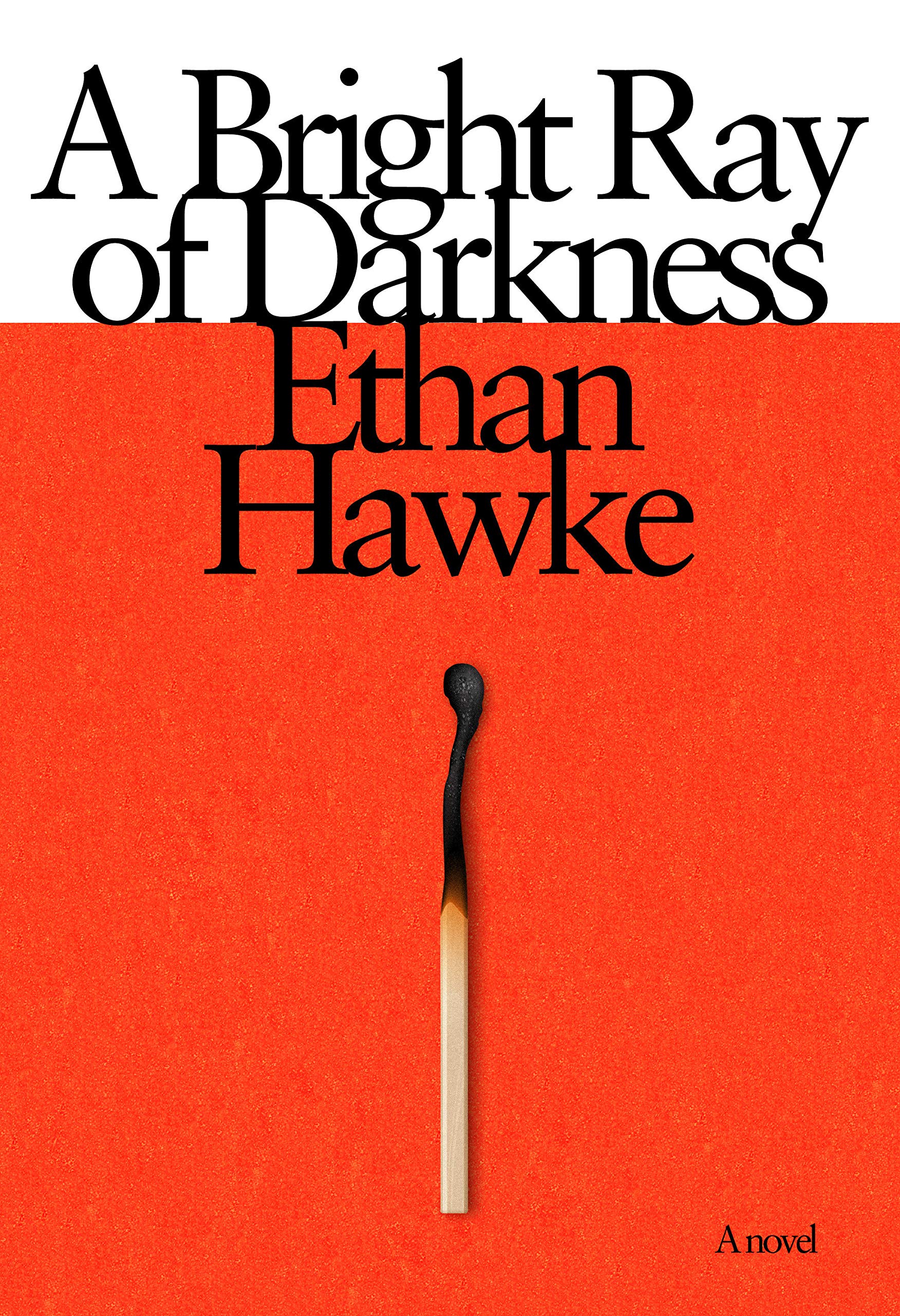 Ethan Hawke, A Bright Ray of Darkness; designed by John Gall (Knopf, February)
Like all of John’s work: bold, timeless, and brilliant.
Striking in its simplicity, brilliant in its execution. A welcome nod to classic fiction designs of the 1960s and 70s.
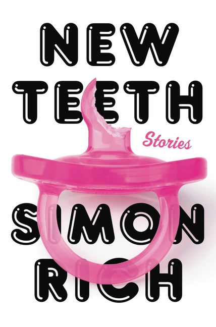 Simon Rich, New Teeth; cover design by Lucy Kim (Little, Brown, July)
I’ve seen this I don’t know how many times this year and each time I love it again. The font, image and title all work perfectly together, and the black and pink on white really stands out on the shelf. Simple, bold, and clever.
So funny and clever. The pairing of the fonts and pacifier really make the cover pop.
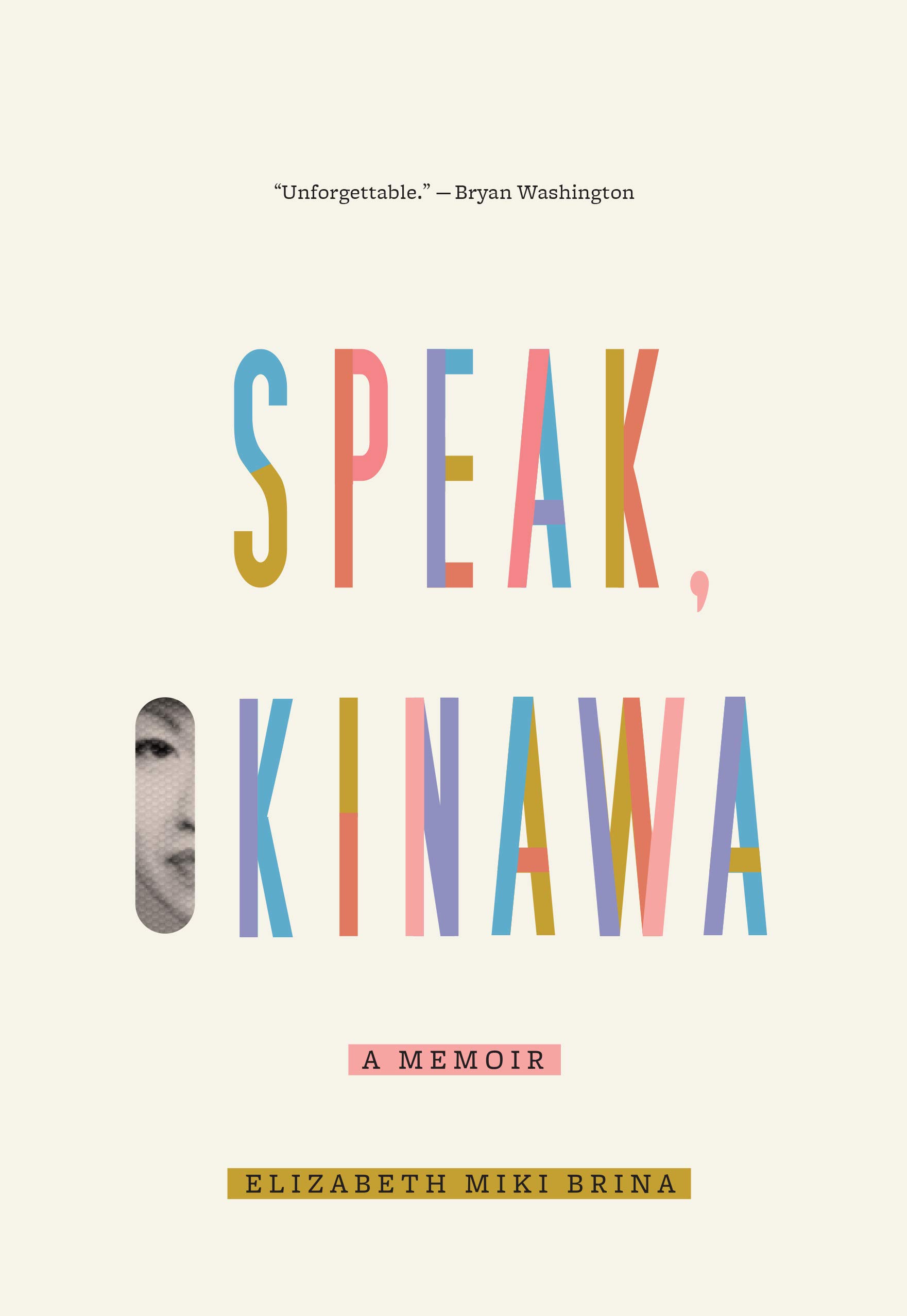 Elizabeth Miki Brina, Speak, Okinawa; cover design by Janet Hansen (Knopf, February)
Such a beautiful example of less being more. I almost hold my breath when I look at this jacket. The power of the figure looking out at the world through that O is memoir perfection.
Just so minimal and beautiful with clear consideration over every detail. Gorgeous, evocative palette and the little slice of face feels intriguing and emotional.
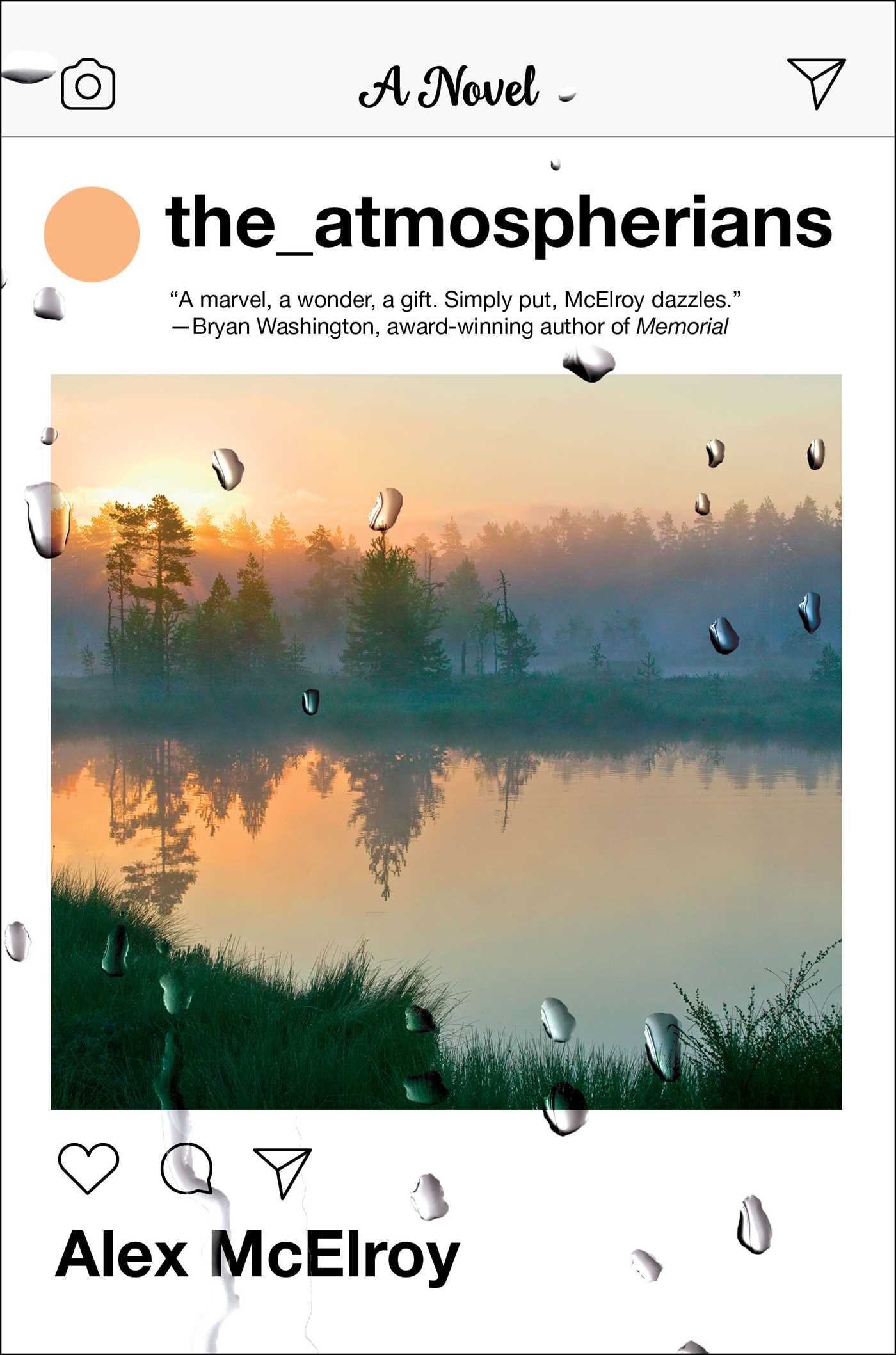 Alex McElroy, The Atmospherians, cover design by Laywan Kwan; (Atria, May)
I love the mood Laywan creates here, pairing the Instagram feed with the serene photograph and topped with layered rain drops. It feels alluring and inviting, yet with an eeriness under it all.
A perfect expression of an instagram post rendered as book cover, and I love the addition of the water droplets that give it that extra dimension.
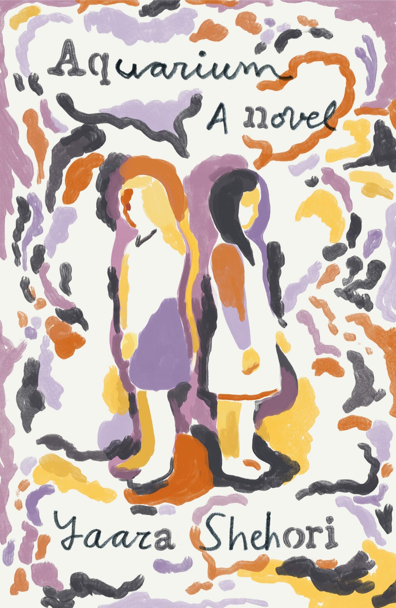 Yaarza Shehori, Aquarium; cover design by Thomas Colligan (FSG, April)
I really admire the overall effect of this art and particularly love how wonderful and idiosyncratic the type is.
This cover tickles every part of my brain, from the unique mark-making to the unusual palette. And that weird lettering—a script-stencil hybrid—shouldn’t work, but of course, Thomas pulls it off and the result is this strange, poetic work of art.
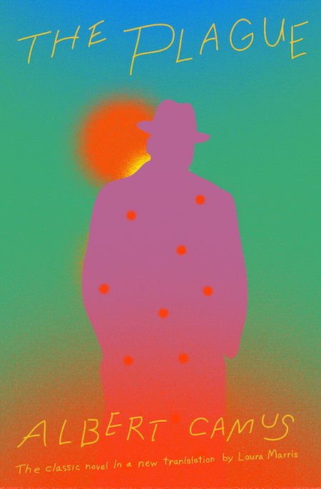 Albert Camus, The Plague; cover design by Sunra Thompson (Knopf, November)
The color caught my eye right away; everything is so vivid that the cover almost vibrates.
I have no words.
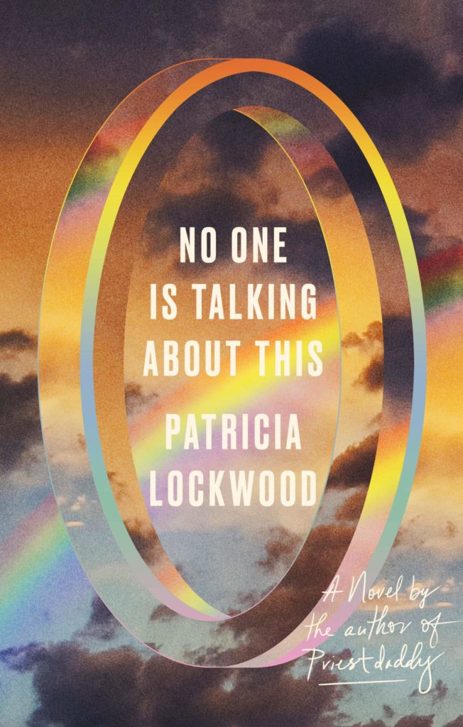 Patricia Lockwood, No One Is Talking About This; cover design by Lauren Peters-Collaer (Riverhead, February)
The sky and dimensional illusion feels so cohesive. It’s so fun to look at!
Big book energy. Perfect.
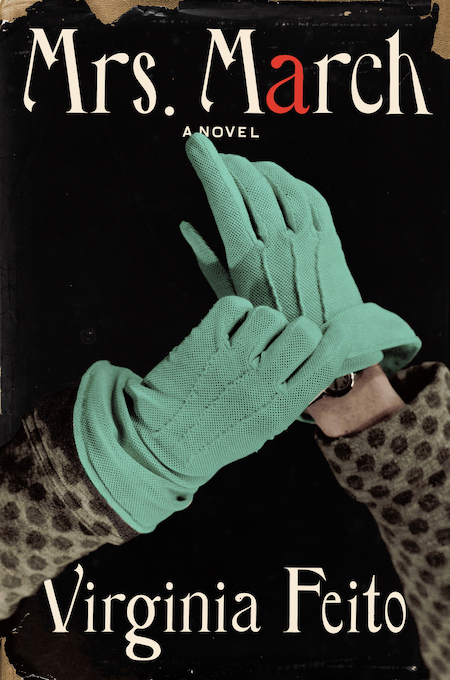 Virginia Feito, Mrs. March; cover design by Jaya Miceli, art direction by Steve Attardo (Liveright, August)
I love how at once fresh and classical this is; the unexpected POV angle, the beautiful type, and the splash of red in the “a.” All the elements come together like a Hitchcockian, paranoid fantasy. I hear a suspenseful violin crescendo when I look at this jacket.
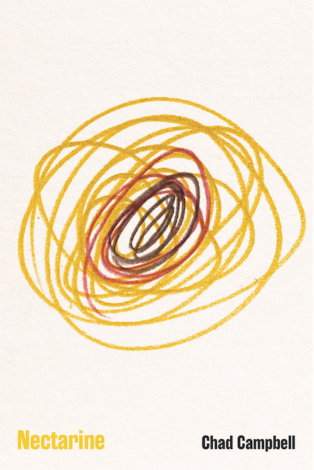 Chad Campbell, Nectarine; cover design by Dave Drummond (Signal Editions, September)
Damn. I love Dave Drummond’s concepts. Would the art work without the title? It would still be intriguing, and oddly beautiful. Clean, and messy. Clearly more than just a scribble…the right amount of shape and color variation to make the art “readable”…. so, yeah, maybe even without the title.
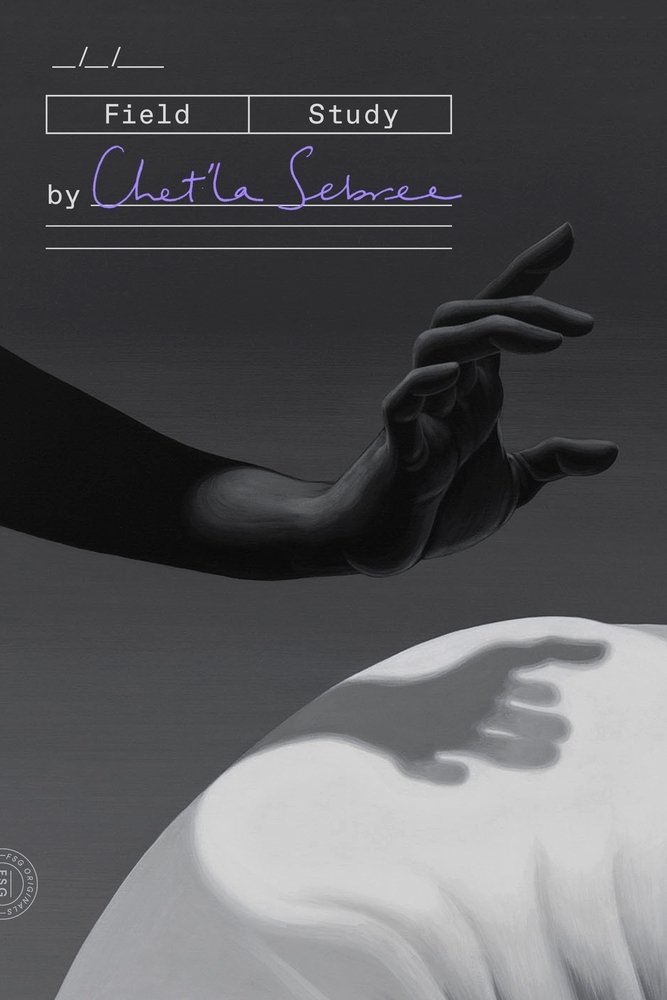 Chet’la Sebree, Field Study; cover design by June Park (FSG Originals, June)
I love the juxtaposition between the rigid clinical type treatment and the fluidity of the image. The handwritten author name in purple seems like a small moment, until you realize the entire thing actually hinges on it. The design is mysterious and cerebral—exactly what I imagine a “field study” of humanity would look like.
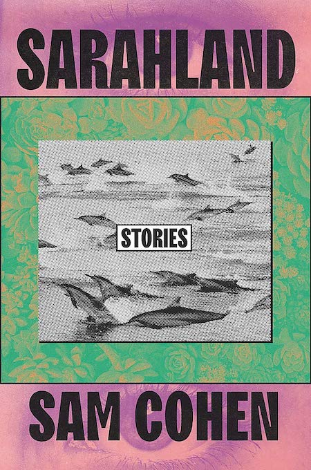 Sam Cohen, Sarahland; cover design by Tree Abraham, Grand Central (March)
A wholly unique cover, this one really caught my eye in store. There’s a great tension here: flat vs. dimensional, muted vs. bold…it’s all a touch awkward and, as a result, most intriguing.
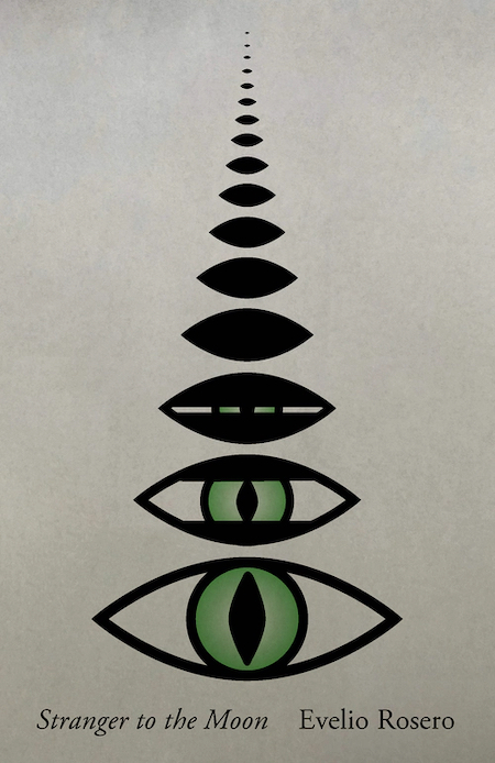 Evelio Rosero, tr. Victor Meadowcroft and Anne McLean, Stranger to the Moon; cover design by Janet Hansen (New Directions, September)
Reptilian and human at the same time, a composition that controls your eye and an image that leaves you with so many questions. Brilliant.
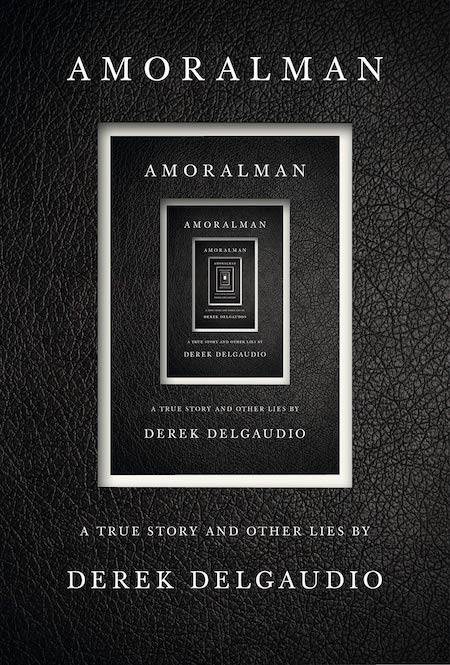 Derek Delgaudio, Amoralman; cover design by John Gall (Knopf, March)
I always love a book on a book cover, and there are so many here. It feels like you could get lost in the endless repetition.
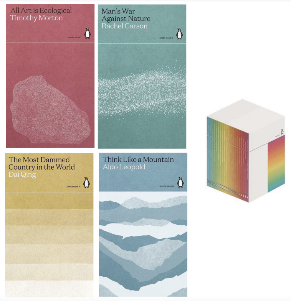 Various authors, Penguin Green Ideas series; cover designs by Tom Etherington (Penguin Classics UK, October)
Thoughtful, timely, stylish, duotone beauties. The slipcase with the spines “in formation” is worth seeking out. These already feel like a contemporary classic of series design.
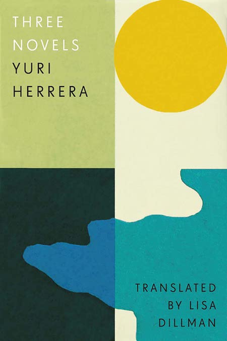 Yuri Herrera, tr. Lisa Dillman, Three Novels; cover design by Tom Etherington (And Other Stories, September)
I love Tom’s use of shapes and color blocking here. The cover feels so serene, and the muted palette is a nice touch.
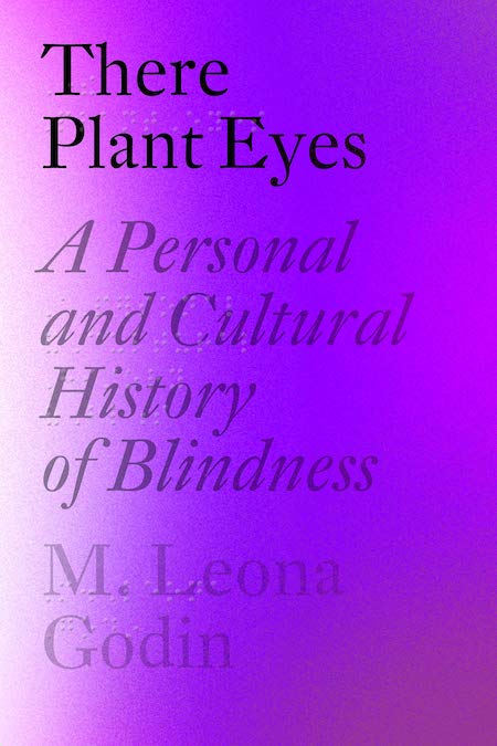 M. Leona Godin, There Plant Eyes; cover design by Janet Hansen (Pantheon, June)
Janet wins with this brilliant use of blind deboss for braille. The tactile quality matched with the optically distorting rays of purples makes for a simple but impactful cover.
 Hanif Abdurraqib, A Little Devil in America; cover design by Michael Morris (Random House, March)
Stunning use of typography.
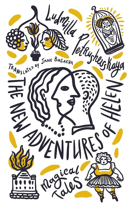 Ludmilla Petrushevskaya, tr. Jane Guvaeva, The New Adventures of Helen, cover design by Natalya Balnova (Deep Vellum, November)
In a market that is saturated with illustrated covers, this illustrated cover feels totally fresh with its minimal color palette and fun interweaving of type and image.
 Natasha Brown, Assembly; cover design by Lauren Harms (Little, Brown, September)
The book itself is physically small, light in your hand; with Lauren’s design, it becomes monumental.
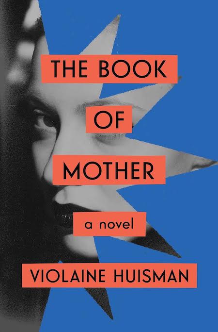 Violaine Huisman, The Book of Mother; cover design by Tristan Offit (Scribner, October)
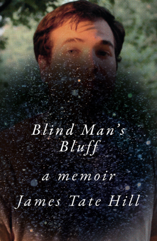 James Tate Hill, Blind Man’s Bluff; cover design by Sarahmay Wilkinson (W.W. Norton, August)
I just keep trying to look over this…obstruction…(is it in my eye?)…to see who that man is. Talk about the viewer being put in the author’s head! Right-on cover imagery for this memoir.
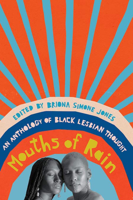 Briona Simone Jones, ed., Mouths of Rain: An Anthology of Black Lesbian Thought; cover design by Emily Mahon (New Press, February)
I am usually ambivalent about bright, happy covers and see them as an industry necessity, but this cover just makes me smile. What makes it especially good is the rigor of the cut-paper aesthetic and the way the type is rendered with the same hand.
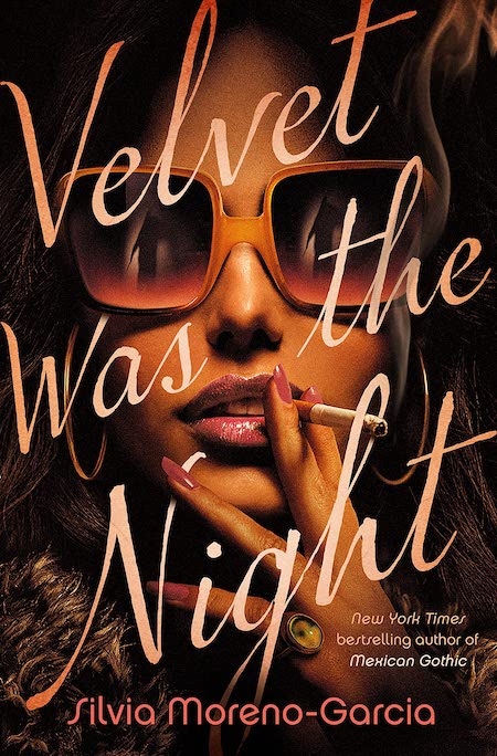 Silvia Moreno-Garcia, Velvet Was the Night; cover design by Tim Green / Faceout Studio (Del Rey, August)
I don’t even know what to say, everything about this is perfect.
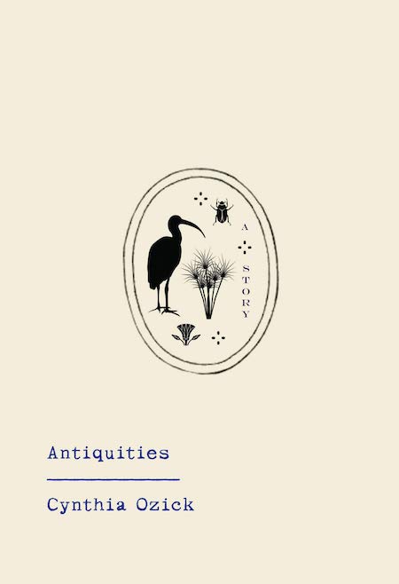 Cynthia Ozick, Antiquities; cover design by Abby Weintraub (Knopf, April)
In an age when big type dominates, I love seeing a design that begs you to look closer and examine it. Instead of broadcasting to the reader, this design makes you do the work. The delicate imagery and imperfect type work together beautifully—each element is a clue left for the reader to explore and ponder why it’s there.
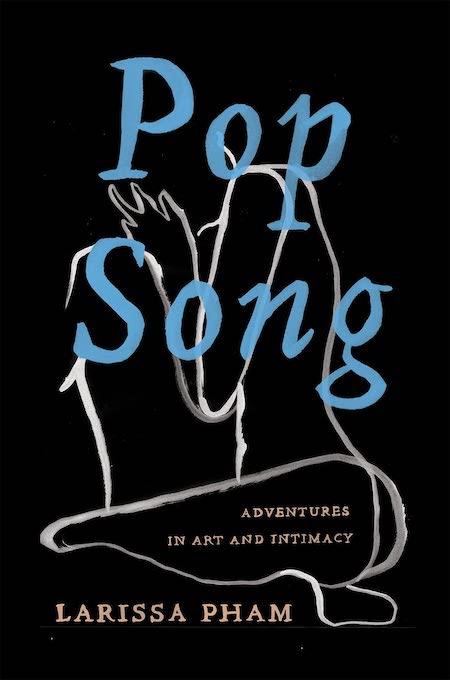 Larissa Pham, Pop Song: Adventures in Art and Intimacy; cover design by Nicole Caputo (Catapult, May)
I love the handmade quality of the illustration and type, it makes the cover feel very intimate, which is perfect for the material.
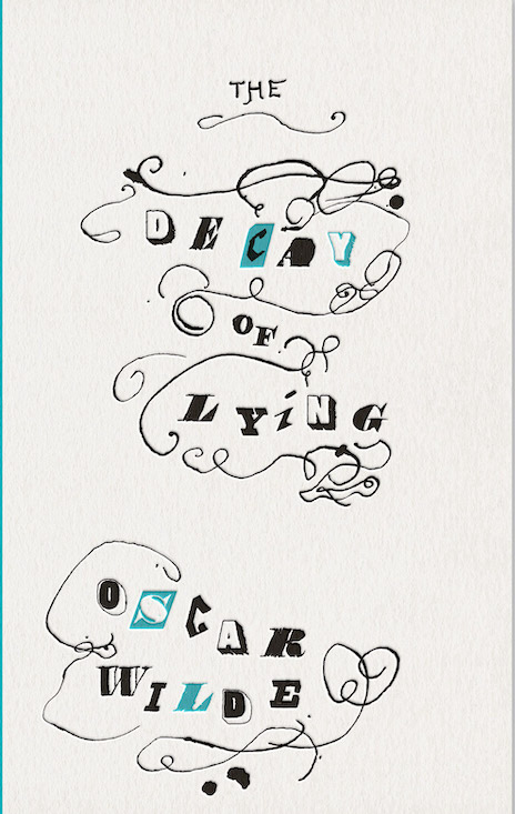 Oscar Wilde, The Decay of Lying; cover design by Felix Koeberlin and David Pearson (Penguin Great Ideas Series, June)
This looks like an exquisite ransom note. The ornaments appear as if they were drawn by a feeble, bed-ridden hand, but Felix Koeberlin, the 10-year-old son of a type designer, provided the calligraphic inspiration.
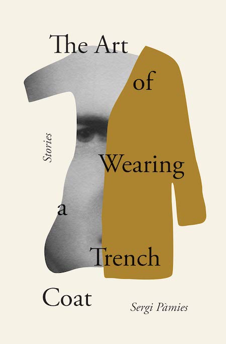 Sergi Pàmies, The Art of Wearing a Trench Coat; cover design By Oliver Munday and Arsh Raziuddin (Other Press, March)
Such a clean use of imagery, type and space. I love the confidence of this cover. It has a tension that makes me stop and read the title. A bit of quiet amongst the hundreds of books shouting at you from the shelves.
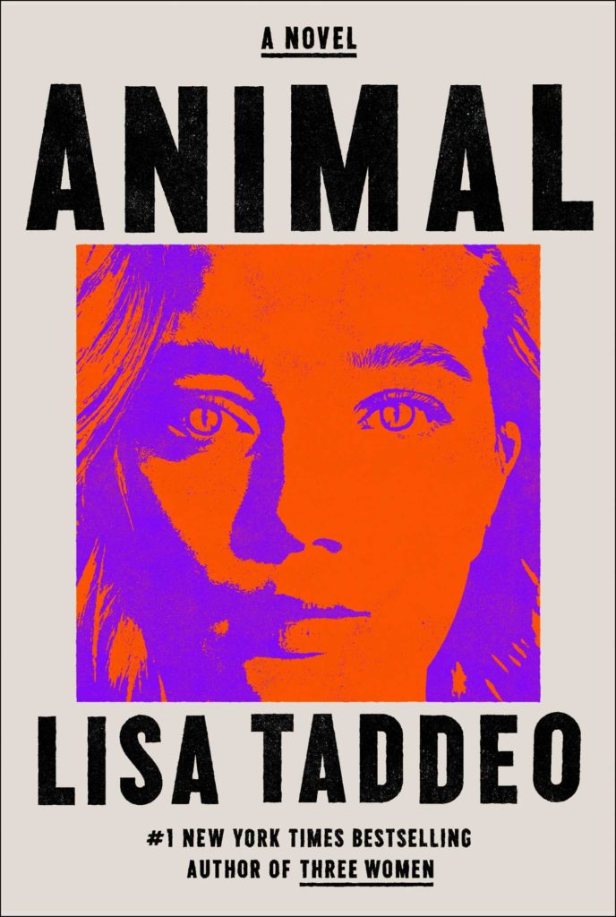 Lisa Taddeo, Animal; cover design by Zak Tebbal & Alison Forner (Avid Reader, June)
It’s hard not to stare back at this cover, and it’s the subtle adjustment in the pupils that really drive this design home.
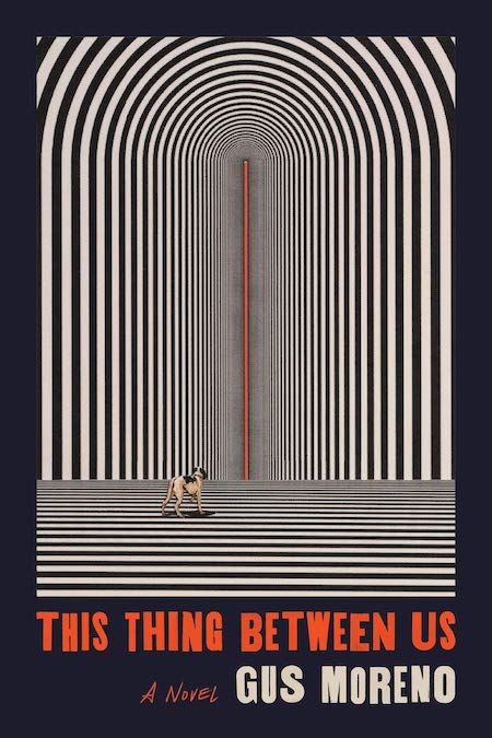 Gus Moreno, This Thing Between Us; cover design by Sara Wood (MCD x FSG Originals)
Mesmerizing, with so many great little details.
 Elvira Navarro, Rabbit Island; cover design by Gabriele Wilson (Two Lines Press, February)
Can you imagine receiving this in the mail? This (faux-fur) slipcase designed by Gabriele Wilson, for Elvira Navarro’s Rabbit Island, was meant to celebrate Two Lines Press’ first published book of 2021.
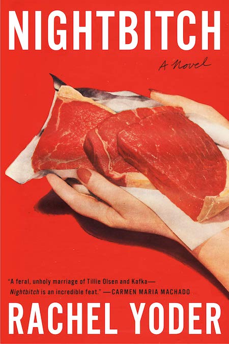 Rachel Yoder, Nightbitch; cover design by Emily Mahon, cover photograph by Nathan Biehl (Doubleday, July)
It’s red with big, white sans serif type and the handwritten dash of “a novel”—all things we’ve seen over and over. But you have never seen a cover like this before. It’s hard to believe a design could out-shock a title like Nightbitch, and Emily nailed it.
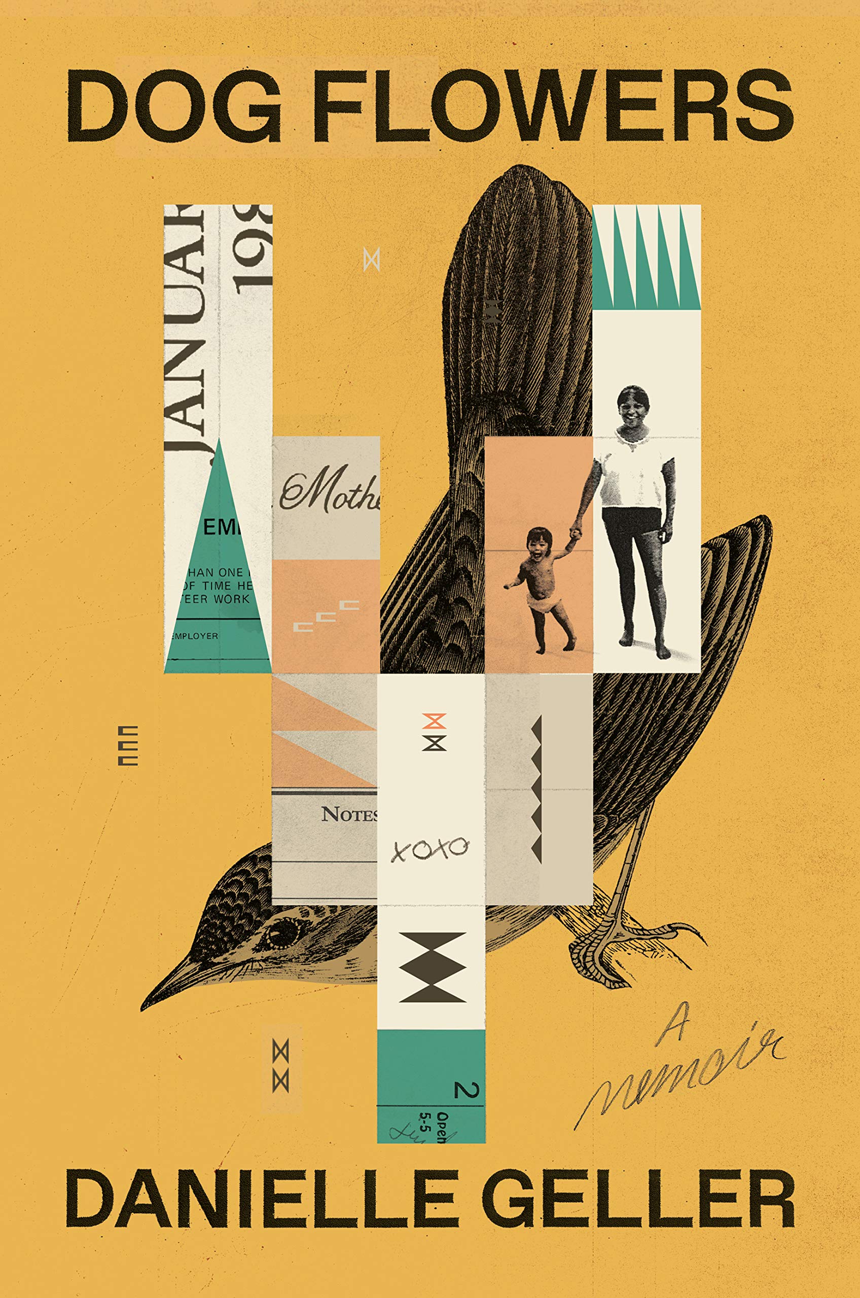 Danielle Geller, Dog Flowers; cover design by Anna Kochman, illustration by Mike McQuade (One World, January)
Every element is so precise, but still human, warm, with ephemera beautifully evocative of a time and place.
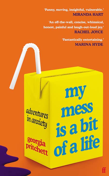 Georgia Pritchett, My Mess Is a Bit of a Life; cover design by Holly Overton, art direction by Donna Payne (Faber (UK), July)
I am always a sucker for a title on an object and this design really engages me. It takes me back to being a child with my first carton of juice. Fits the tone of the book perfectly.
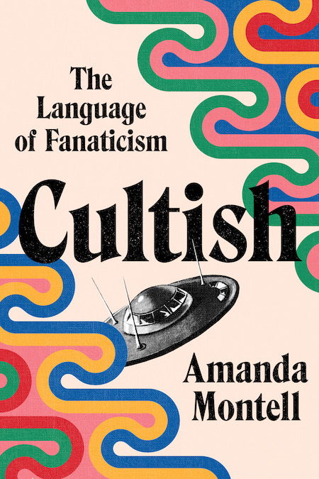 Amanda Montell, Cultish; cover design by Joanne O’Neill (Harper Wave, June)
I feel like Joanne is the queen of picking stylish fonts! I also love the retro feel with the colors/pattern/texture, and the immediately recognizable stereotypical flying saucer.
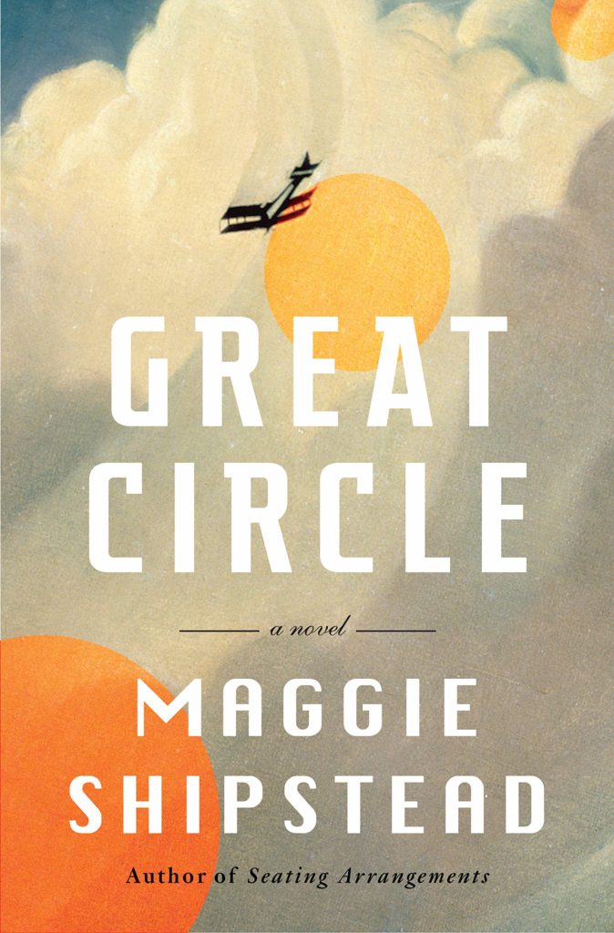 Maggie Shipstead, Great Circle; cover design by Kelly Blair (Knopf, May)
This was my favorite book I read this year and I also loved the cover. It has such a sweeping feel that matches the novel’s epic tale. Love the romantic colors, smart type treatment, and grainy texture. Looks and feels like a classic.
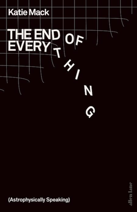 Katie Mack, The End of Everything; cover design by Tom Etherington (Penguin UK, July)
I love all that empty black space and how the rigid lines turn a bit fiddly when they get chopped. A fitting book to start your freelance career with?
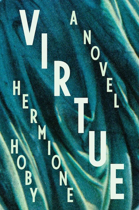 Hermione Hoby, Virtue; cover design by Ben Denzer (Riverhead, July)
Love how the type works with the draping in the background.
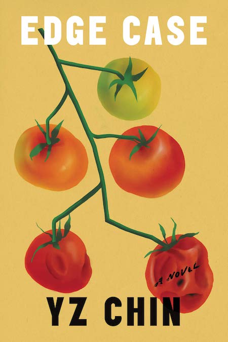 YZ Chin, Edge Case; cover design and illustration by Na Kim (Ecco, August)
Who doesn’t love some ripe tomatoes?
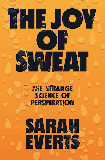 Sarah Everts, The Joy of Sweat: The Strange Science of Perspiration; cover design by Renald Louissant, art direction by Sarahmay Wilkinson (W.W. Norton, July)
What can I say about this, except that I want to reach out and touch it! I haven’t seen the book in person, but I sincerely hope some cash was spent to emboss and spot gloss those sweat drops. Between the blocky black type that interacts with the sweat, the orange gradient, and the small scientific element that punctuates the subtitle, the design decisions here are incredibly complex, but the result is effortless.
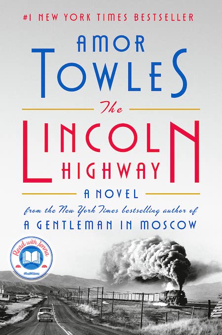 Amor Towles, The Lincoln Highway; cover design by Nayon Cho (Viking, October)
The typography and colors are gorgeous. Everything just works out very nicely here.
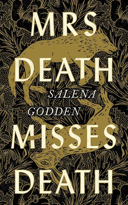 Salena Godden, Mrs Death Misses Death; cover design by Gill Heeley (Canongate UK, January)
Atmospheric and very arts and crafts—right up my street (yep, cover design is so subjective). I love the illustration and the depth. The type sings out. There’s quite a lot going on but the balance is great.
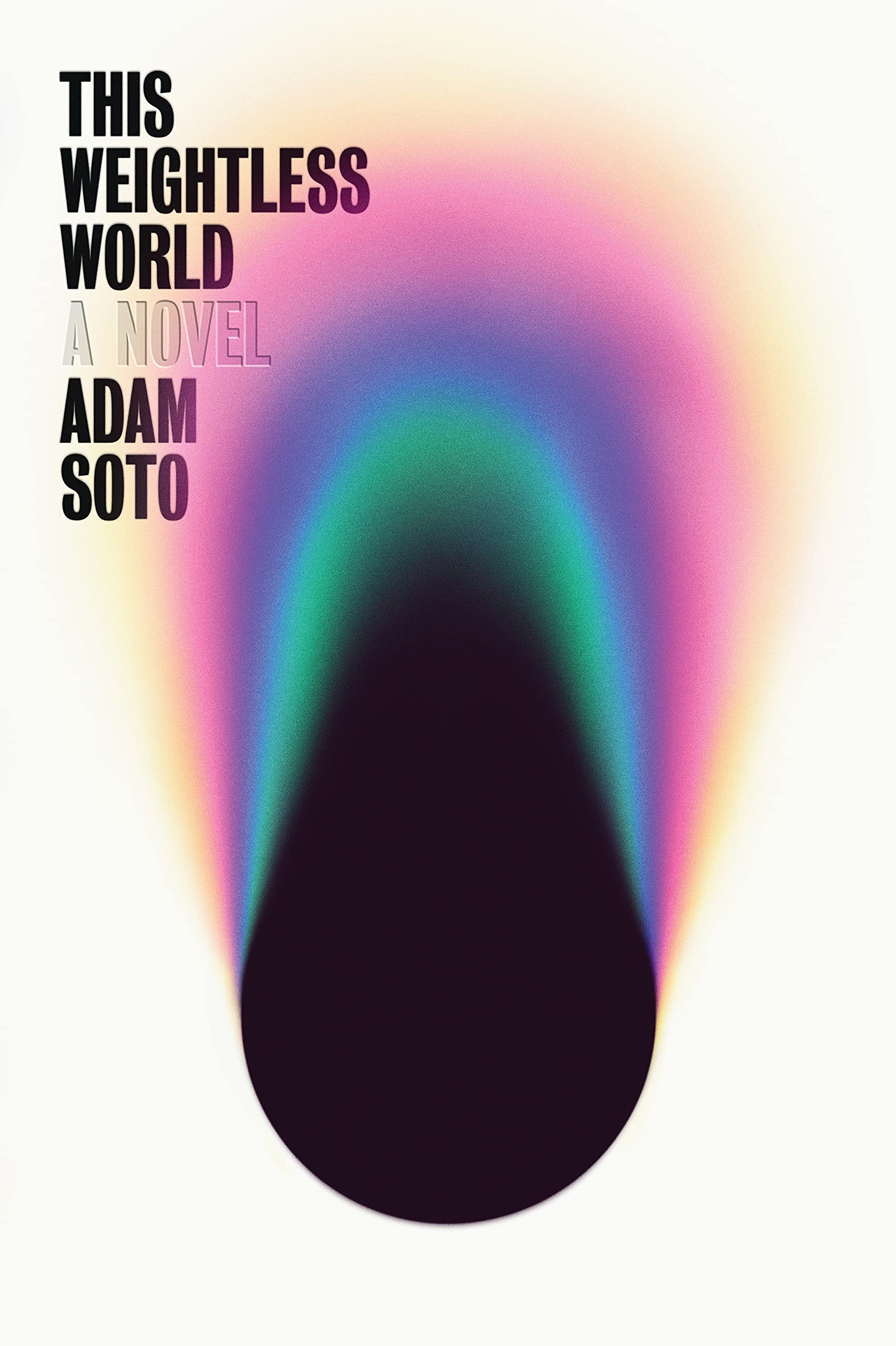 Adam Soto, This Weightless World; cover design by Tyler Comrie (Astra House, November)
Beautiful and intriguing. Great use of metallic effects; the iridescent colors, but most of all that dense, dark, black hole, just sucks you in. That “A Novel” isn’t printed but only embossed on the final jacket is a small but nice touch that complements the overall simplicity of the design.
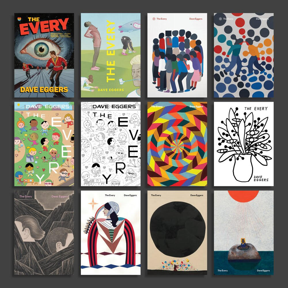 Dave Eggers, The Every; art direction by Sunra Thompson (McSweeneys, November)
A book with 32 DIFFERENT COVERS. Good lord. This project makes me so happy I could cry.
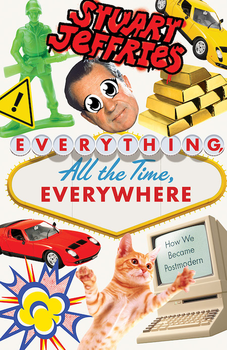 Stuart Jeffries, Everything, All the Time, Everywhere: How We Became Postmodern; cover design by Zak Tebbal (Verso, October)
Pure madness.
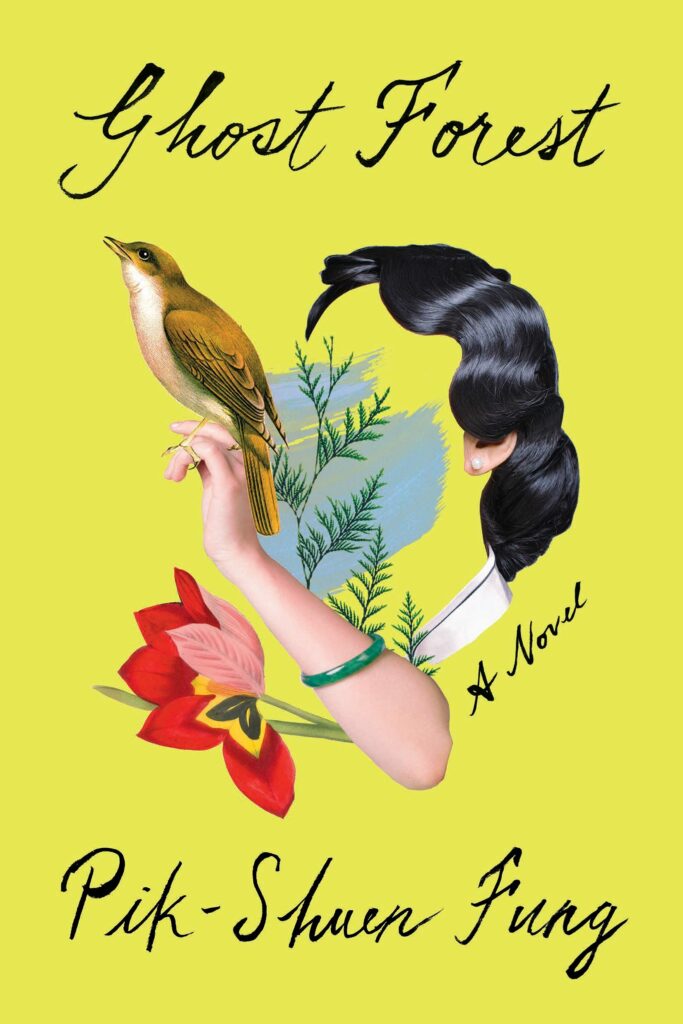 Pik-Shuen Fung, Ghost Forest; cover design by Donna Cheng (One World, July)
Every element in the collage is lovely, and it’s intriguing for what it leaves out. Beautiful use of color, and the idiosyncratic calligraphy is at once antique and new.
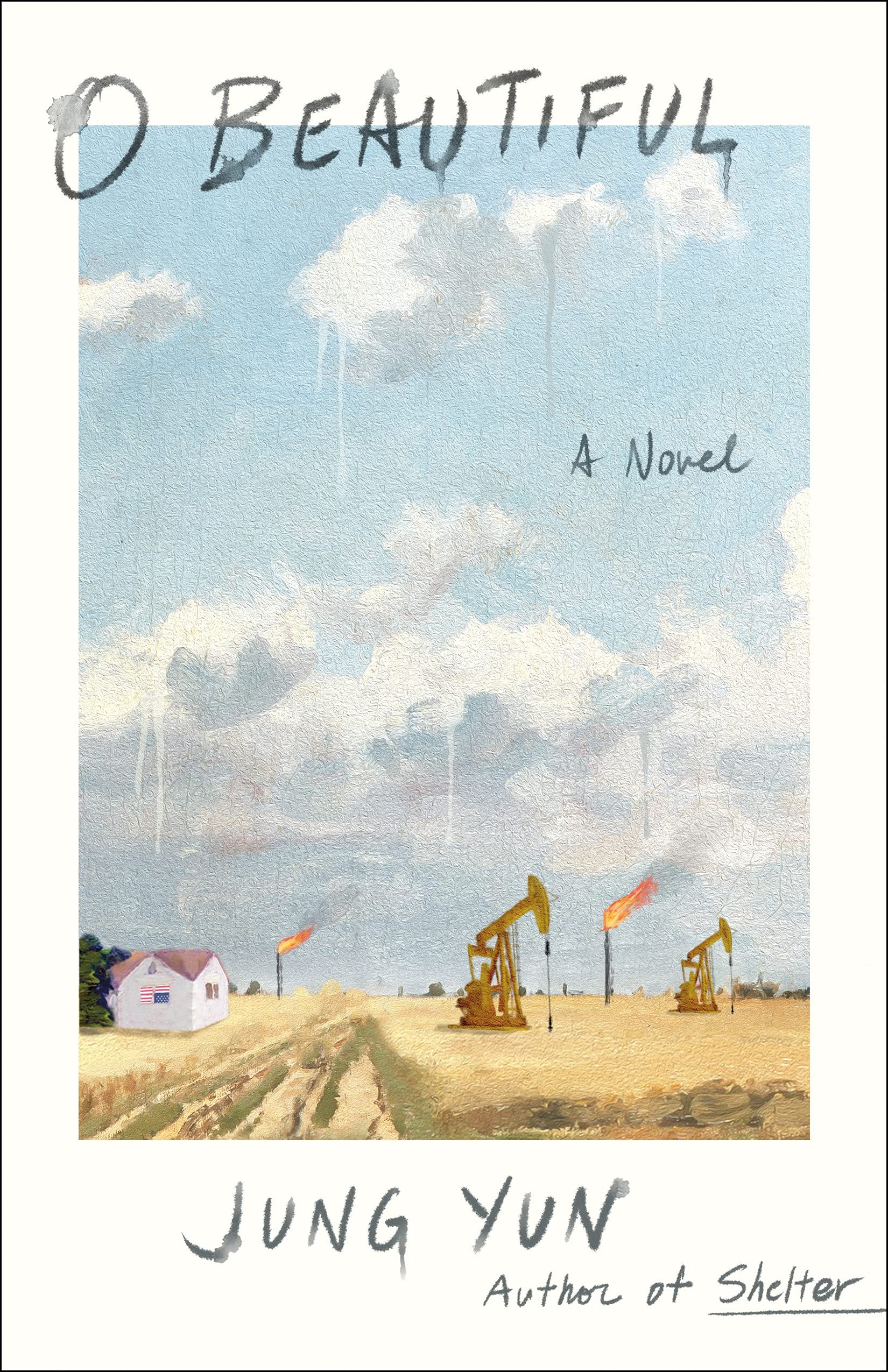 Jung Yun, O Beautiful; cover design by Young Jin Lim (St. Martin’s, November)
The dripping clouds are so intriguing. And beautifully paired with hand lettering that’s been delicately splattered with water.
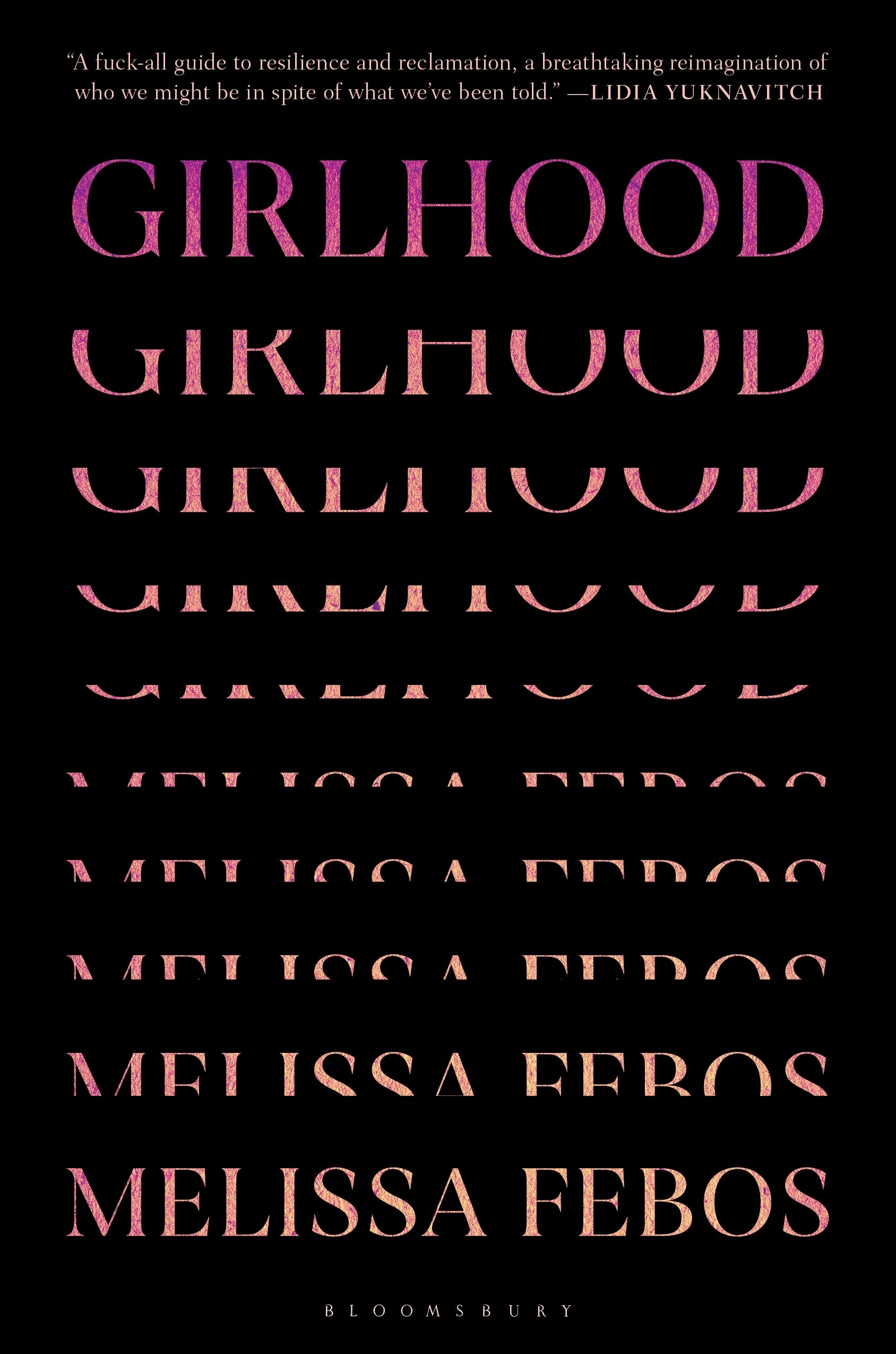 Melissa Febos, Girlhood; cover design by Katya Mezhibovskaya (Bloomsbury, March)
Katya distills a complex topic so elegantly; I was deeply moved by the typographic transition from girlhood to selfhood.
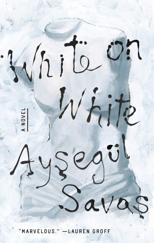 Ayşegül Savaş, White on White; cover design by Lauren Peters-Collaer (Riverhead, December)
It’s not an easy task to put copy over a painting that doesn’t distract or disappoint. The drippy lettering is full of character without compromising the art it sits on. I love it.
 Paris Lees, What It Feels Like for a Girl; cover design by Tom Etherington (Particular Books (UK), May)
Flipping epic, full of energy perfect for the text. Feels so fresh.
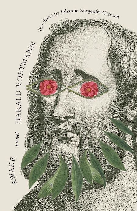 Harald Voetmann, tr. Johanne Sorgenfri Ottosen, Awake; cover design by Joan Wong (New Directions, September)
One of the most playful covers I’ve ever seen, so full of life and wit. The placement of all those elements was probably heavily labored over, but it feels so incredibly effortless.
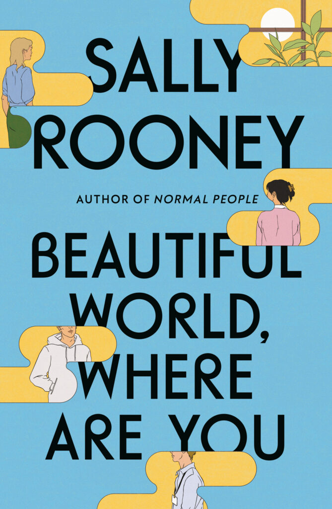 Sally Rooney, Beautiful World, Where Are You; cover design by Gray318, illustrations by Manshen Lo (FSG/Faber, September)
The illustrations by Manshen Lo are beautiful, but the way Jon has integrated them into the cover is what makes it such a success. The way that rounded font mirrors the smooth edges of the illustrative elements is particularly pleasing. Never an easy job to package the follow-up to a huge international bestseller. Feels really fresh.
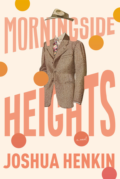 Joshua Henkin, Morningside Heights; cover design by Kelly Blair (Pantheon, June)
The big type, the peachy color theme, and the floating suit and hat make this cover instantly iconic.
 Michael Dobbs, King Richard; cover design by Tyler Comrie (Knopf, May)
A refreshing and modern take on a historical biography.
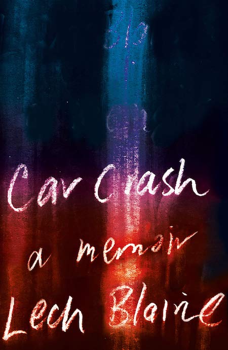 Lech Blaine, Car Crash; cover design by Design by Committee (Black Inc., March)
Every time I come across this cover, I have the urge to touch it, to see if the Cray-Pa art would smudge onto my fingertips . . . the school-art-class feel of scratching off words in thick pastel, working through an adolescent tragedy. A perfect combination of hand lettering and art—abstract, but not—for this particular memoir.
 Kazuo Ishiguro, Klara and the Sun; cover design by Pete Adlington (Faber (UK), March)
Really loved this cover. The graphic simplicity had me from the start and it’s perfect for the story. When a cover is so beautifully thought through it makes me very happy.
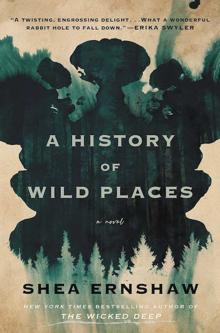 Shea Ernshaw, A History of Wild Places; cover design by Danielle Mazzella di Bosco (Atria, December)
This cover is so creepy yet beautiful! The inky-ness creates that ghostly atmosphere, while the trees remind us of a familiarly dark place…
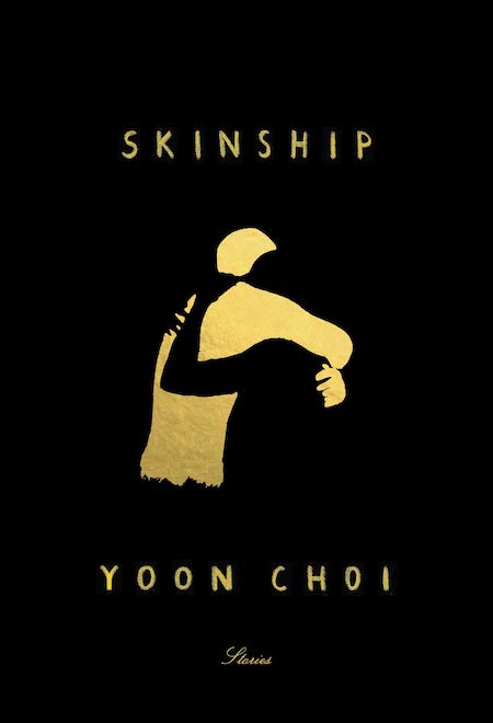 Yoon Choi, Skinship; cover design by Janet Hansen, art by Félix Díaz de Escauriaza (Knopf, August)
Super simple, super moving. The black and gold are striking alone, but the use of negative space carries so much weight.
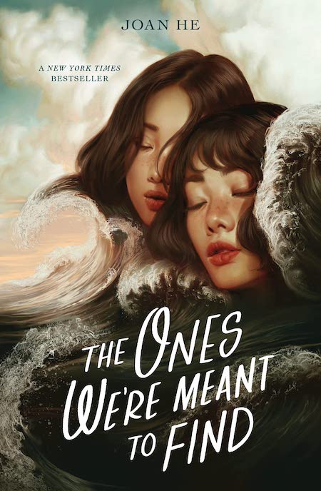 Joan He, The Ones We’re Meant to Find; cover design by Aurora Parlagreco, illustration by Aykut Aydoğdu (Roaring Book Press, May)
This cover just blows me away. The stunning illustration with the handwritten title and the understated author name makes this cover feel like a true work of art.
 Mark McGurl, Everything and Less; cover design by Ben Denzer (Verso, October)
Unwrap the jacket for a full shelf of spine design that delights in every genre! It’s a book lover’s playground!
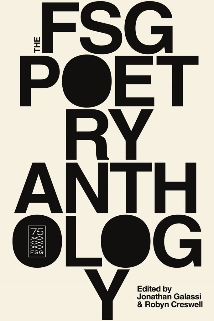 Robyn Creswell, Jonathan Galassi, eds., The FSG Poetry Anthology; cover design by Na Kim (FSG, November)
Simple, clean, classic . . . vintage yet modern. Fruit held up by the steady “Y” trunk? Am I reading too much into it? Does it matter? I want this cover art framed, poster-sized, hanging in my apartment . . . to make me feel like a hip, well-read lover of poetry.
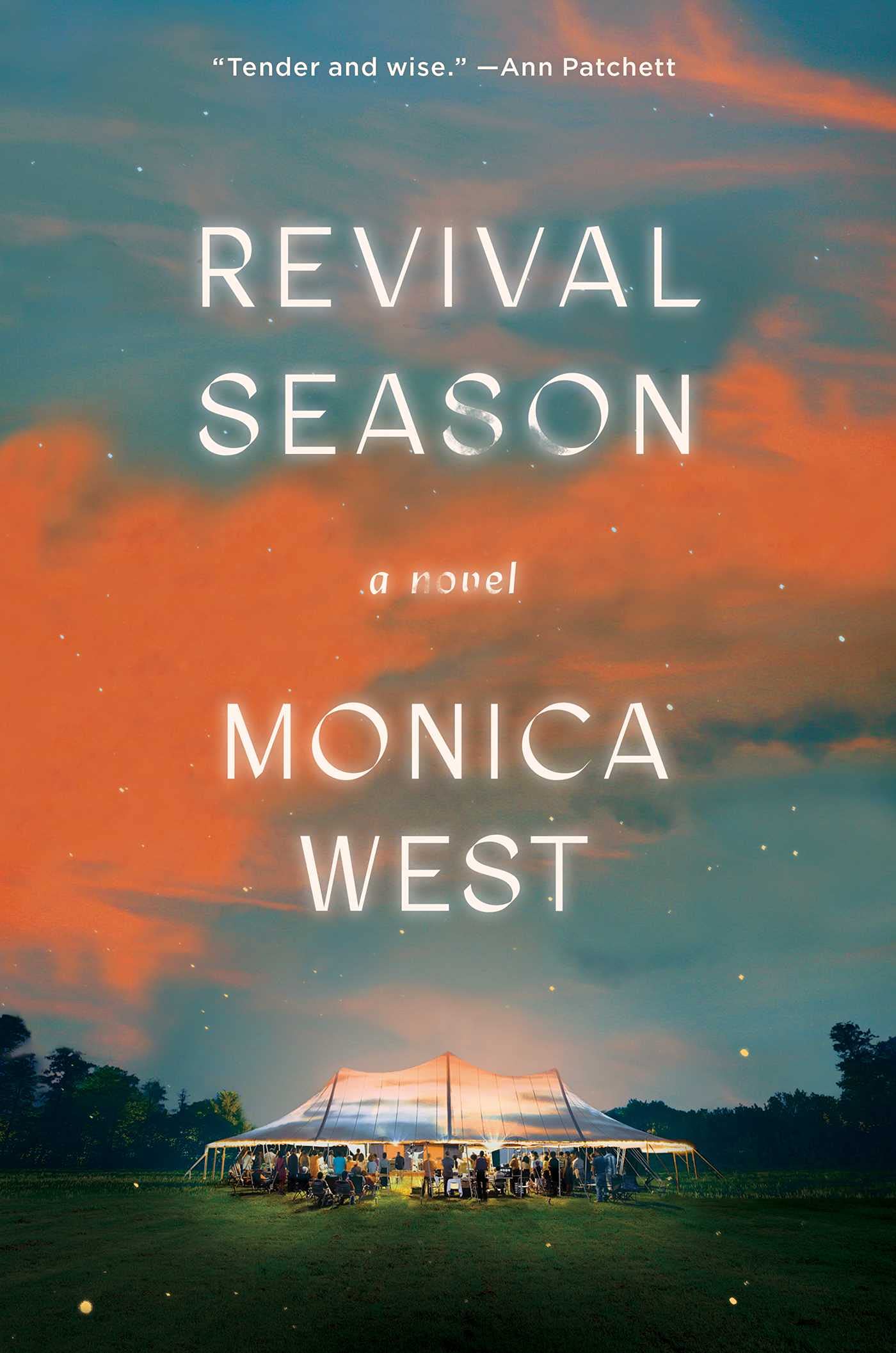 Monica West, Revival Season; cover design by Tristan Offit (Simon & Schuster, May)
More and more, I feel myself drawn to super bold designs. This design by Tristan has been an exception. Every time I see this cover I want to pick it up. I love the beautiful sky, elegant type and the little dots of sparkle on the print edition. It’s quietly powerful.
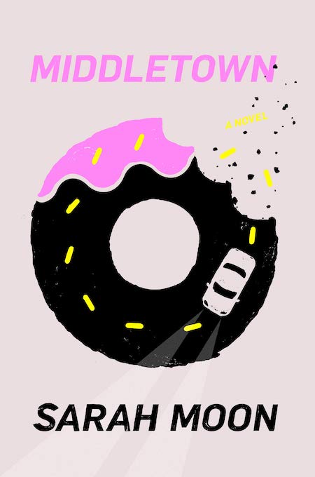 Sarah Moon, Middletown, cover design by Strick&Williams (Levine Querido, April)
Love the playful illustration and use of neon ink.
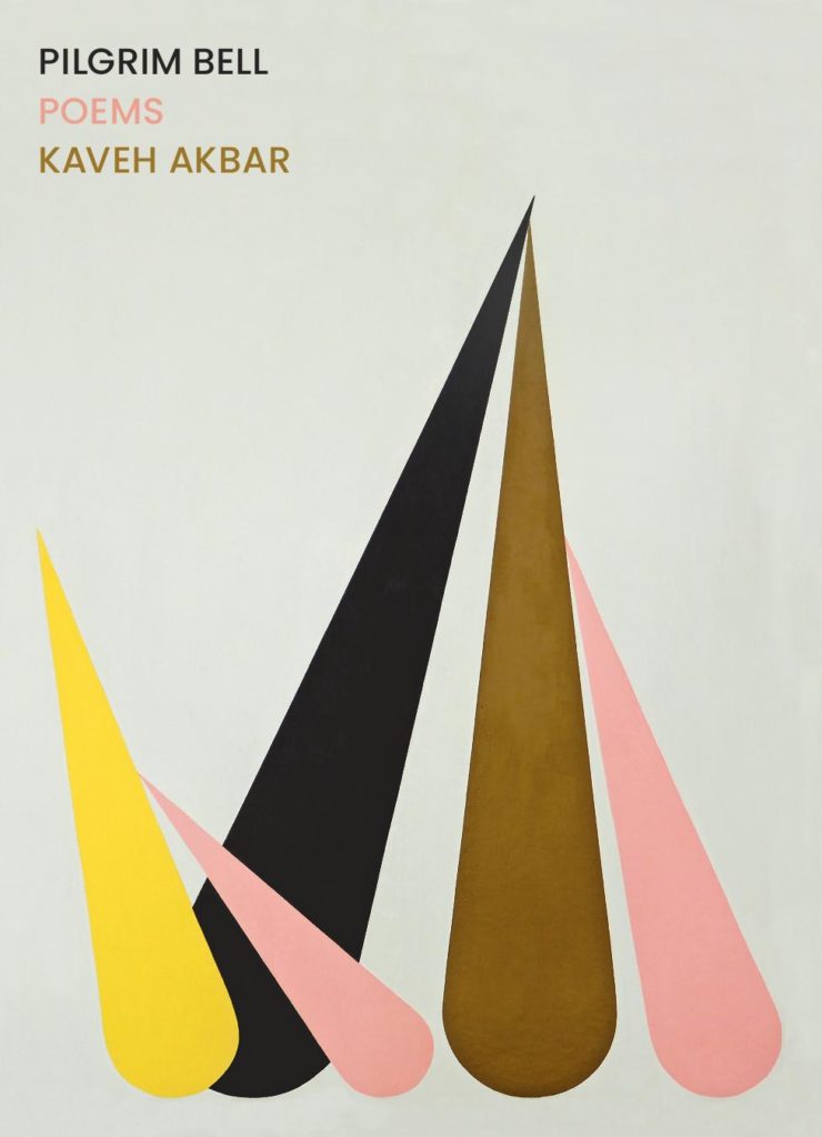 Kaveh Akbar, Pilgrim Bell; cover design by Hannah Bagshaw (Graywolf, August)
The amount of feeling conveyed by the delicate composition of the painting and type here is remarkable. At first glance it feels serene, and then the sharp spikes and the air around the type vibrate with a palpable edge.
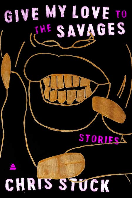 Chris Stuck, Give My Love to the Savages; cover design by Stephen Brayda, art by Arnold R. Butler (Amistad, July)
What IS this? I’m not totally sure but it looks fantastic in real life. The metallic effects and tactile finish are just brilliant.
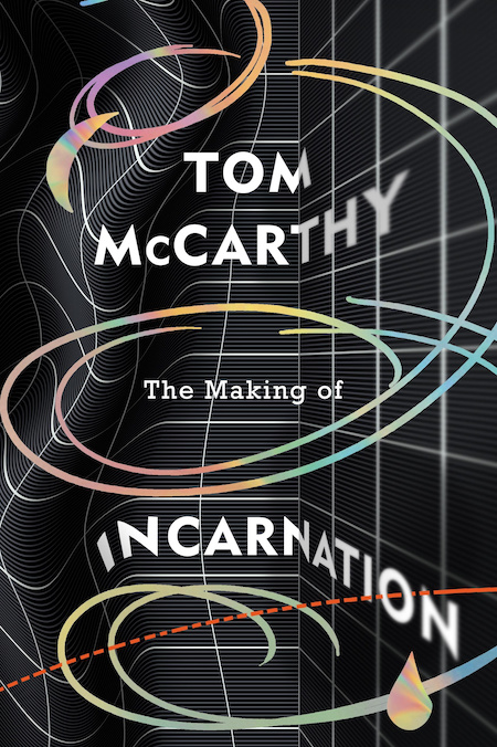 Tom McCarthy, The Making of Incarnation; cover design by Mario de Meyer (Jonathan Cape (UK), September)
This cover evokes such strong feelings of creativity through its use of organic shapes, sense of space, and typography, that makes this cover feel all the more three-dimensional.
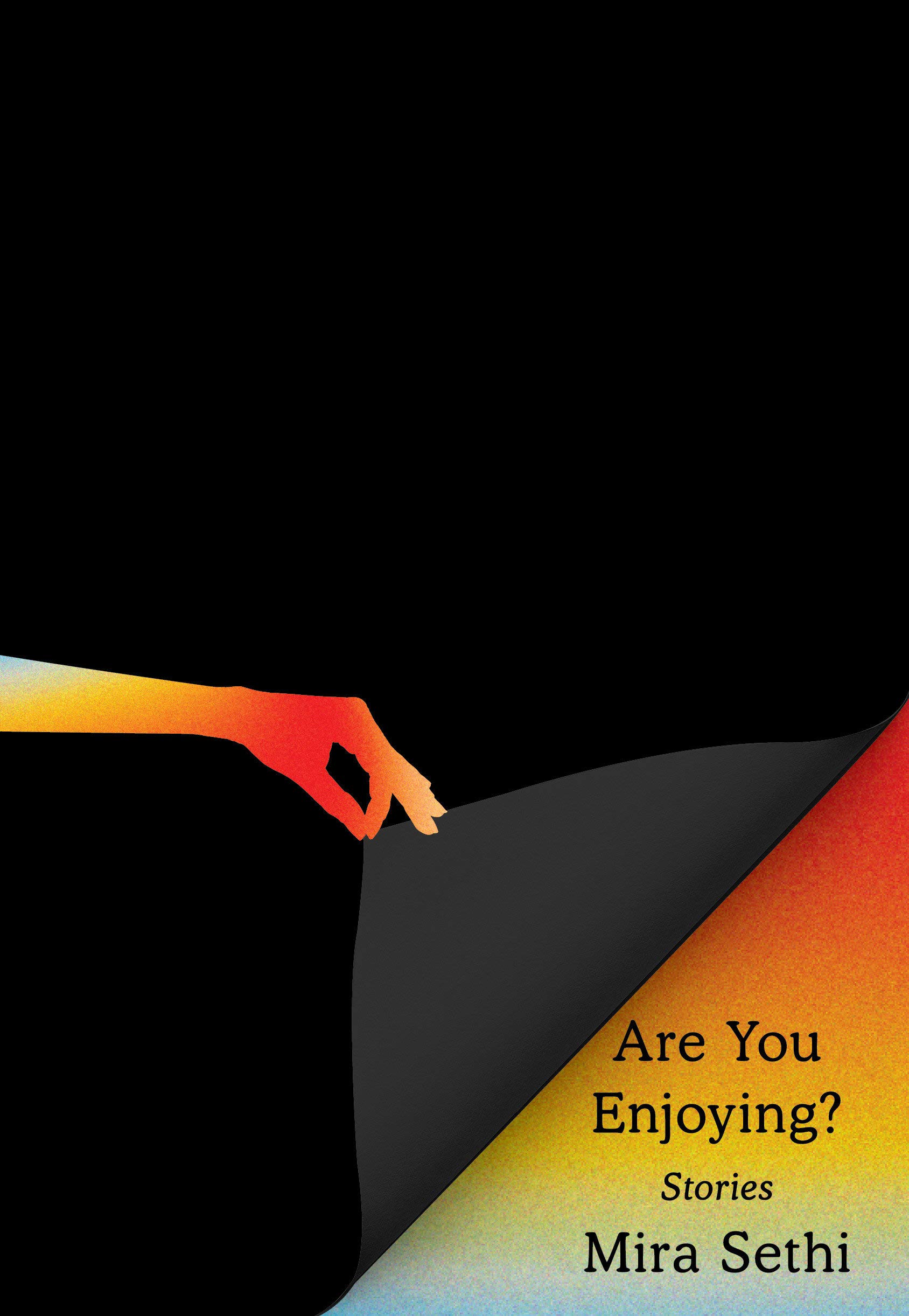 Mira Sethi, Are You Enjoying?; cover design by Janet Hansen (Knopf, April)
Stunning use of negative space and a trompe l’oeil effect. Topped with the book’s inquisitive title, the cover is irresistibly charming.
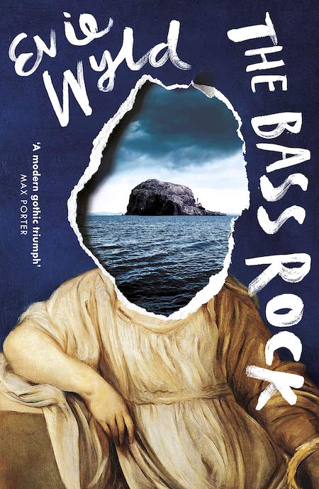 Evie Wyld, The Bass Rock; cover design by Kishan Rajani (Vintage UK paperback, August)
Both the US and the UK versions of this cover are fantastic, but I adore the missing woman’s head, the scrawled sideways title, and the combination of danger and whimsy in this version.
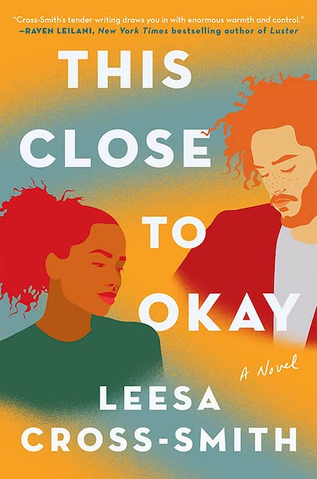 Leesa Cross-Smith, This Close to Okay; cover design by Laywan Kwan (Grand Central Publishing, February)
I love the colors, illustration style, and gradient background. I think it’s a sophisticated twist on the illustrated romance covers.
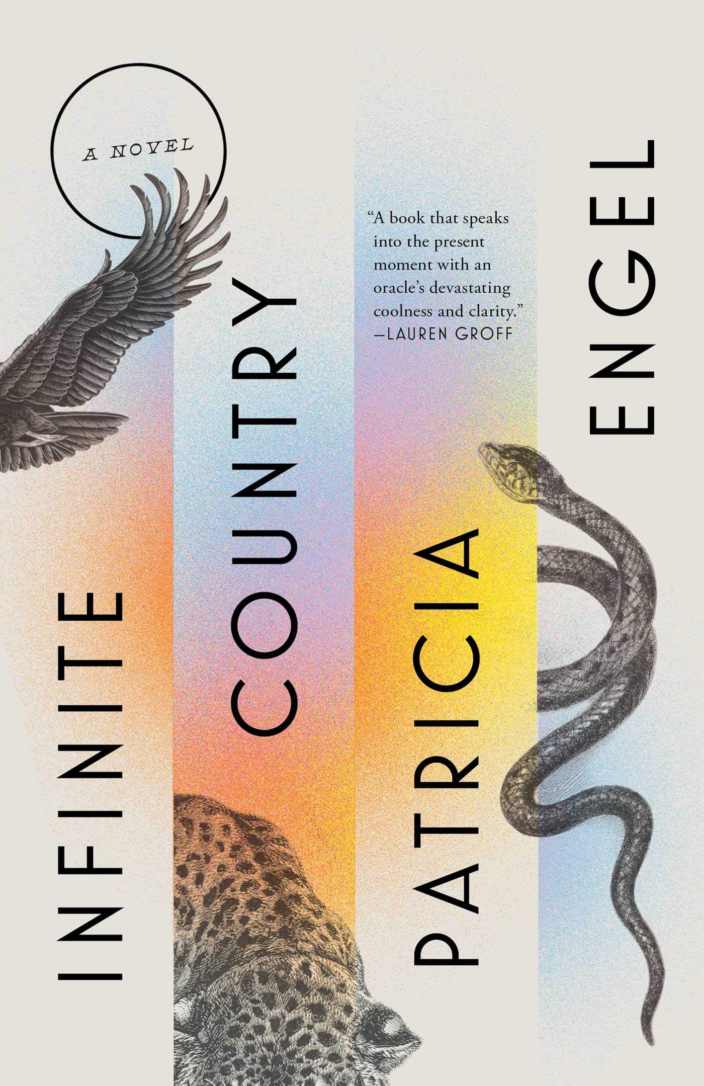 Patricia Engel, Infinite Country; cover design by Grace Han (Avid Reader Press, March)
I love how the art and type were kept monochromatic which highlight the interplay of the gorgeous colors on this piece.
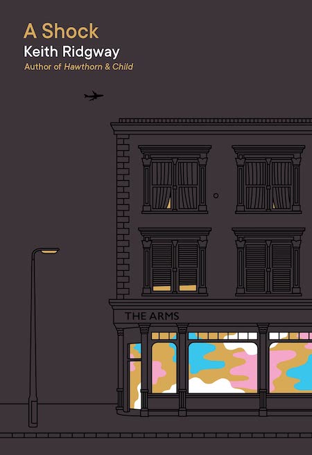 Keith Ridgway, A Shock; cover design by Nathan Burton (Picador UK, June)
Love the minimalist approach and the tiny peaks through the curtains.
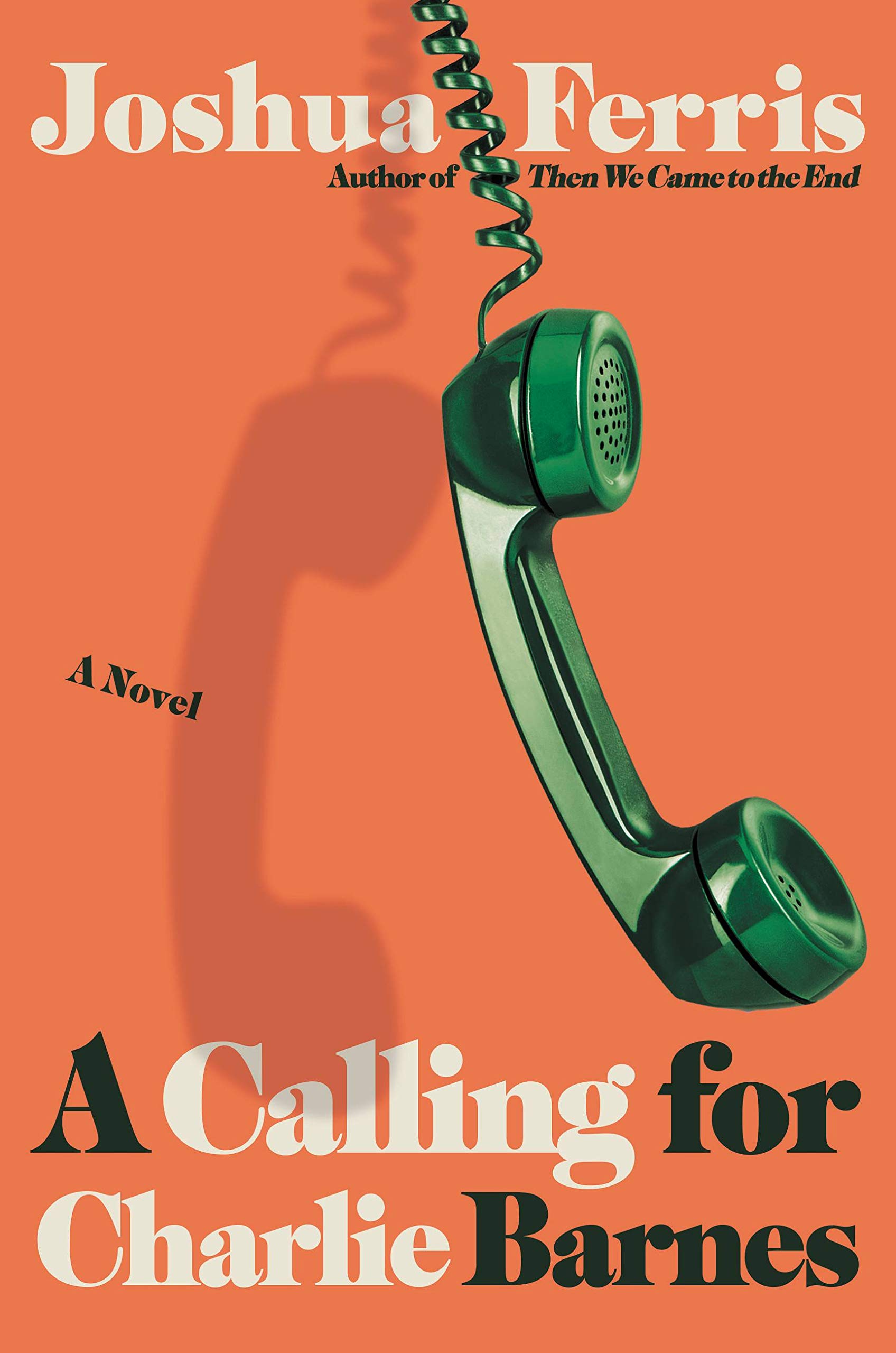 Joshua Ferris, A Calling for Charlie Barnes; cover design by Gregg Kulick (Little, Brown, September)
I love the dimensionality, minimalism and the perceived motion of that phone left swinging off the hook.
 Albert Samaha, Concepcion; cover design by Lauren Peters-Collaer (Riverhead, October)
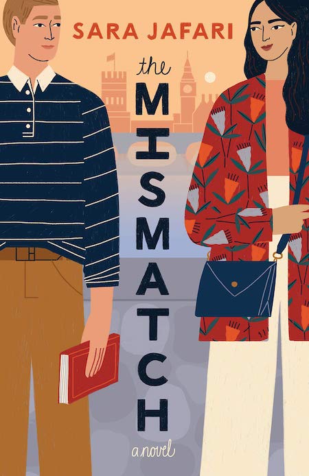 Sara Jafari, The Mismatch; cover design by Abbey Lossing (Dell, August)
Another great illustrated cover! The characters’ expressions are perfect, as is the stacked title.
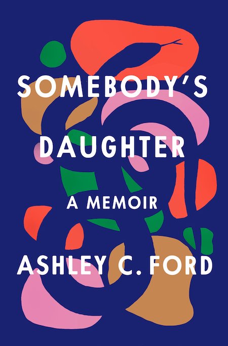 Ashley C. Ford, Somebody’s Daughter; cover design by Rachel Willey (Flatiron, June)
The slow reveal of the snake gets me every time I look at this jacket. There’s such a perfect balance of tension between the exuberant color palette and that lurking snake.
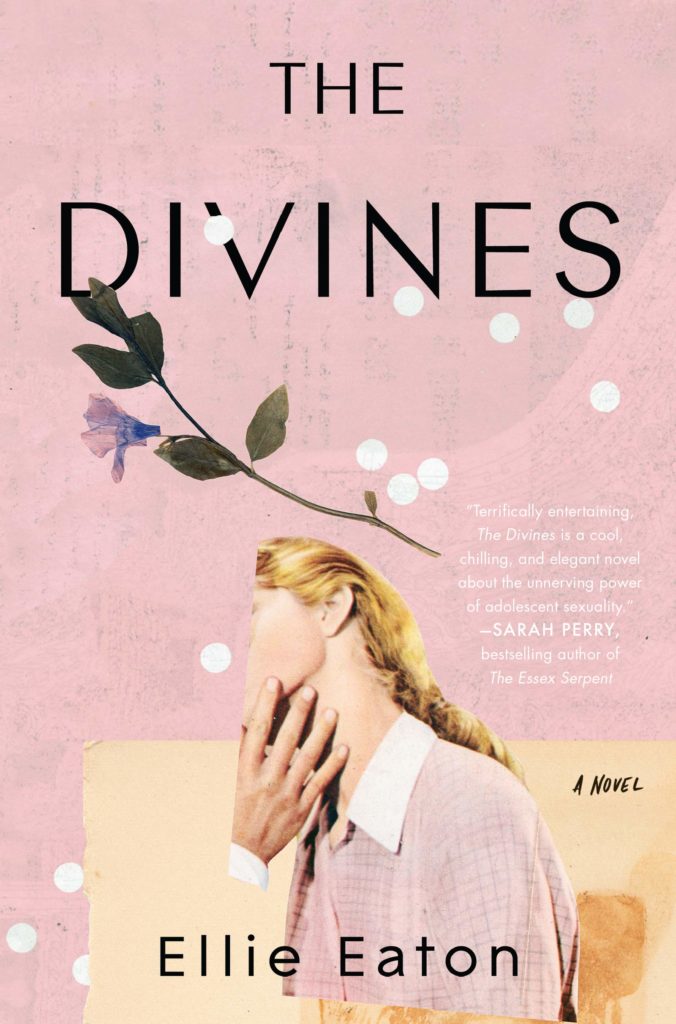 Ellie Eaton, The Divines; cover design by Mumtaz Mustafa, art by Beth Hoeckel (William Morrow, January)
Everything about this cover is brilliant, the pink, the creepily cropped photograph and the slight overlap of the white dots and the type.