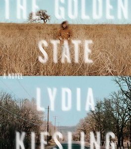
Cover design is mainly reading. I like to tell my students this—in part so they will sit down quietly and read instead of bothering me, and also because it’s true. Sometimes, though, you don’t really get to read the thing until it’s out—when I began work on Norah Lange’s People in the Room I only had a general description and the first two chapters. It’s not much, but I do believe that reading an incomplete (or even nonexistent) book is still reading, even if it doesn’t involve the usual business of sticking your face into the printed words. Ideally, having read enough (and read it well, with that obsessive degree of inquiry Nabokov demanded of his students), a kind of readerly intuition should emerge, allowing a glimpse beyond the given lines.
That intuition is often hard to decipher, and it’s less of the metaphorical puzzle-solving that is the domain of conceptual illustration, and more of a cautious fumbling towards an image that sums up the book without exactly summing it up. Some summing up is of course required, and then it’s a matter of trimming it down into an elegant, inviting shape.
Norah Lange was a prominent figure in the Argentinian avant-garde, but until recently she’d been largely remembered in the English-speaking world (unfortunately and unsurprisingly) as a saucy footnote in Borges’s biography. Her literary career was bold and varied, from poetry and memoirs to the more overtly modernist novels like People in the Room. There are hints of Robbe-Grillet and early Georges Perec—spaces as characters and characters stripped bare, with touches of quiet humor and quieter desperation.
The book starts off and stays in a tone of determined indirectness, so I thought it wouldn’t be quite right for the cover to simply show a bunch of people in a room. Lange’s way with words hints right away that there won’t be much in the way of narrative and character development. There is a mystery of sorts, strange missives and a mystery man, and those may all be read as cyphers to some grand uniting metaphor, but I’m more tempted to read them at face value—as pieces of a fragmented image that gains a greater depth and lightness in its unfinished state. There’s longing, love and isolation, and the premonition of death. Lange toys with our innate need to make sense of things and fit them into a coherent narrative. She discards symbols and signs as easily as she introduces them, so that the picture remains a blur throughout the whole book—the only thing consistent is the canvas.
The story is about a woman spying on her neighbors across the street. She does leave her own room eventually, as I found out when I finally got to read the book, but she remains an observer, no matter how close she gets to the people in the room, who may not exist at all (although this particular puzzle seems to me not worth solving). There’s a layer of separation between her and her subjects, and the voice is not quite inside or outside, but perched right on that layer, along the edge.
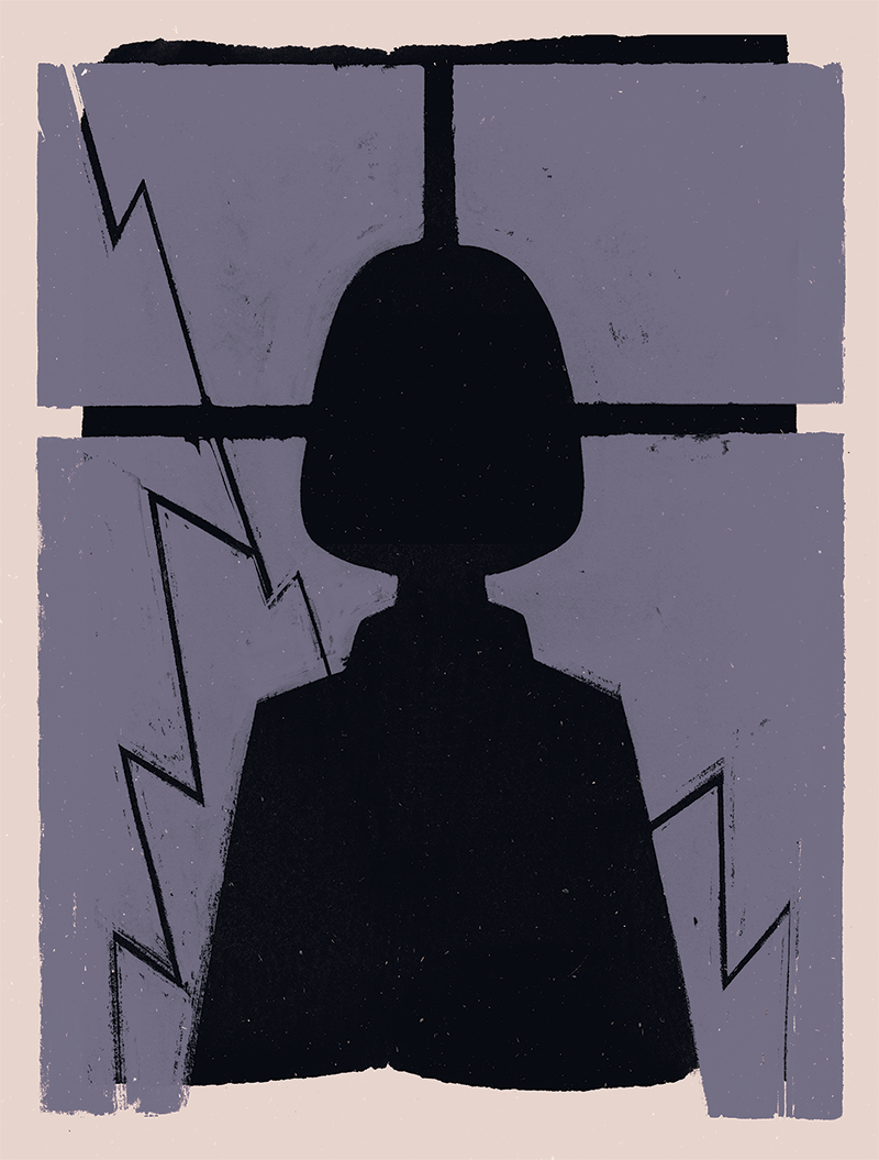
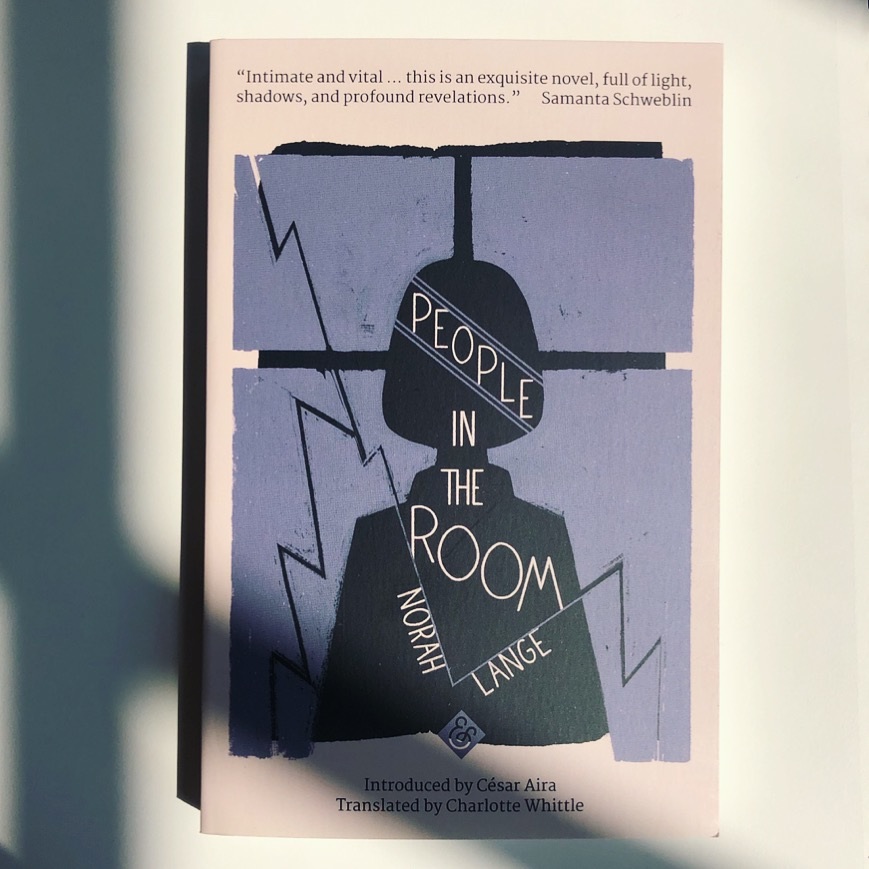
I thought of capturing this image, as if the facade of the house was printed over the narration, flattening everything into a screen. Her head would be cross-haired right in the middle, and for the rest of the design, I’d go completely bland, so that it would look more like a medicine package than a novel.

I did a variation with a more naturalistic feel, but it felt somewhat off, “too studio Ghibli,” as the publisher said (and I agreed).
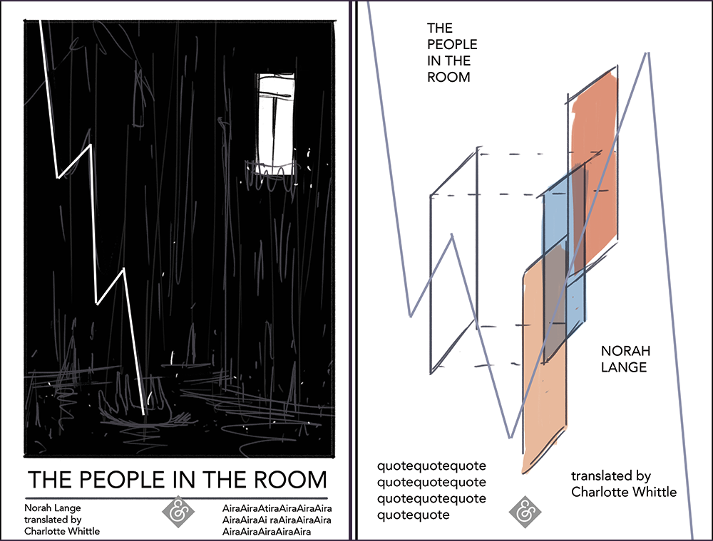
The third idea was to focus on the street drowned in black ink with the lightning and the window as the only non-black shapes against it. I personally liked this design and ended up recycling it in my own short comic called Resident Lover, with a wee nod to the author.
Lastly, I wanted to break down the layers into a simple schematic image: no window, no rooms, certainly no people—just the jagged rhythm and the refractions (if that’s the word). I quite liked this cover too, but the first idea still felt the strongest and so we went with that.
At first I tried a fully digital treatment, stacking several layers of screen tones that would overlap into a tense, uncomfortable moire, lightened here and there with a fuzzy eraser. After the many hours I spent tweaking each corner, the cover still looked uninspired, so I scrapped it and decided to go full analogue, with brush and ink.
I applied tape—badly—allowing the edges of the frame to be as rough as they please, and inked the rest freehand, leaving little speckles of empty space here and there as motes of dust or particles of lightning. Something still felt unfinished, so I looked through my scrap folder and found a few ink roller bits that I did for no good reason some four to five years ago. I placed one of them underneath the inked silhouette and suddenly it worked: the black grounded the design and gave it a bit of needed gloom.
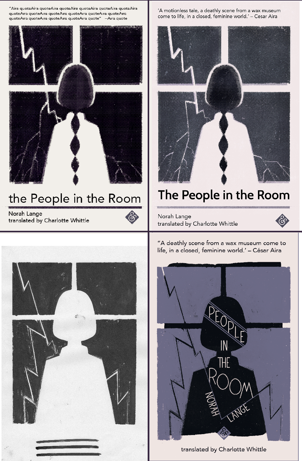
The publisher didn’t like the boring lettering, and so I tried to plug the words into the central shape. Around the same time, the title lost its opening “the,” which fitted rather well on the top of her head, so now I had to rearrange them all anew. I played around with very narrow lettering and loose handwritten style, but it didn’t quite work. Then I tried to connect the lightning and finally it struck me (sorry): why not break the lettering a bit further, and keep it uncomfortable. That’s what I did, and although I’m not too happy with the final lettering—a part of me would prefer to keep the negative space completely black—the tightly squeezed title does spell out the claustrophobia much better.
I’d like to thank And Other Stories for inviting me to design this book—it’s an honor to be part of a project like this, and I can only hope I did this novel justice. Thanks also to the translator, Charlotte Whittle, for her amazing work and encouragement.